
Gogosha Optique
A new identity with focus.
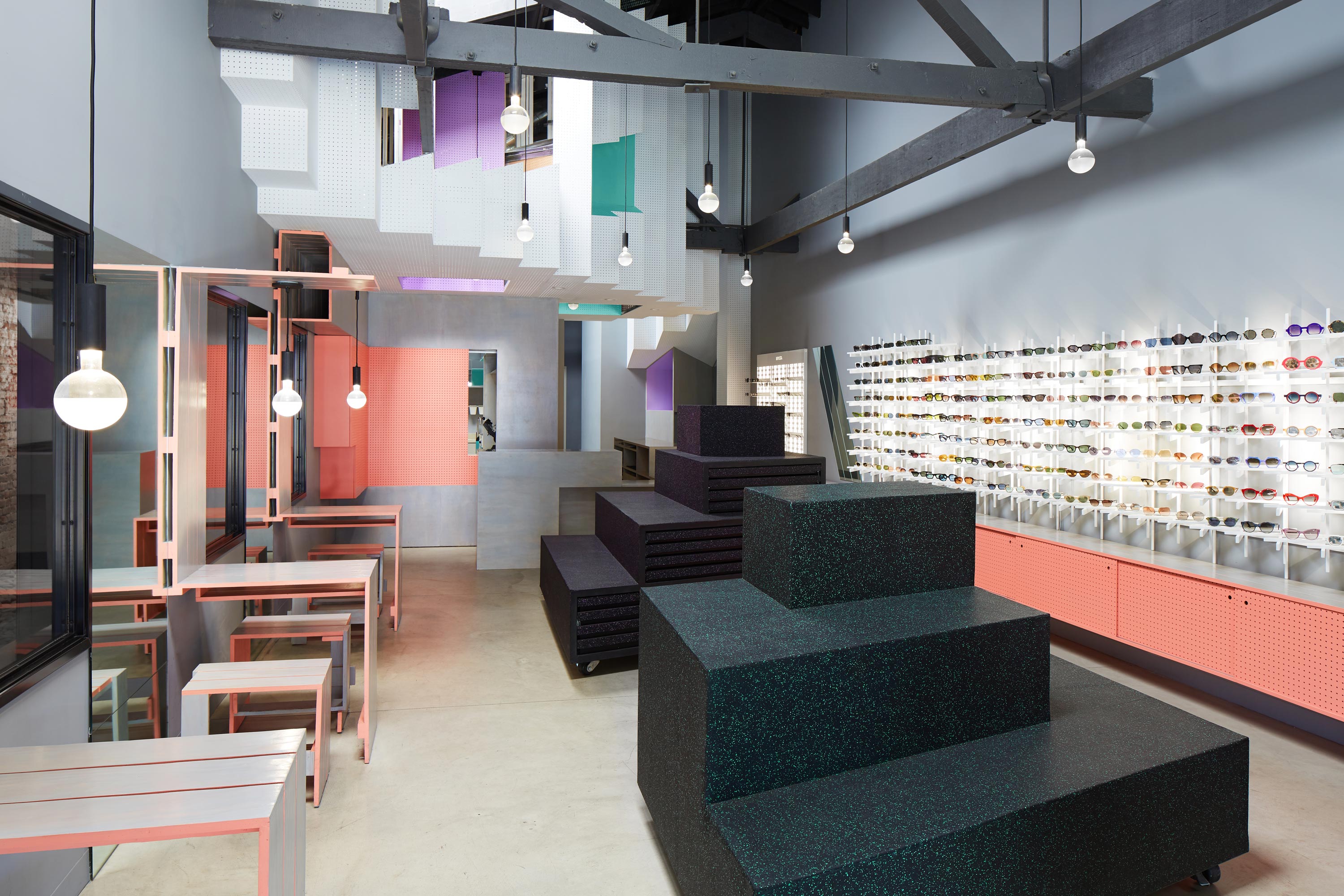
Gogosha Optique is a premium eyewear and sunglass boutique based in Los Angeles. They believe that eyewear should be more than just a brand name stamped at the temple of a frame. Their carefully curated selection of eyewear is often seen adorning many of Hollywood's great and good having paid a personal visit to Julia and her team themselves.
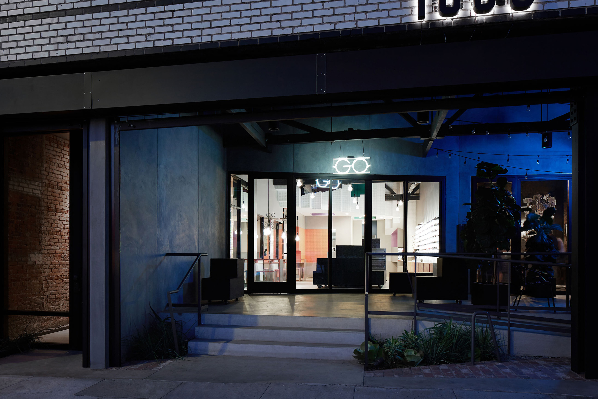
In 2015, Gogosha's first store in Silver Lake was being refitted and it was seen as the perfect opportunity to revist the identity.
Some logos design themselves.
This was one of those occasions.
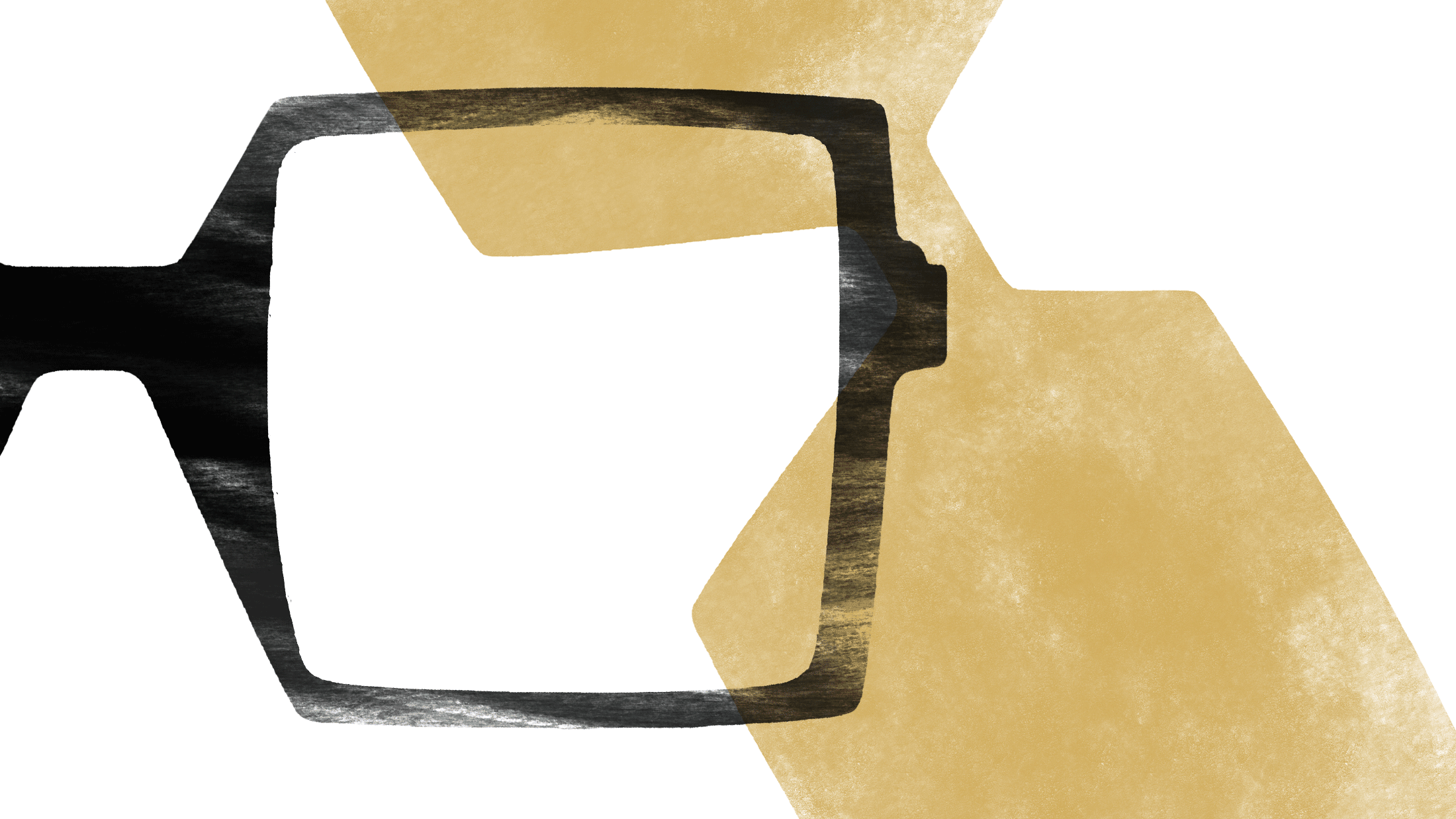
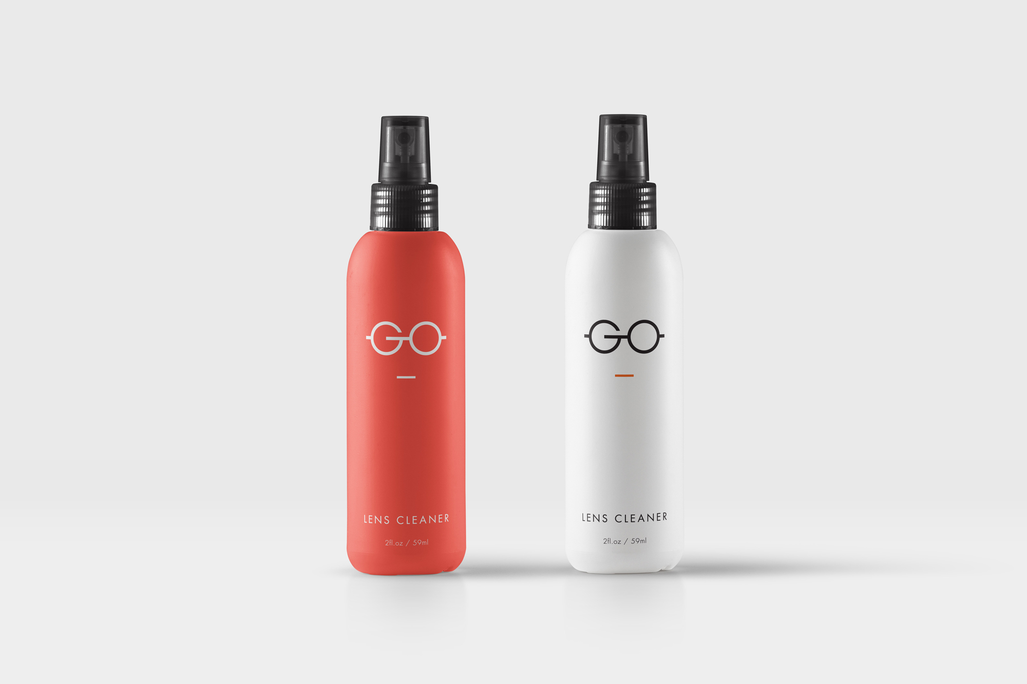
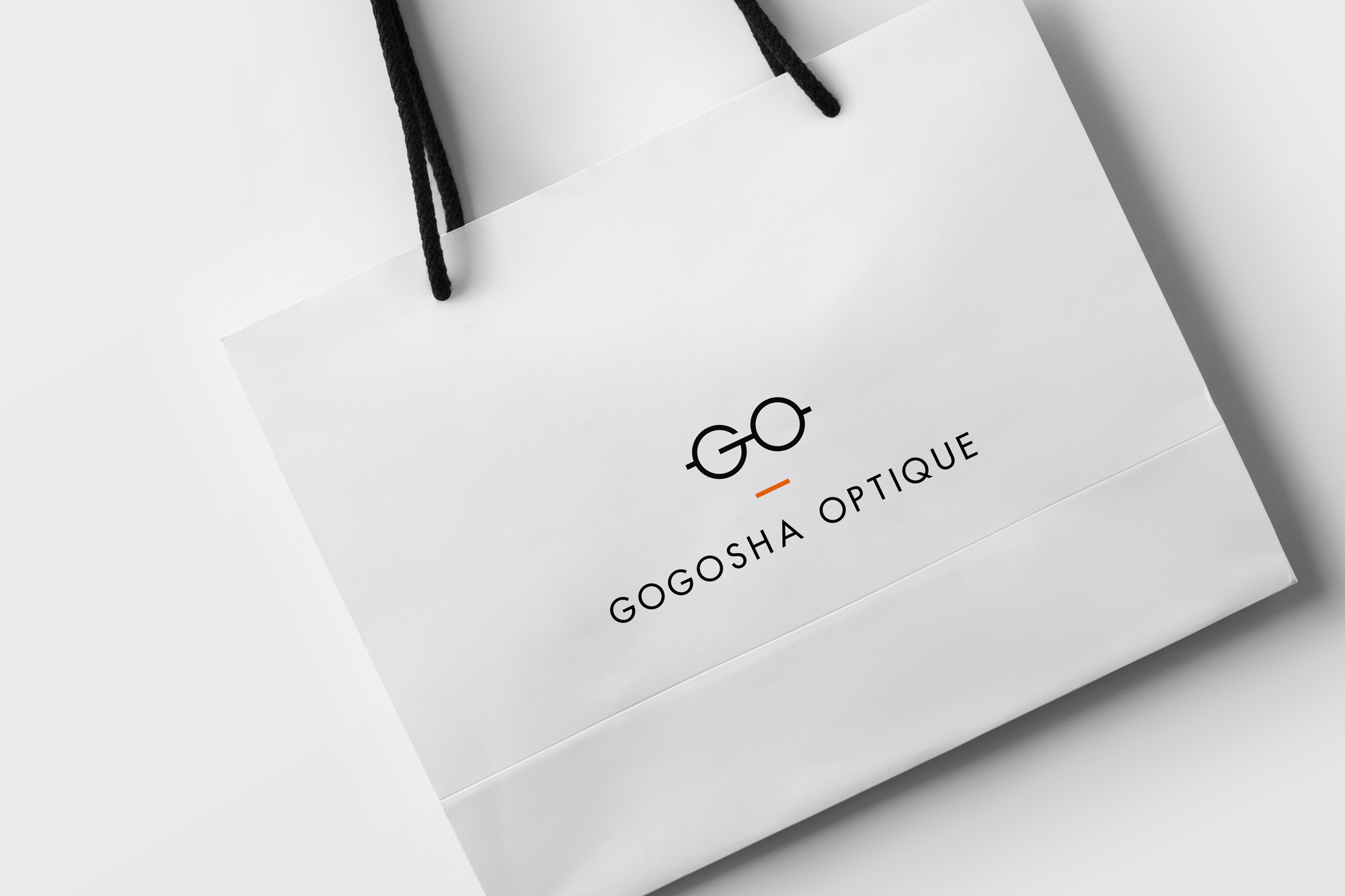
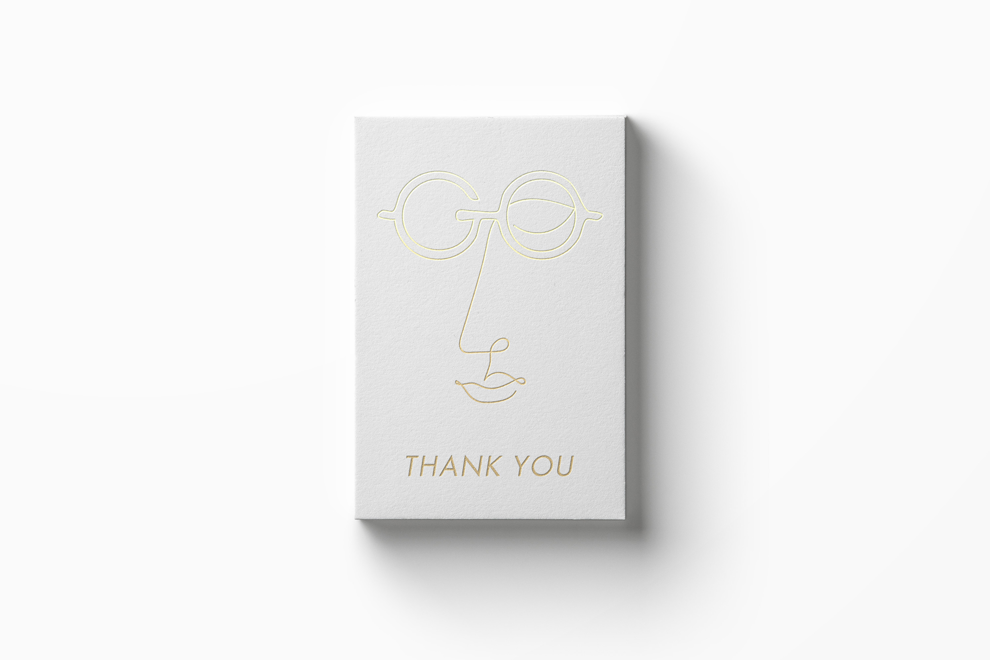
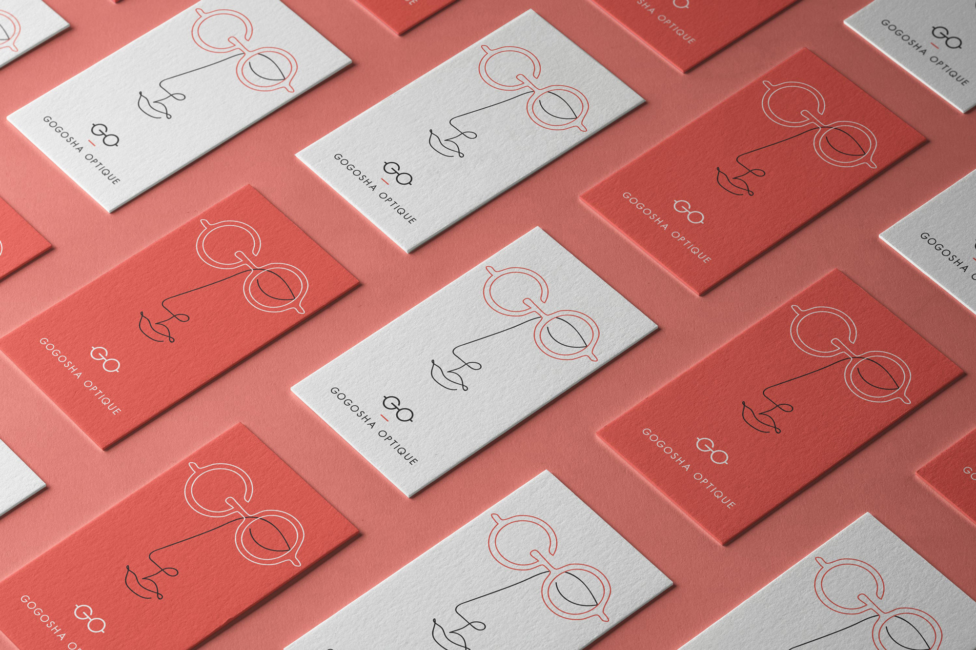
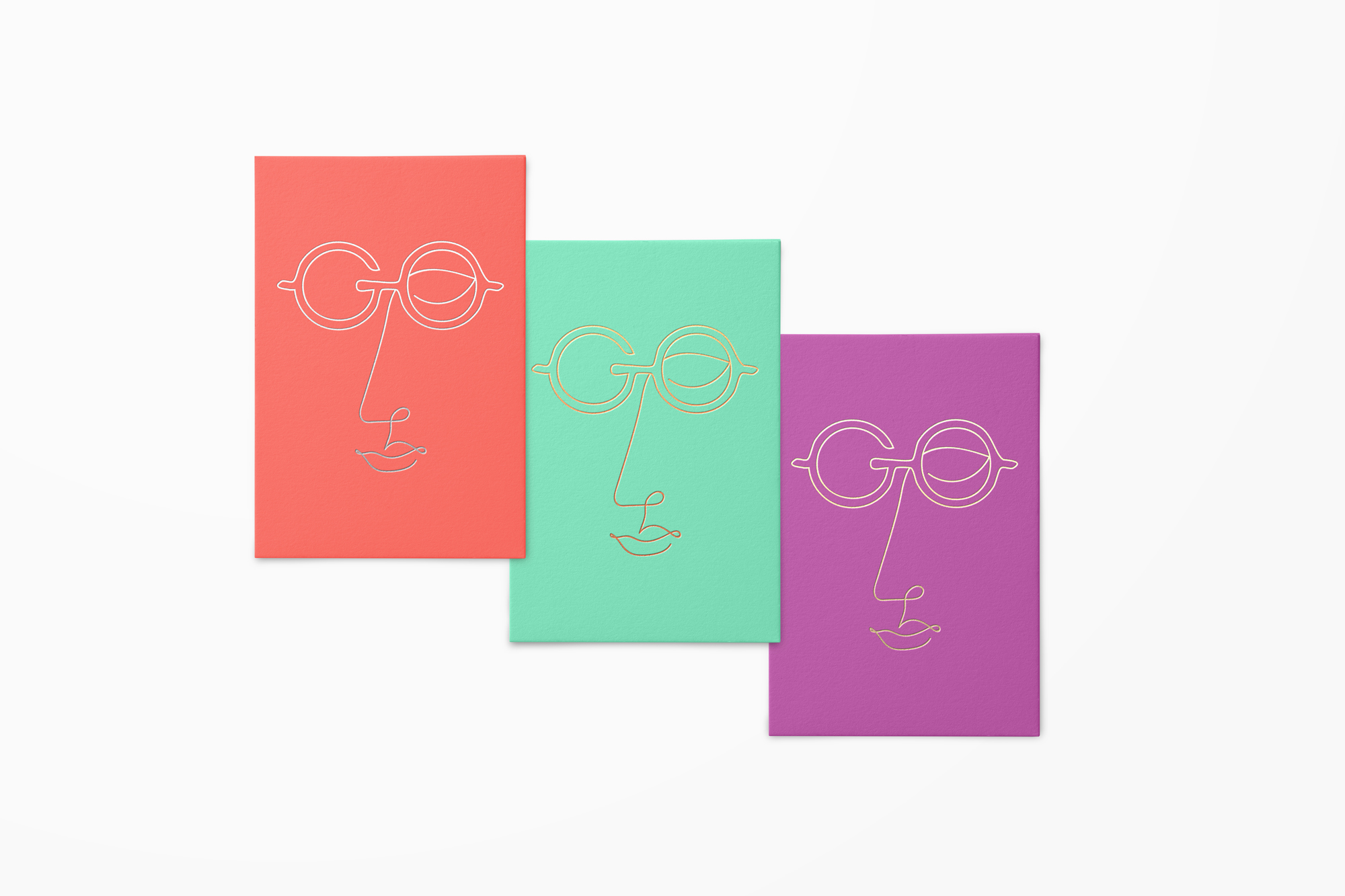
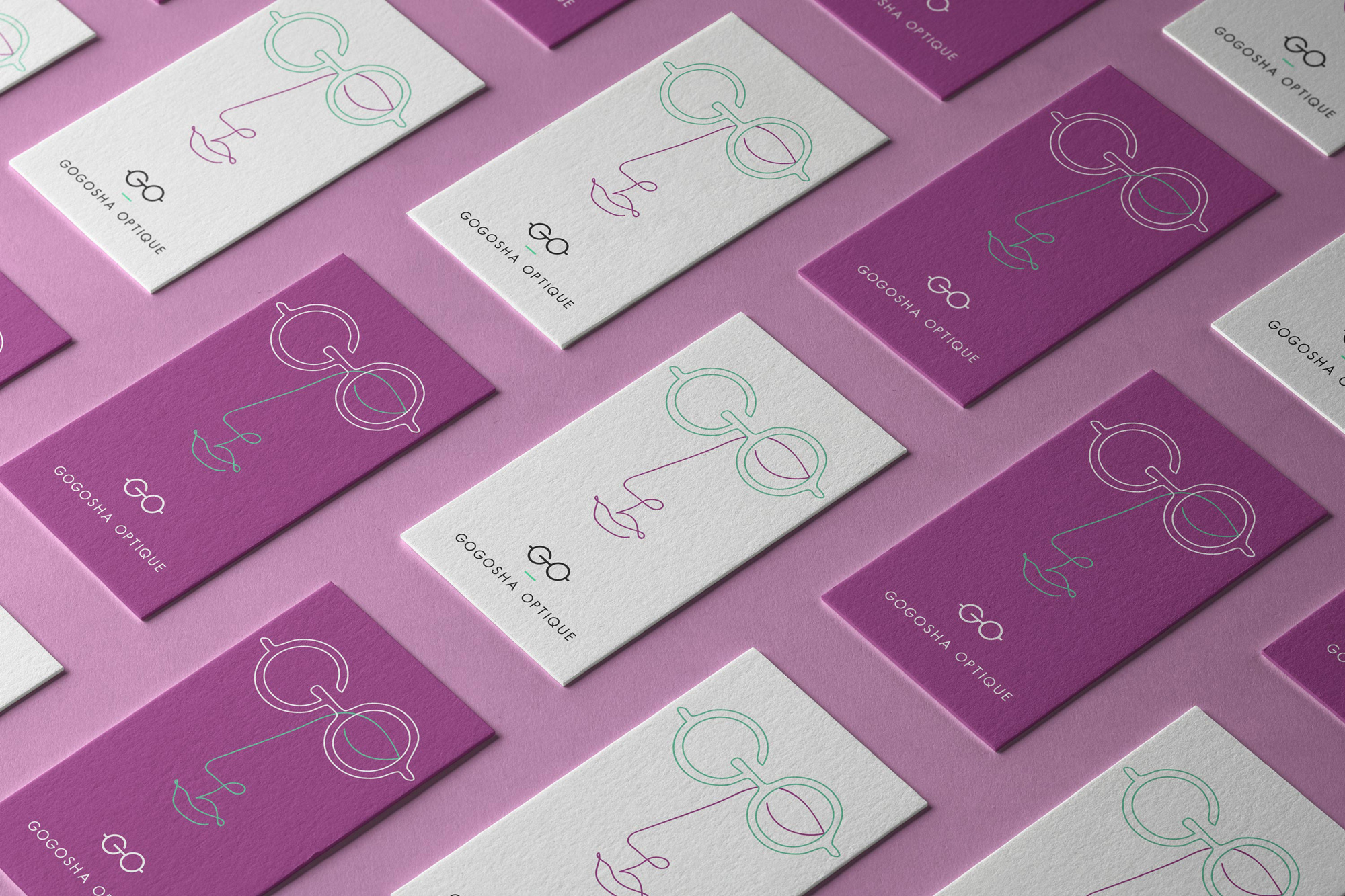
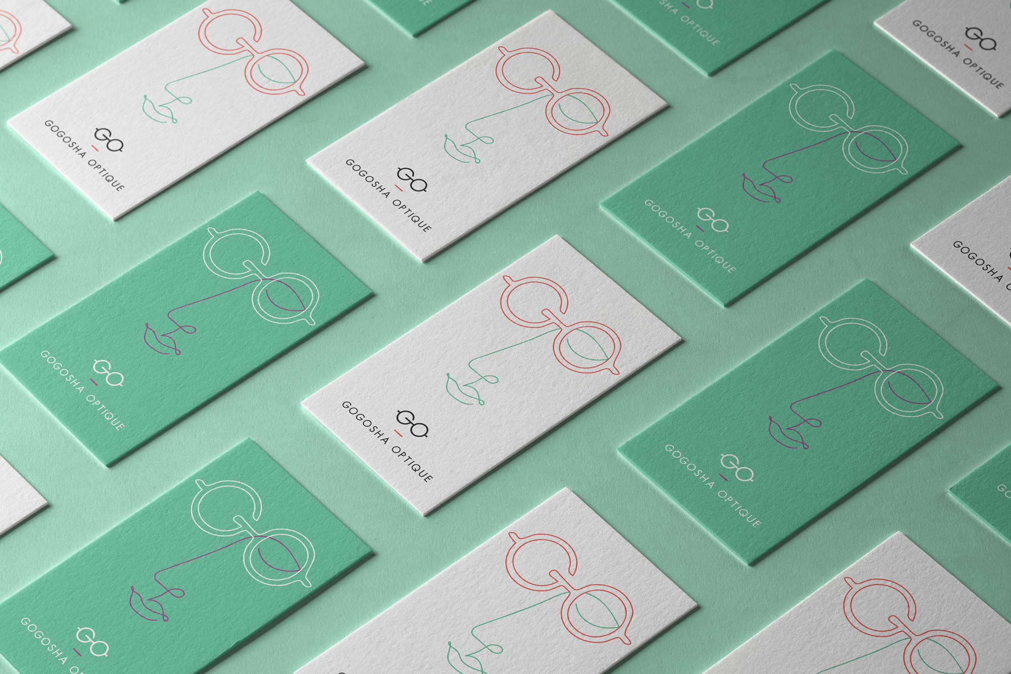
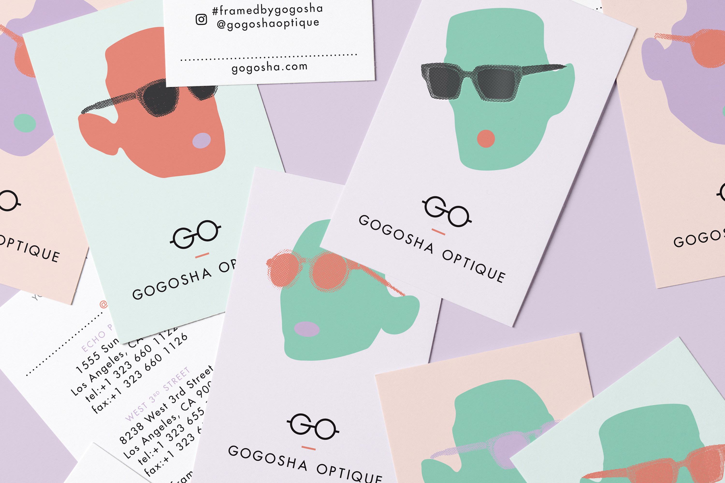
The circular geometric shapes created by the initials G and O lend themselves perfectly to a spectacle shape. To not use those gifts in the creation of this logo we would have had to seriously ask ourselves if we were in the right line of work.
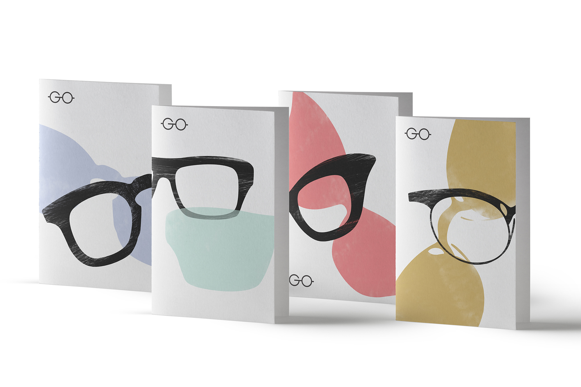
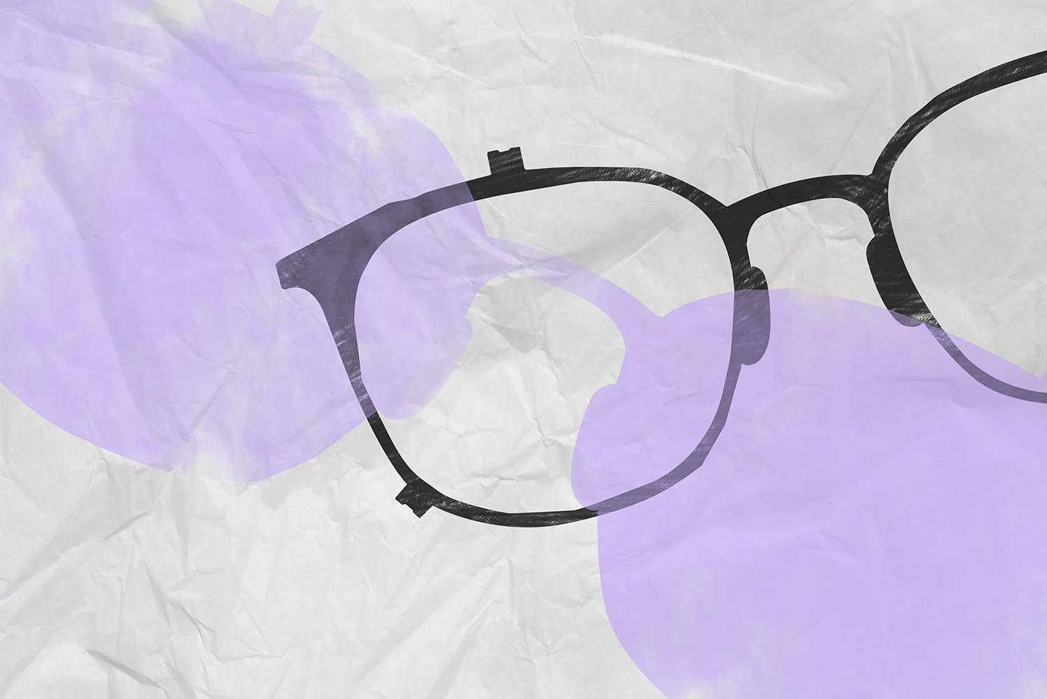
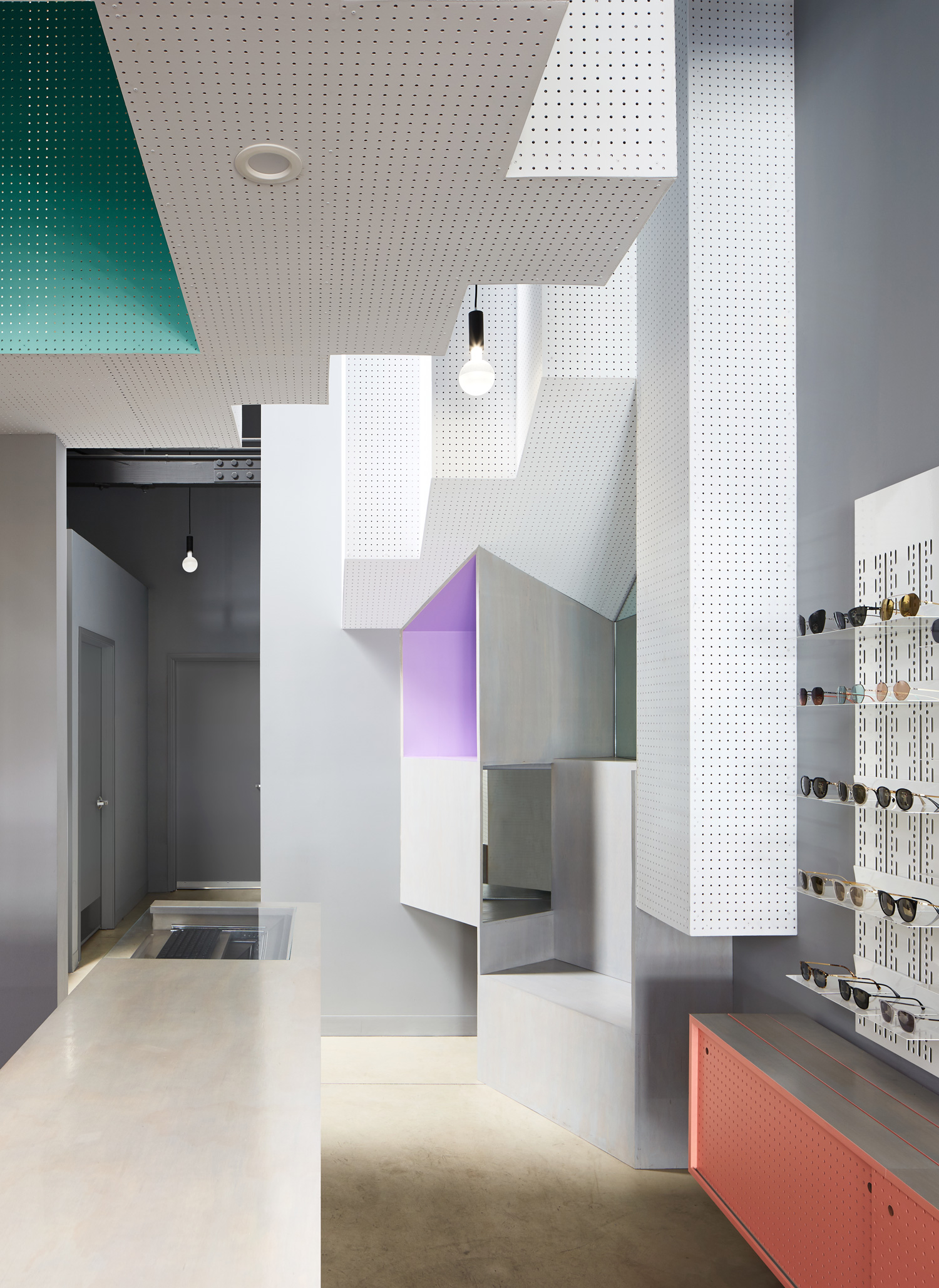
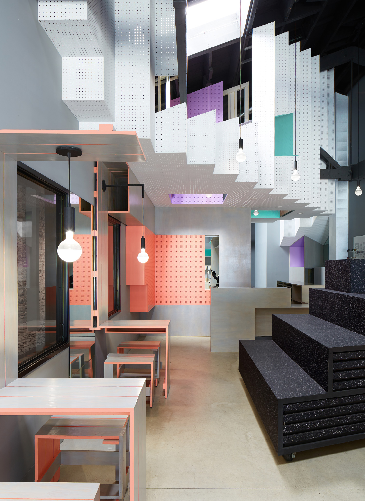
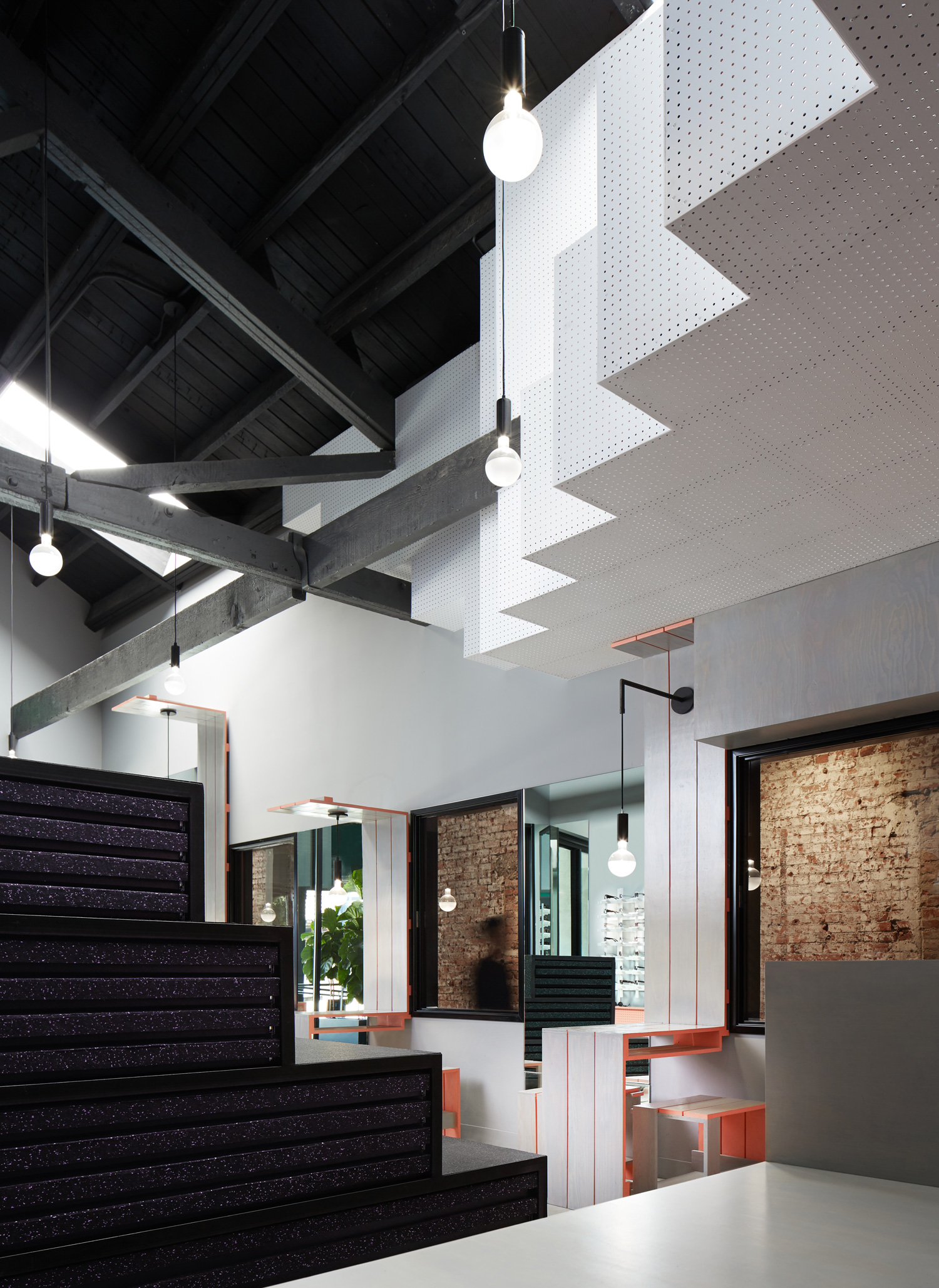
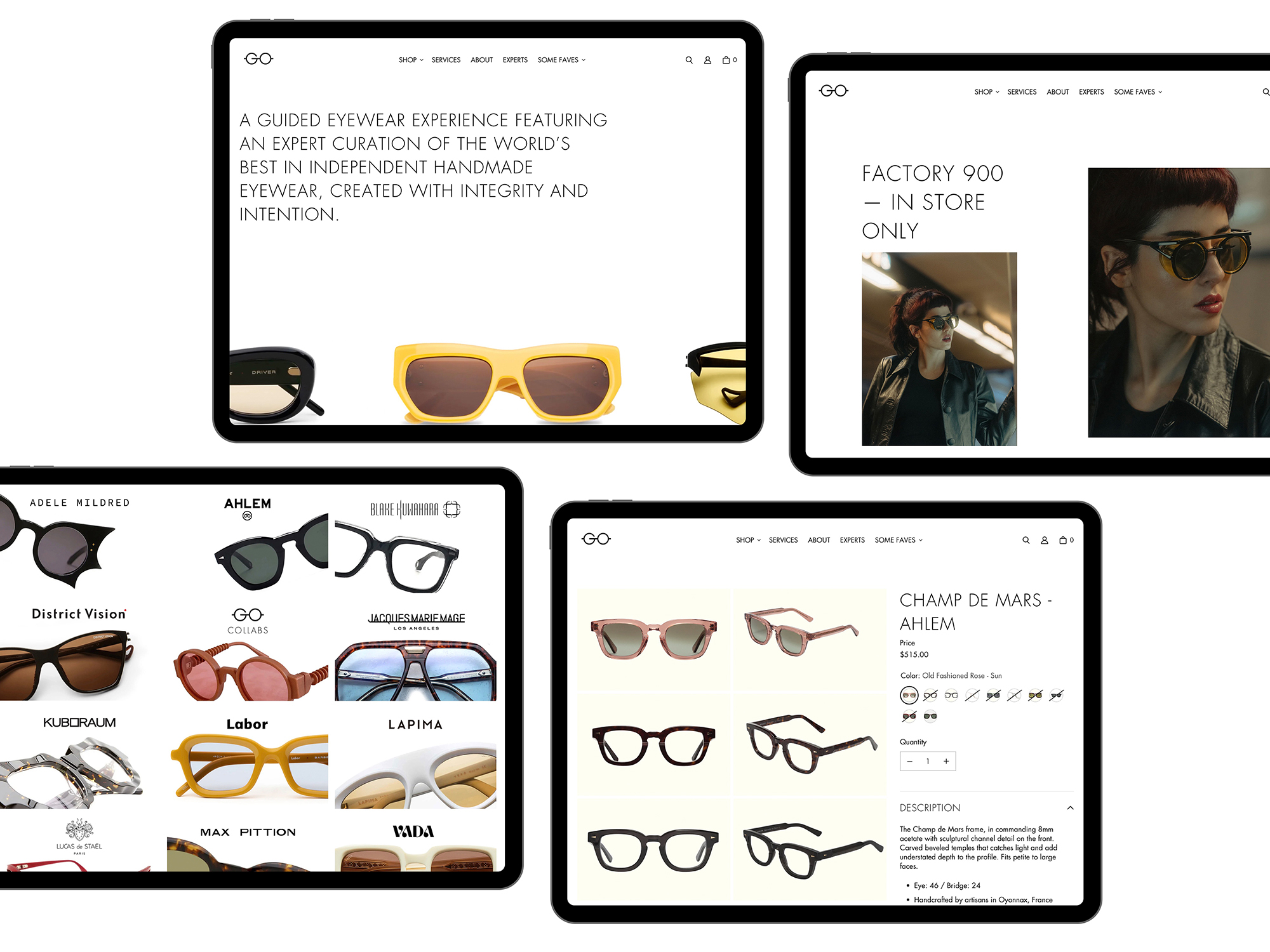
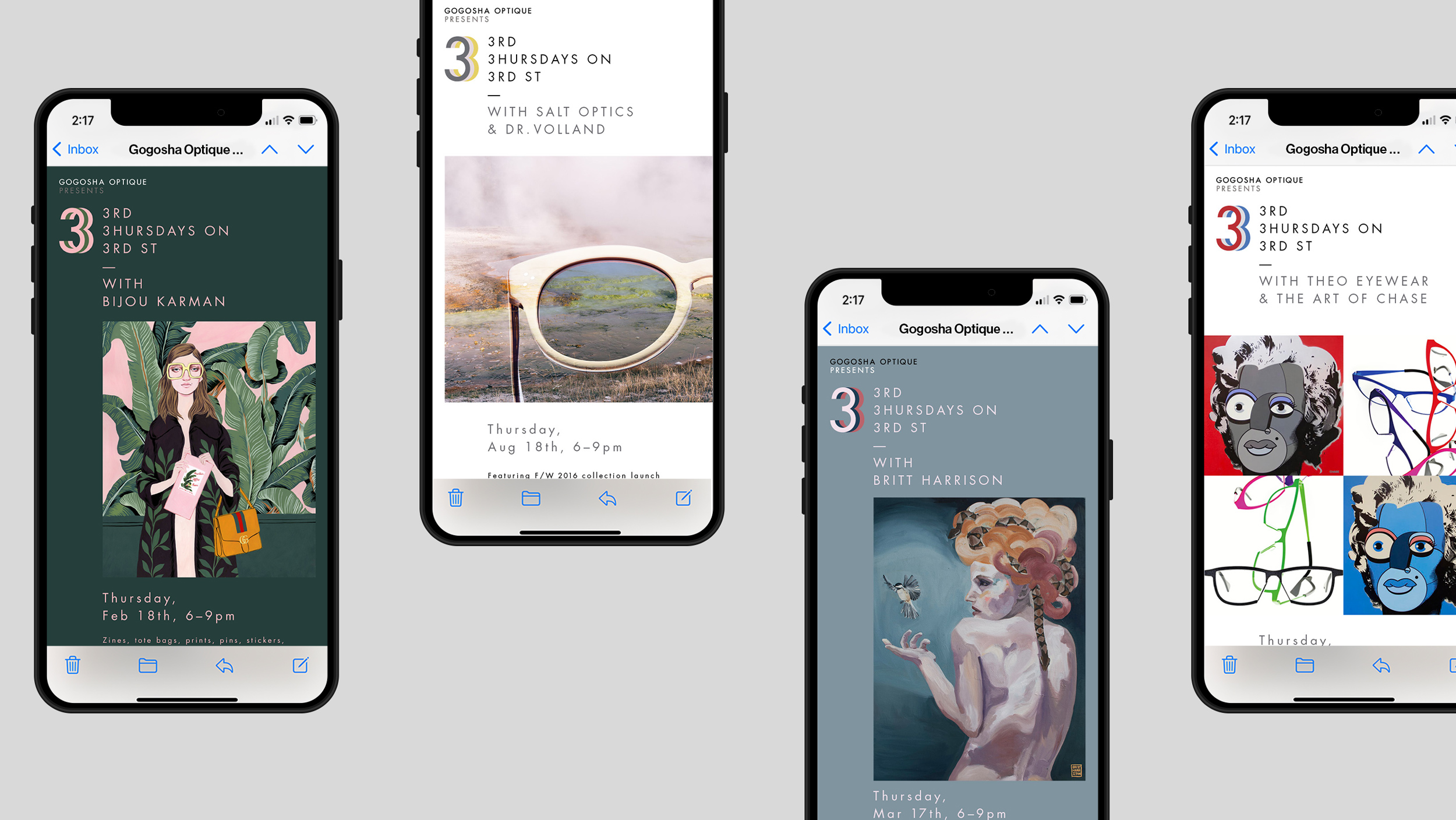
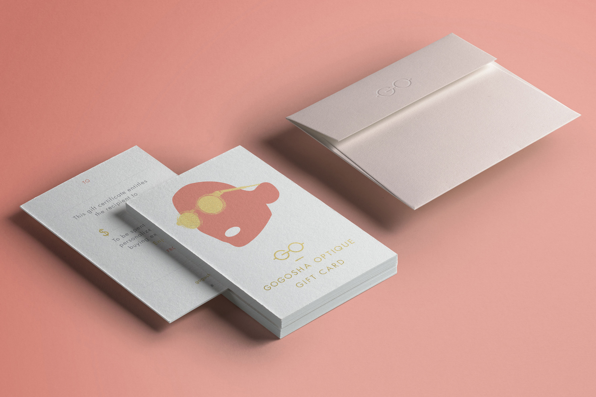
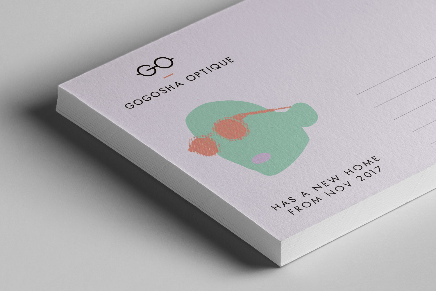
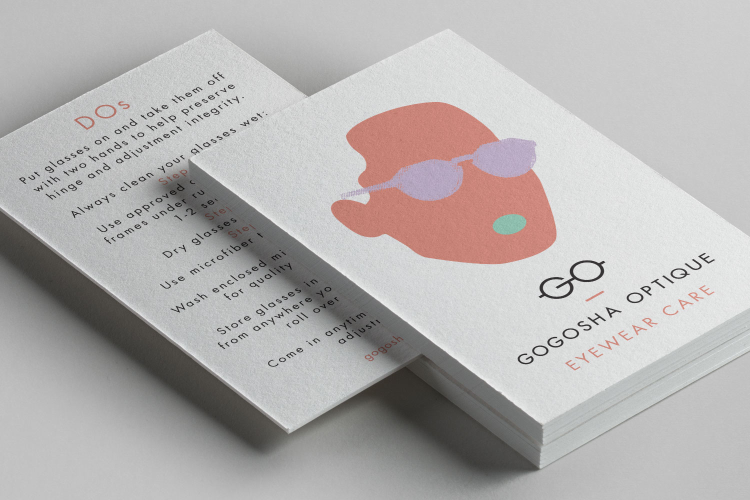
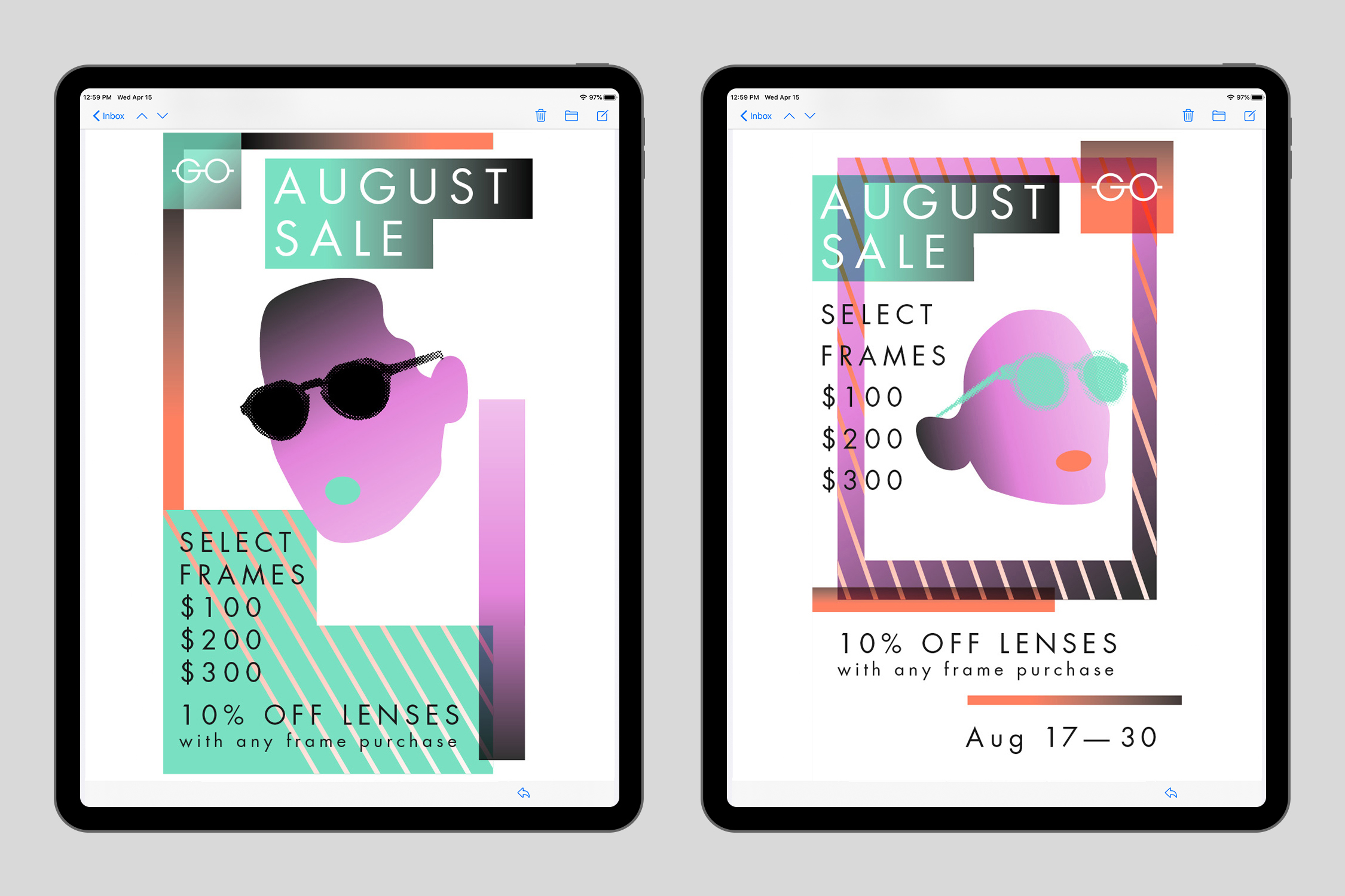
Since the launch of the rebrand we have continued to evolve and update, working on sales campaigns and events. Since the opening of their new store on Sunset Boulevard in 2018, we have carried out small refreshes integrating new colour palettes and distinctive illustrative visuals.
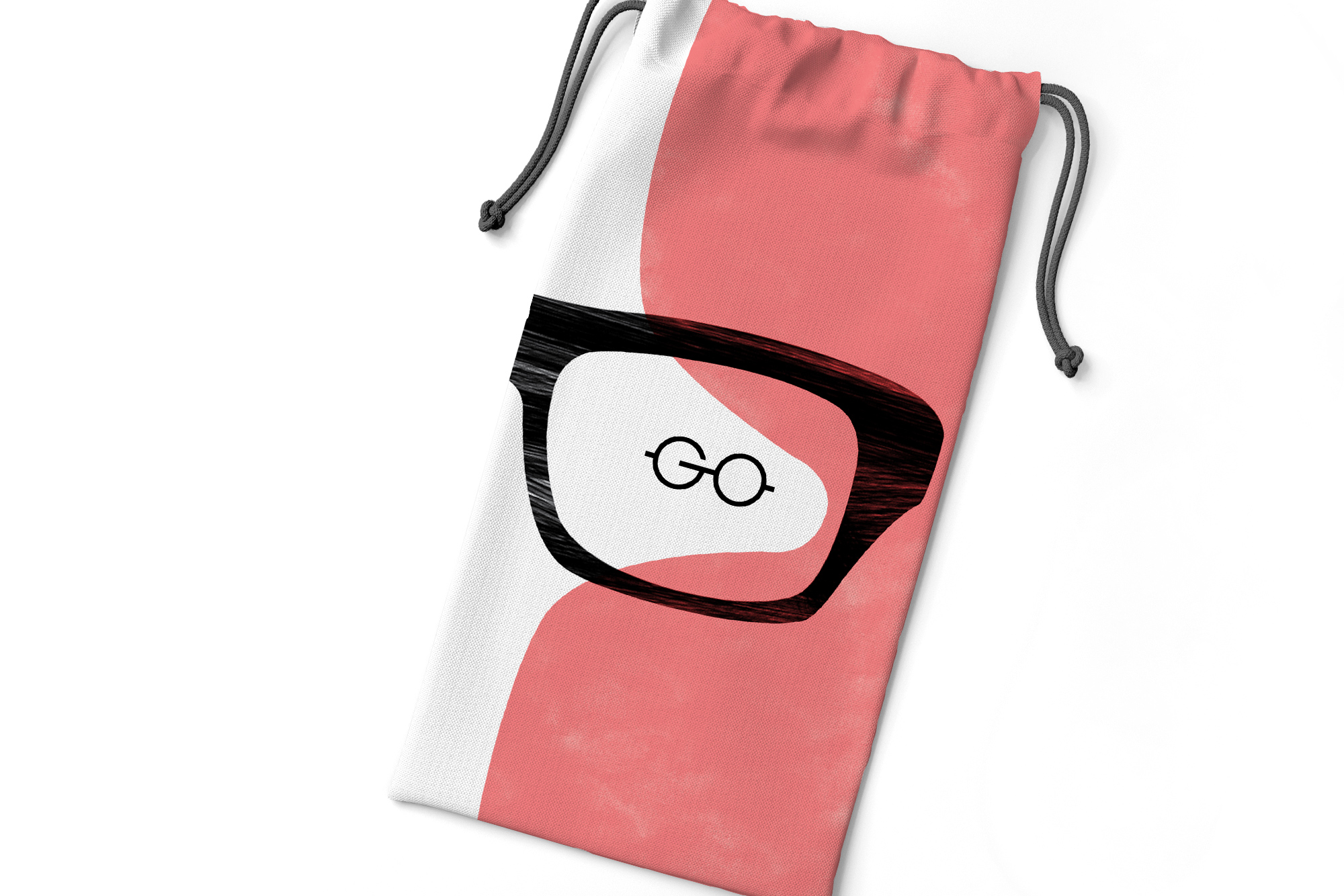
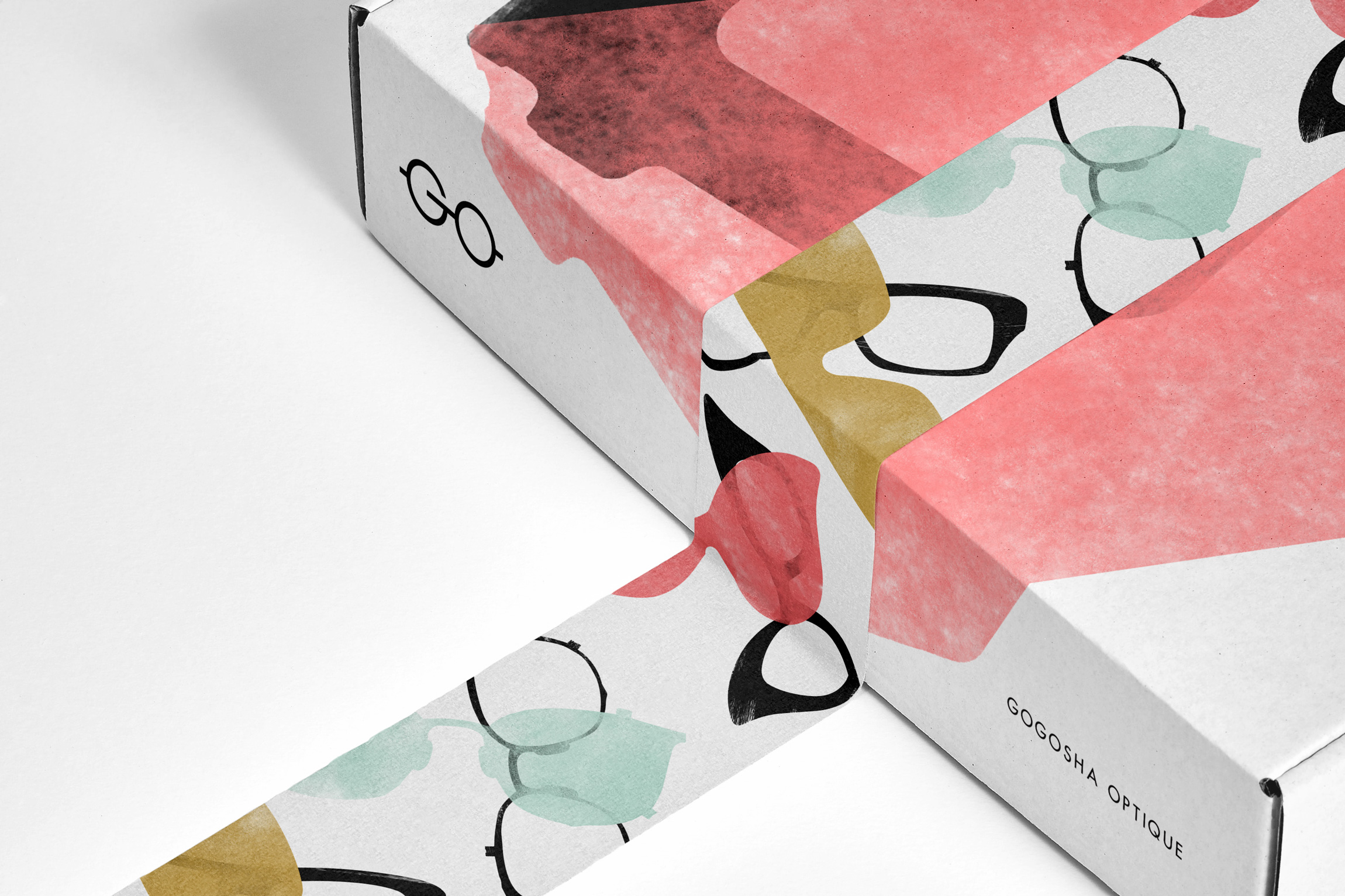
During covid, like many businesses, Gogosha Optique had to adapt and started their 'virtual fittings' service. Julia and her team simply transferred their knowledge and expertise over screen instead of in real life. After an initial consultation, selected eyewear was sent out to the client for them to complete the fitting service and see the frames in person in order to make their final decisions. Naturally some nice packaging was needed in which to send the frames out in.
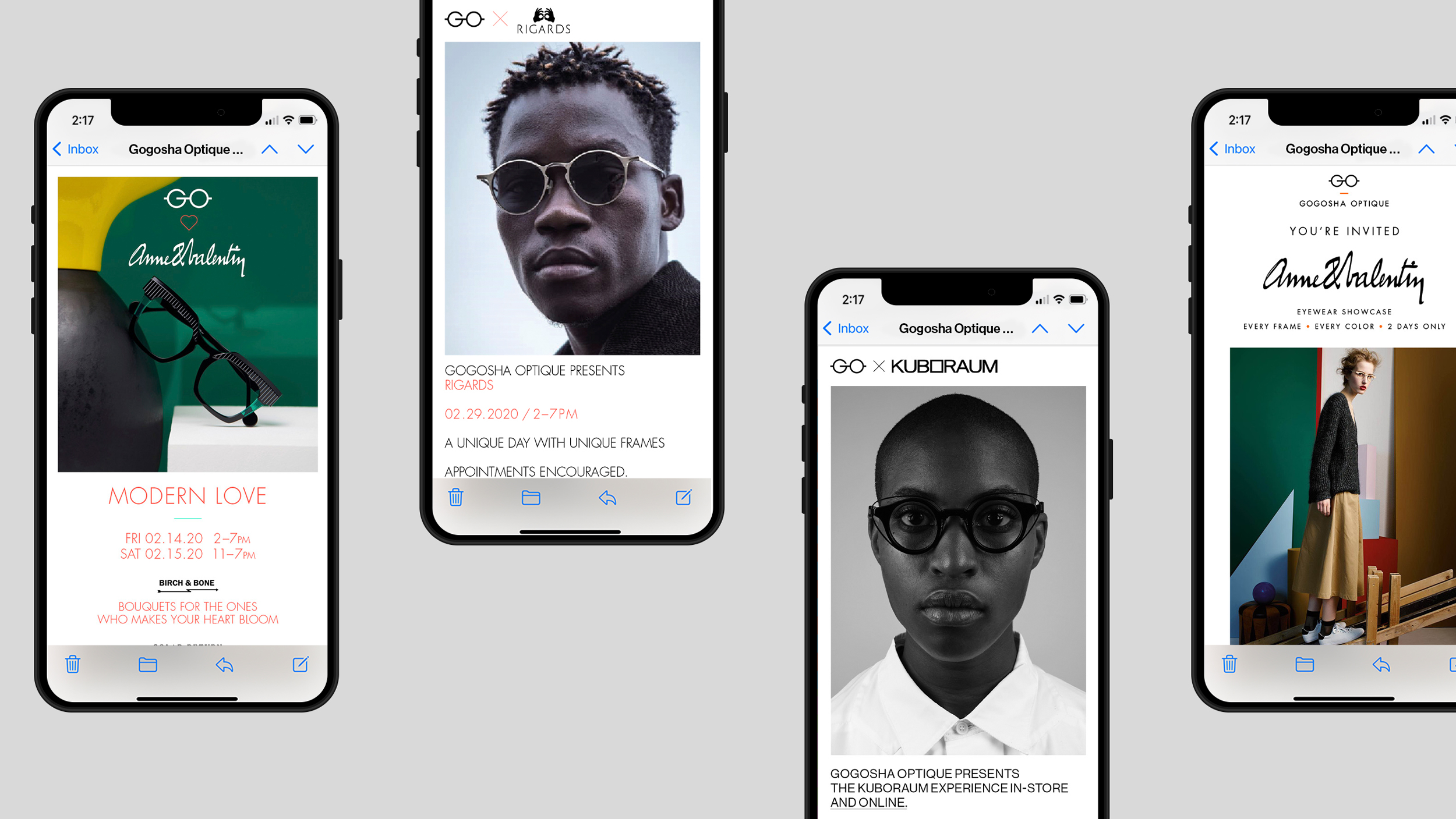
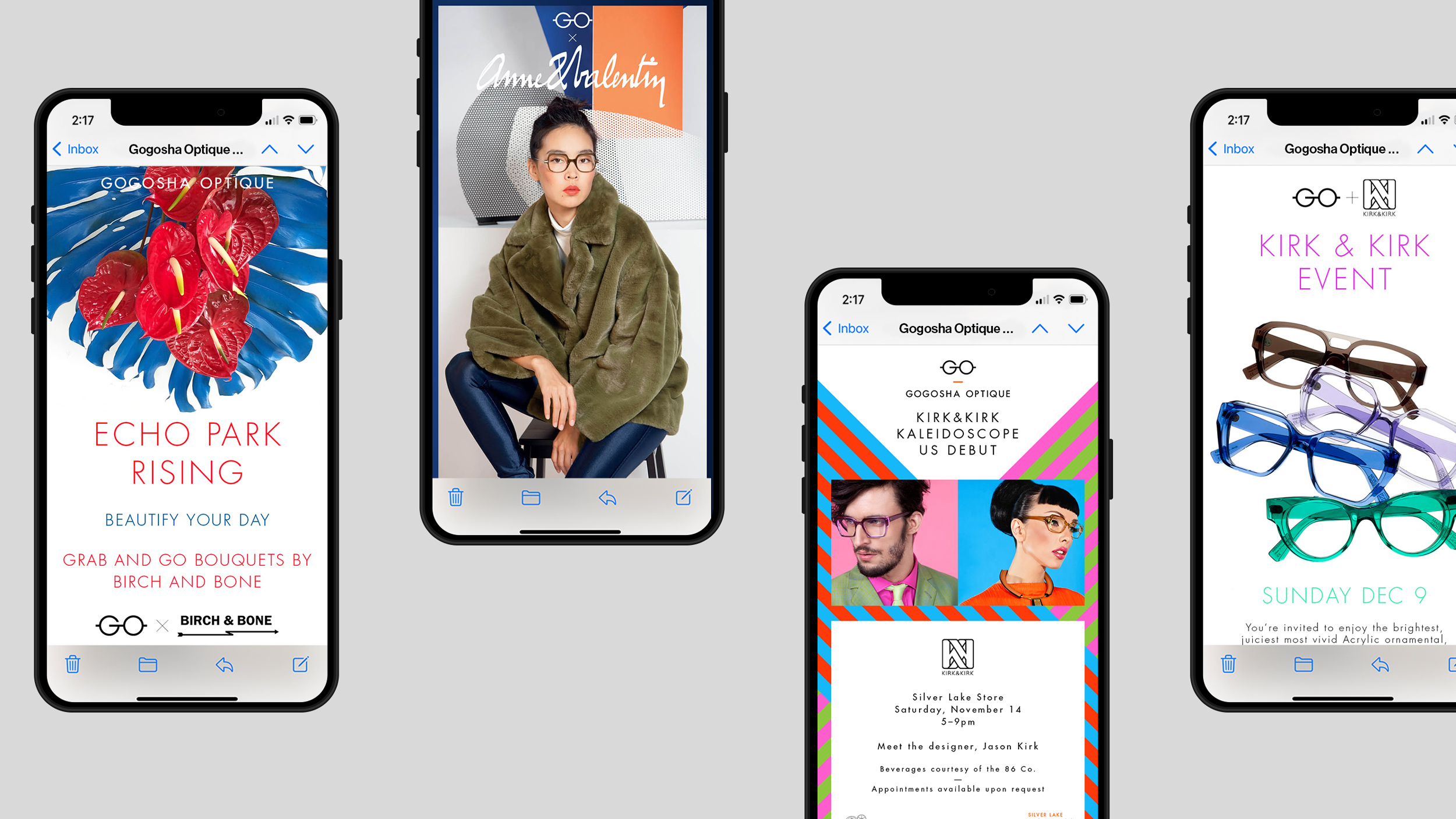
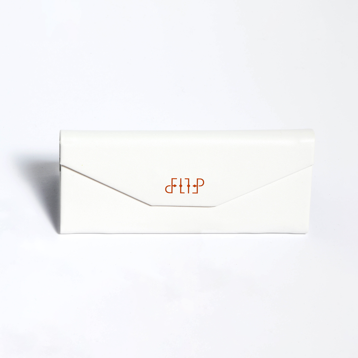
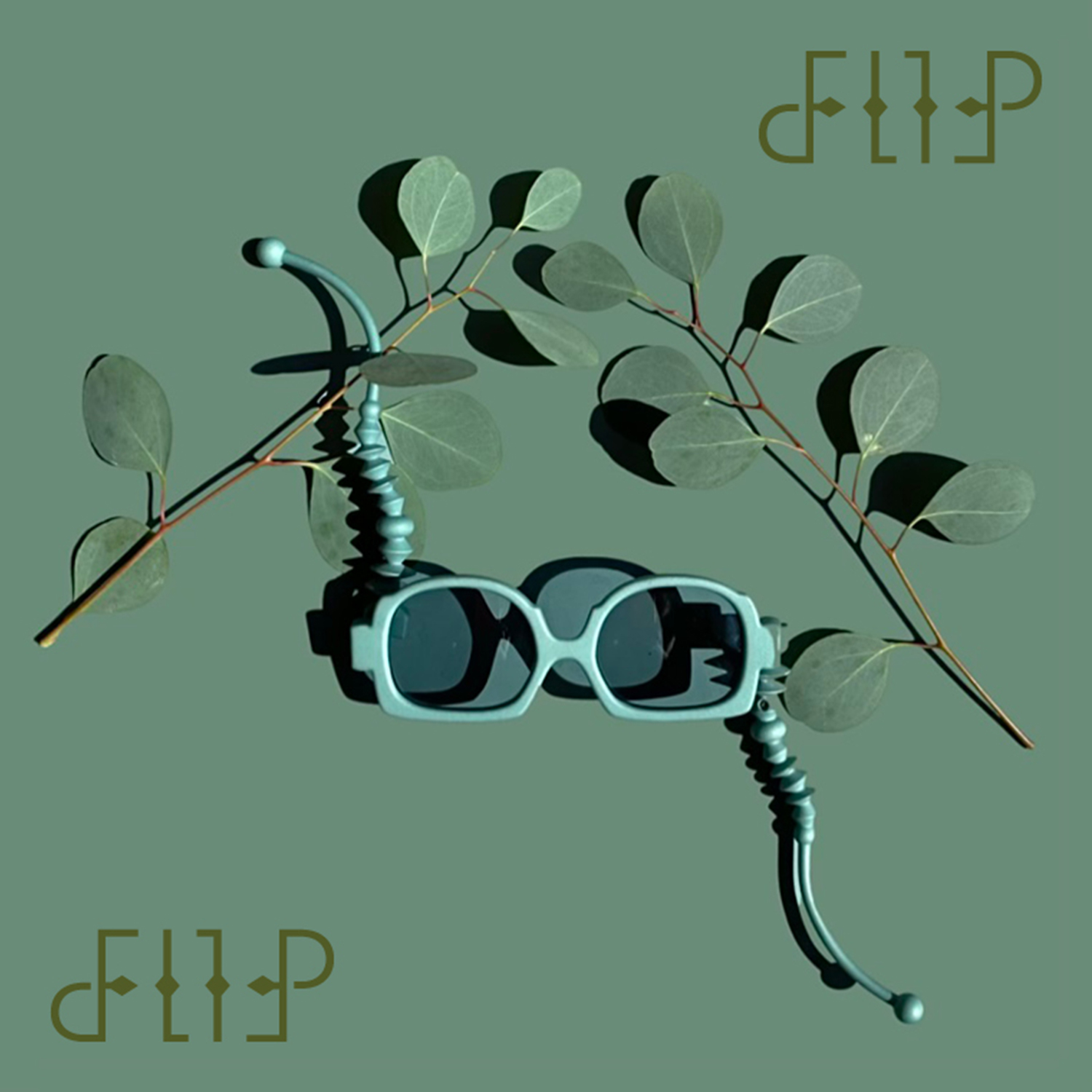
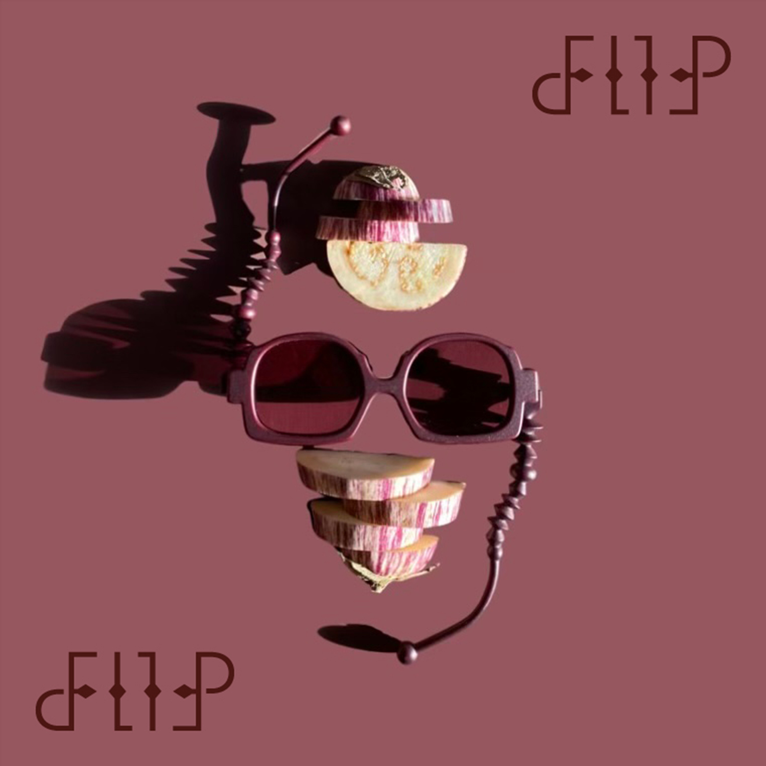
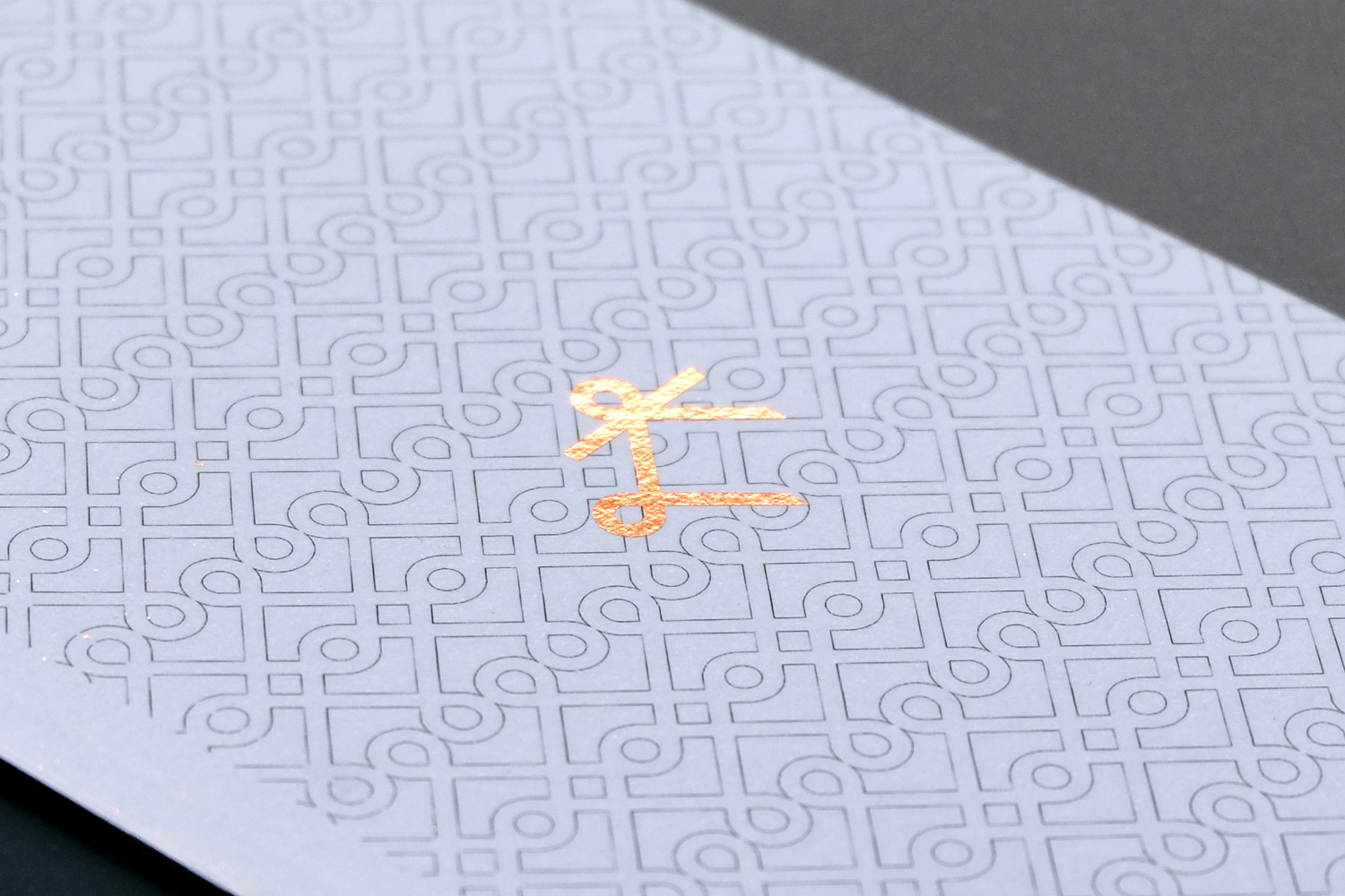
Occasionally Gogosha partners with eyewear brands to release special limited edition collections. We were asked to create a logo for their collaboration with BAARS for a new frame collection called Flip.
Using the frame design as reference point we created a logo that is an ambigram— it reads the same when viewed upside down. Perfect for eyewear with the name and concept Flip.


Different visual campaigns have been carried out over the course of more than 8 years working together but the logo remains at the identity's core.
Work carried out
—
Logo design
Visual identity
Packaging design
Digital design
Signage
Store photography
Stephen Schauer
Relevant work
KV Hotels
The Avenue