Notes__ A place where we show work in progress, recently completed projects and selected older work from the archive.
Whiskey Tango Fondo
Recently completed
We have designed the identity for a new gravel ride event from former professional cyclist Phil Gaimon. The ride will take place in the Alabama Hills, nestled in the foothills of the Sierra Nevada Mountains.
View full project here
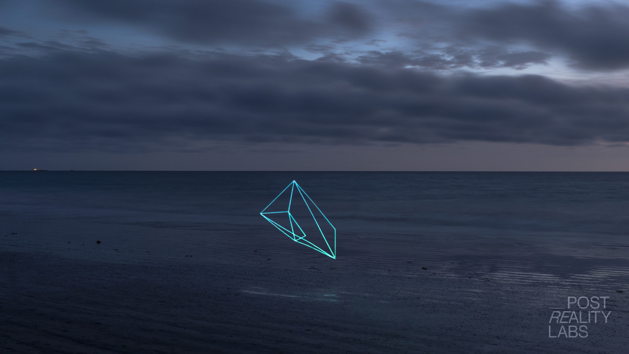
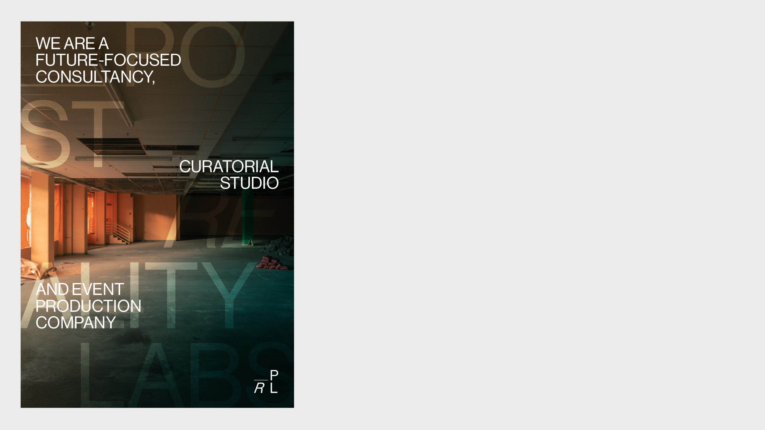
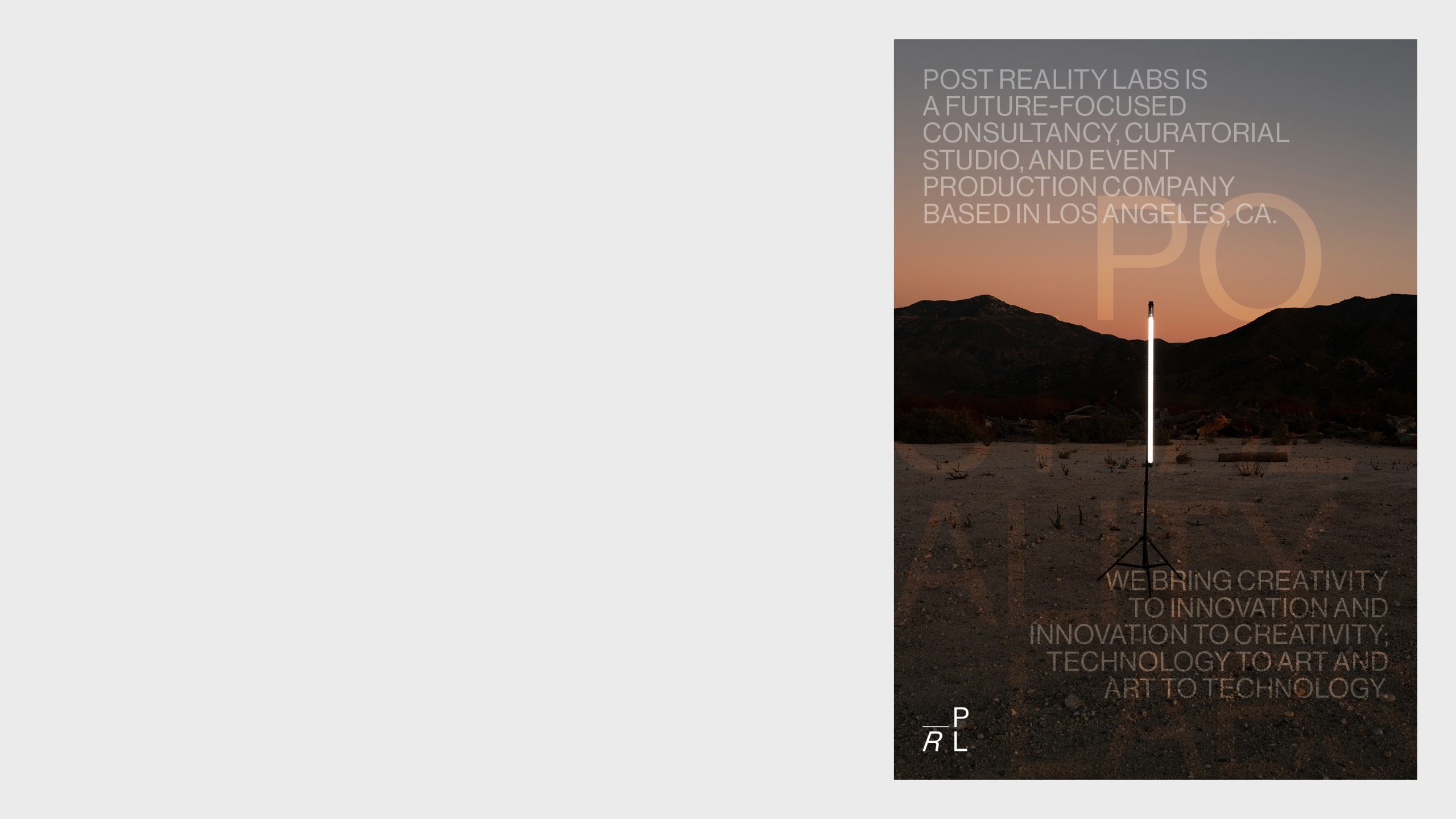
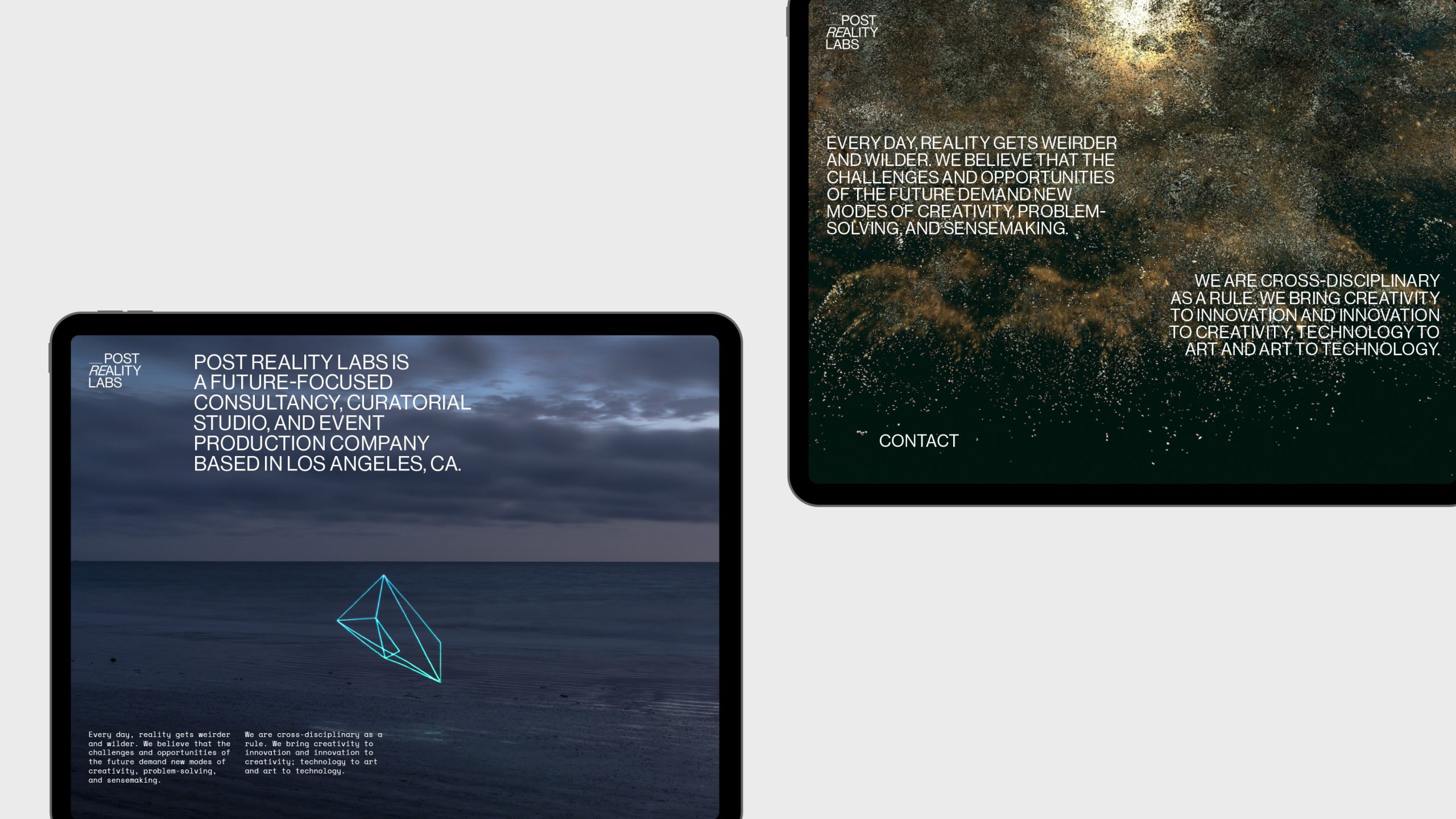
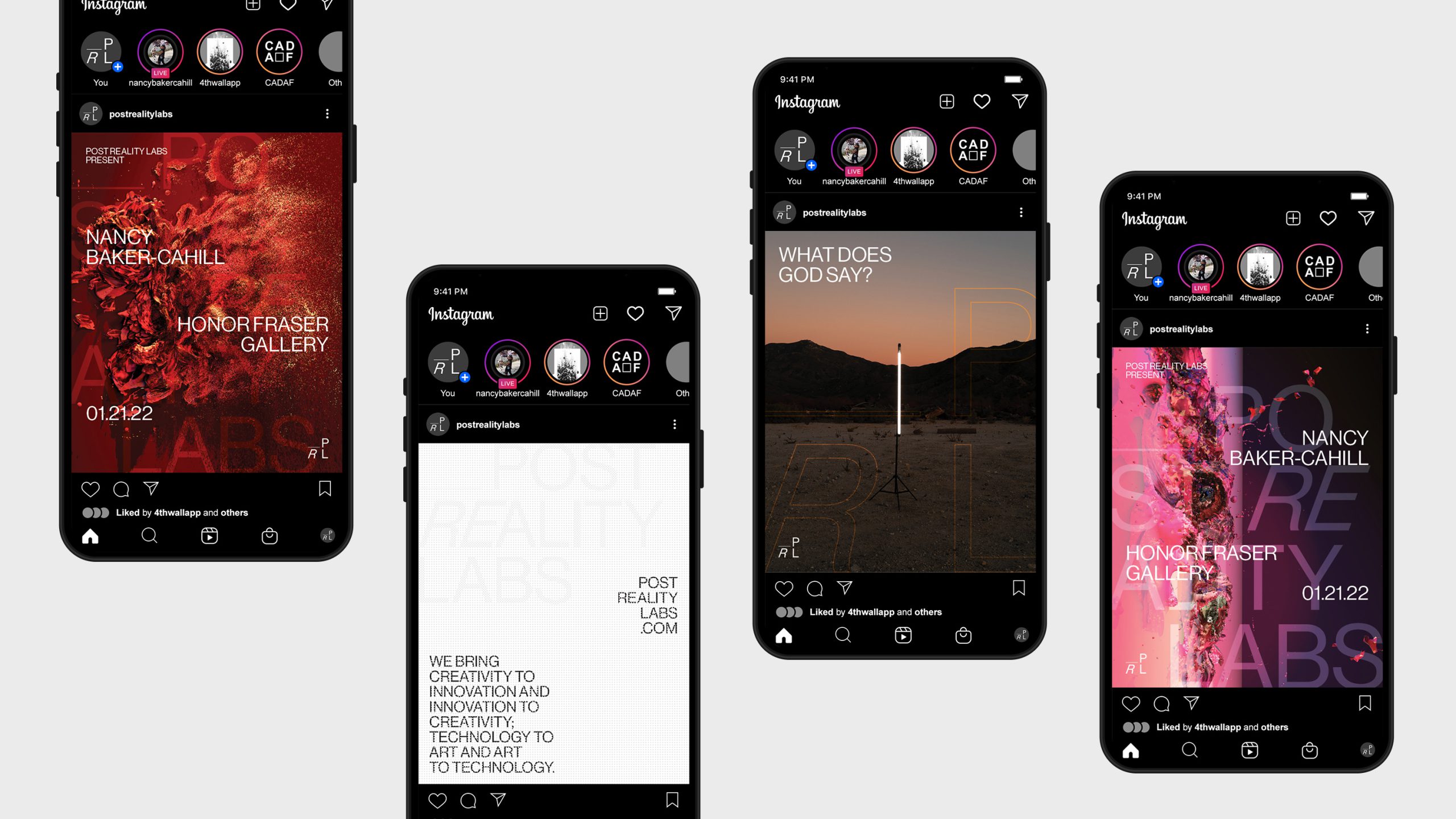
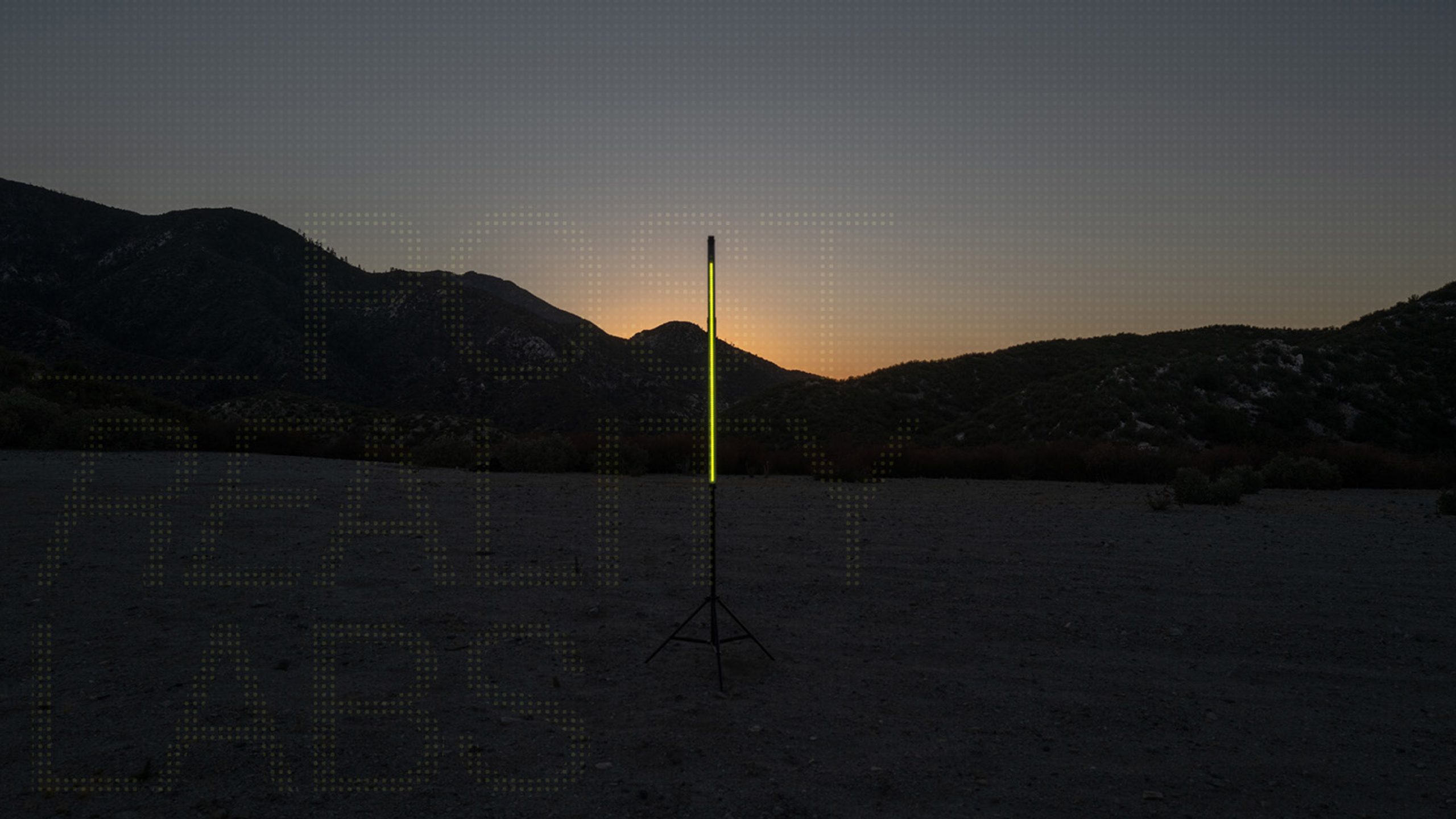
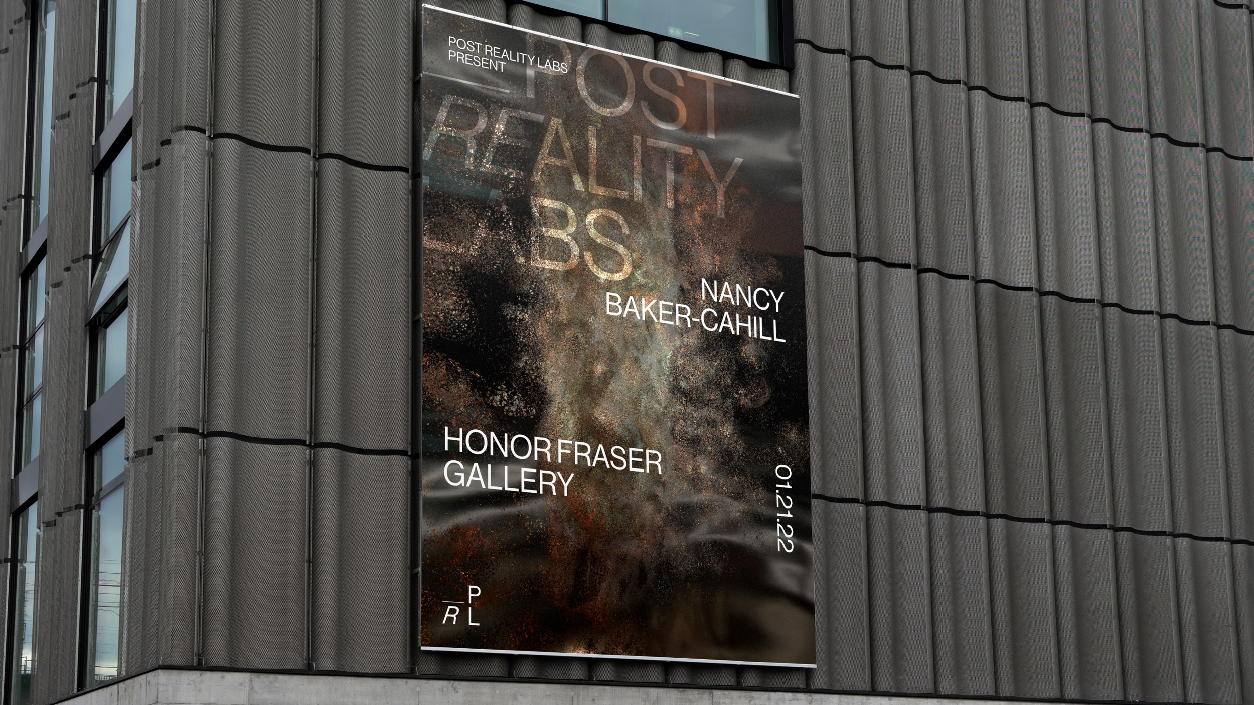
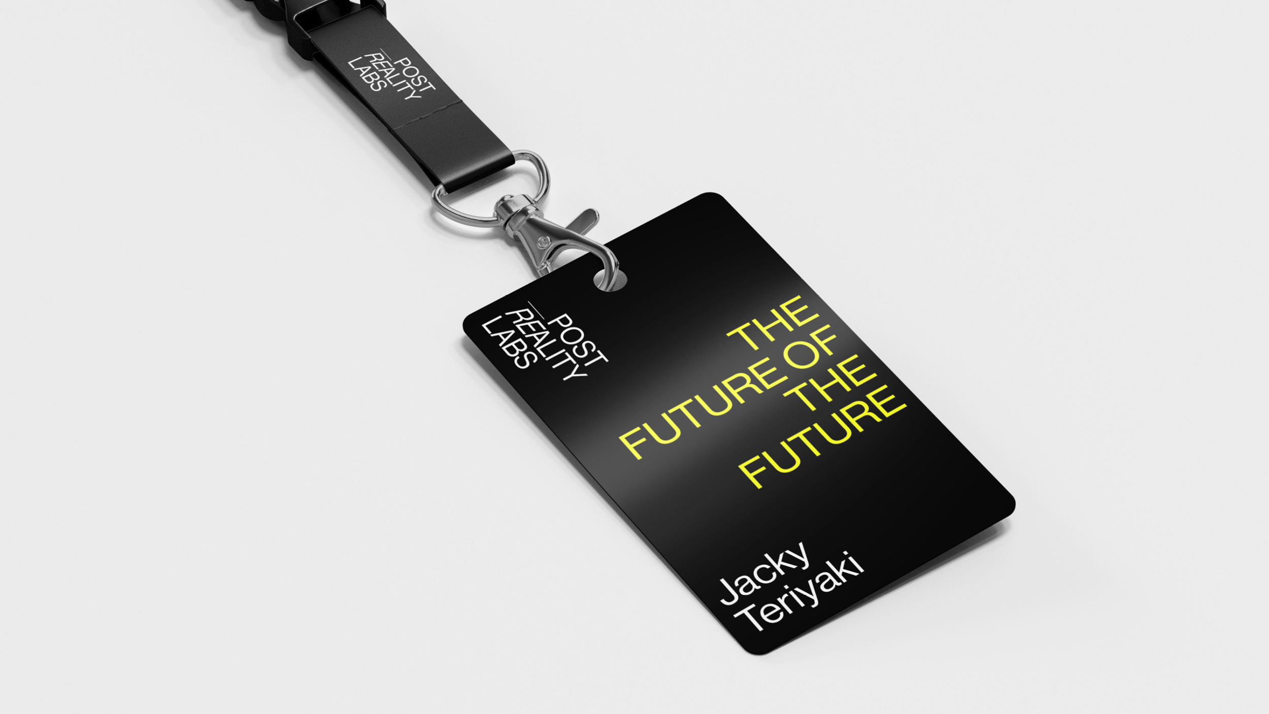
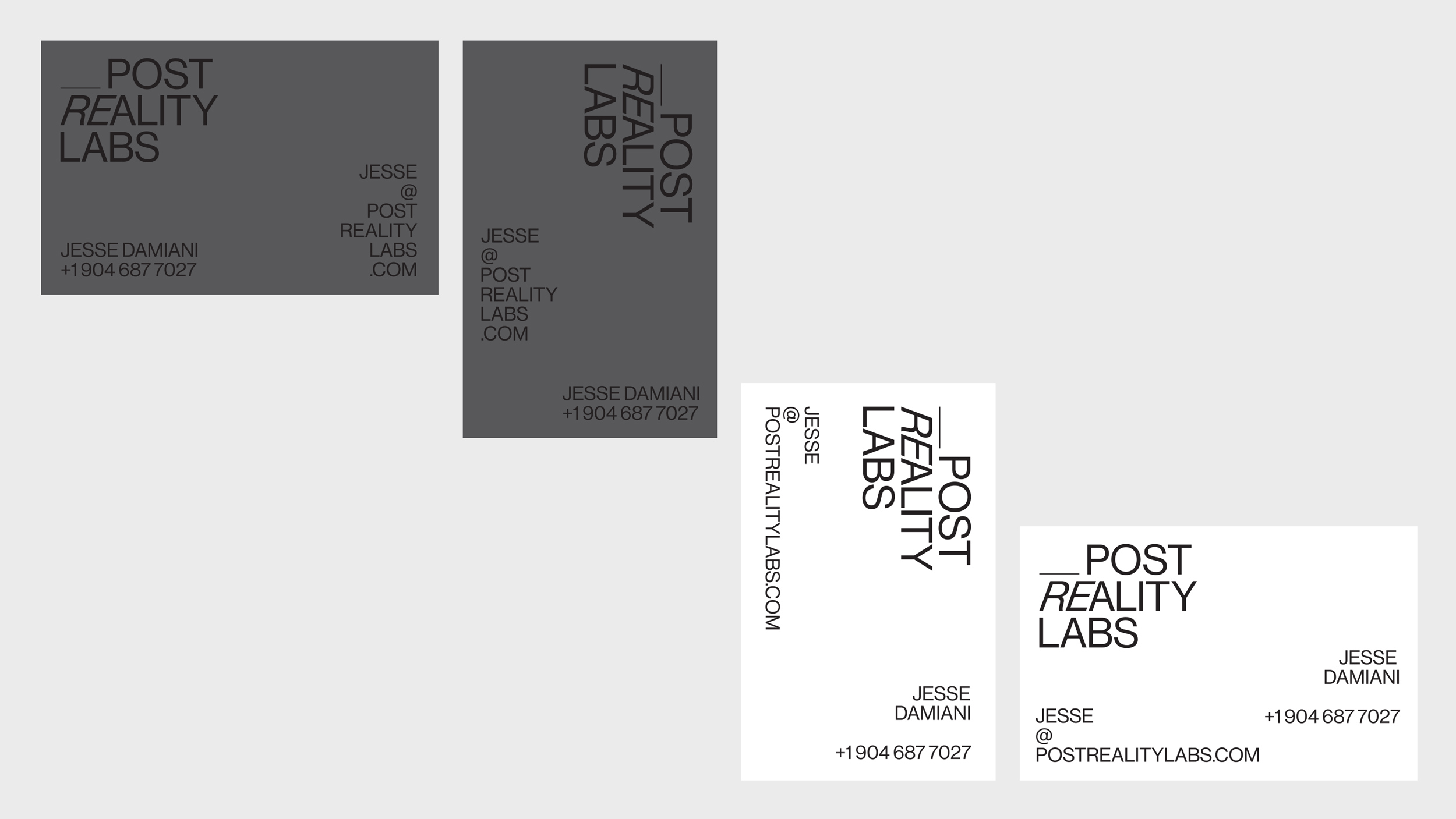
Post Reality Labs
Work in Progress
Post Reality Labs is a future-focused consultancy, curatorial studio, and event production company based in Los Angeles, CA.
Ongoing.
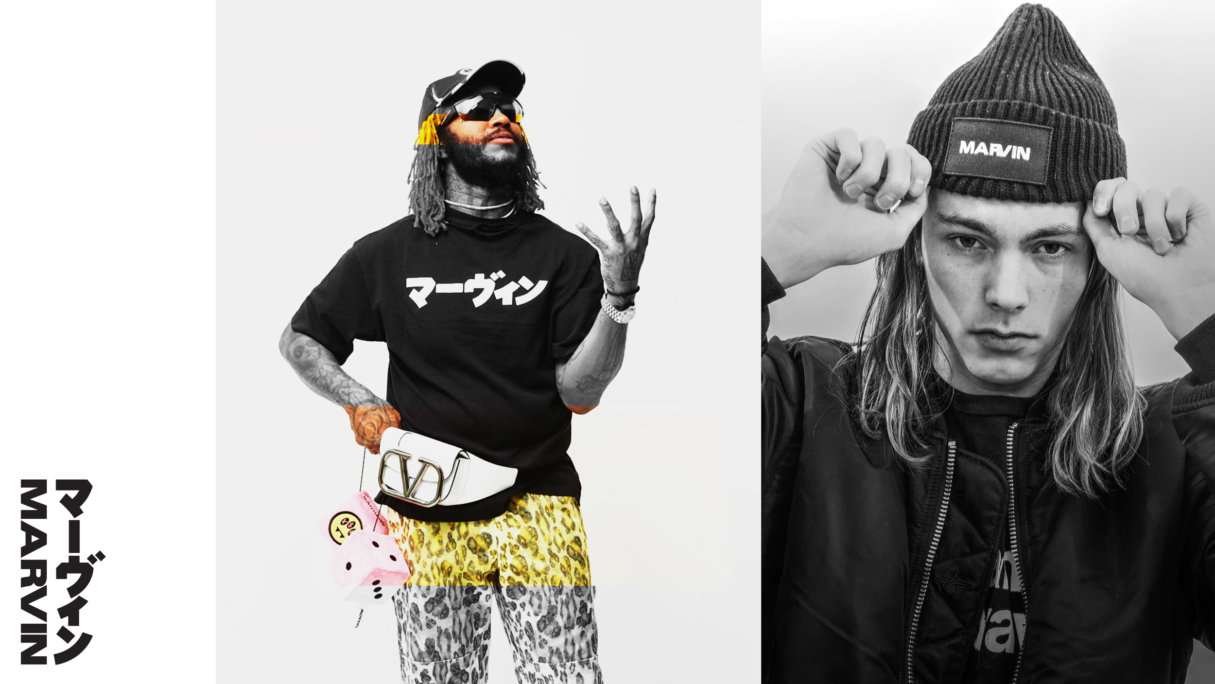
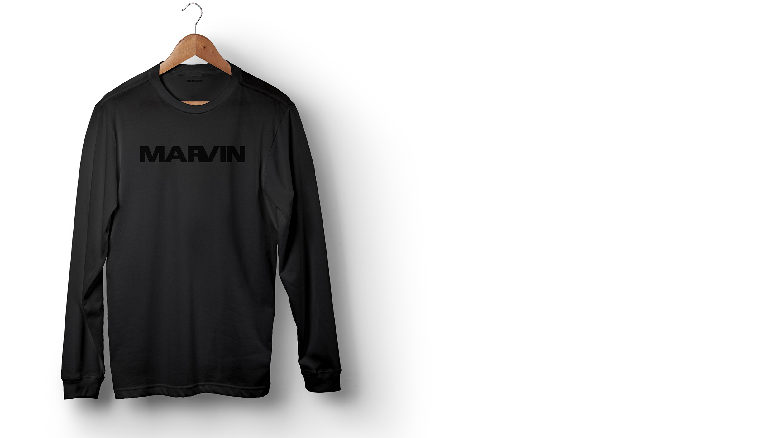
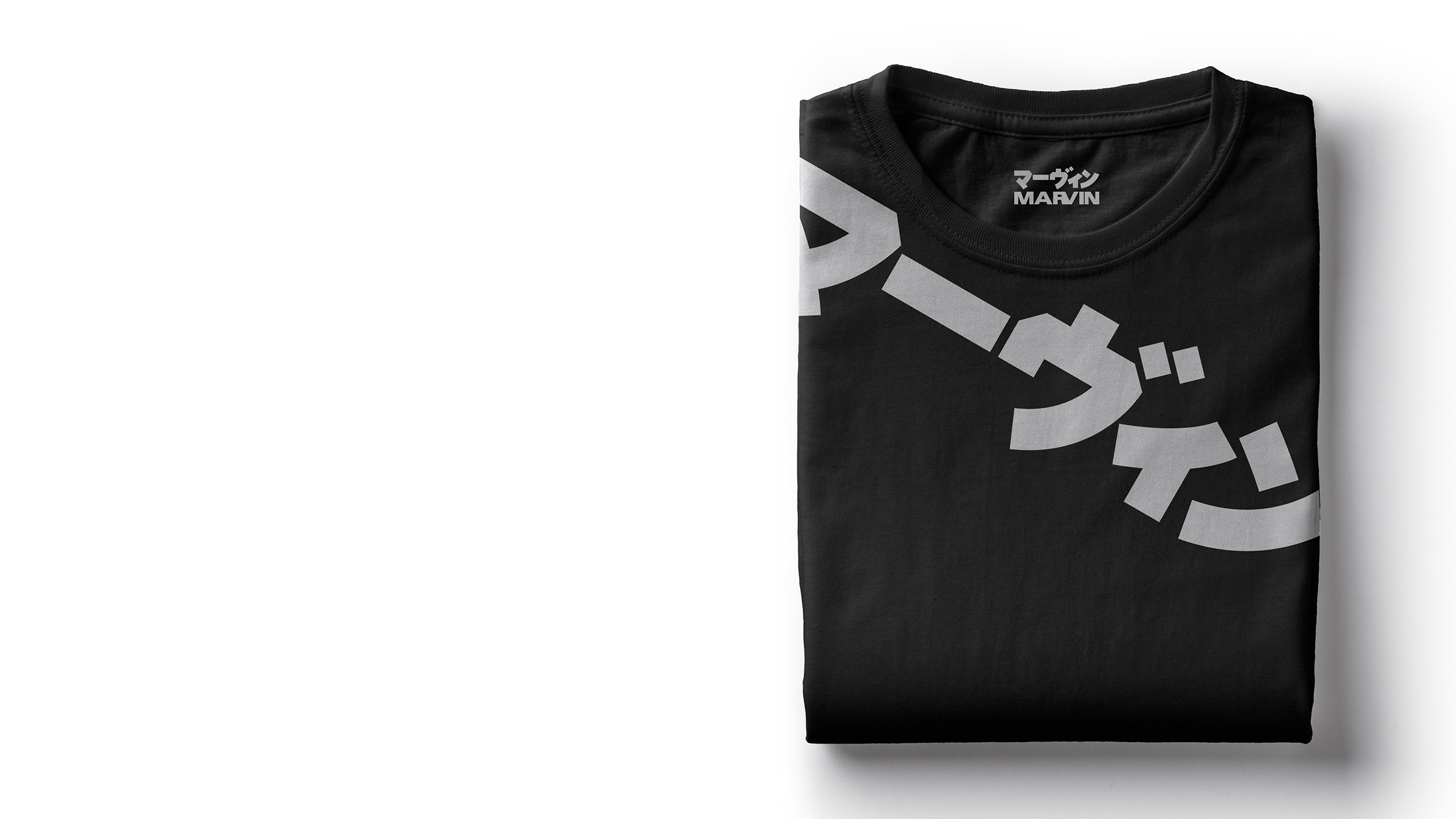
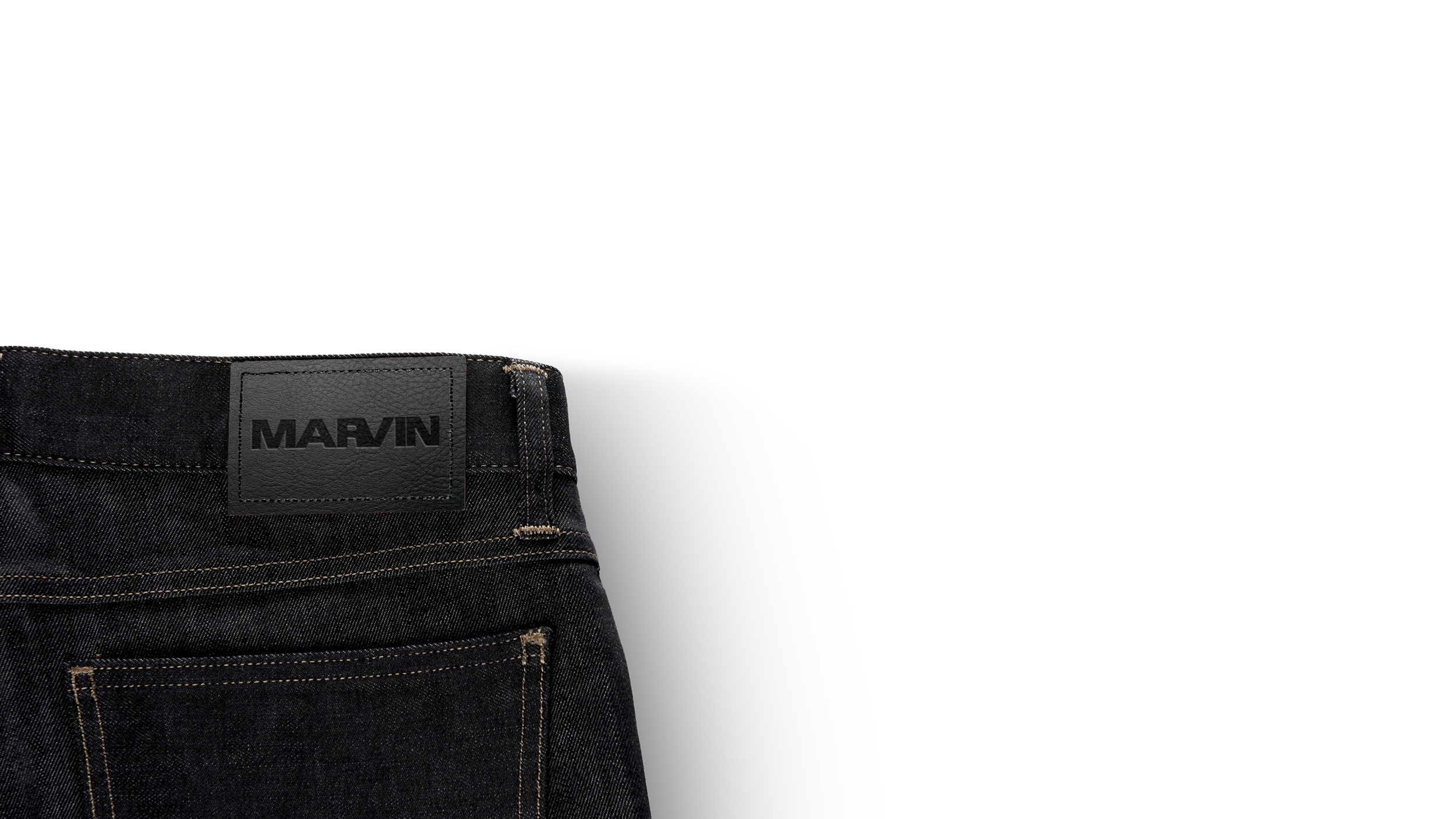
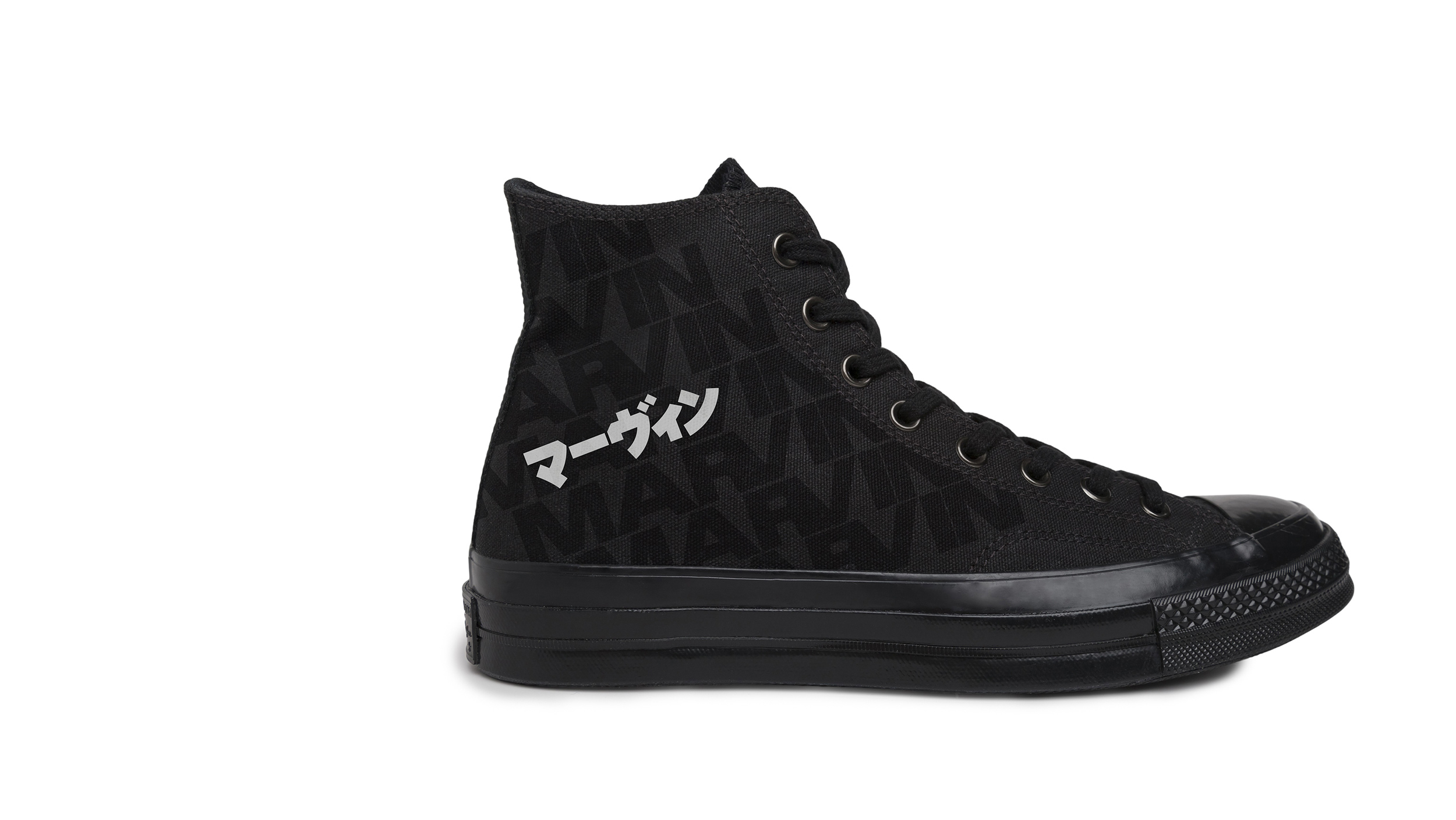
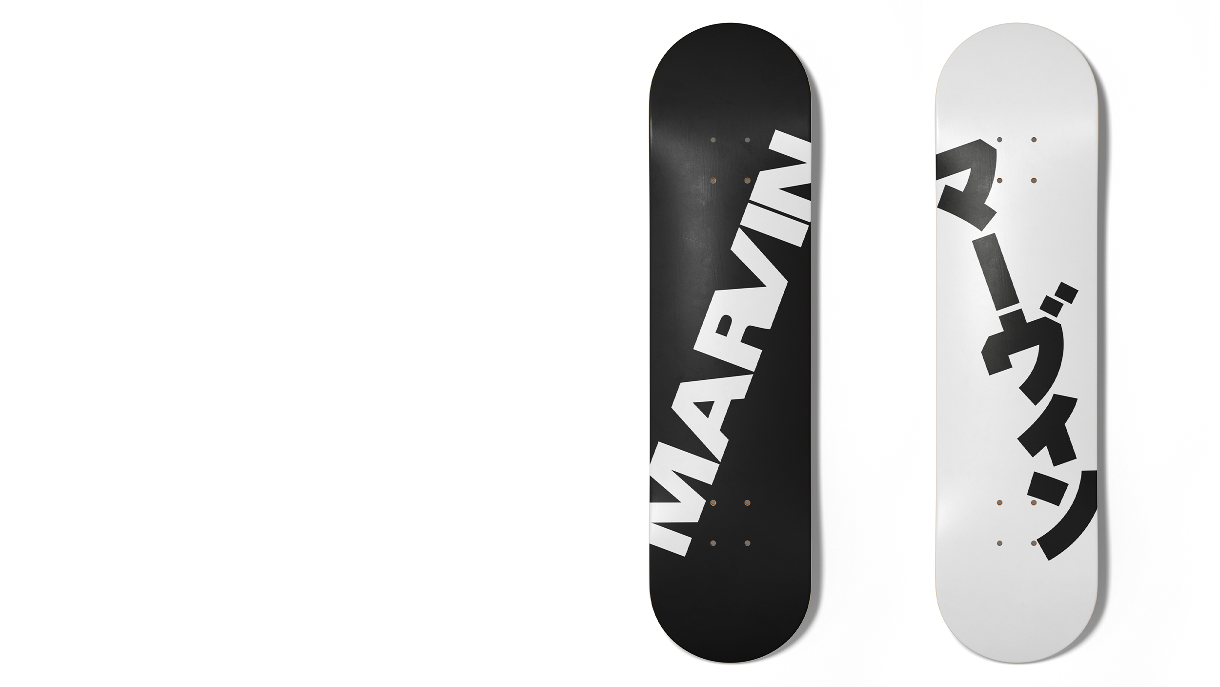
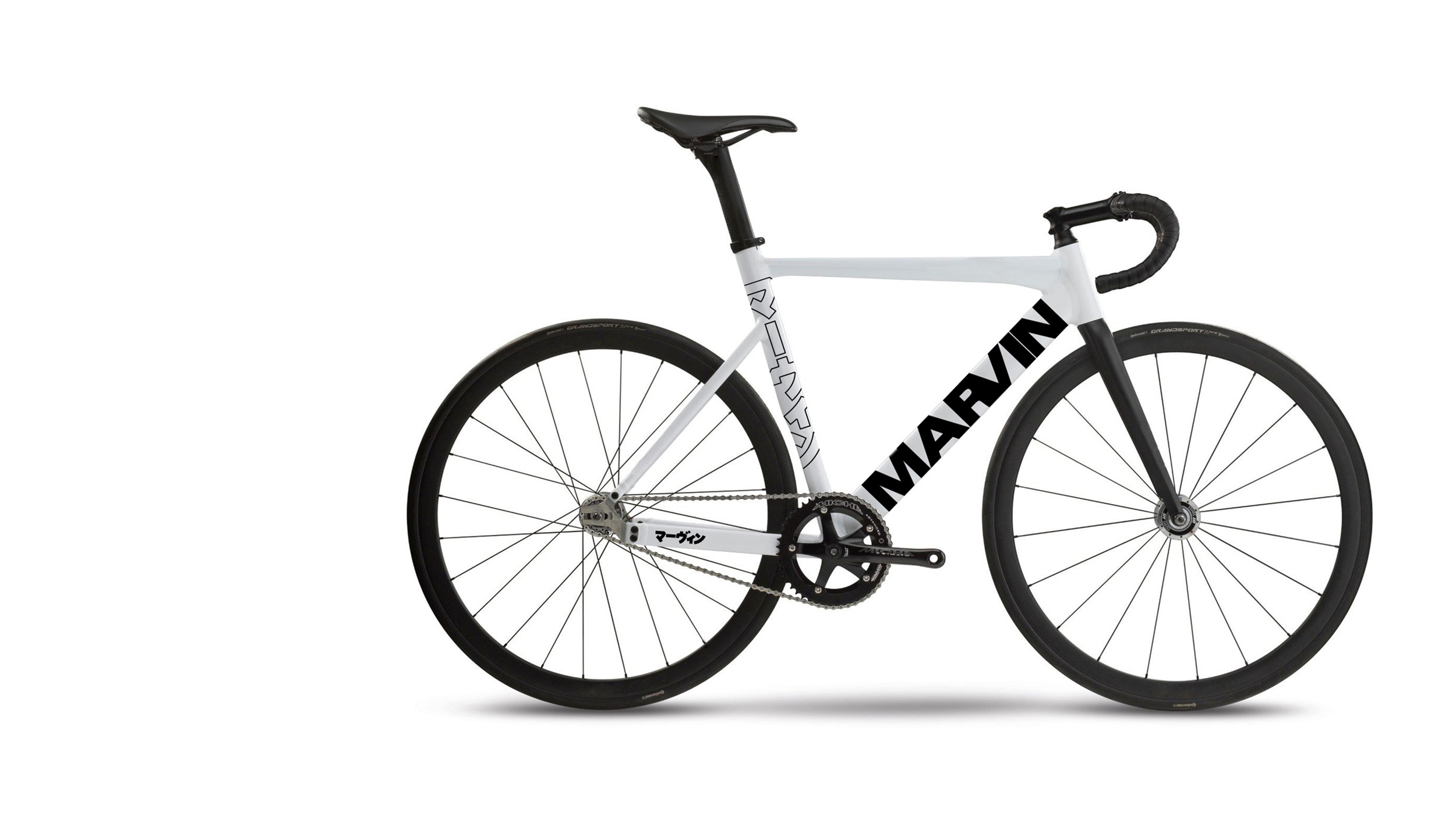
Marvin
Archive
2020
We created the logo for MARVIN.
A fashion / music / culture magazine and lifestyle brand.
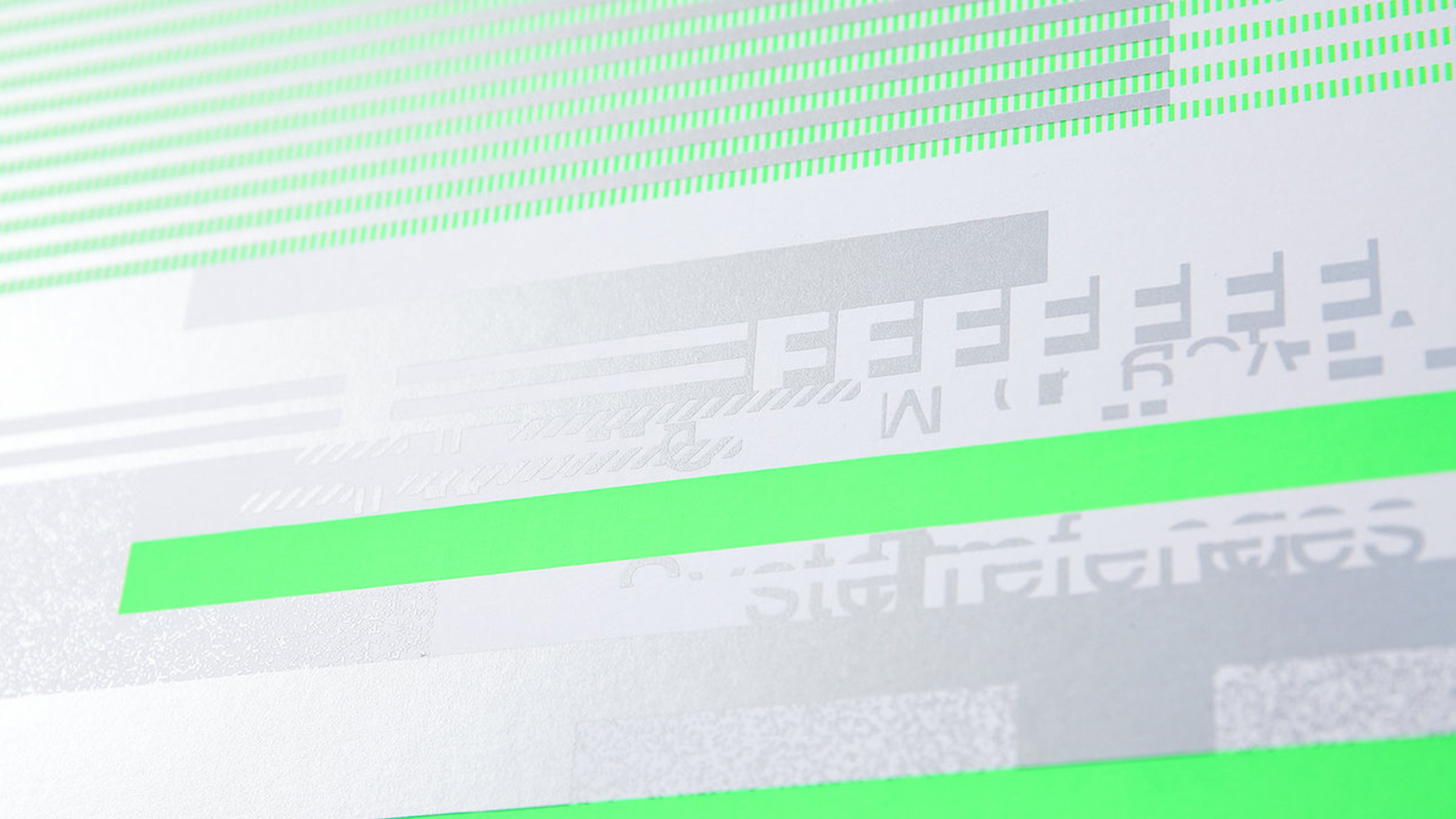
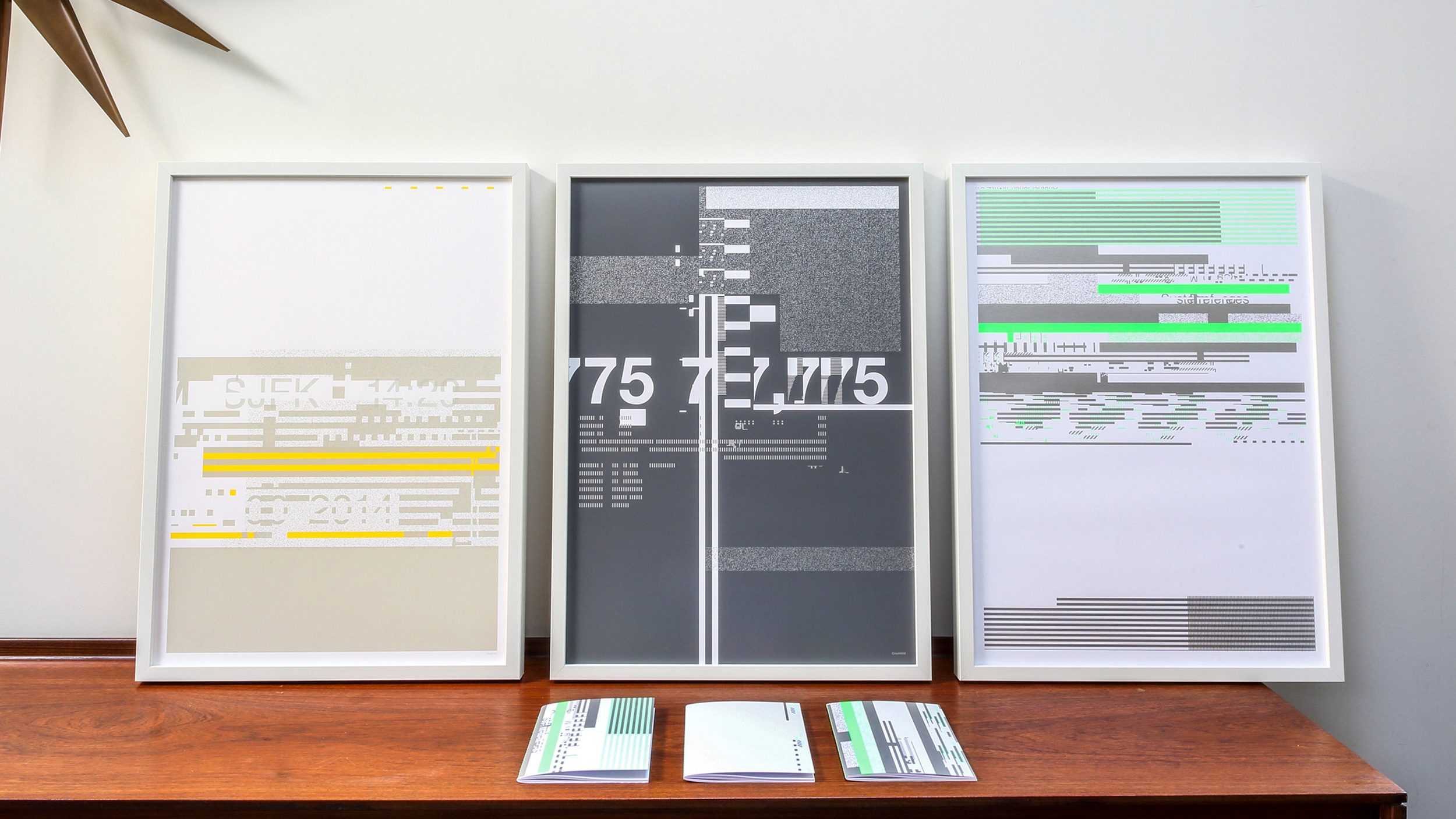
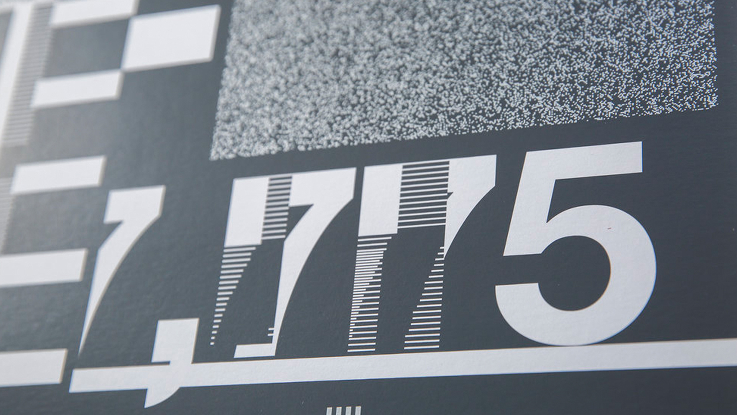
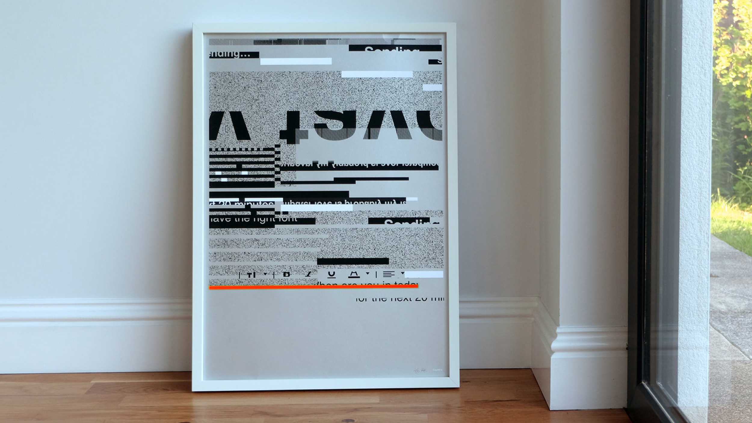
Crash Sites
Archive
2018
The monitor flickers. The screen freezes. Your computer crashes. And all that’s left is a weird, static weave of letters, lines, icons, colours and codes.
This is the inspiration for CRASH, a series of limited edition, screen printed items, turning digital breakdowns into beautifully crafted analogue materials.

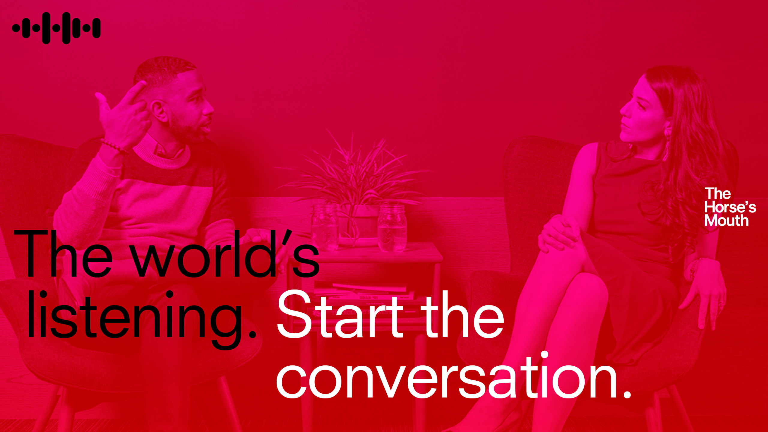
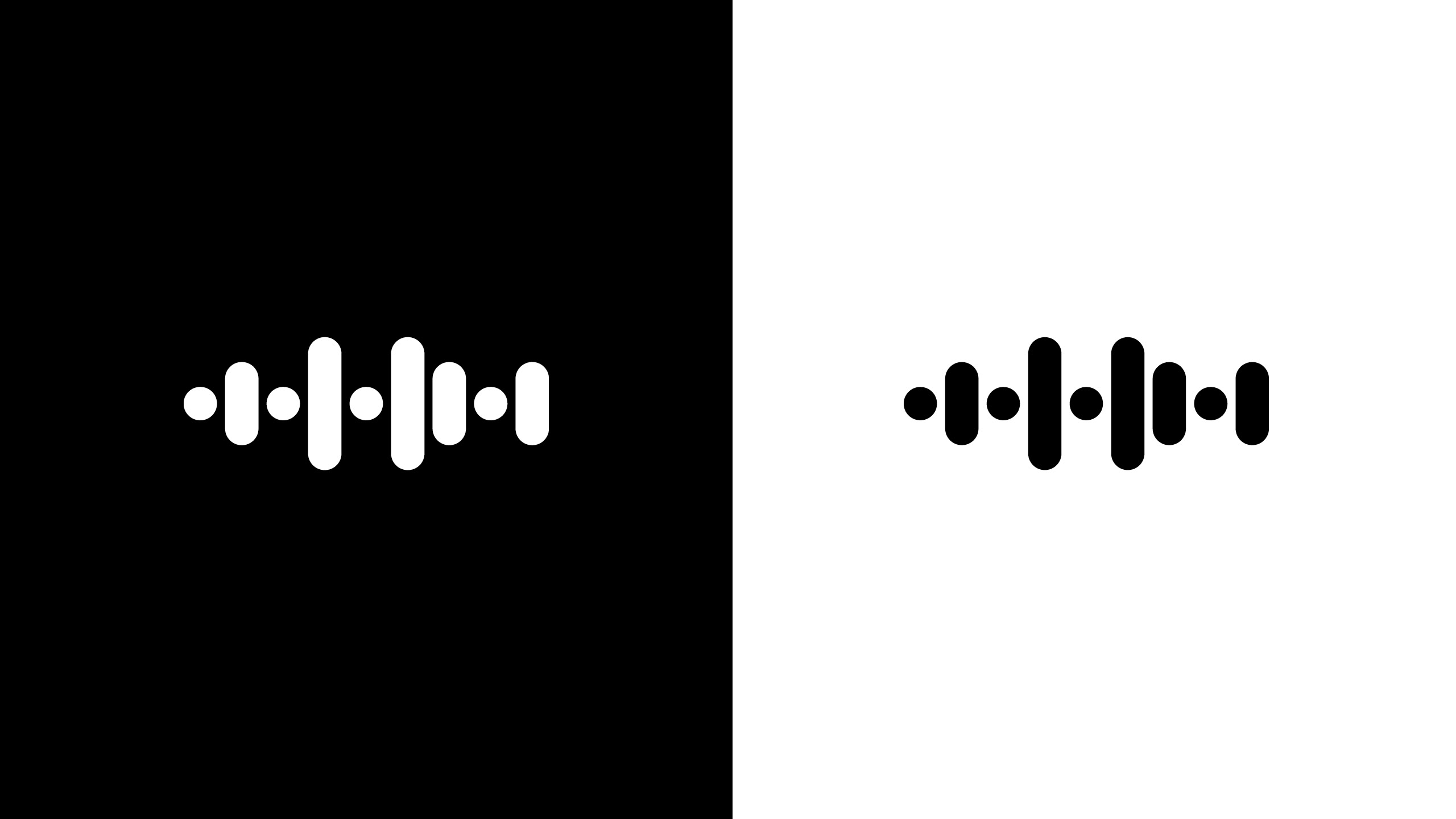
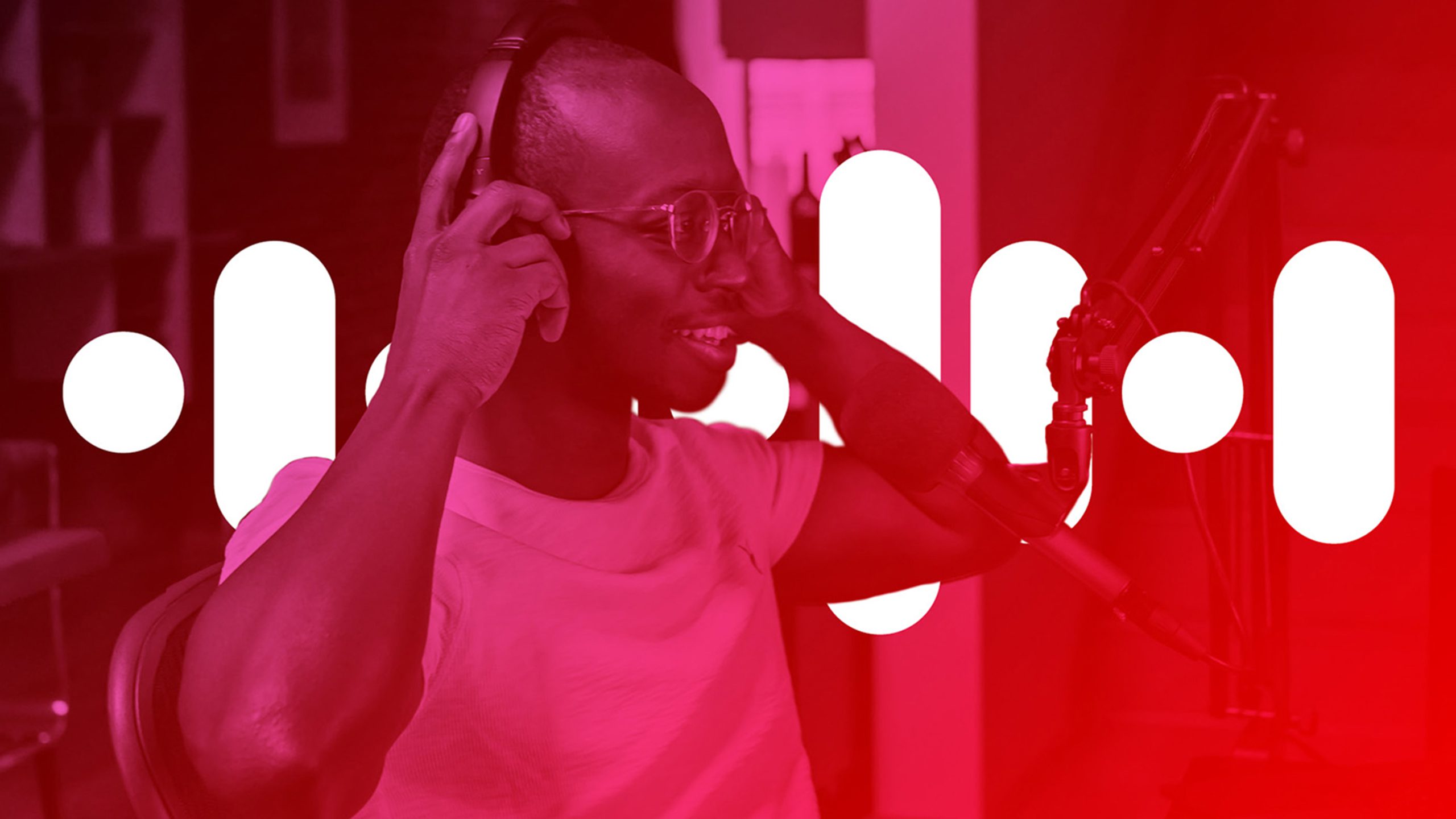
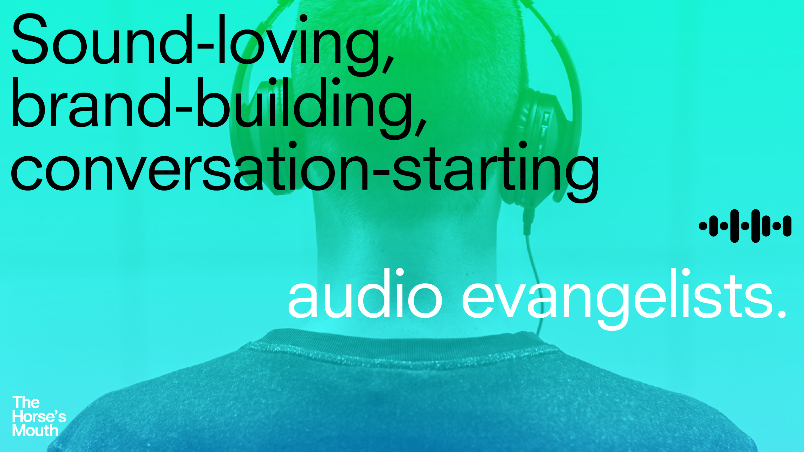
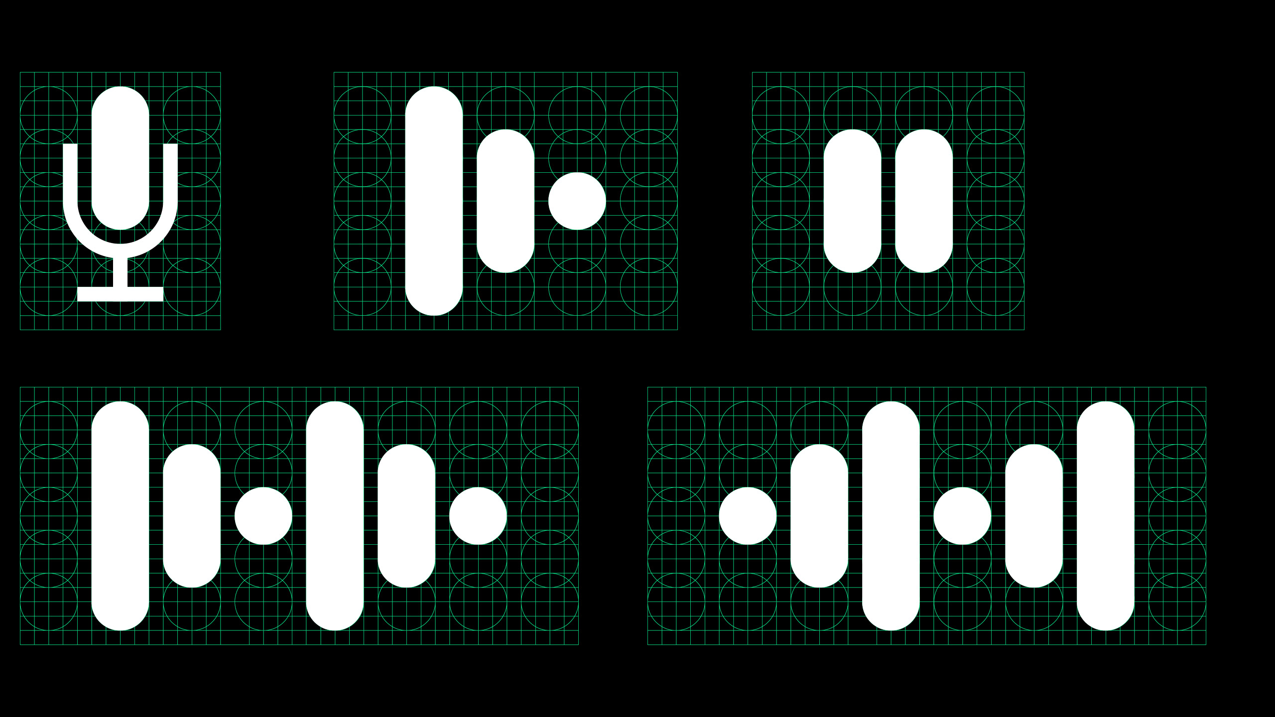
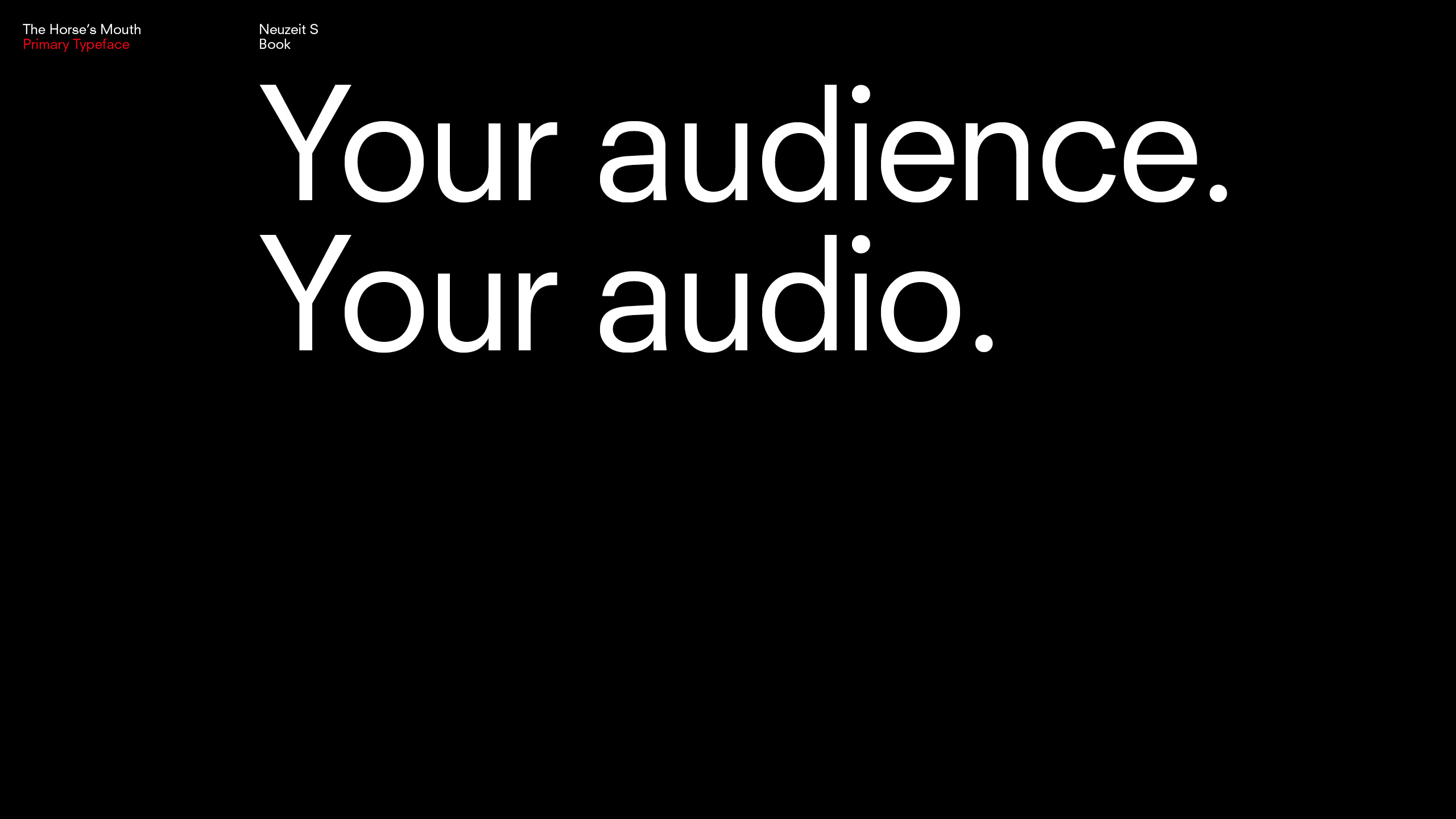
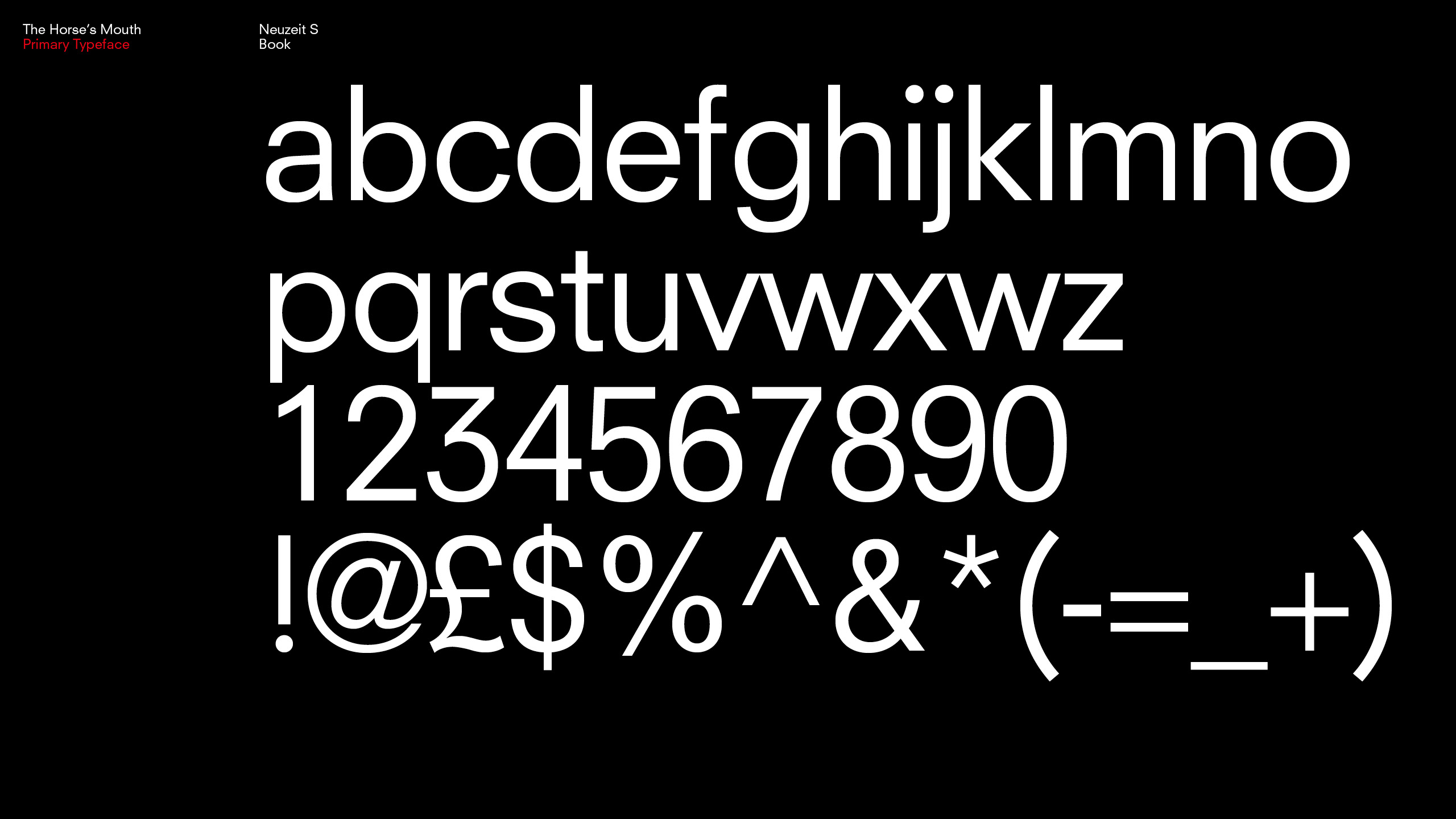
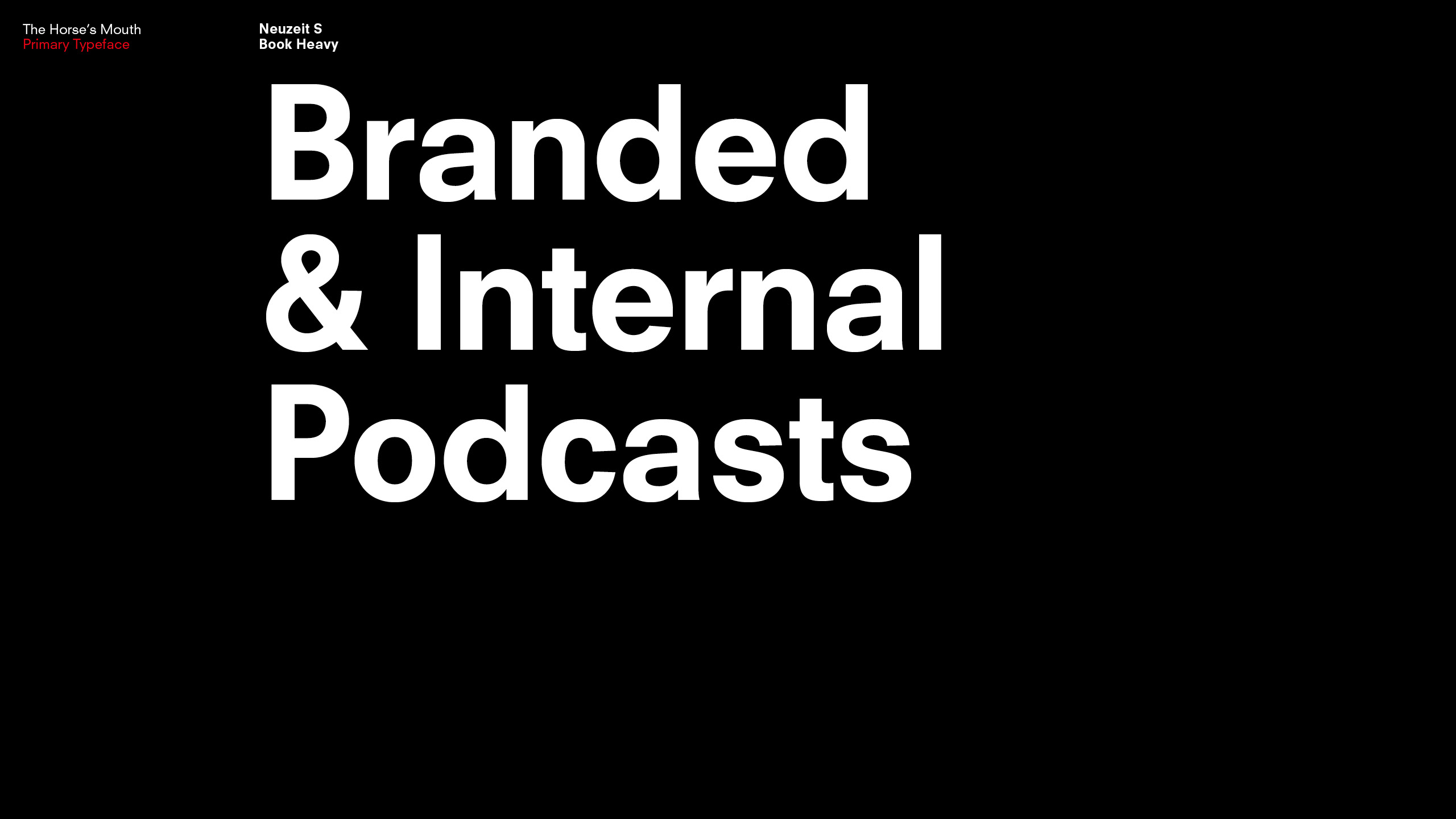
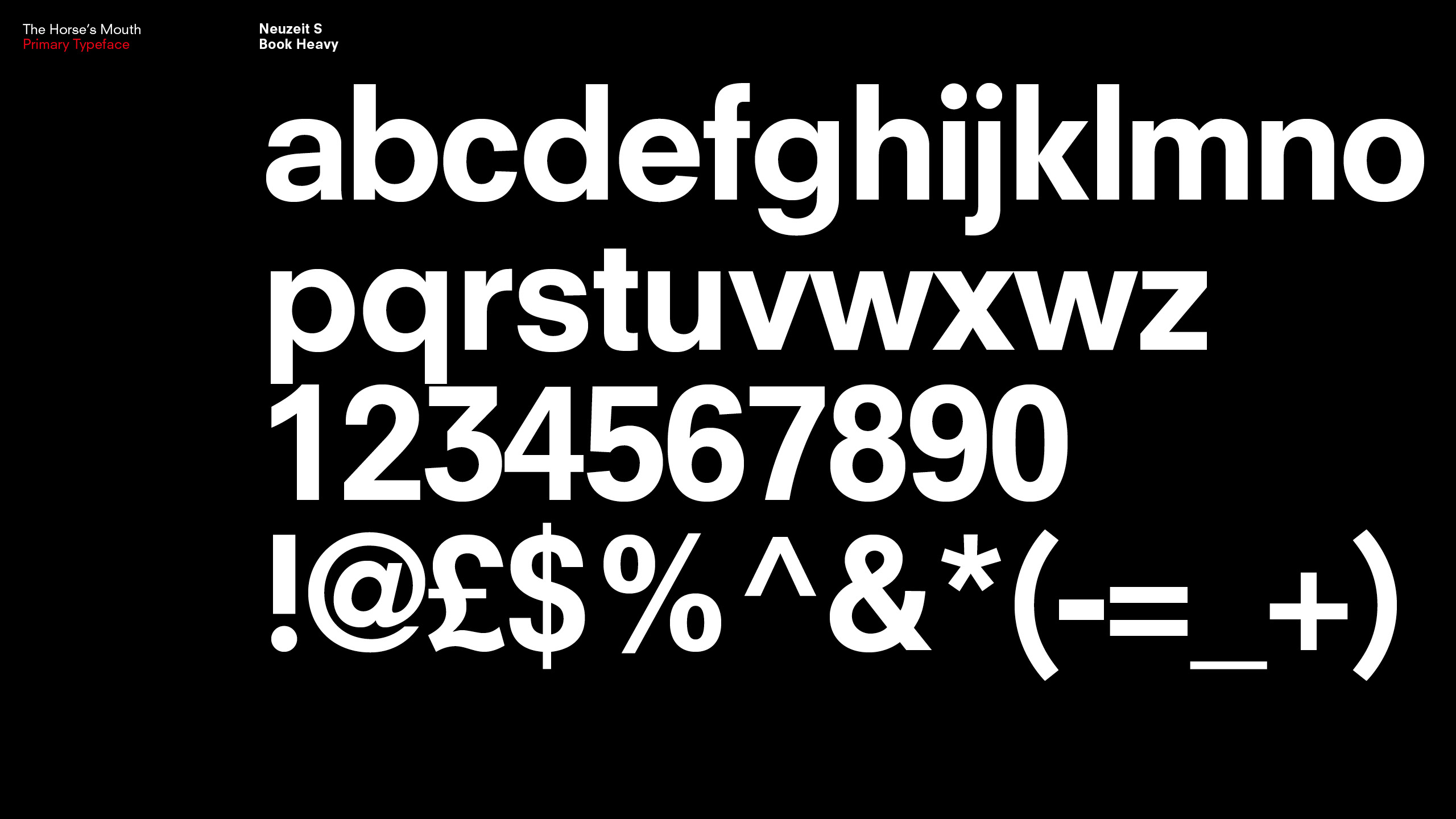
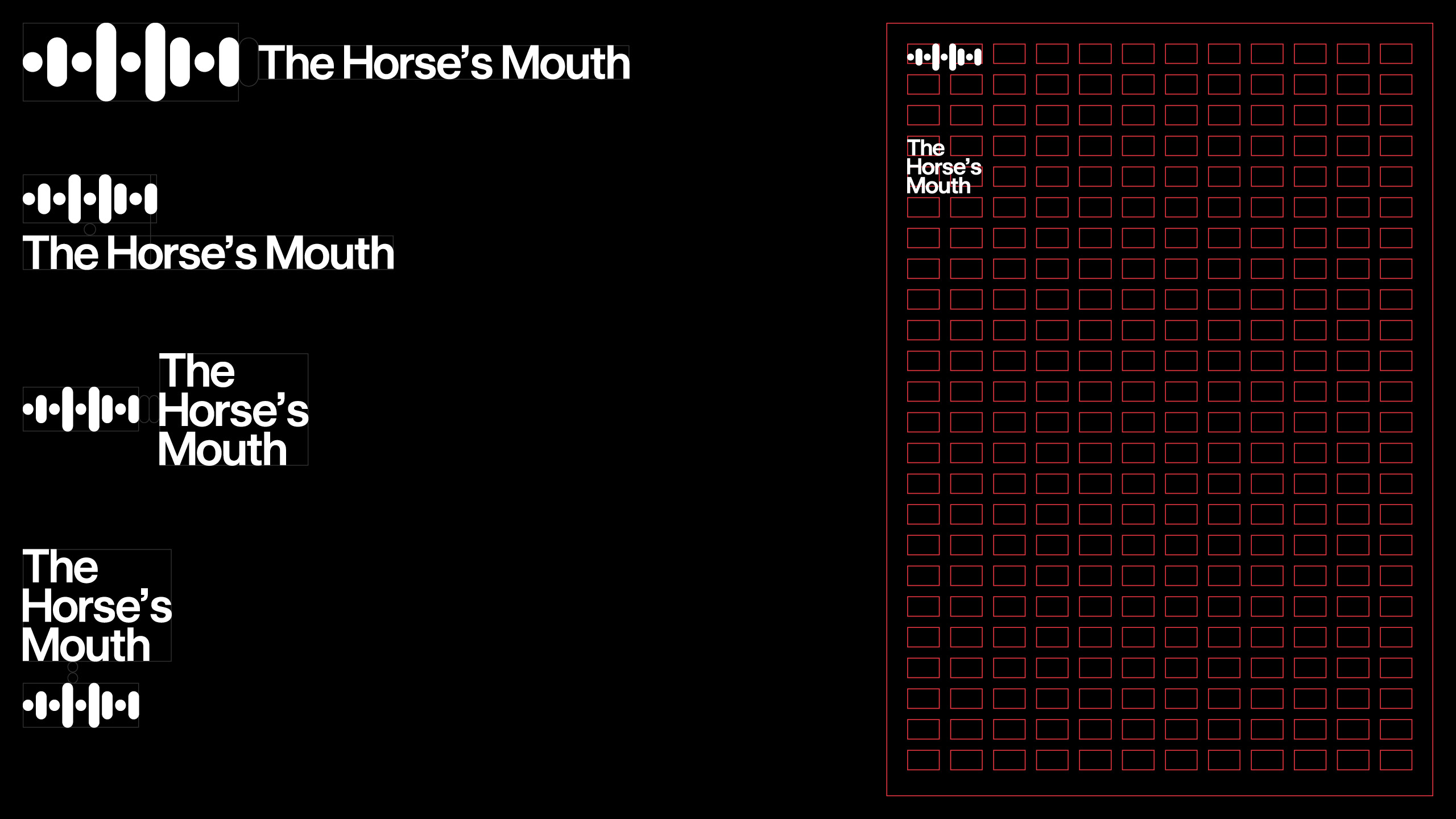
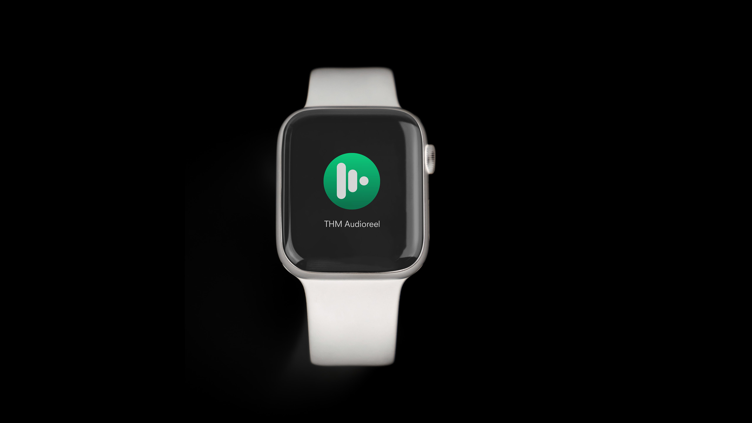
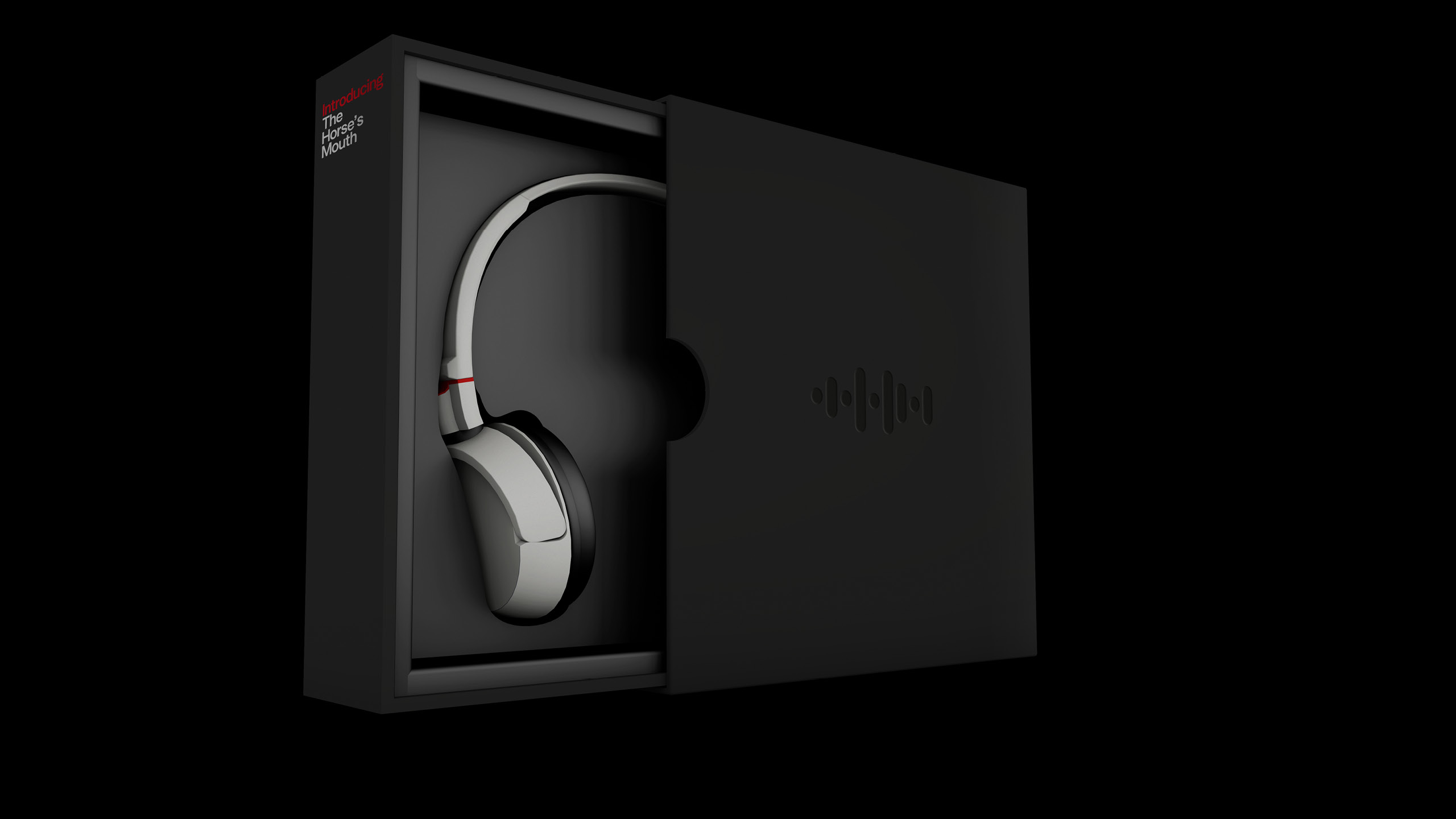
The Horses Mouth
Archive
2020
The Horse's Mouth is an agency that creates original podcasts for brands looking to grow to new audiences or to increase loyalty for their existing one. More than just a production house, they work with clients to establish the right brand strategy and then create original, tailored podcasts that will be compelling, inspiring and relevant to their customers, teams and fans.
Our logo is based on a soundwave icon and the abstracted letters of the company's initials. This is coupled with a simple, bold logotype. We worked closely with the THM team to develop a logo and identity that would be both eye catching but also to be clear about what they do to benefit a brand.

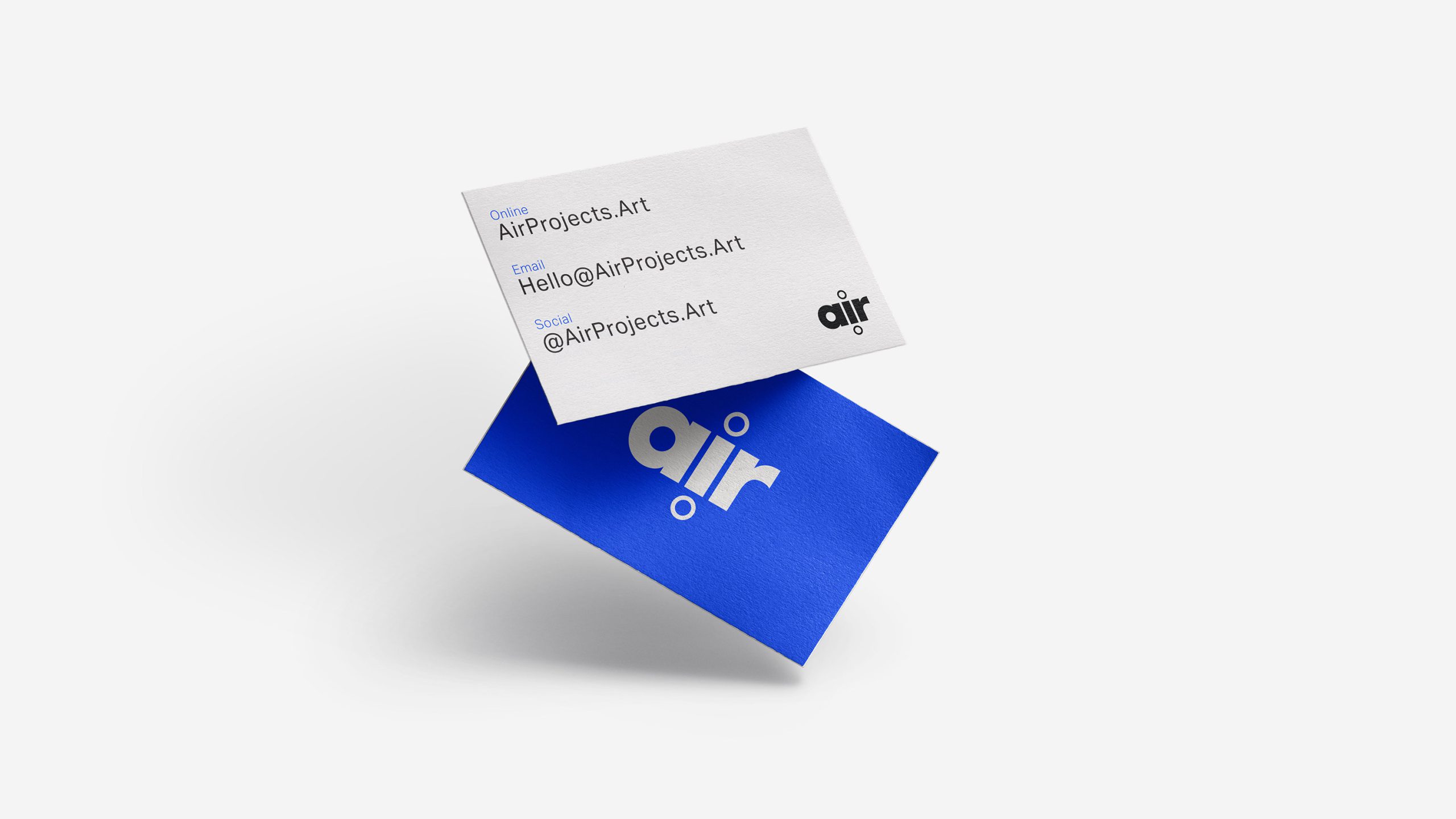
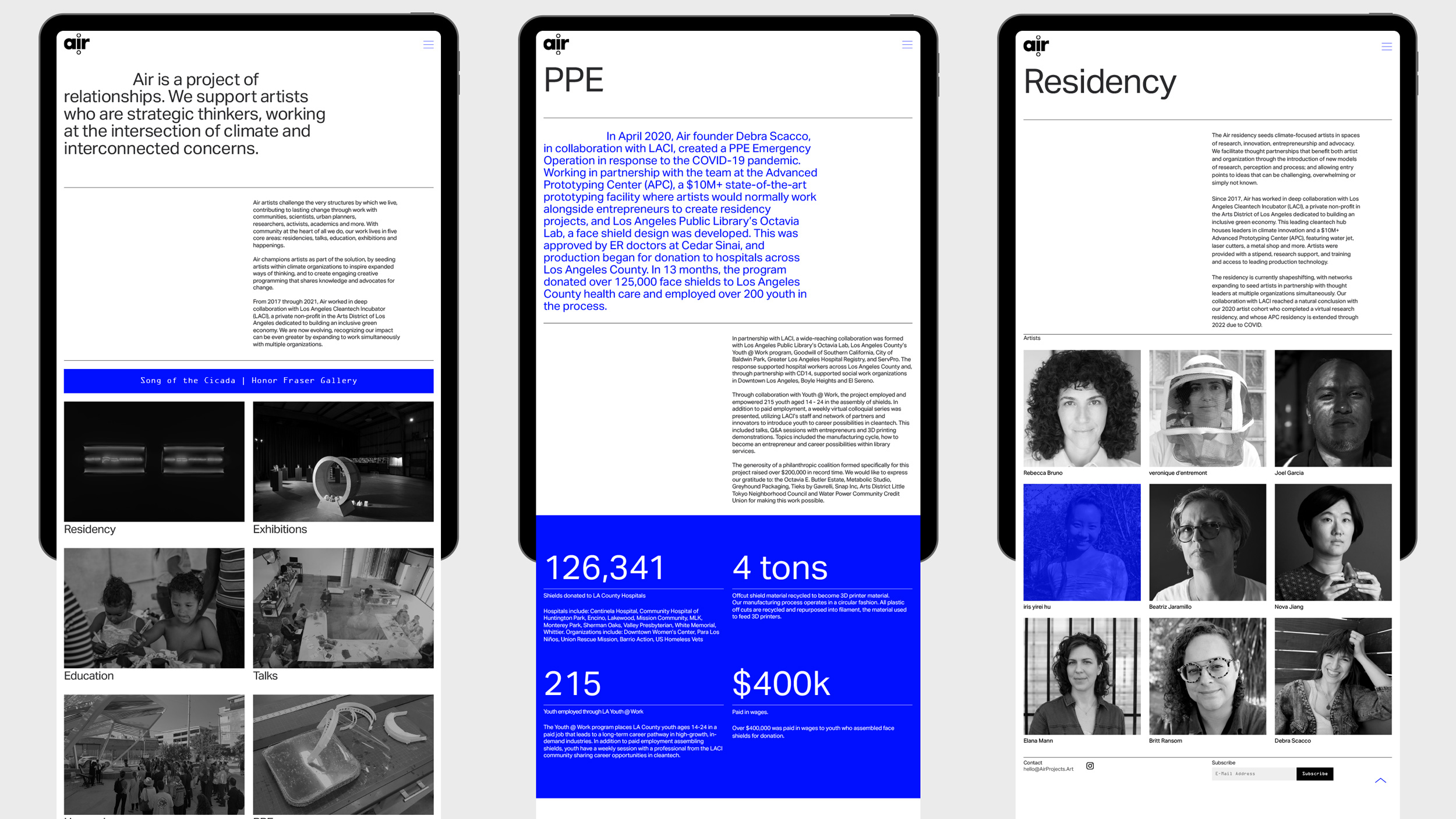
Air
Archive
2020
Air champions artists as part of environmental, social and economic solutions, by seeding artists within climate organizations to inspire expanded ways of thinking, and to create engaging creative programming that shares knowledge and advocates for change.
We carried out logo design,
visual identity and website design.
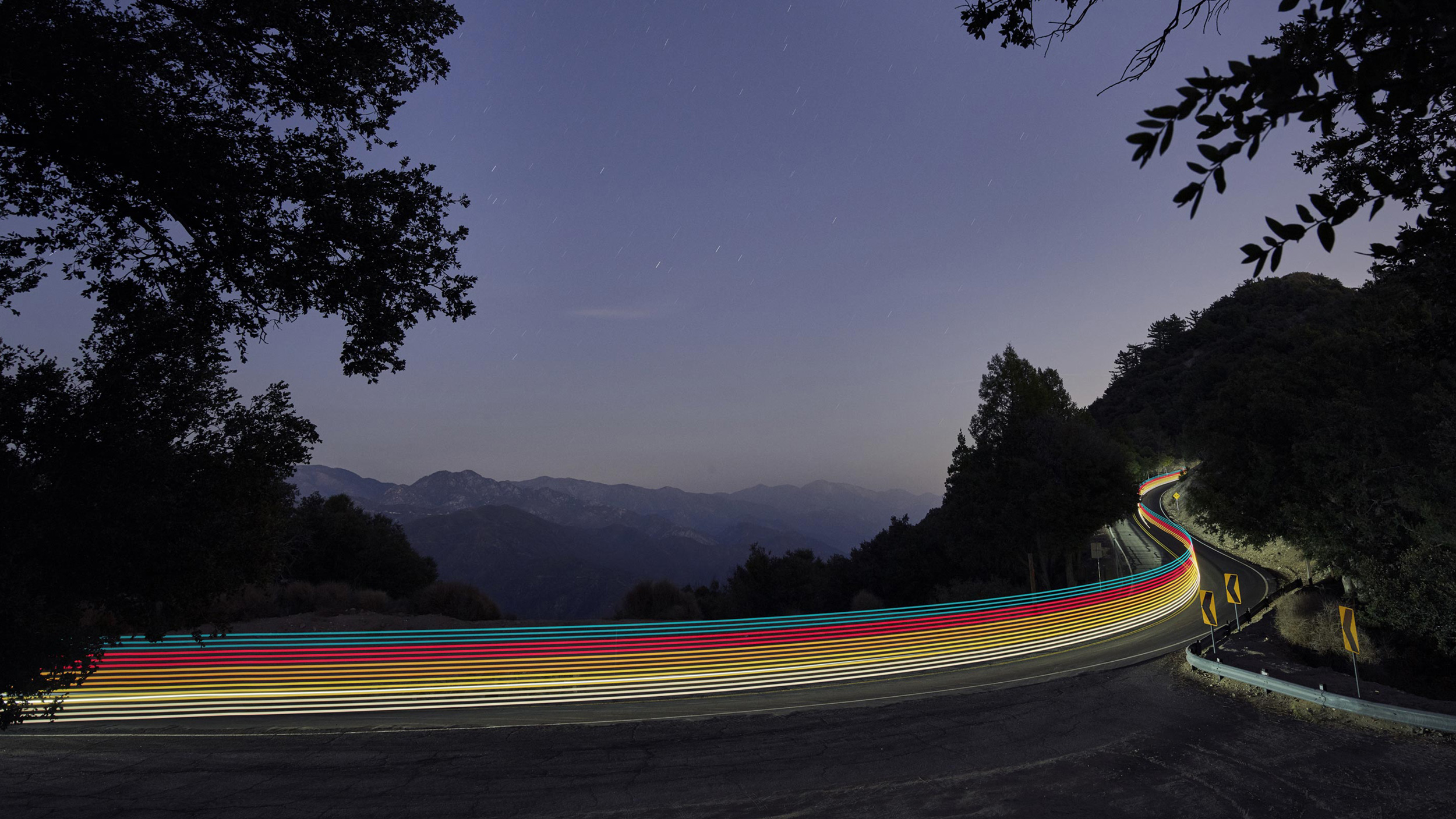
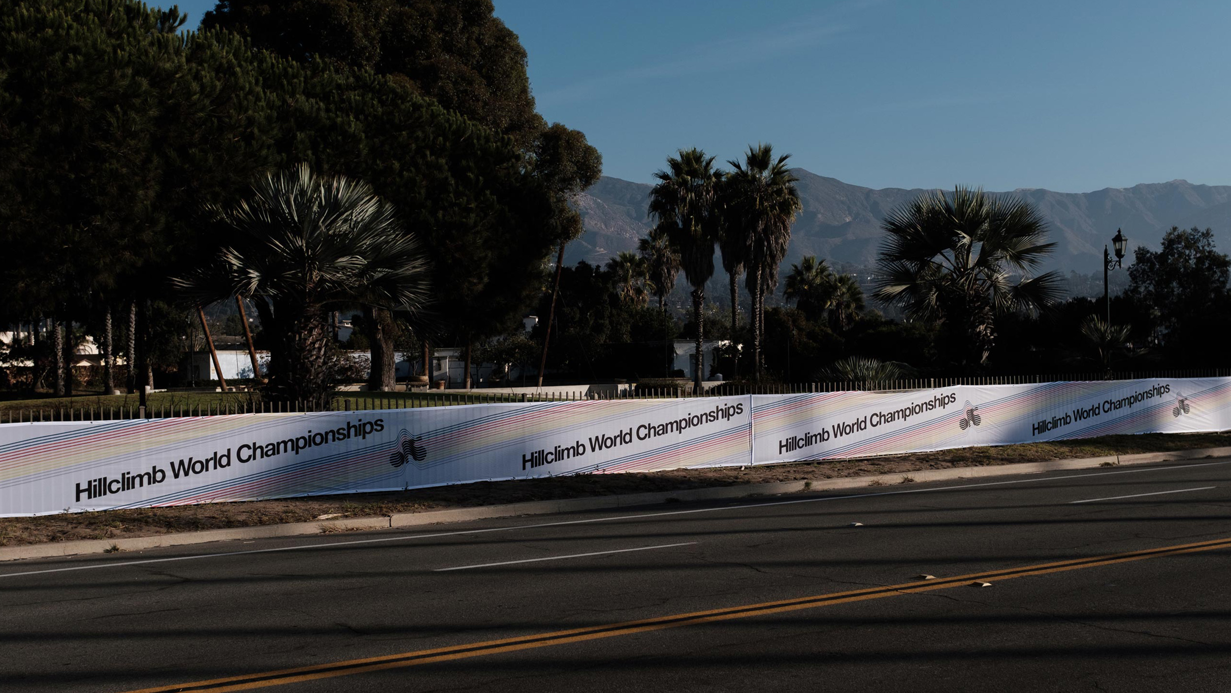
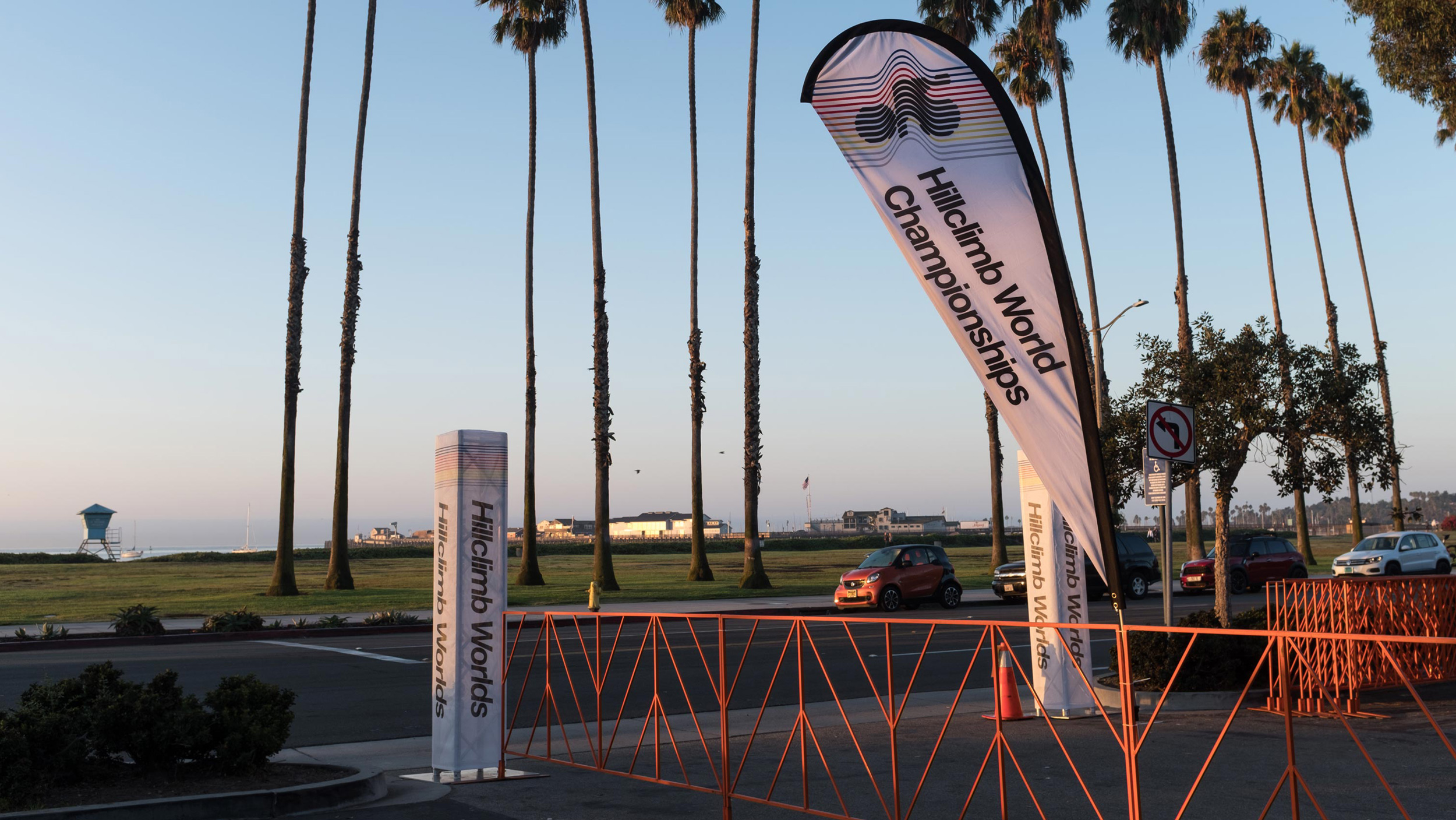
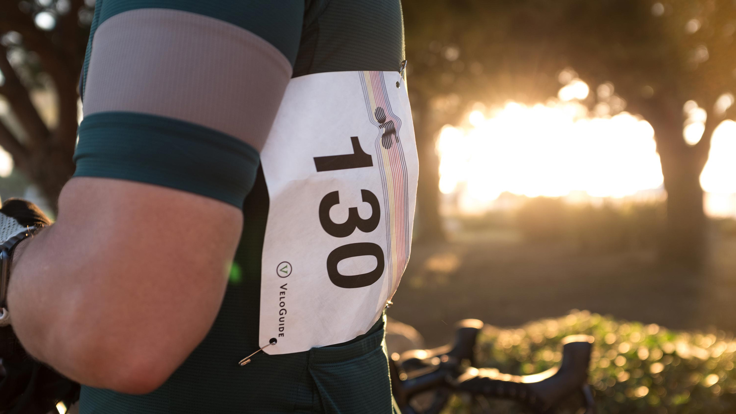
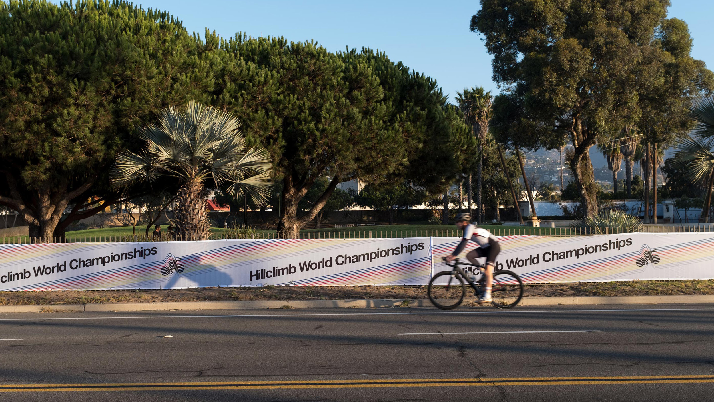
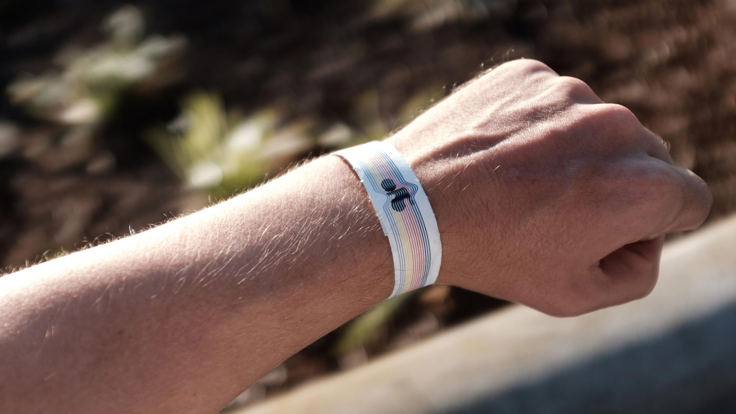
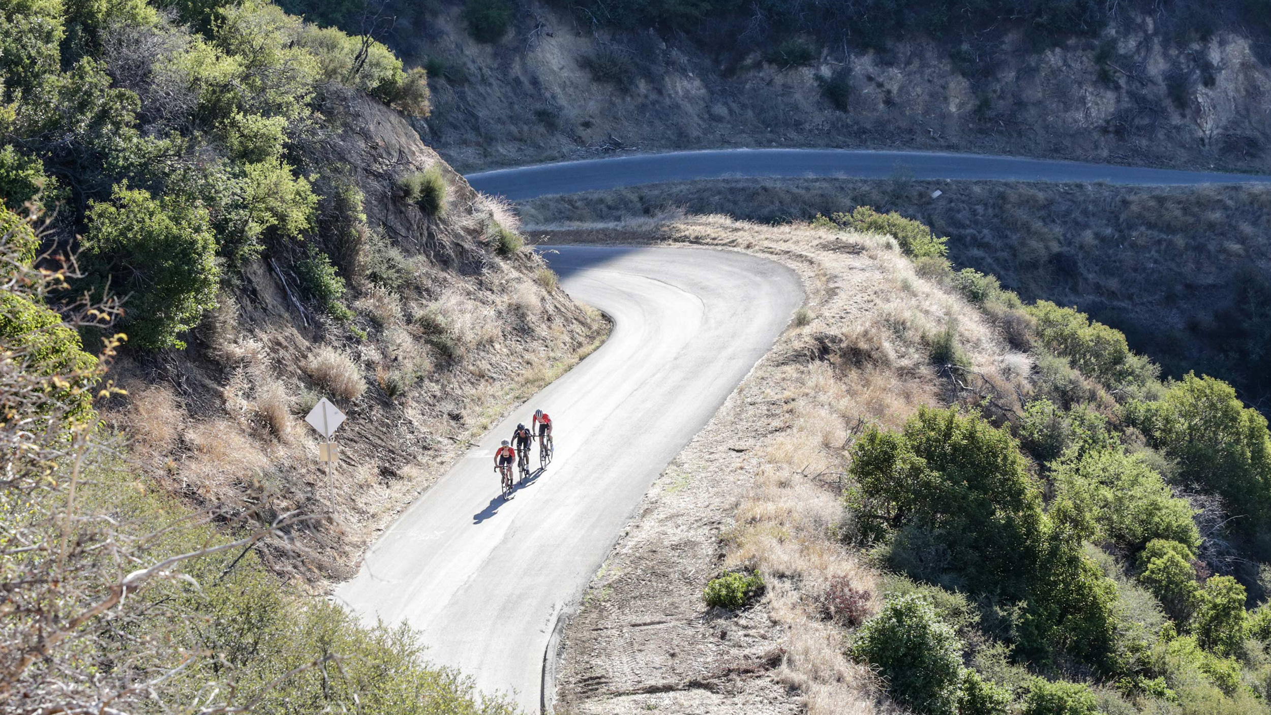
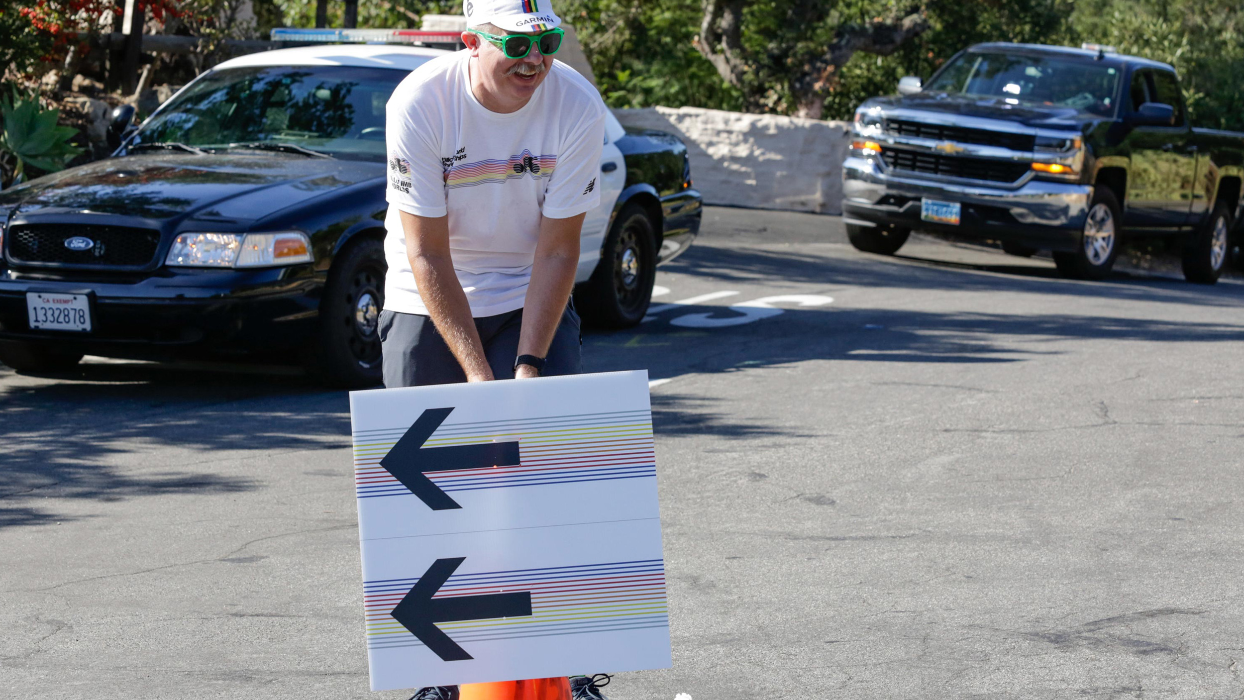
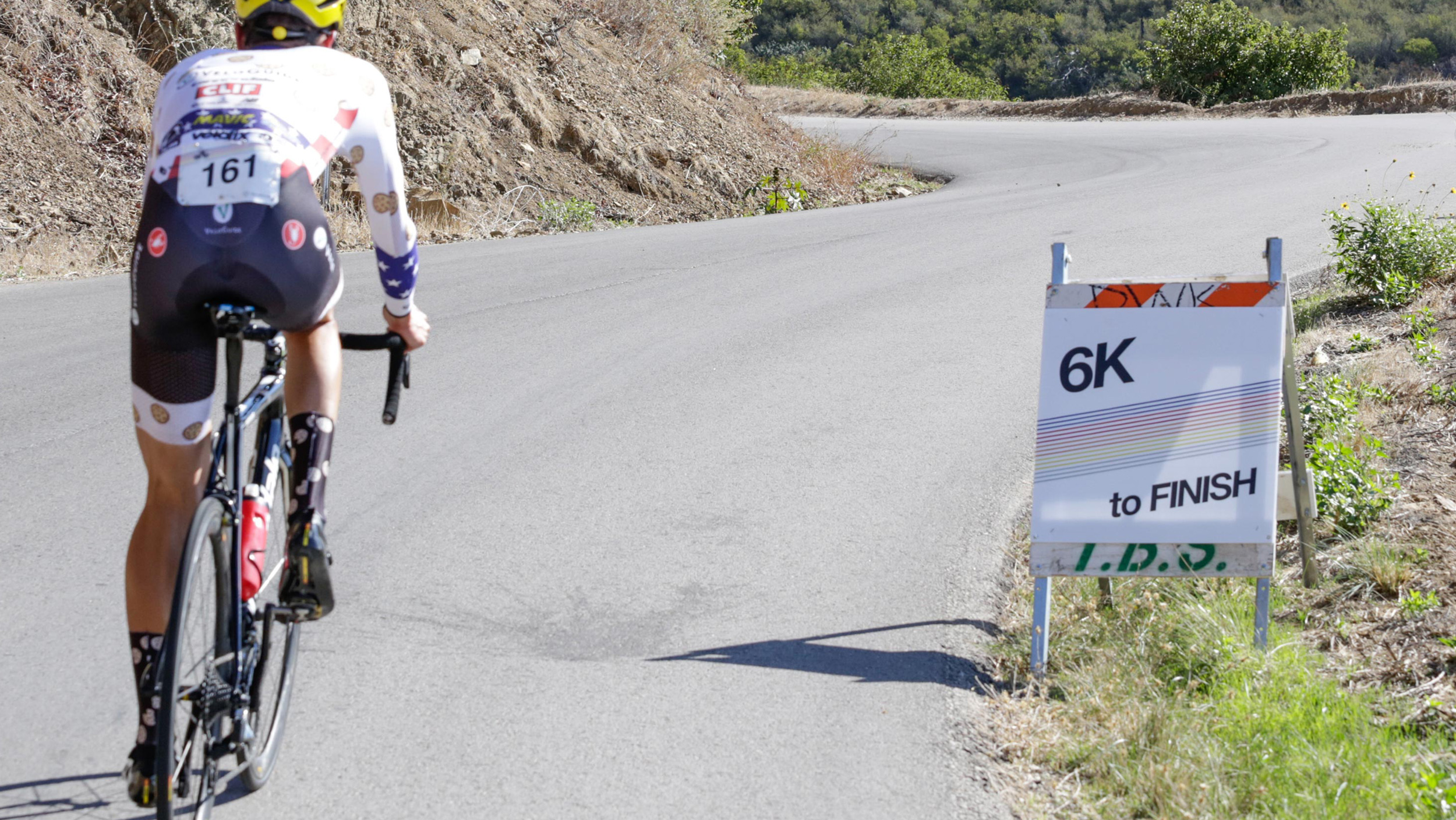
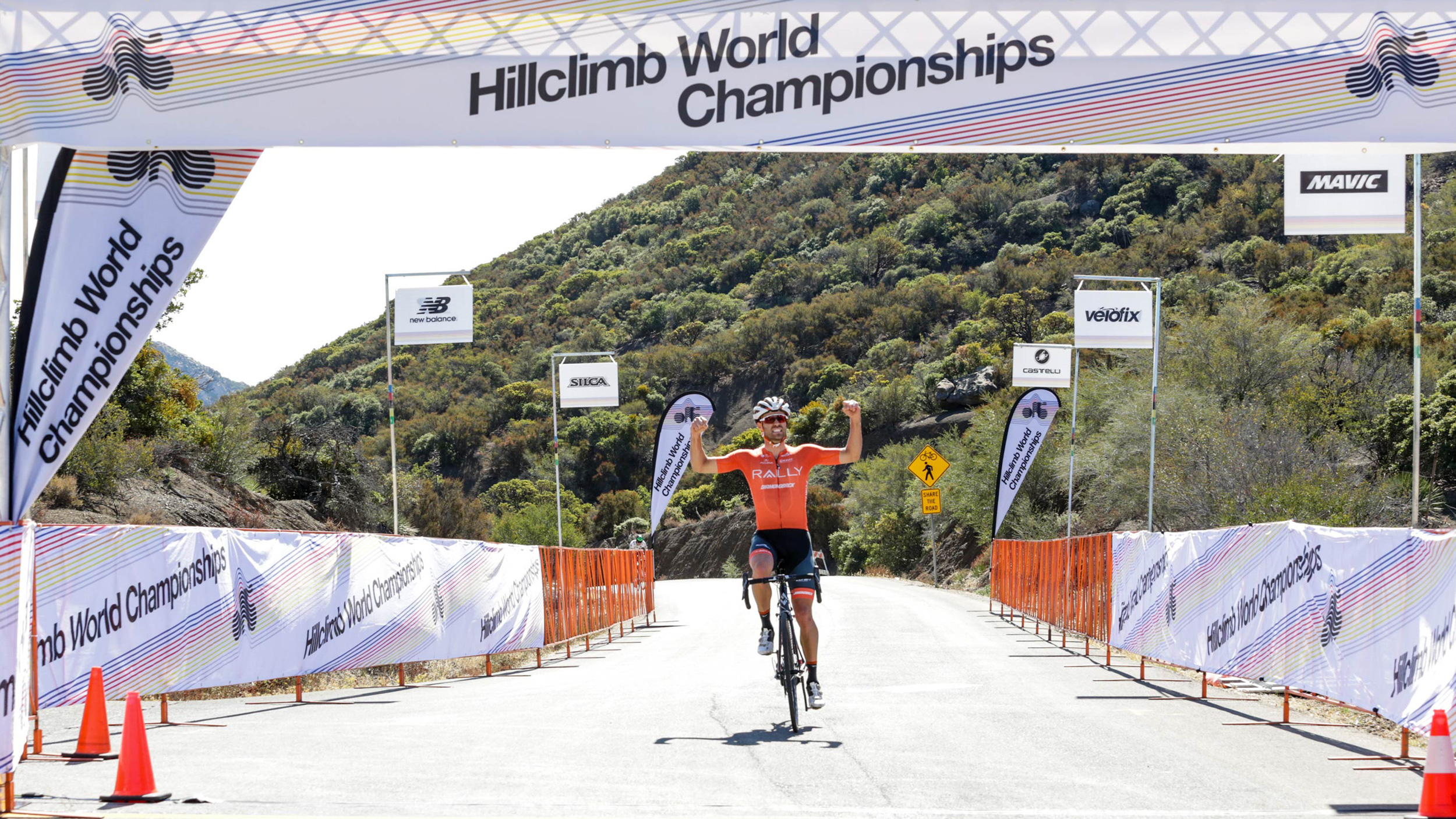
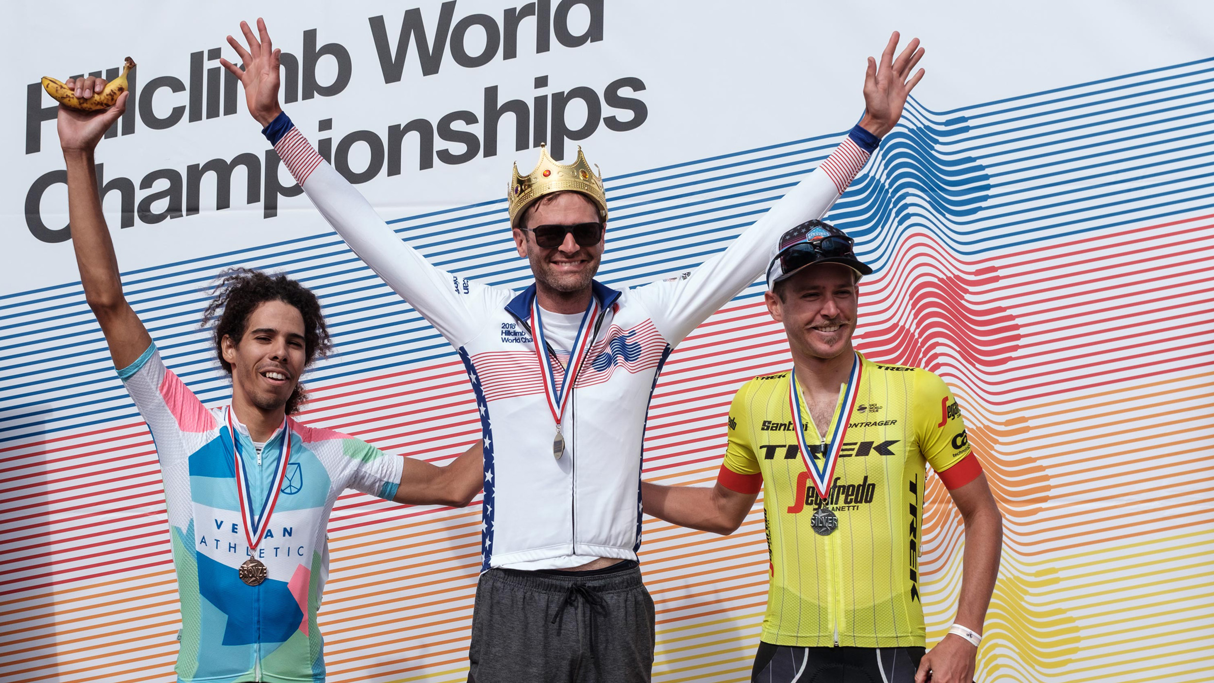
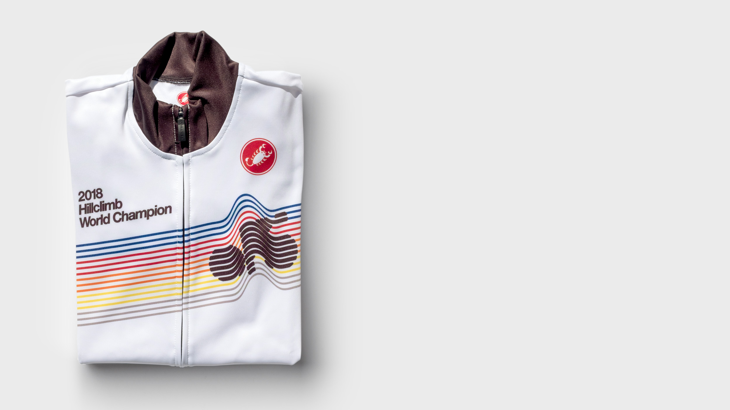
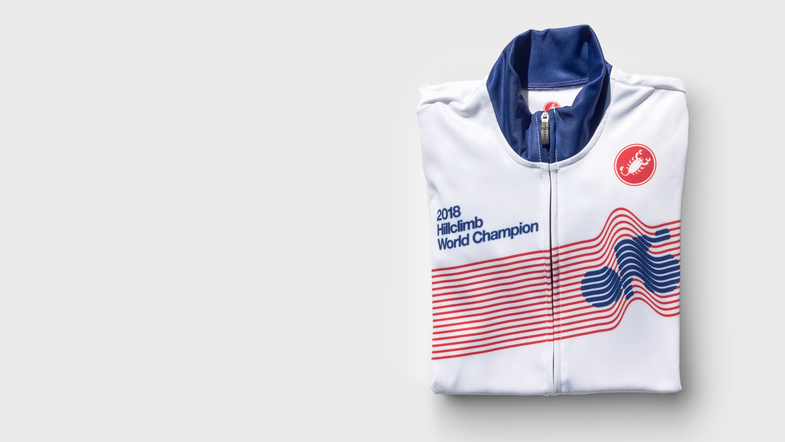
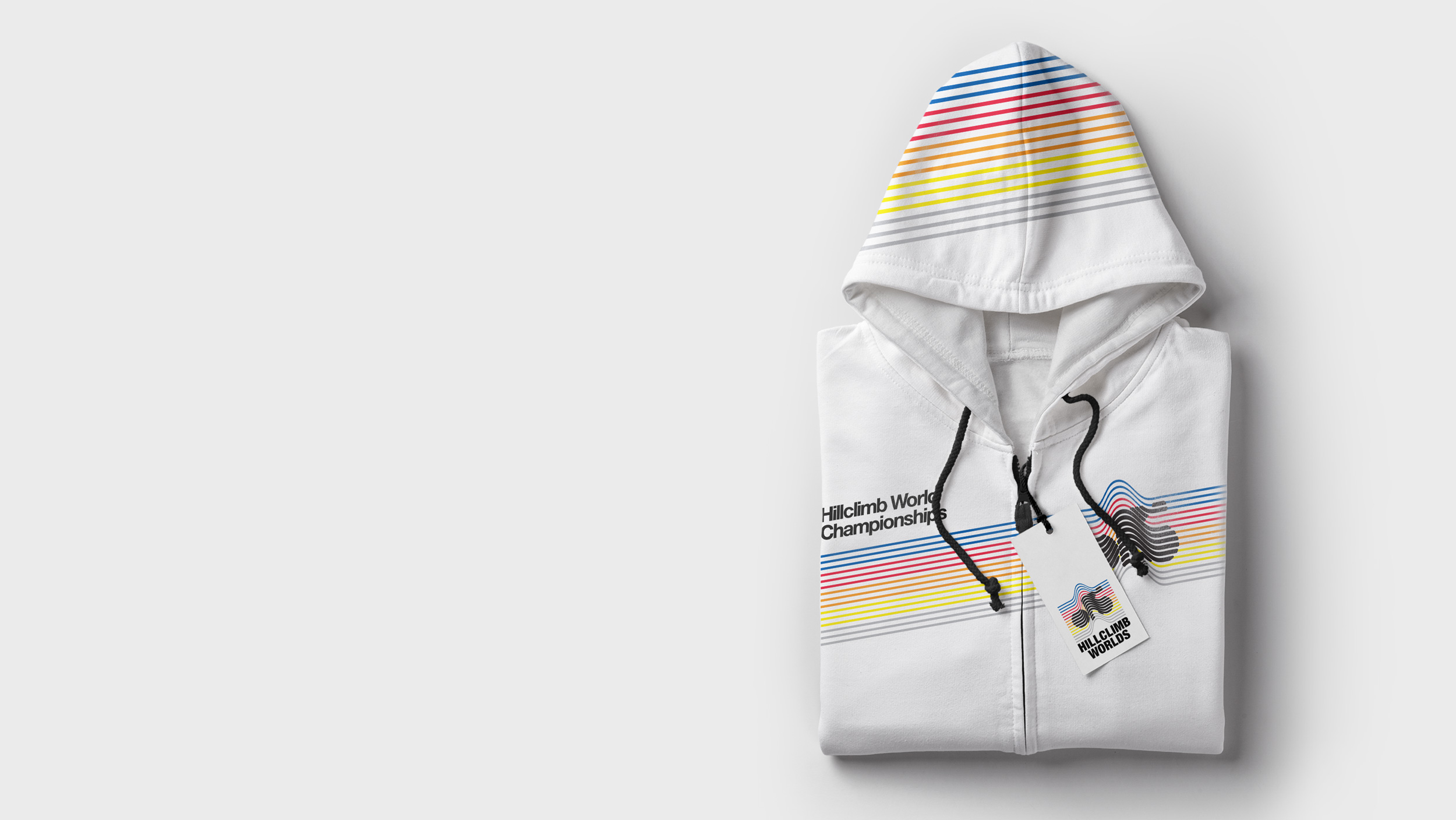
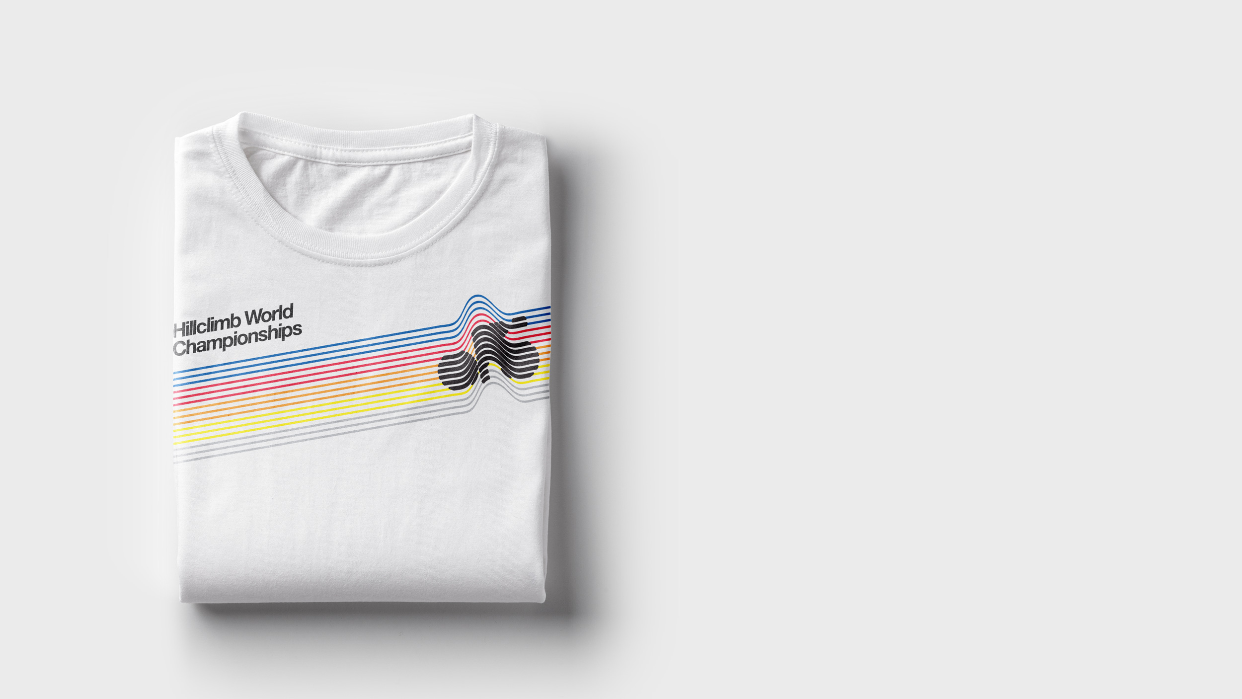
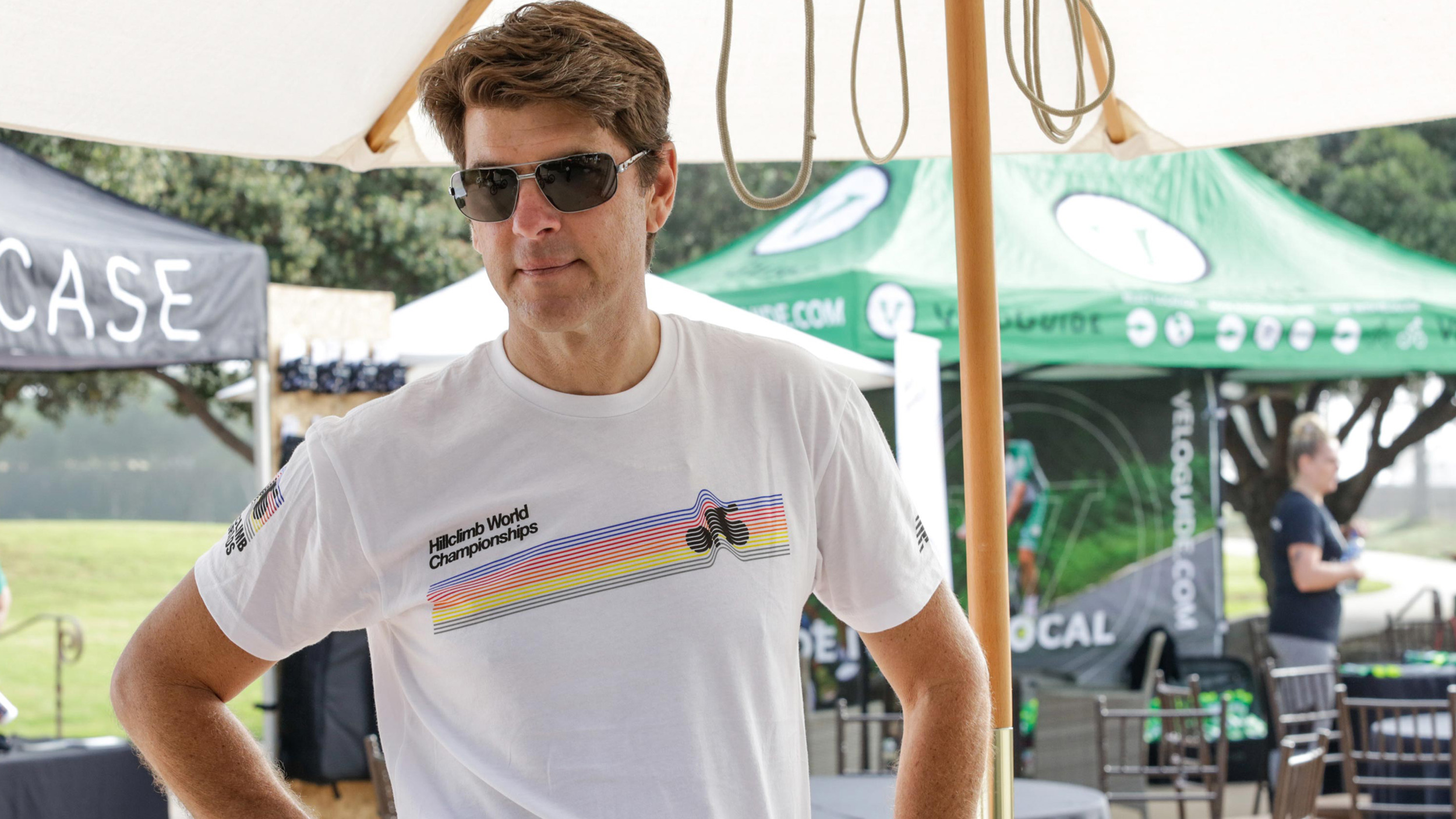
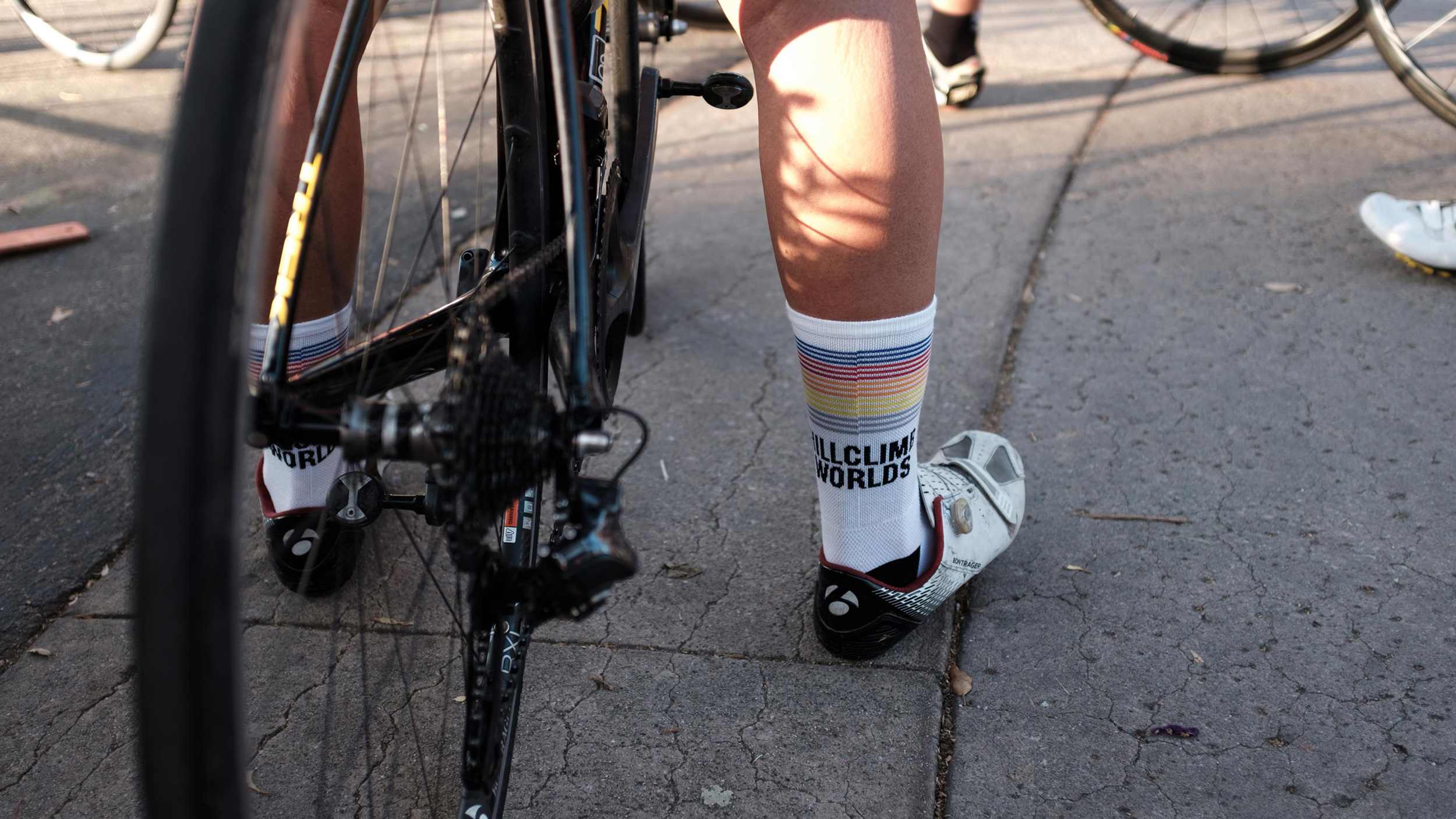
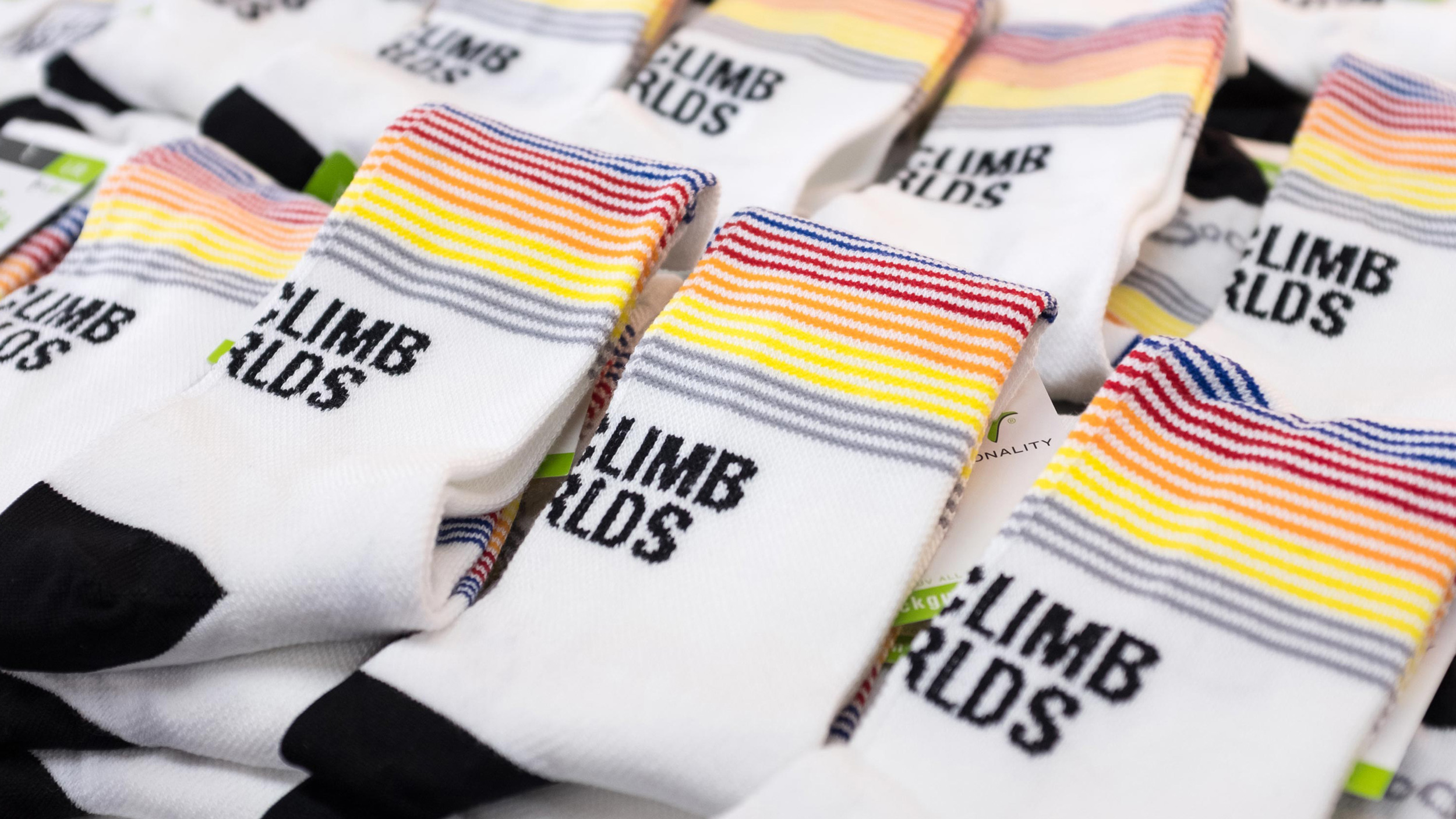
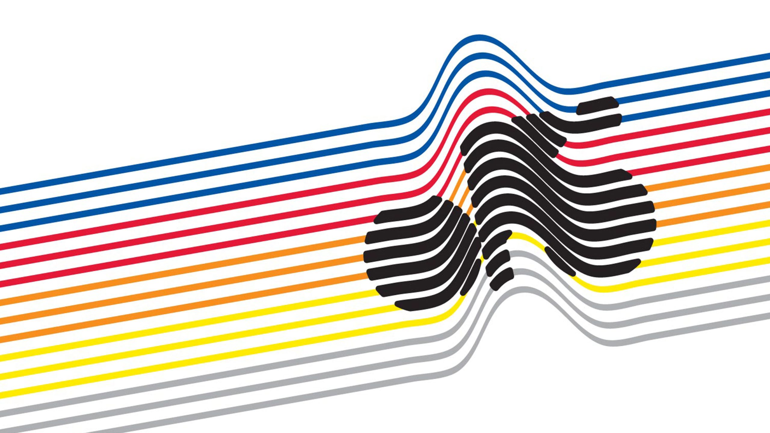
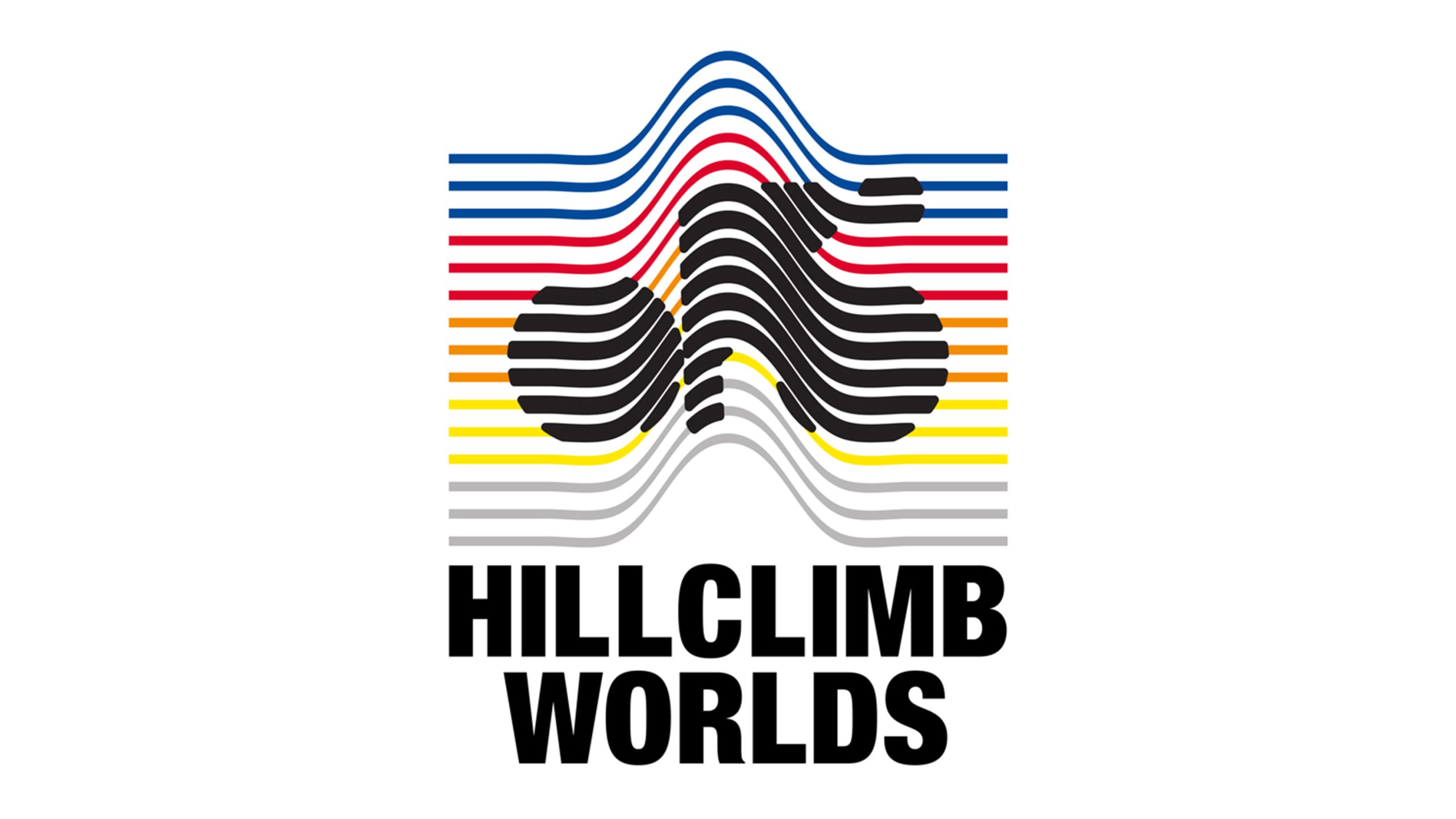
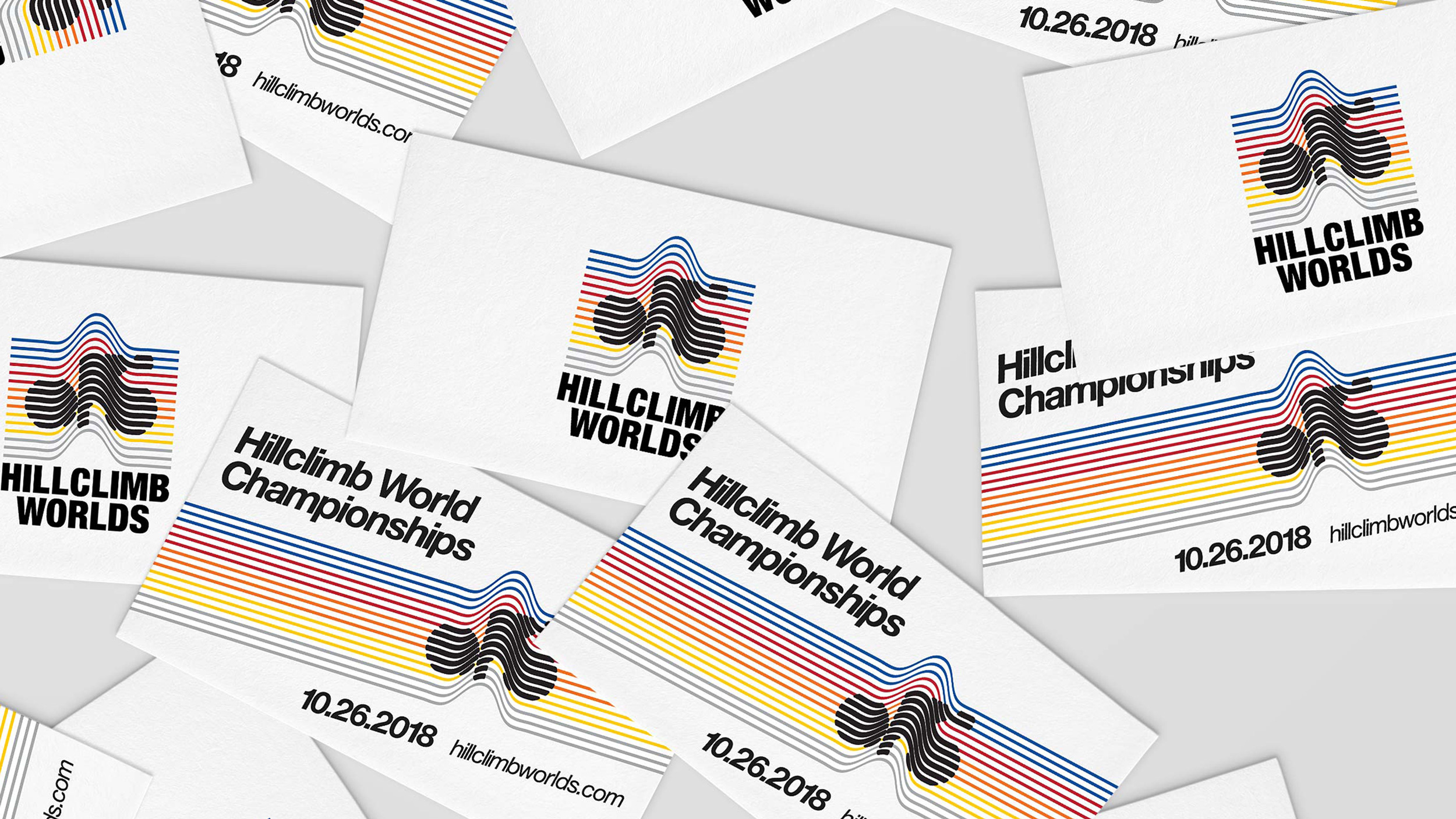
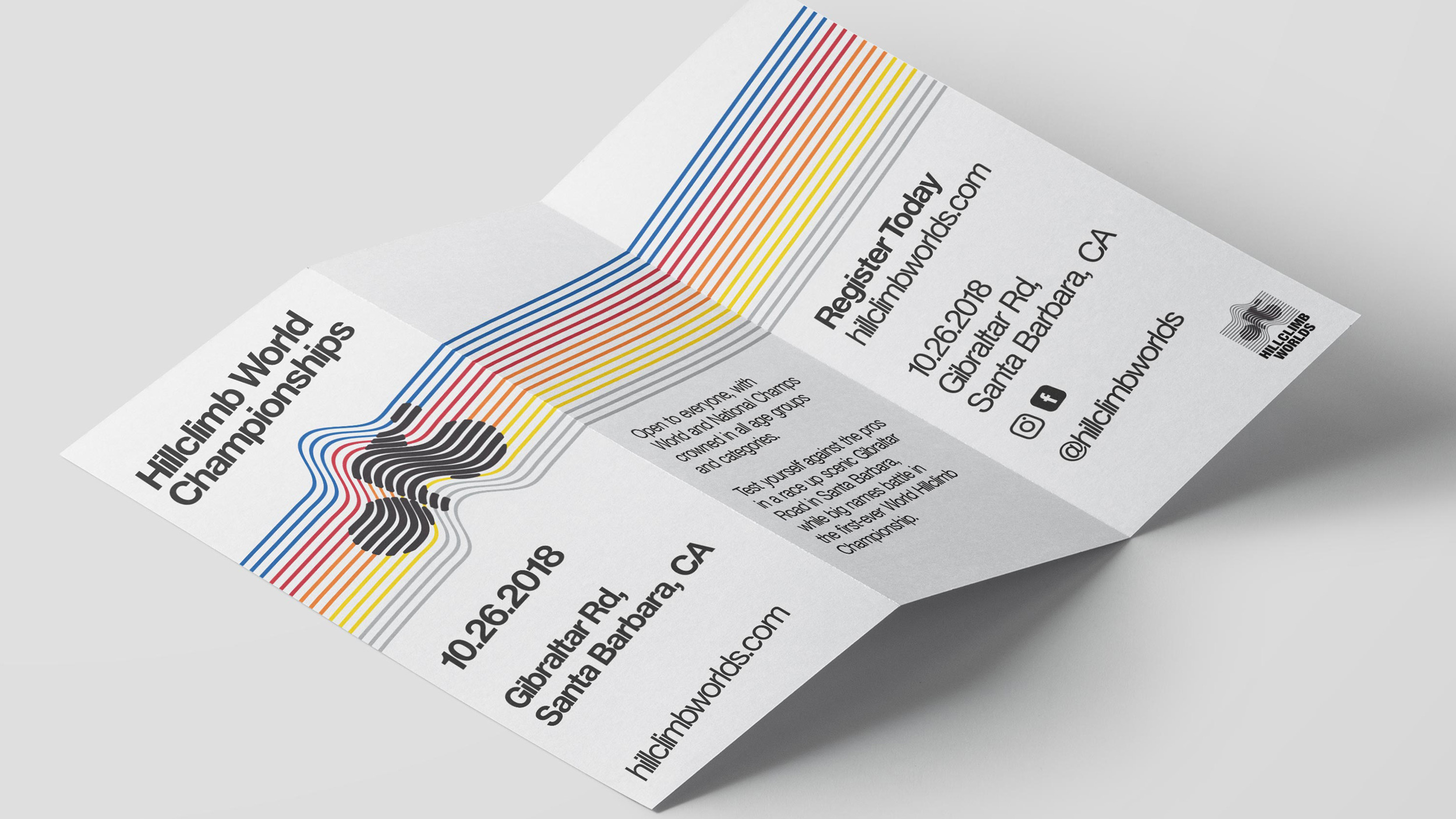
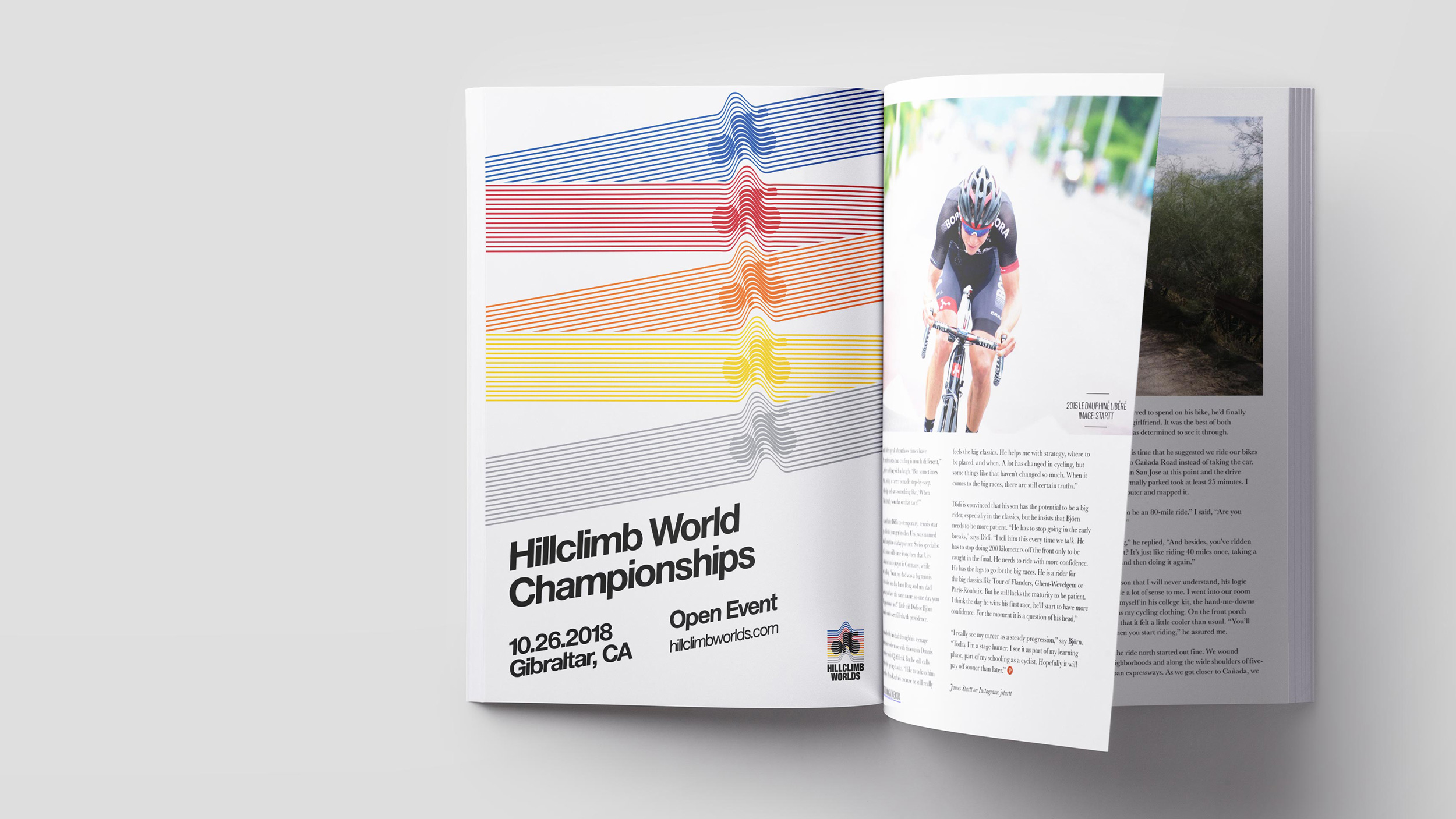
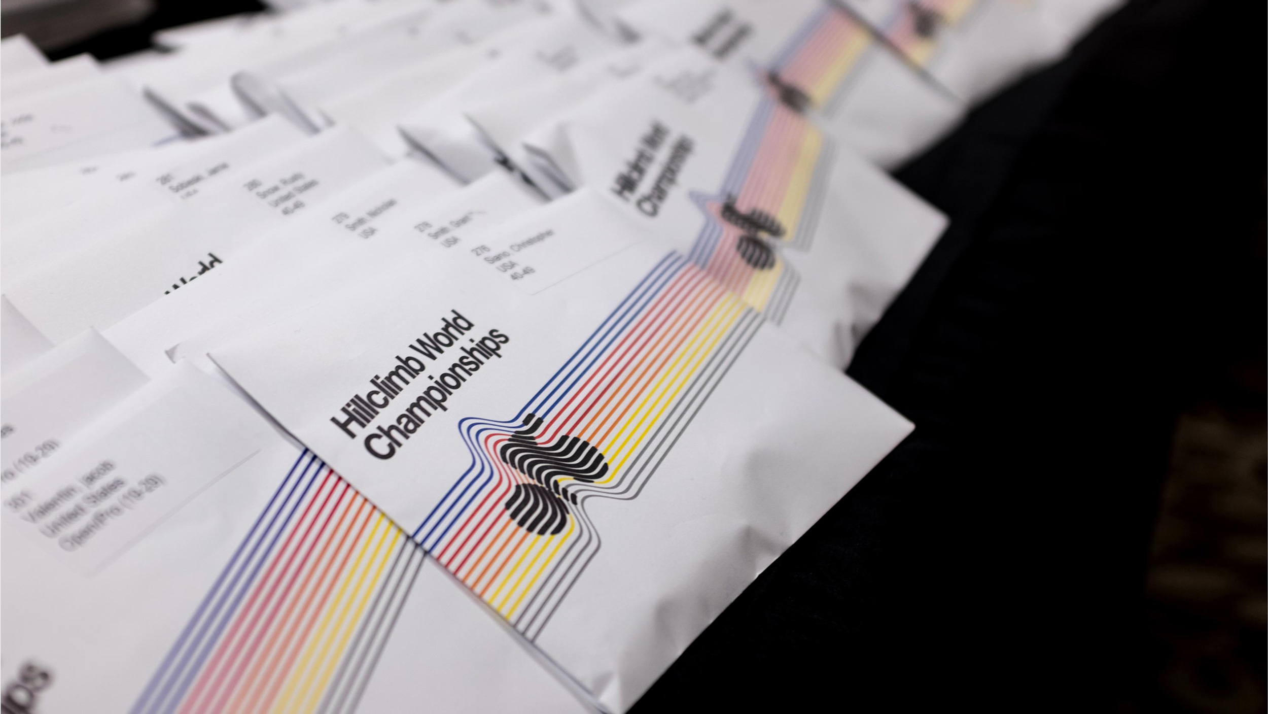
Hill Climb Worlds
Archive
2018
2017 was the last year of The National Hill Climb Championships as an official UCI cycling event. Former professional Phil Gaimon, as the last winner, wanted a chance to defend his crown so decided to set up a new competition in its place.
We needed to create a logo that conveyed cycling, specifically hillclimbing and give the event the gravitas of an officially recognised cycling championship. A simple cycle icon was integrated into a single undulation conveying speed and the nature of the event.
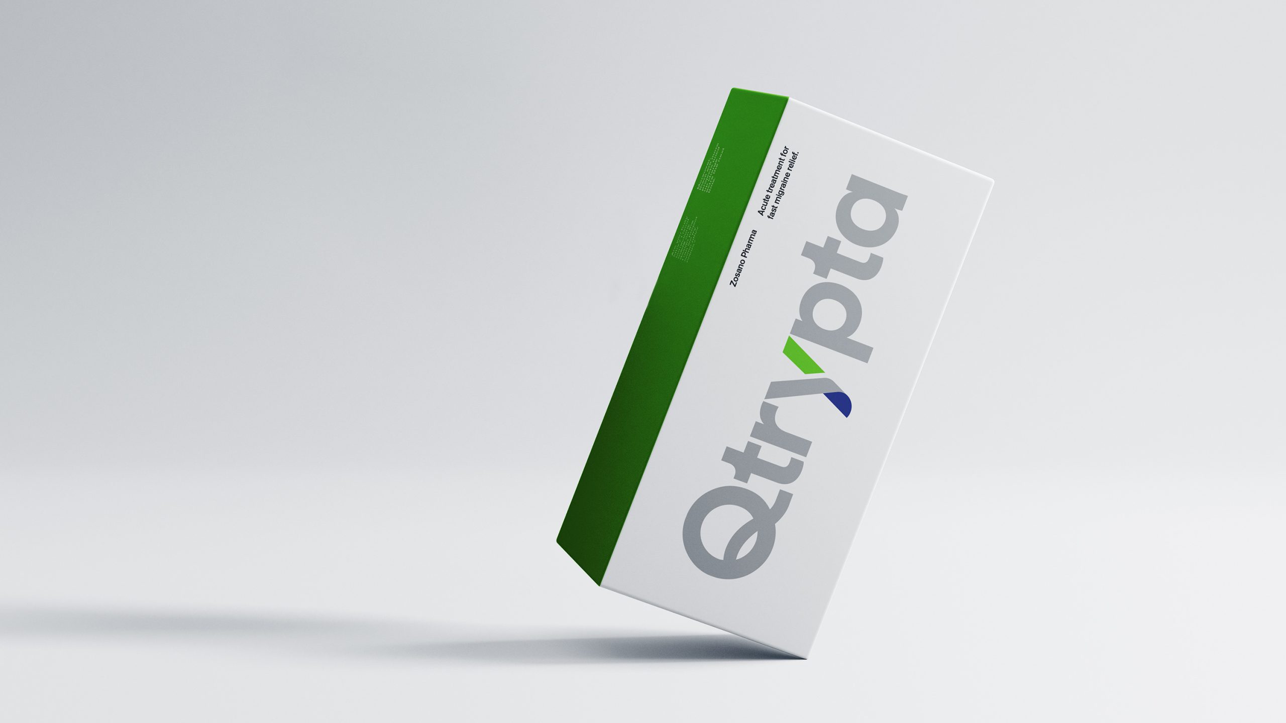
Qtrypta
Archive
2020
QTRYPTA is a novel, state of the art acute treatment for migraine that is purposely designed to avoid the distressing tradeoffs of existing therapies.
The logotype we have created needed to be distinctive enough to standout in a crowded marketplace, but also be legible enough to be easily read and recognised – a challenge given the unique nature of the name.
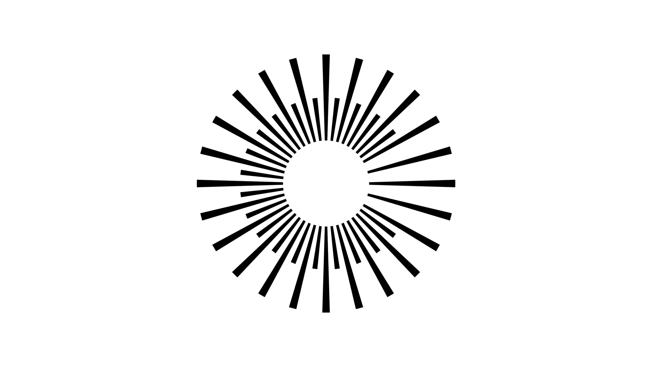
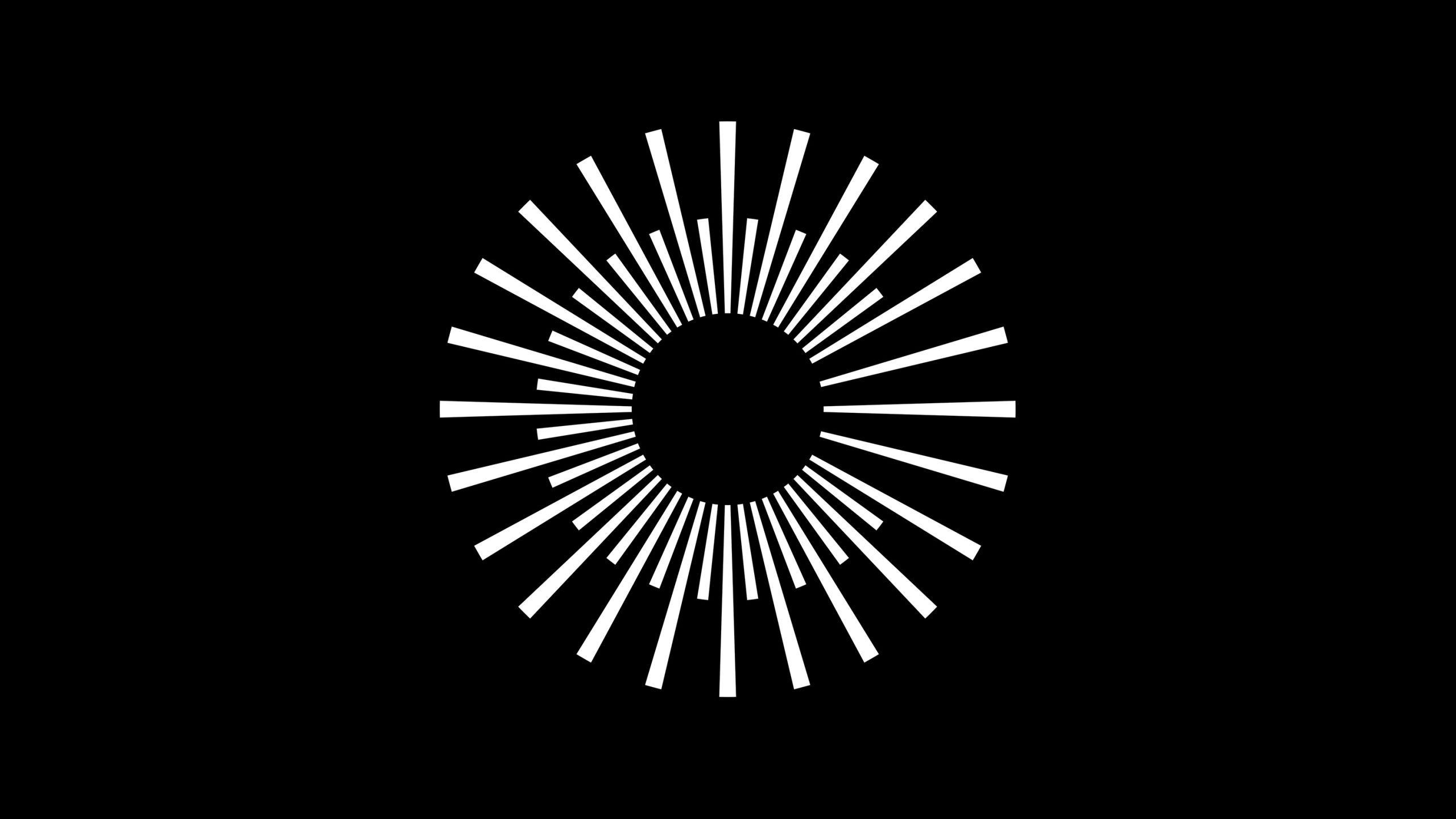
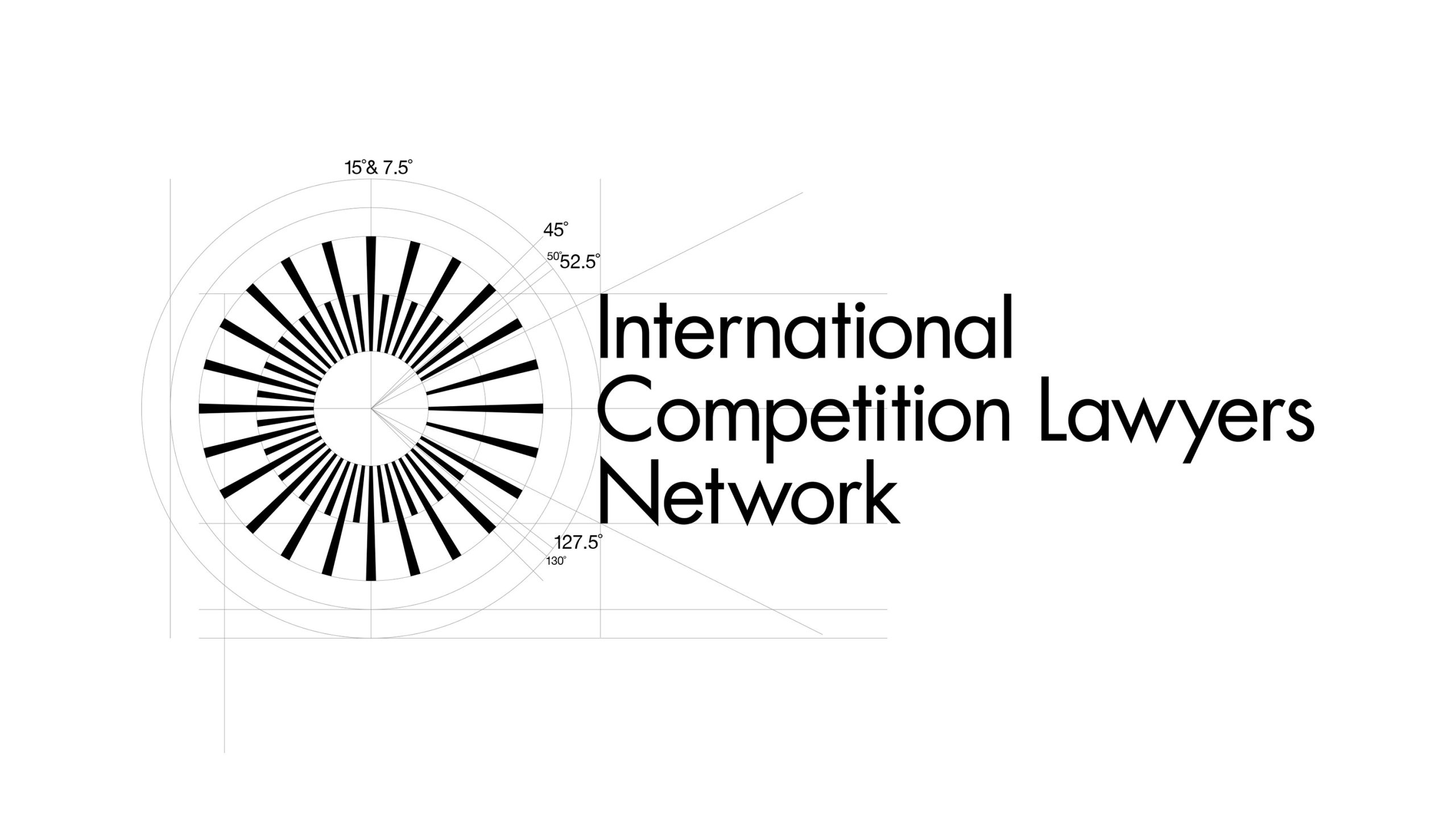
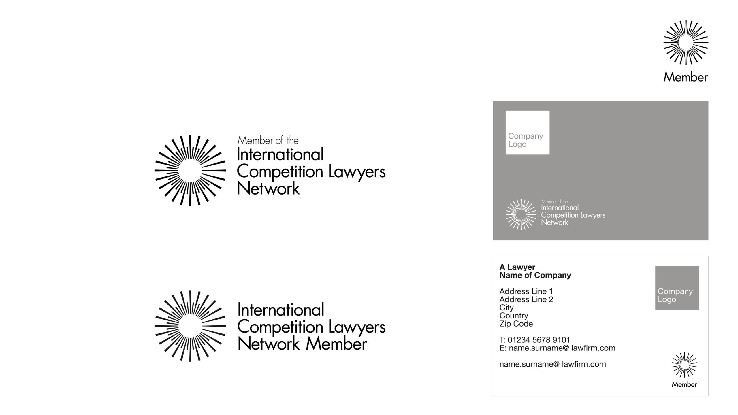
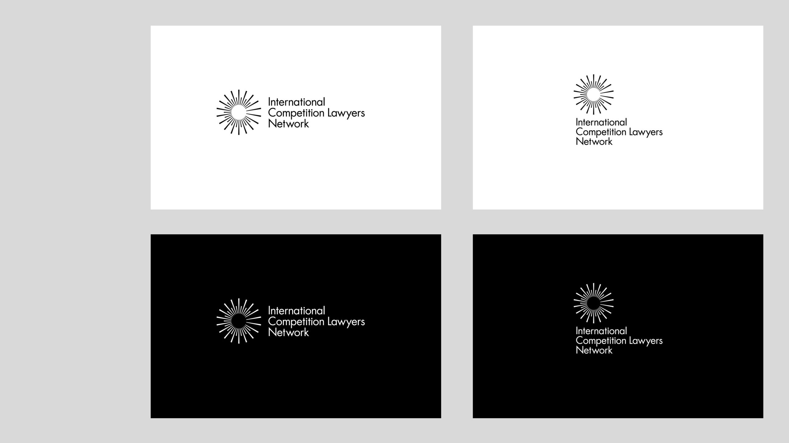
ICLN
Archive
2020
The ICLN is an organisation bringing together the worlds leading law firms to provide a network of the best competition lawyers. Competition law has never been such an in-demand practice area and so creating this organisation allows access to a choice global expertise for a client and a wealth of reliable collaboration for the firms.
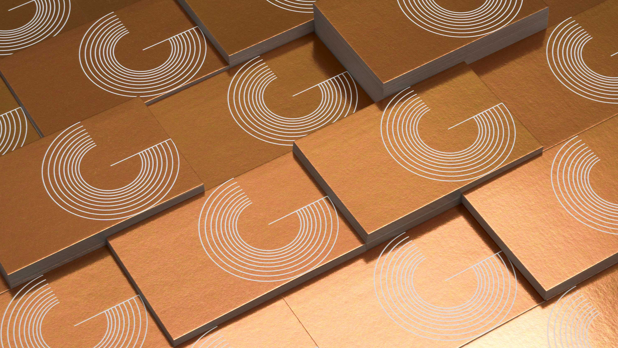
Our logo design takes the circular form usually used to represent the idea of ‘global’ but resists the usual clichés and goes for something more striking. The differing lines draw a ‘C’ but also reference competition in an abstract shape - the difference in line lengths.
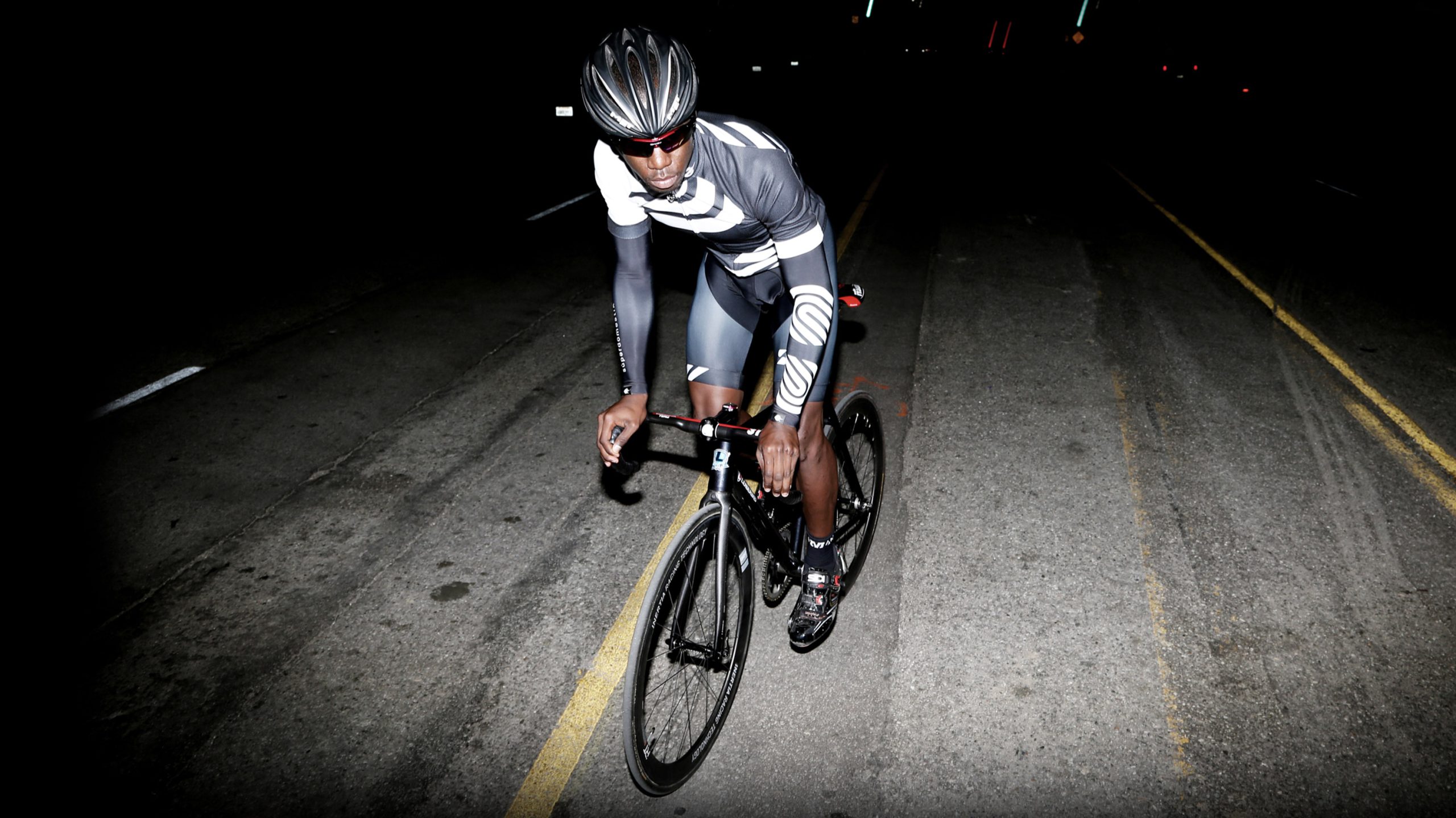
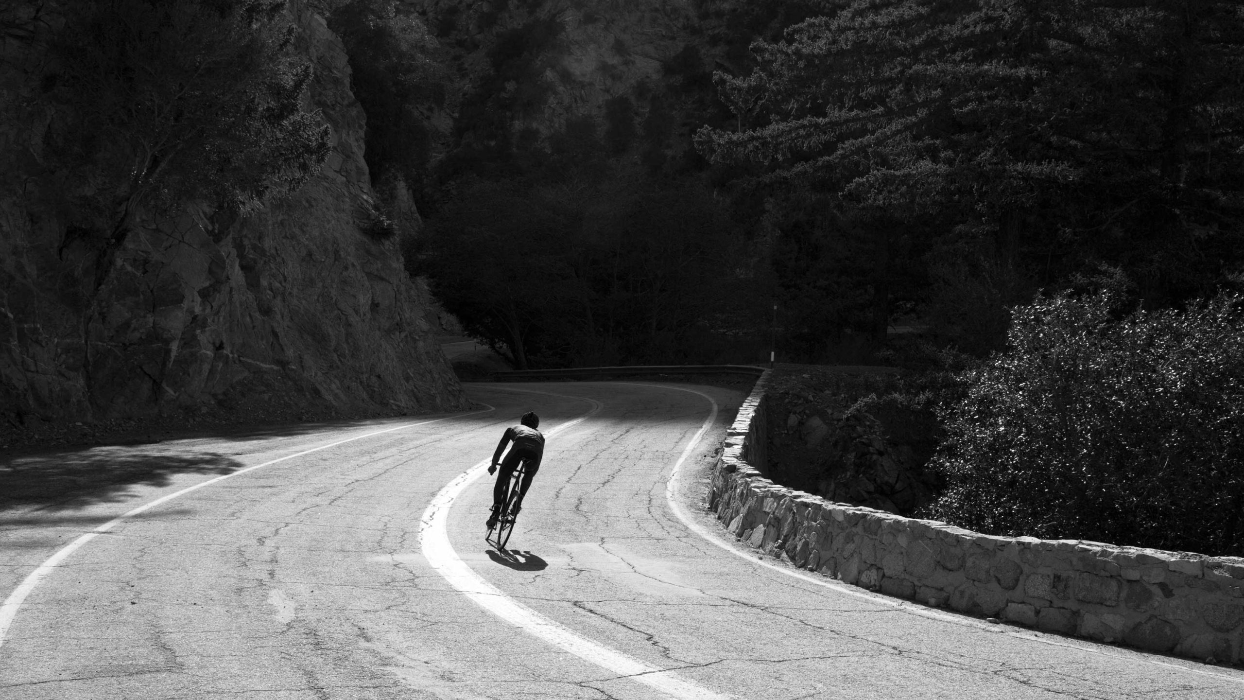
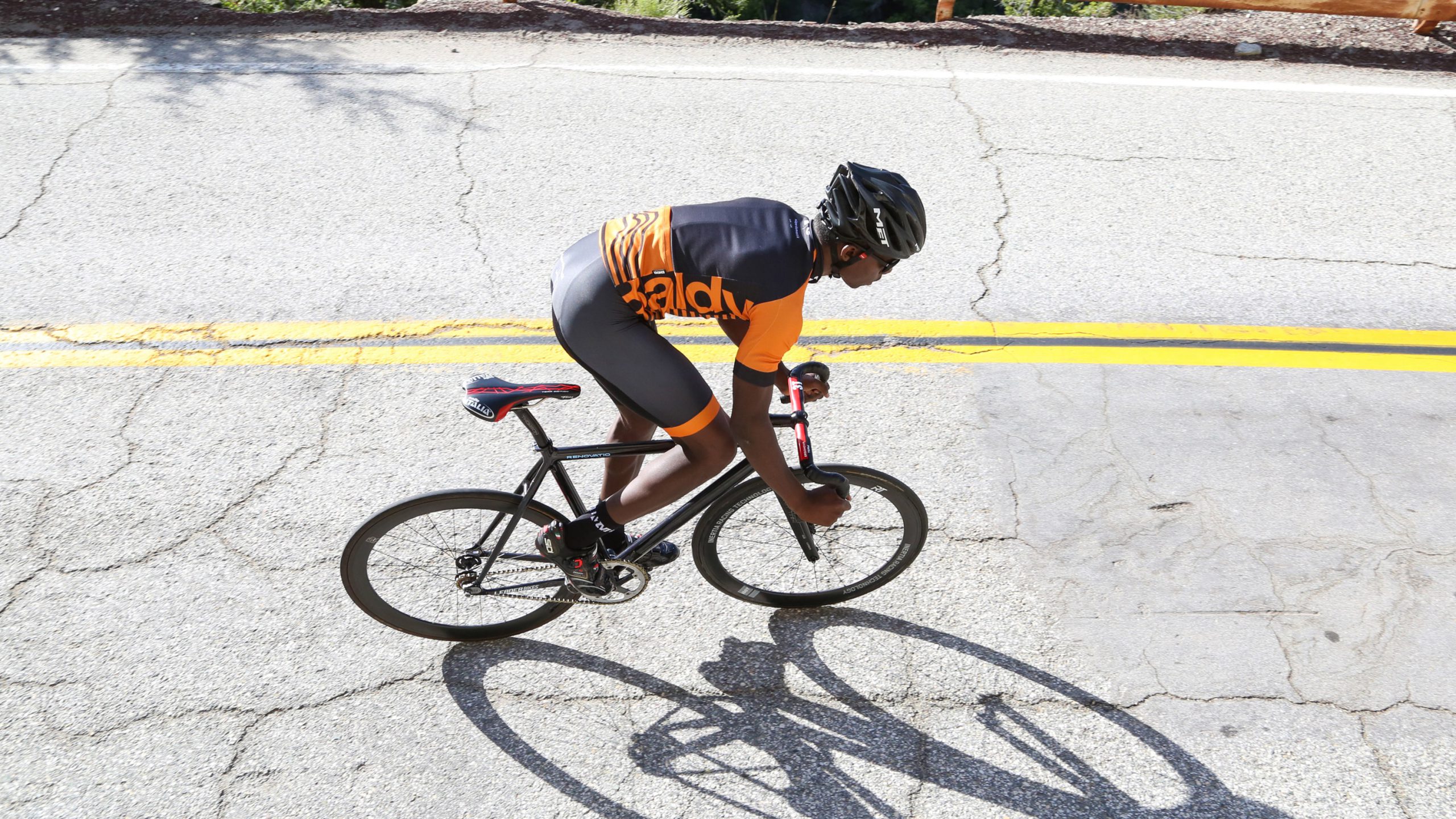
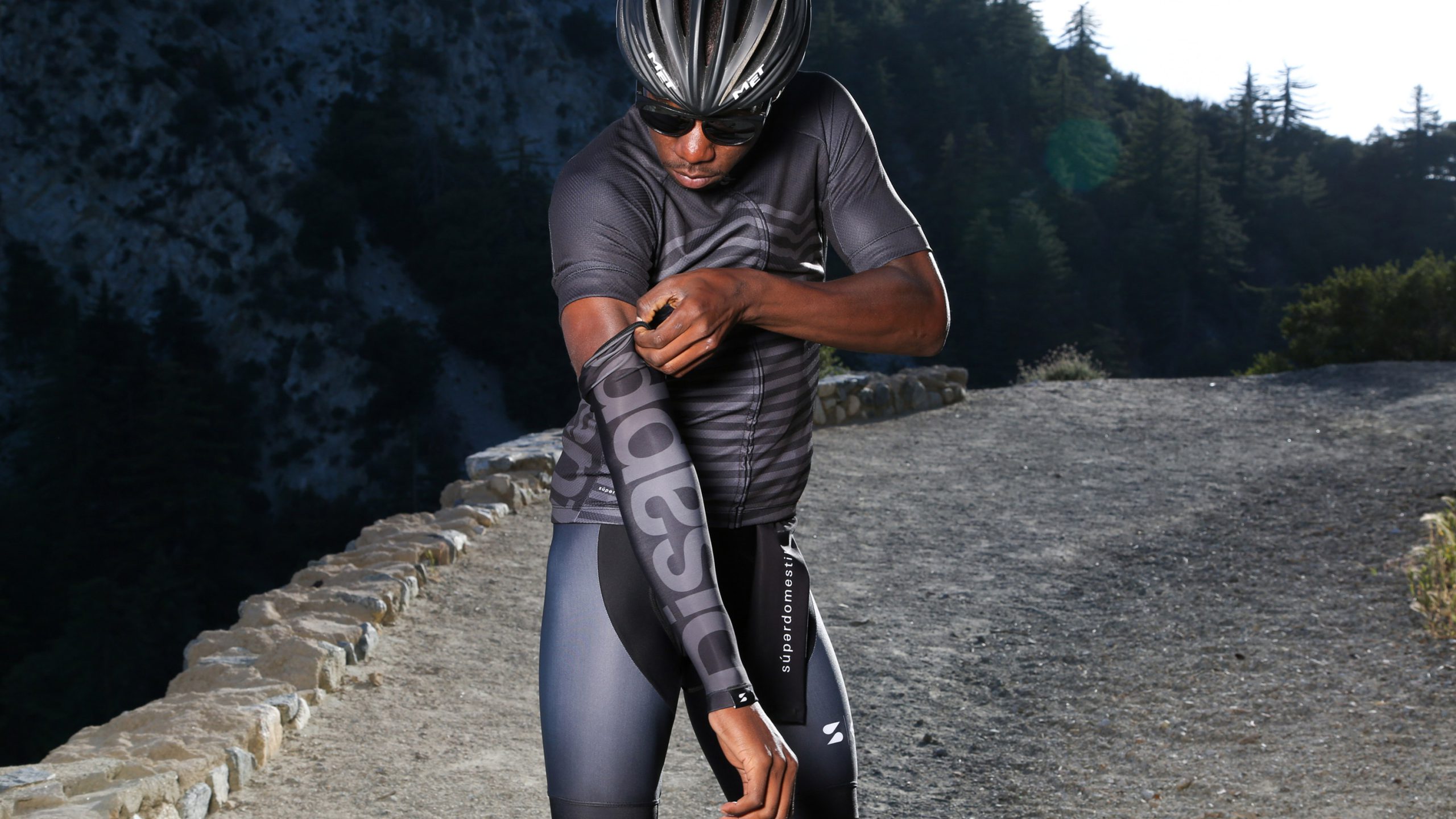
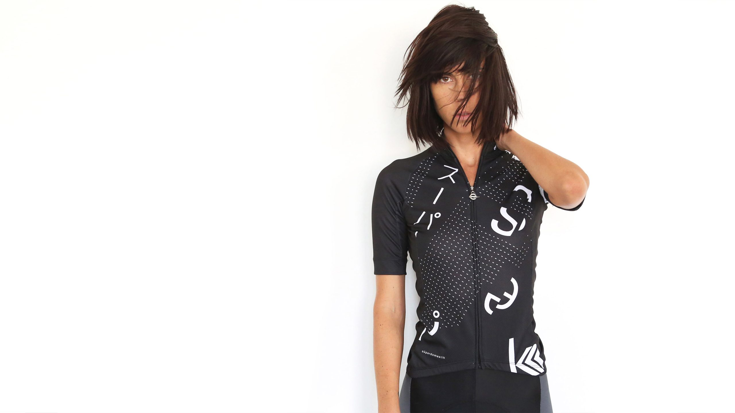
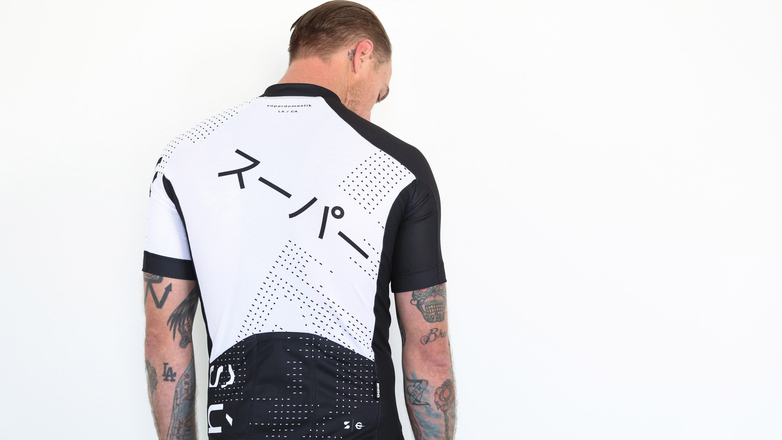
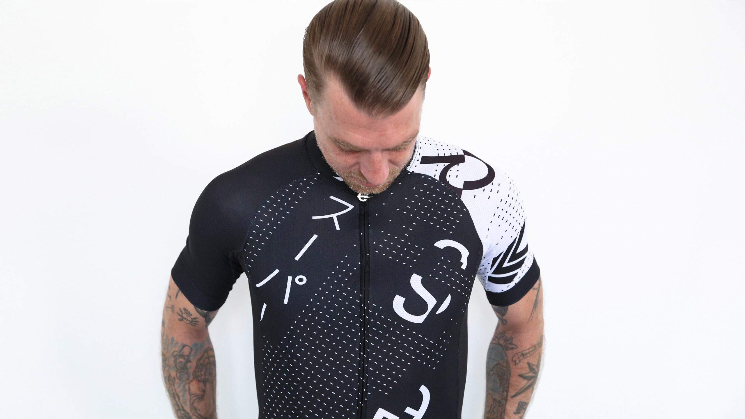
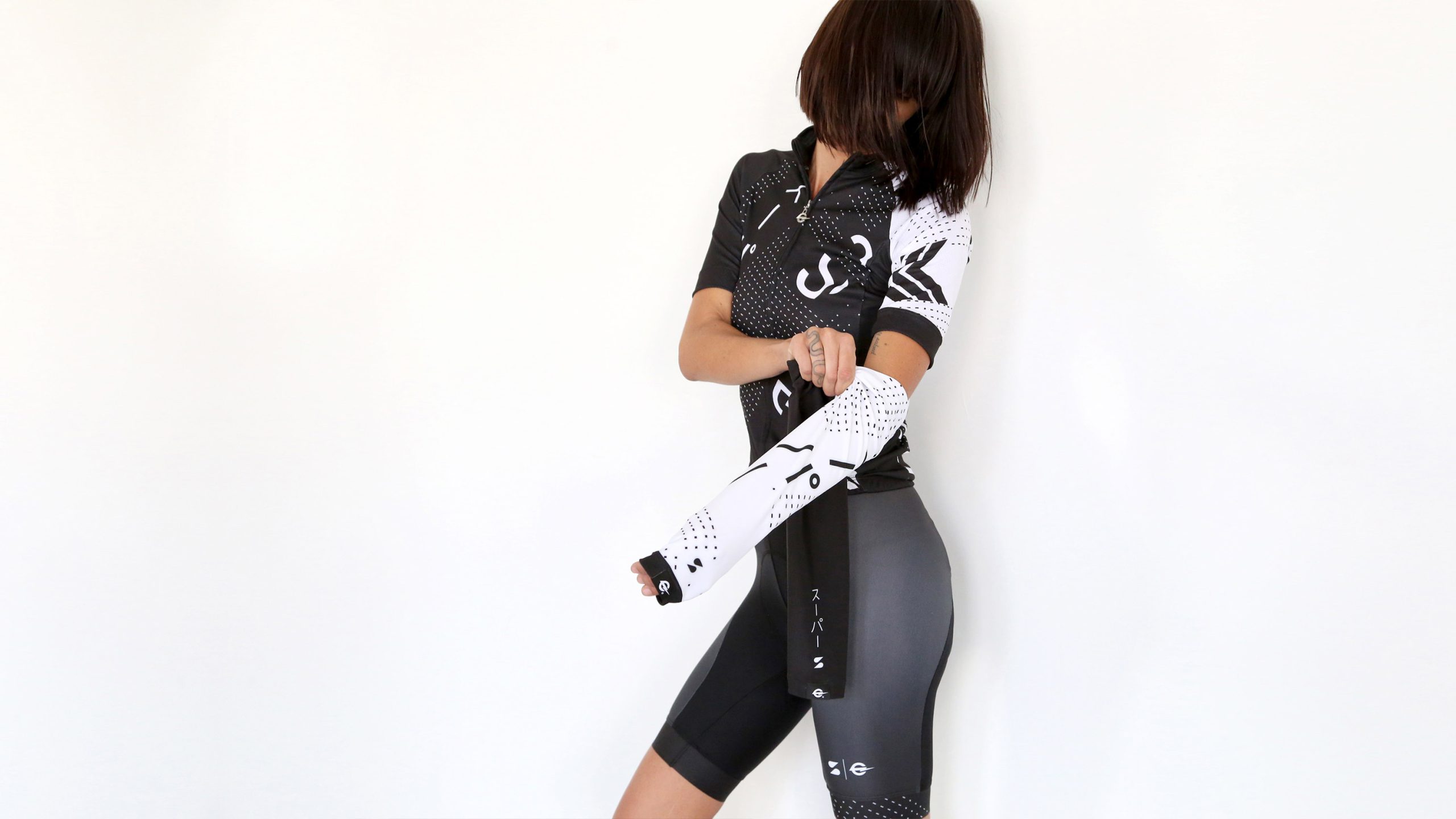
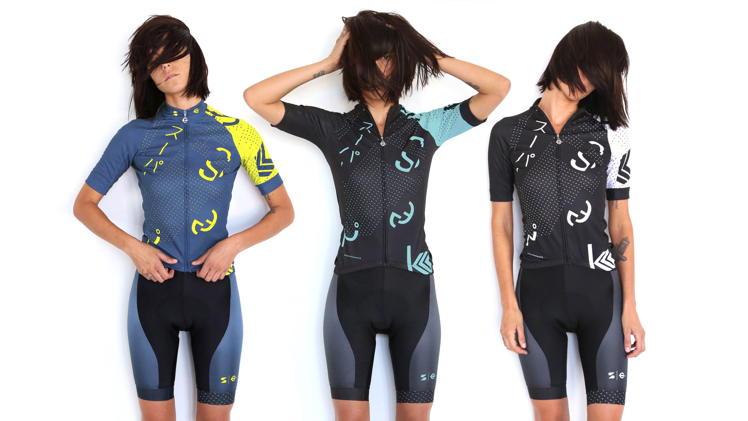
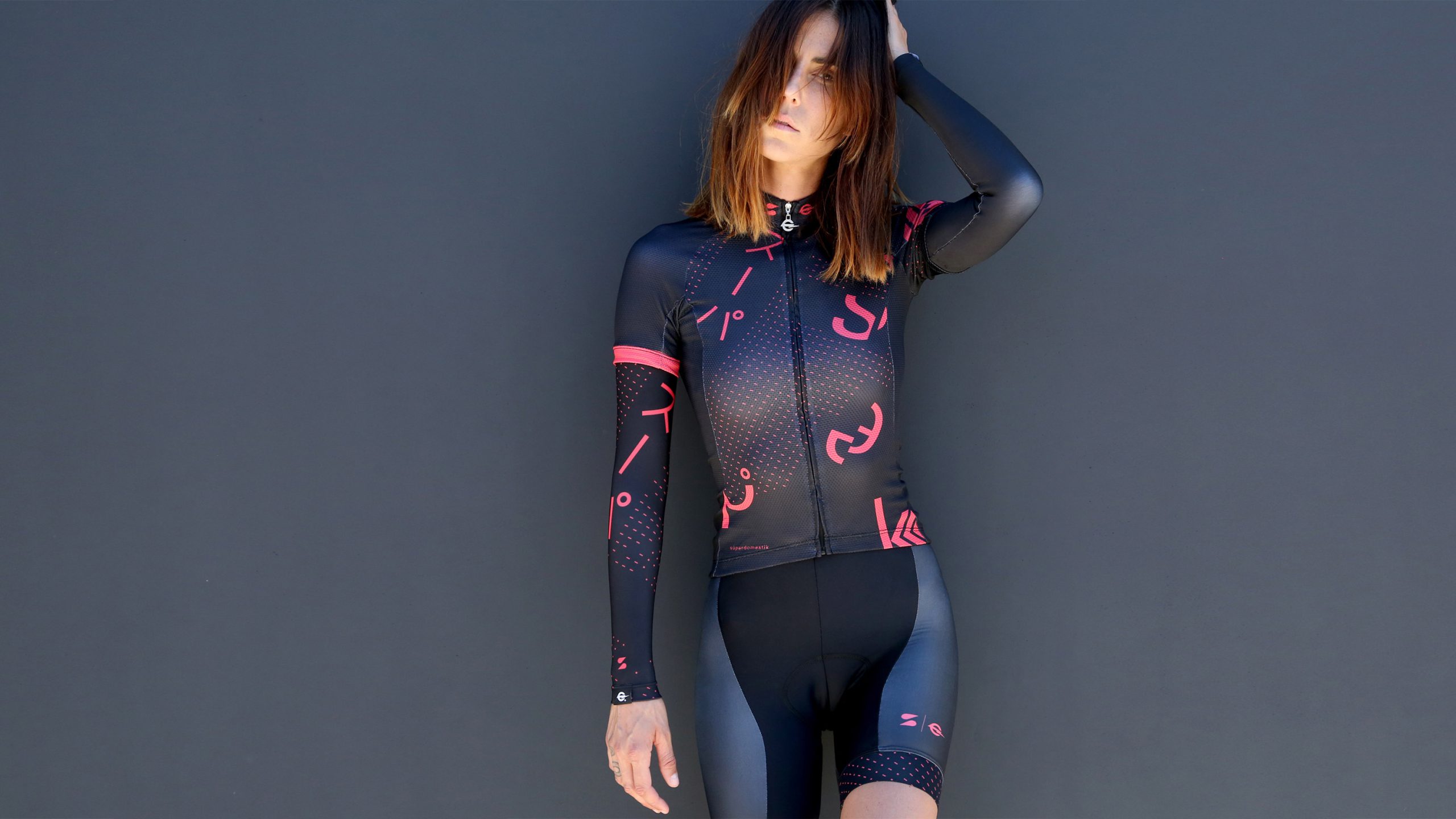
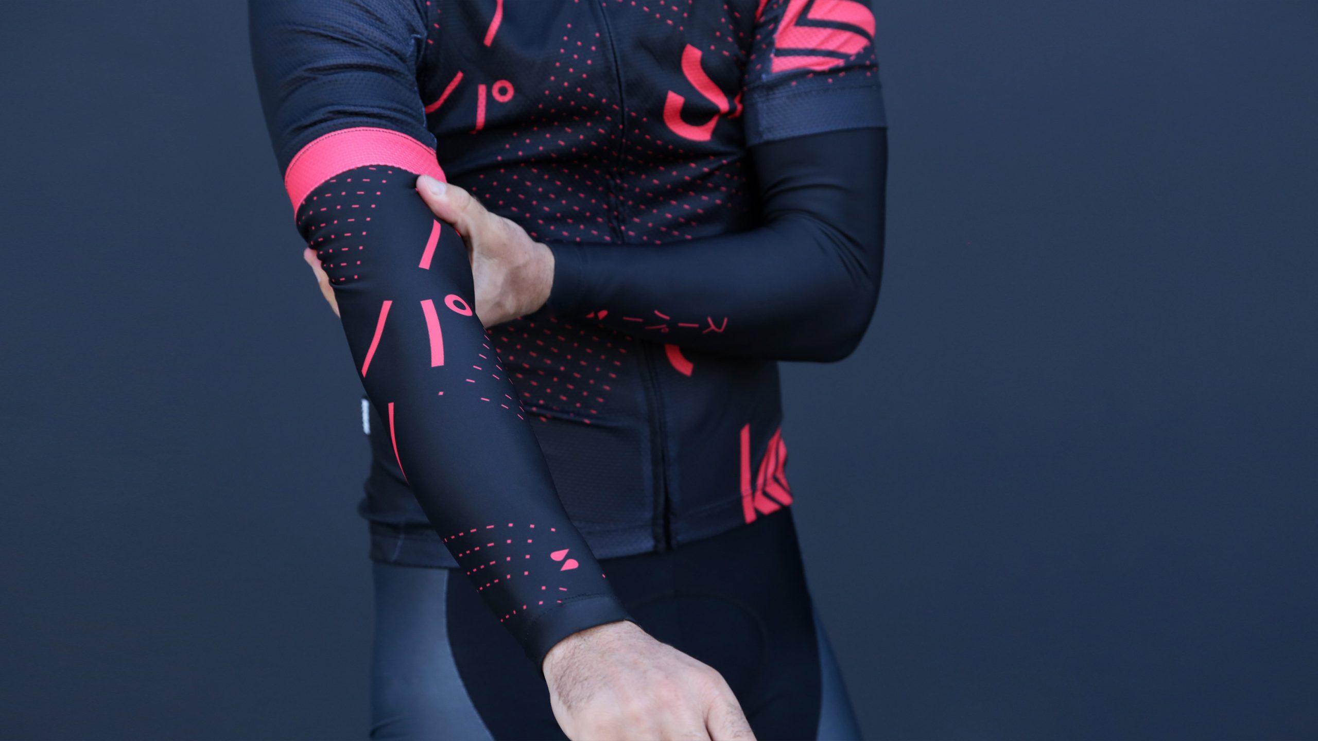
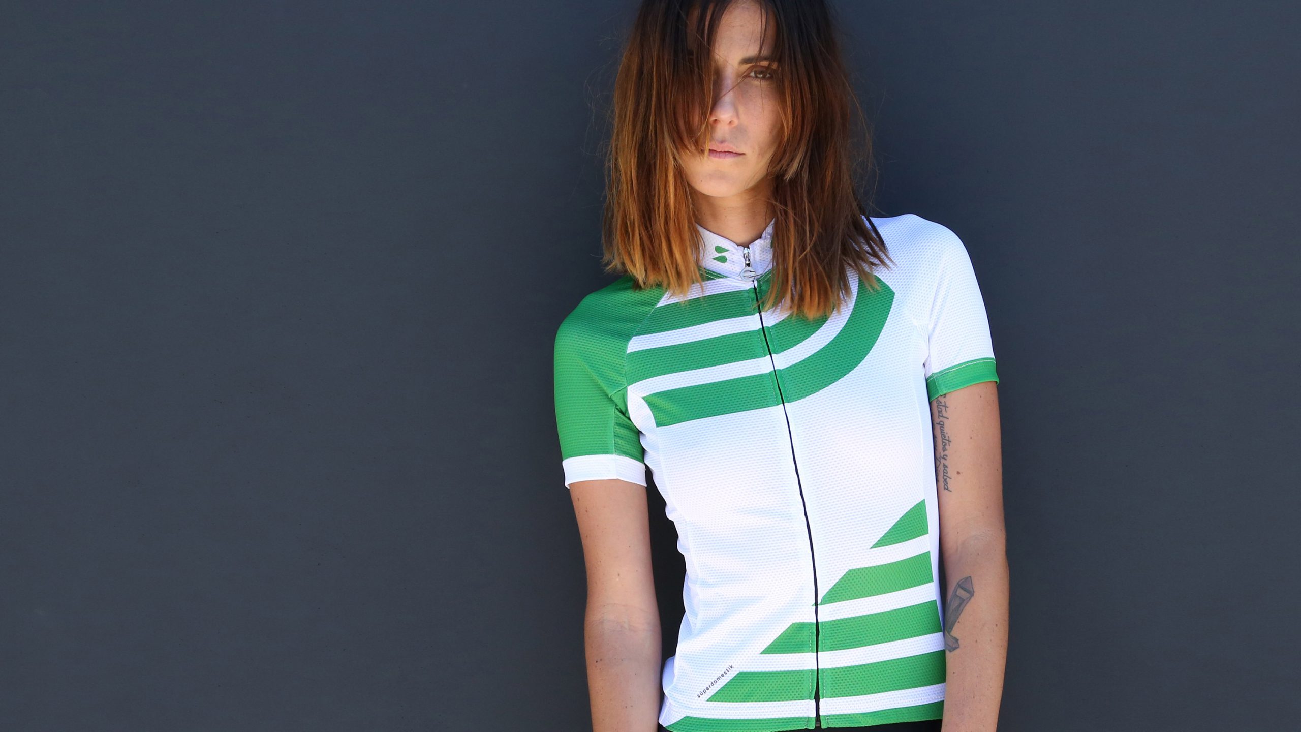
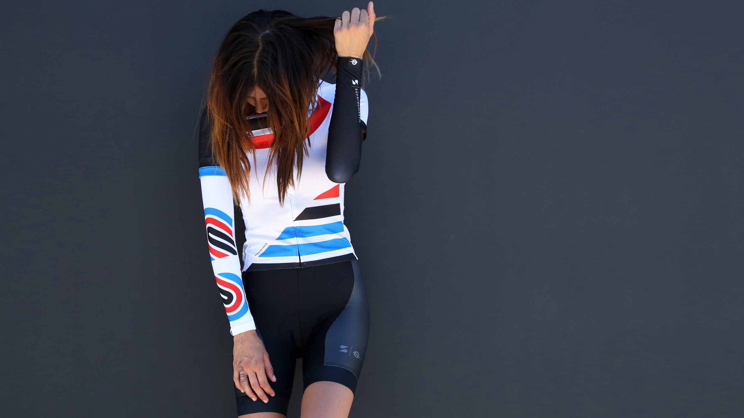
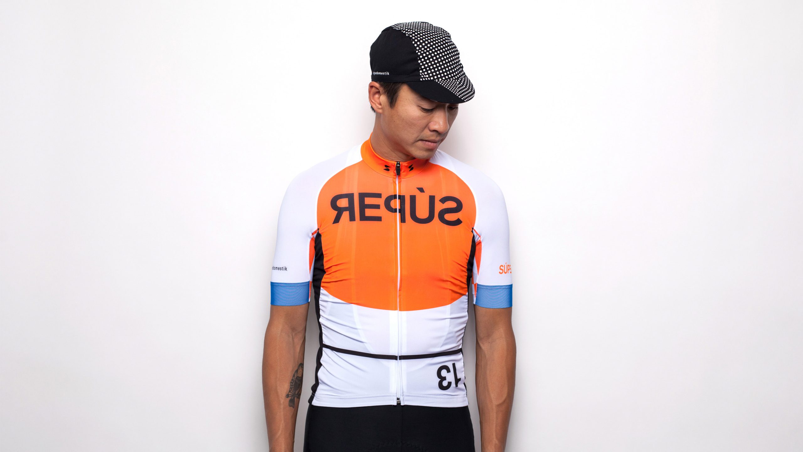
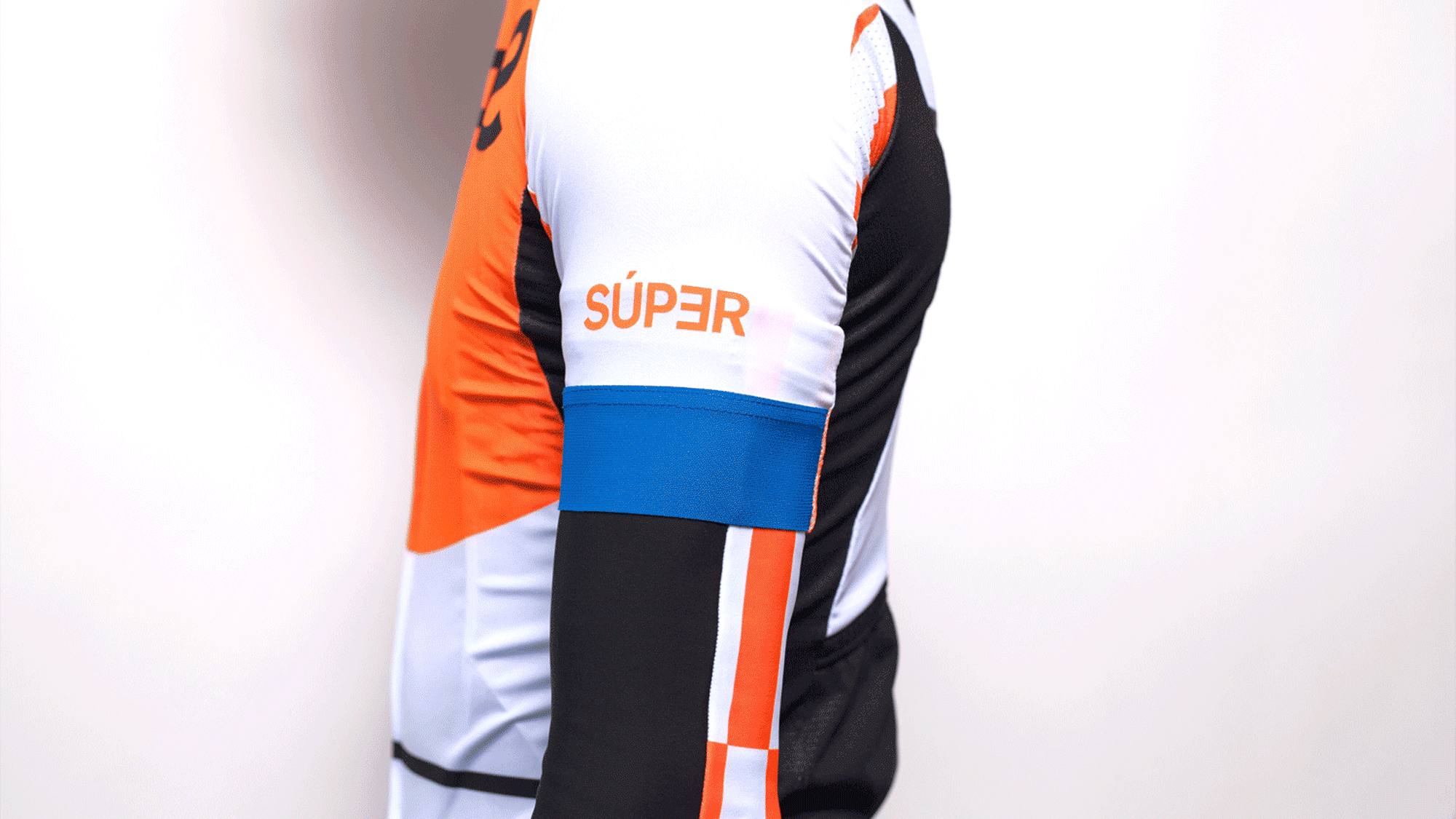
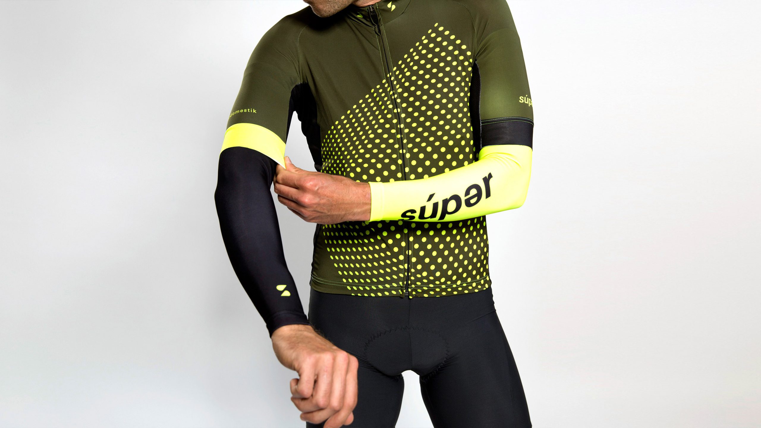
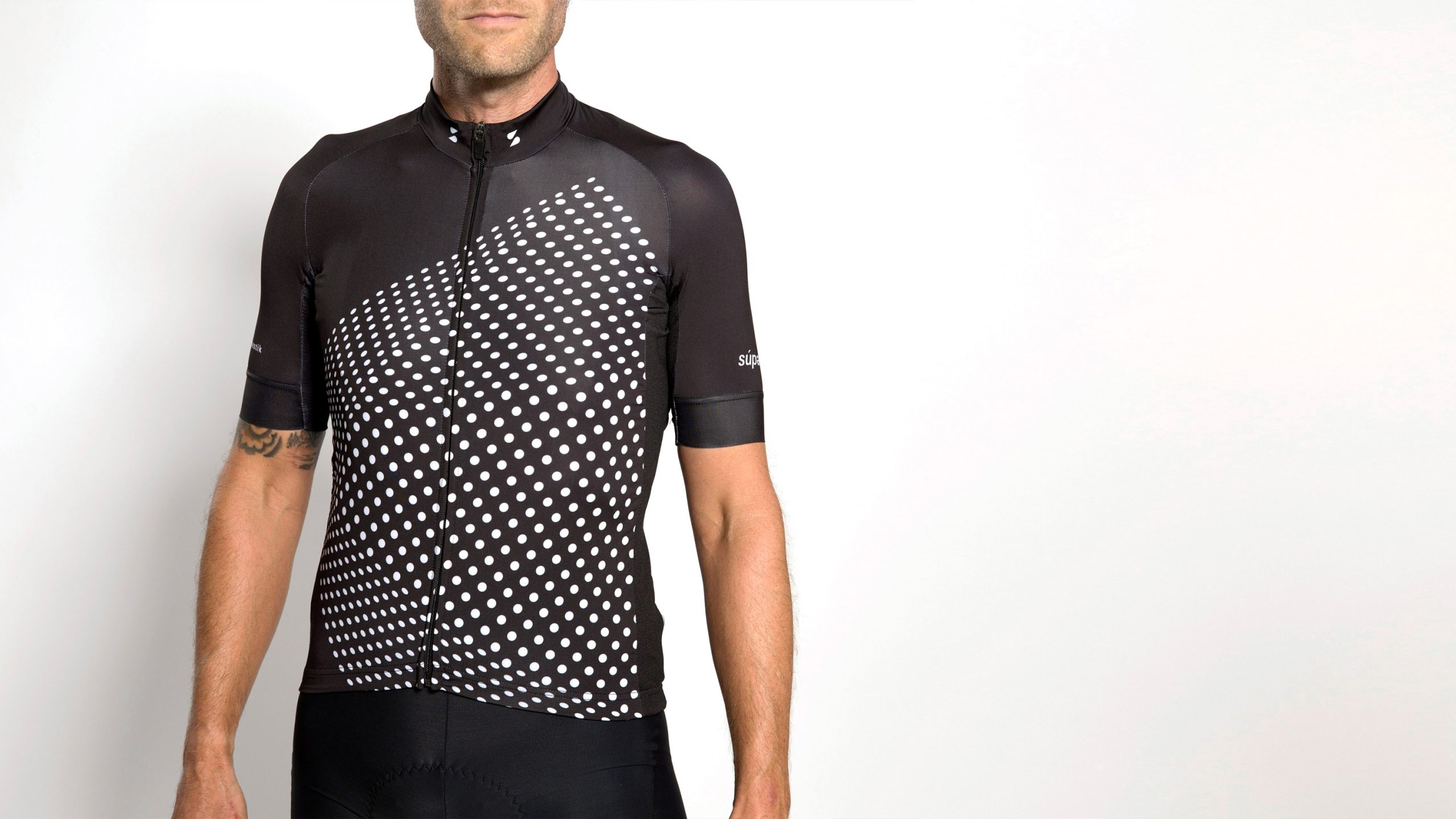
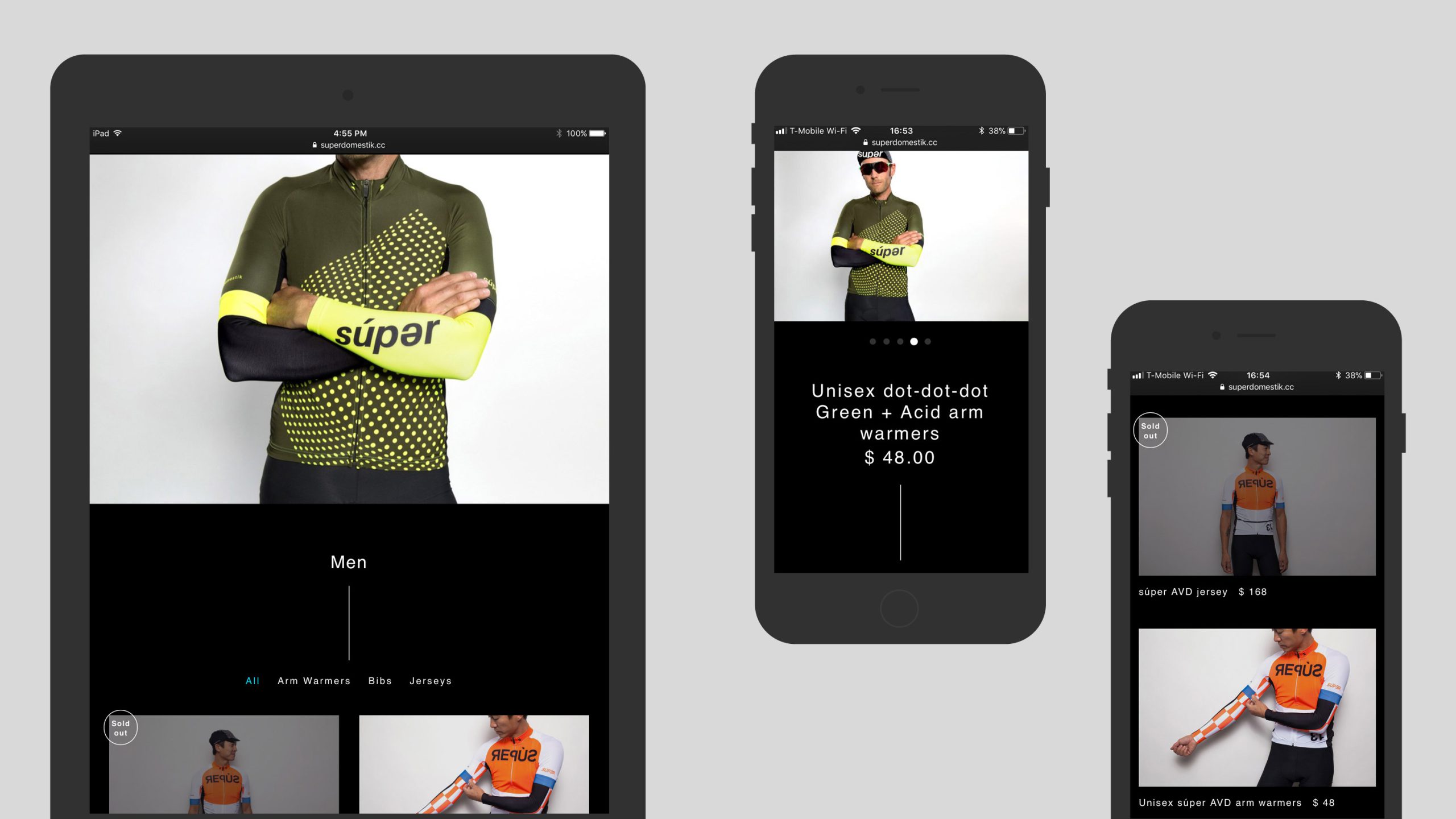
Superdomestik
Archive
2015—2018
Identity for a boutique cycling apparel brand based in Los Angeles, CA. They wanted to scale up their operation and came to us to ask for help with a new identity.
Often in sports apparel a logo can be seen at the wrong orientation, whether it be upside down or going in the wrong direction. We created a simple mark using the S of Súperdomestik that can be read the same whether upside down or not. The logo is flexible enough as a stand alone graphic that can used in various styles and also as the basis to create kit designs from.
Combining our past times with work doesn't happen very often so when the opportunity came up to work with Súperdomestik we jumped at the chance. After carrying out a full rebrand we designed several seasonal collections and special edition pieces.
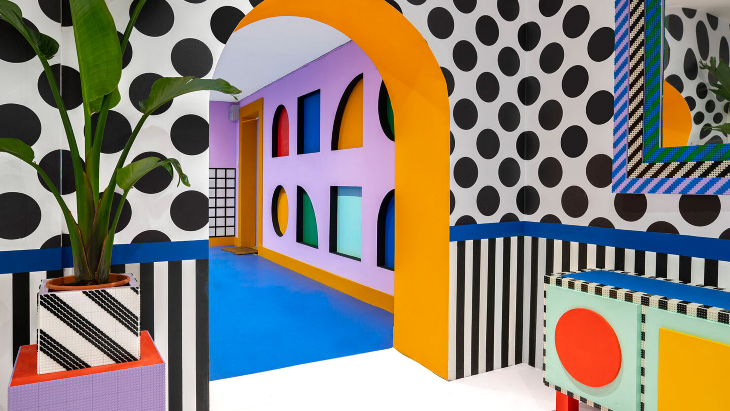
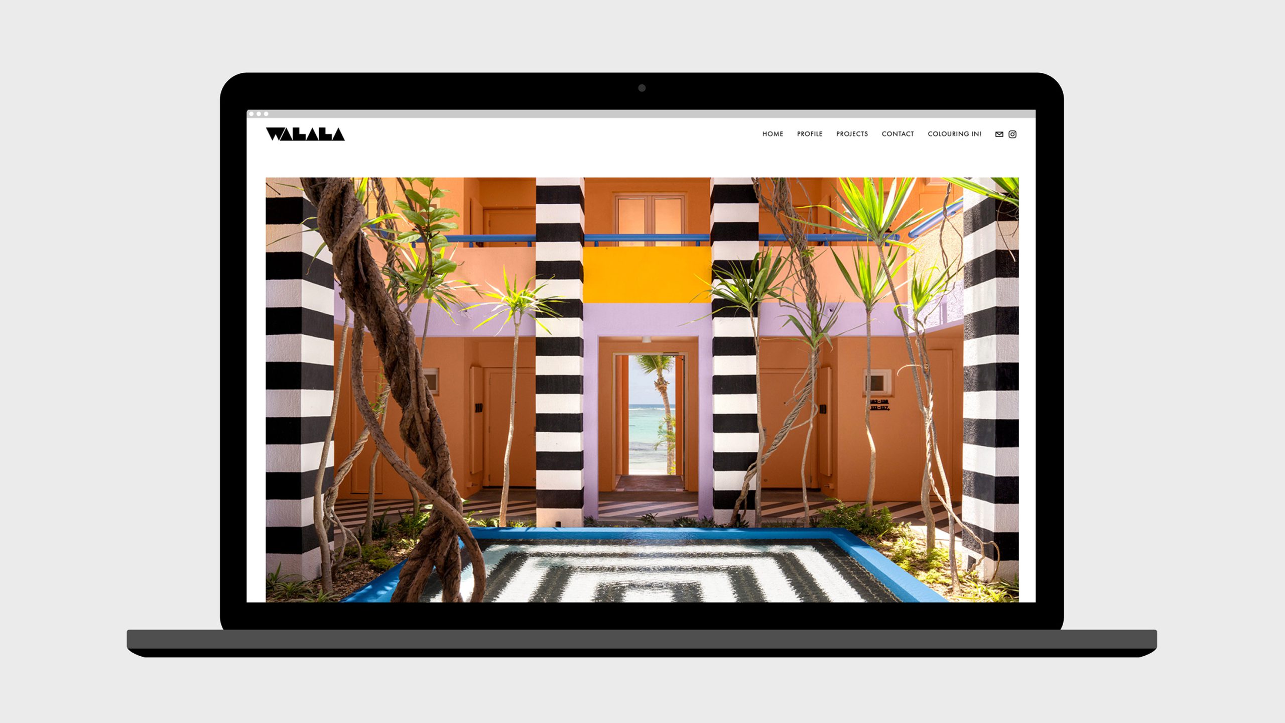
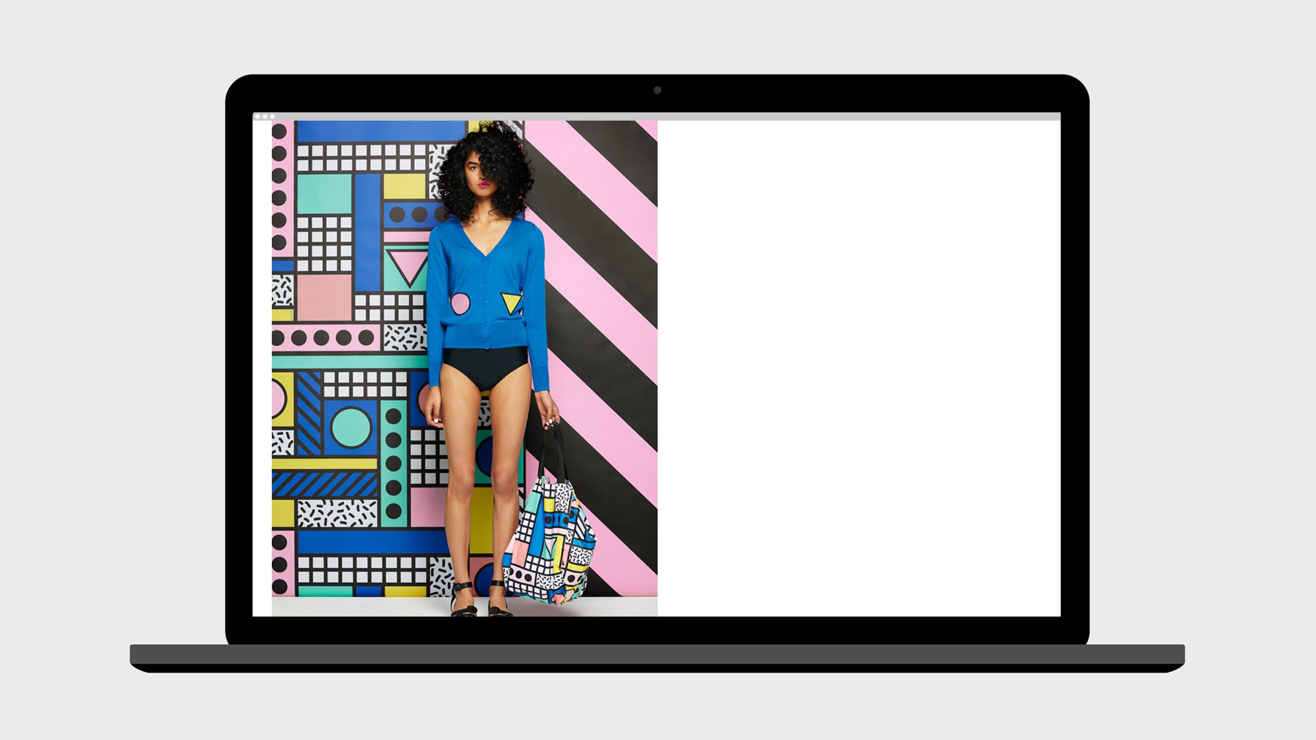
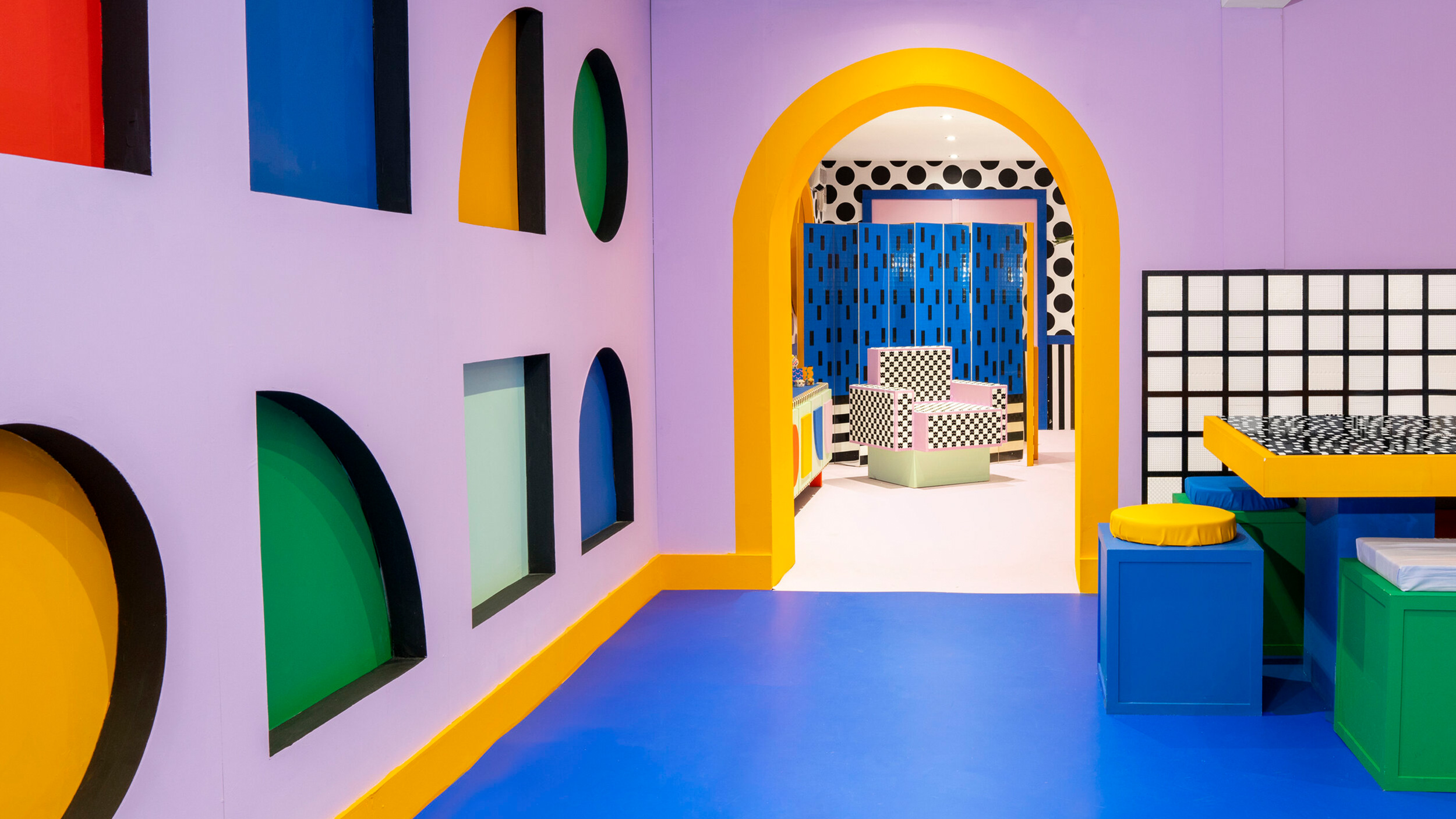
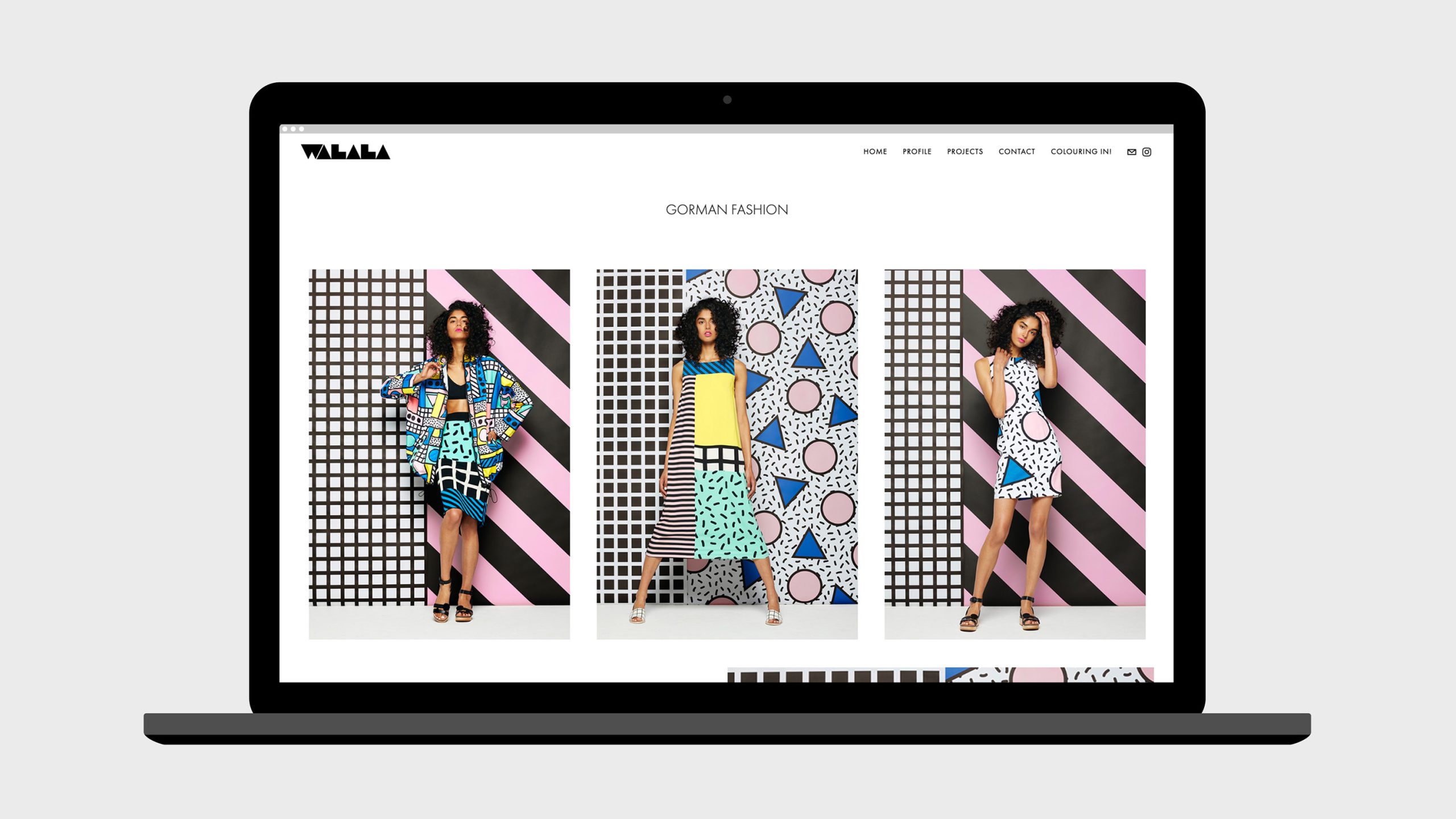
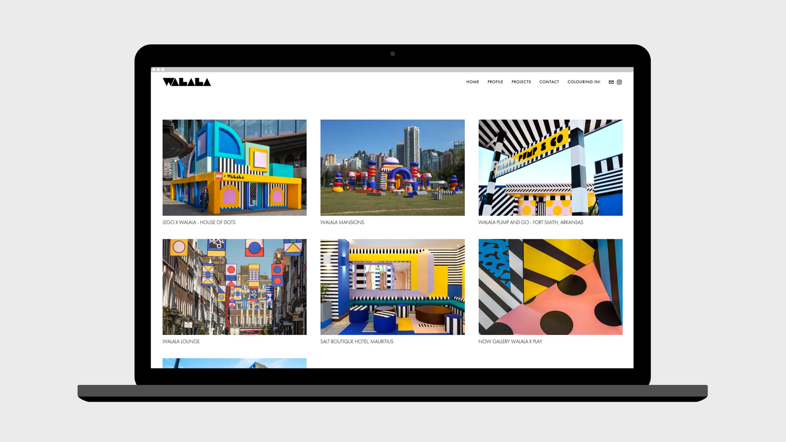
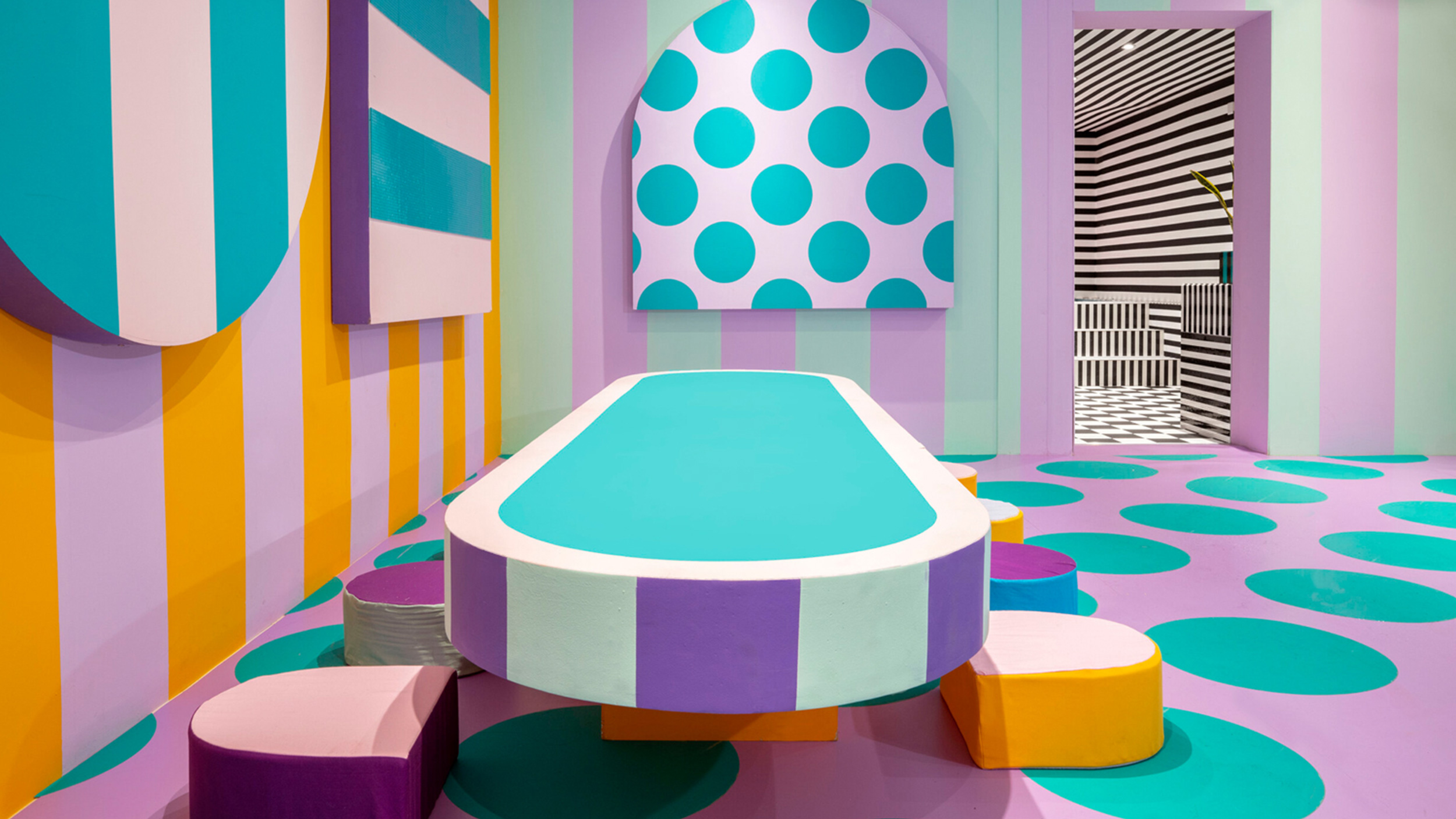
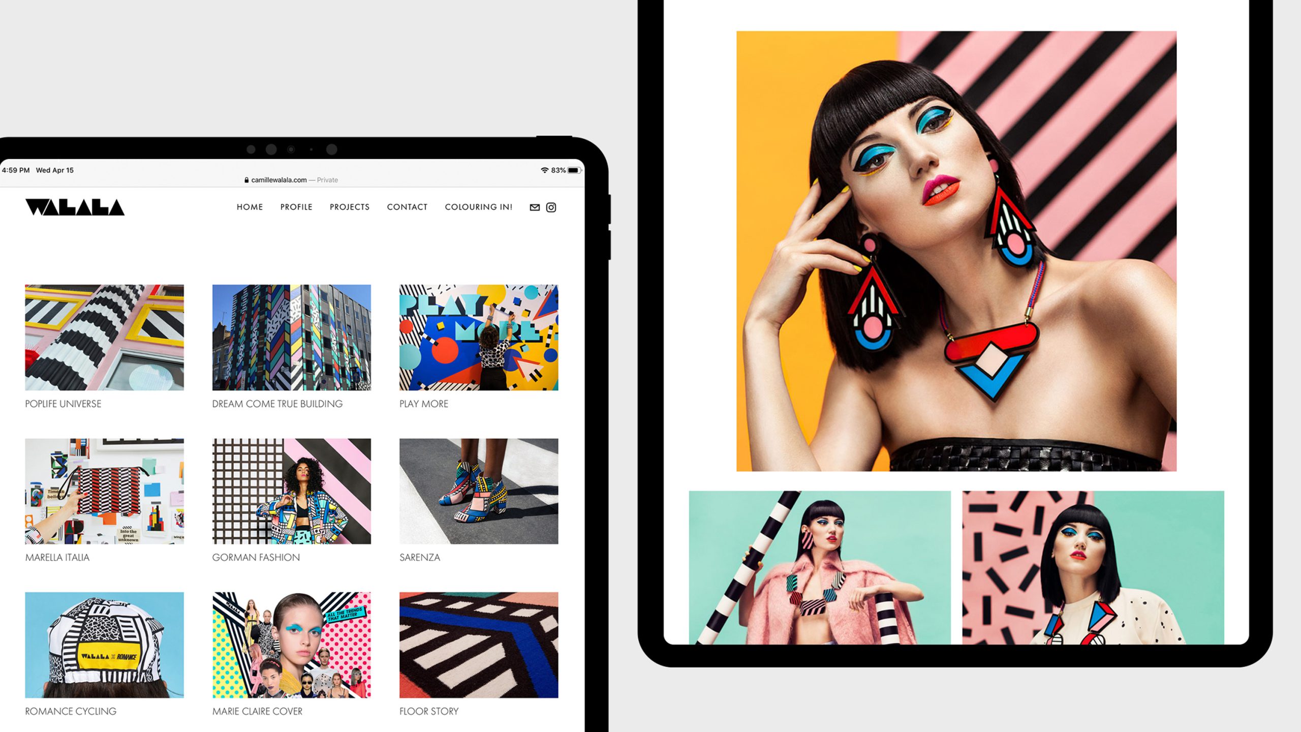
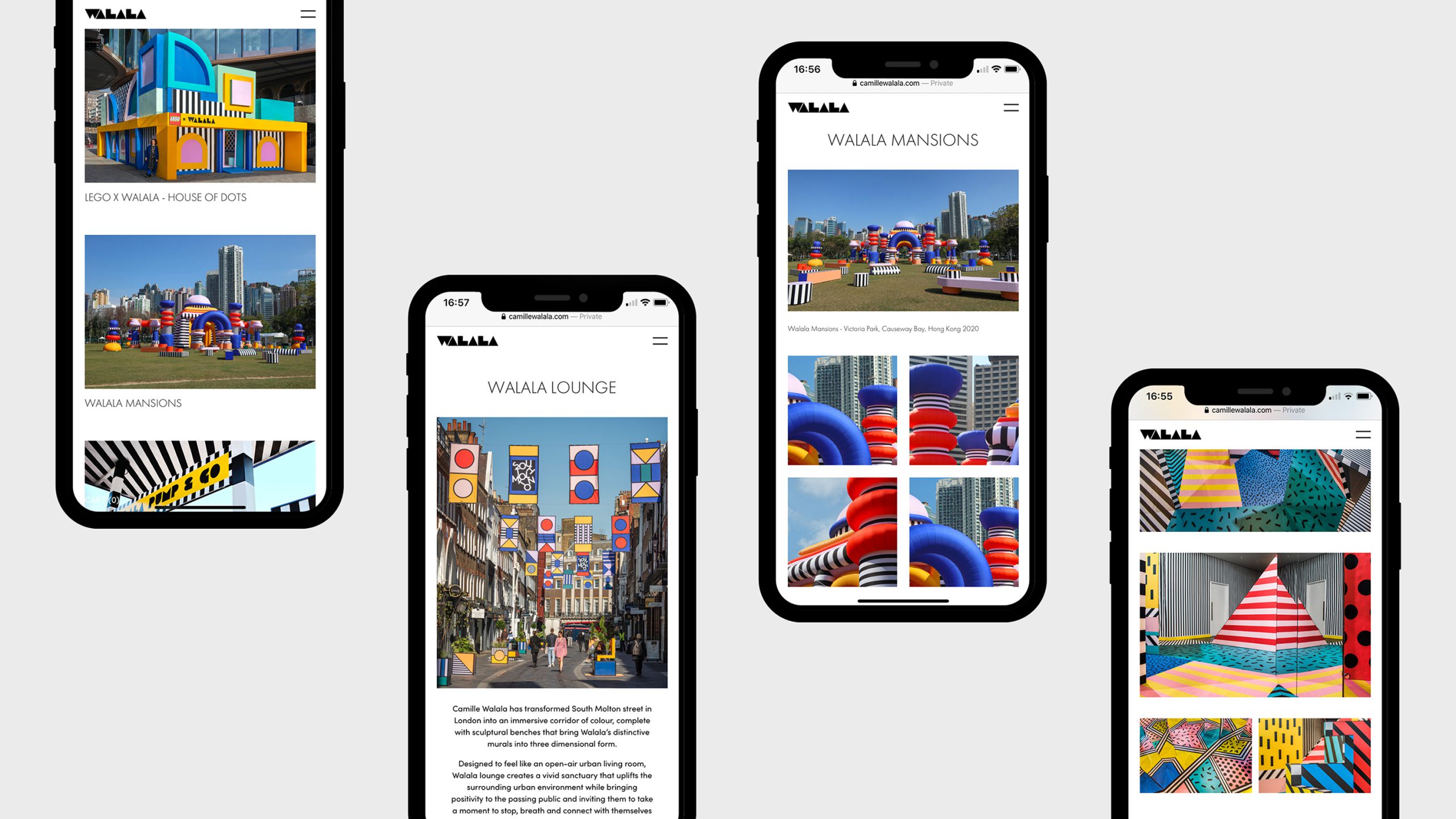
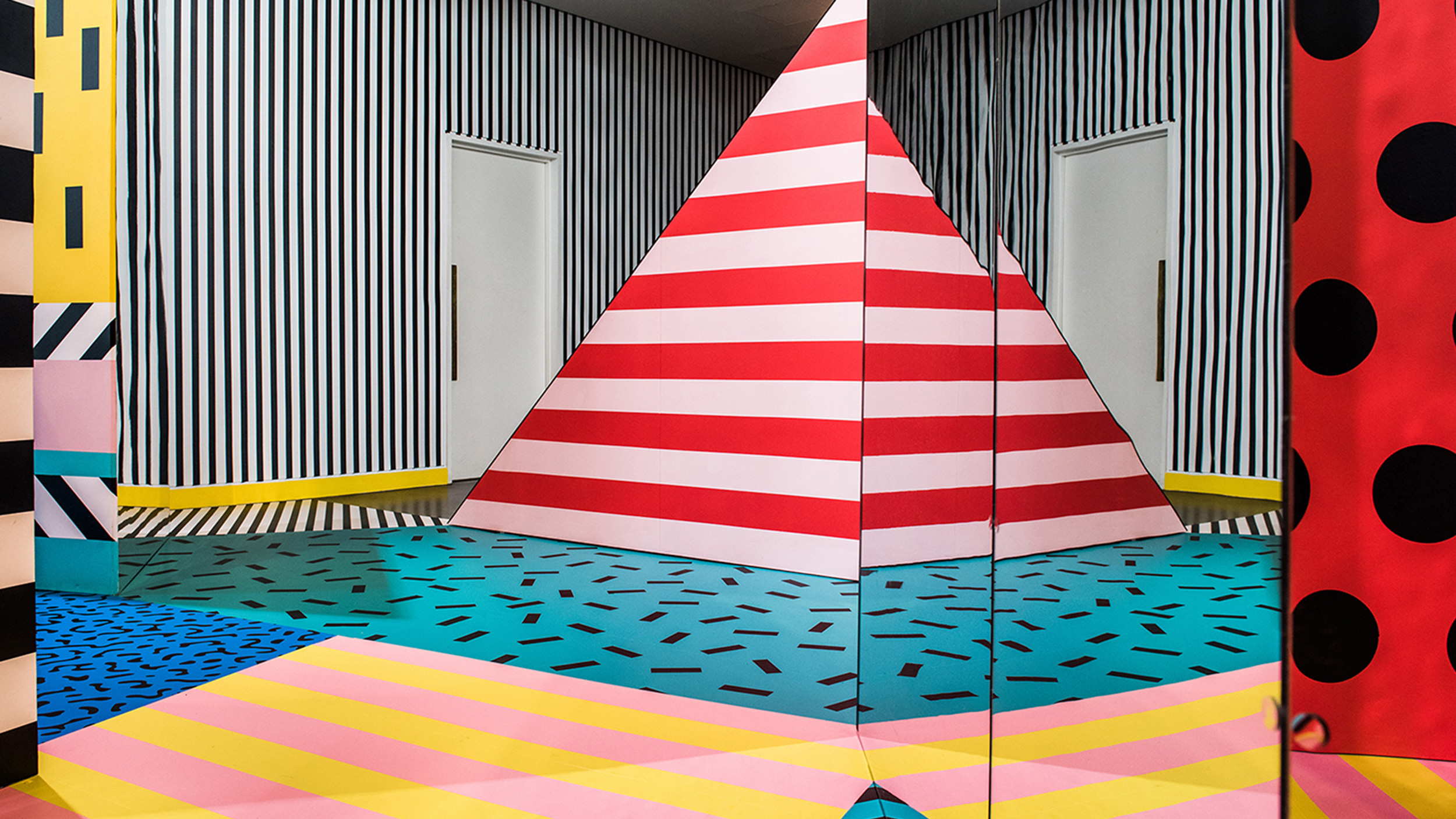
Camile Wallala
Archive
2020
Camille Walala's trademark vibrant colours, bold patterns, typography and geometries create environments that stimulate the senses and inspire joy. We provided a simple, clean and easy to update online platform in which she can showcase those attributes to the full.
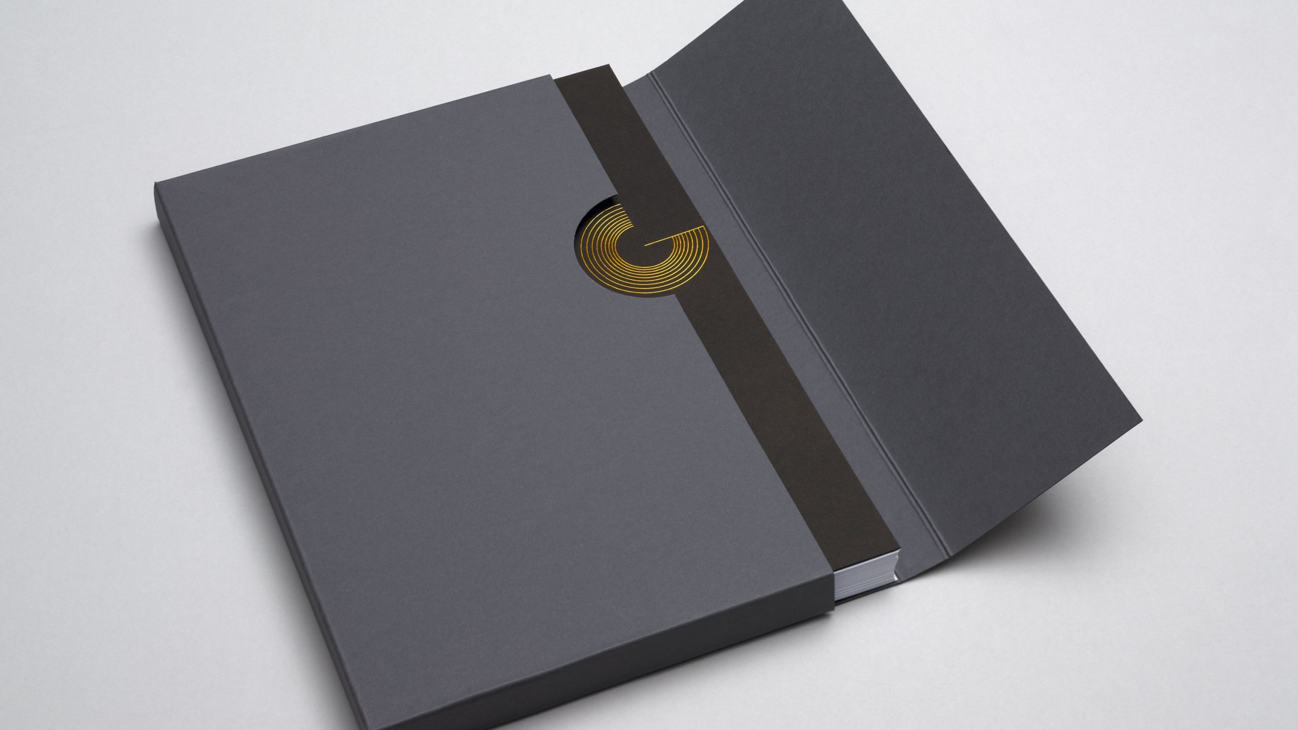
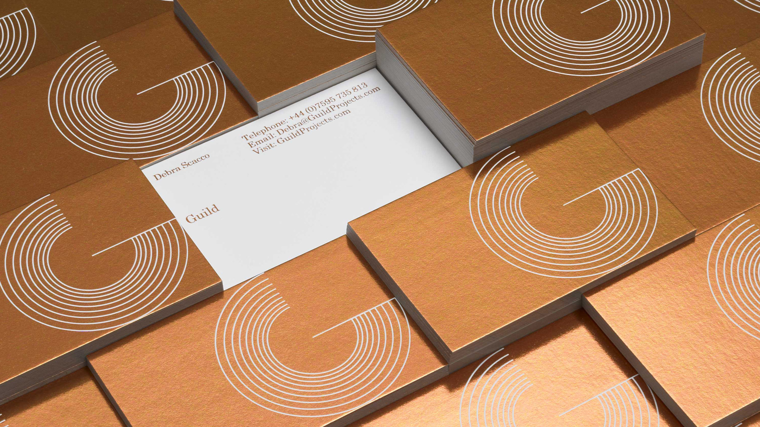
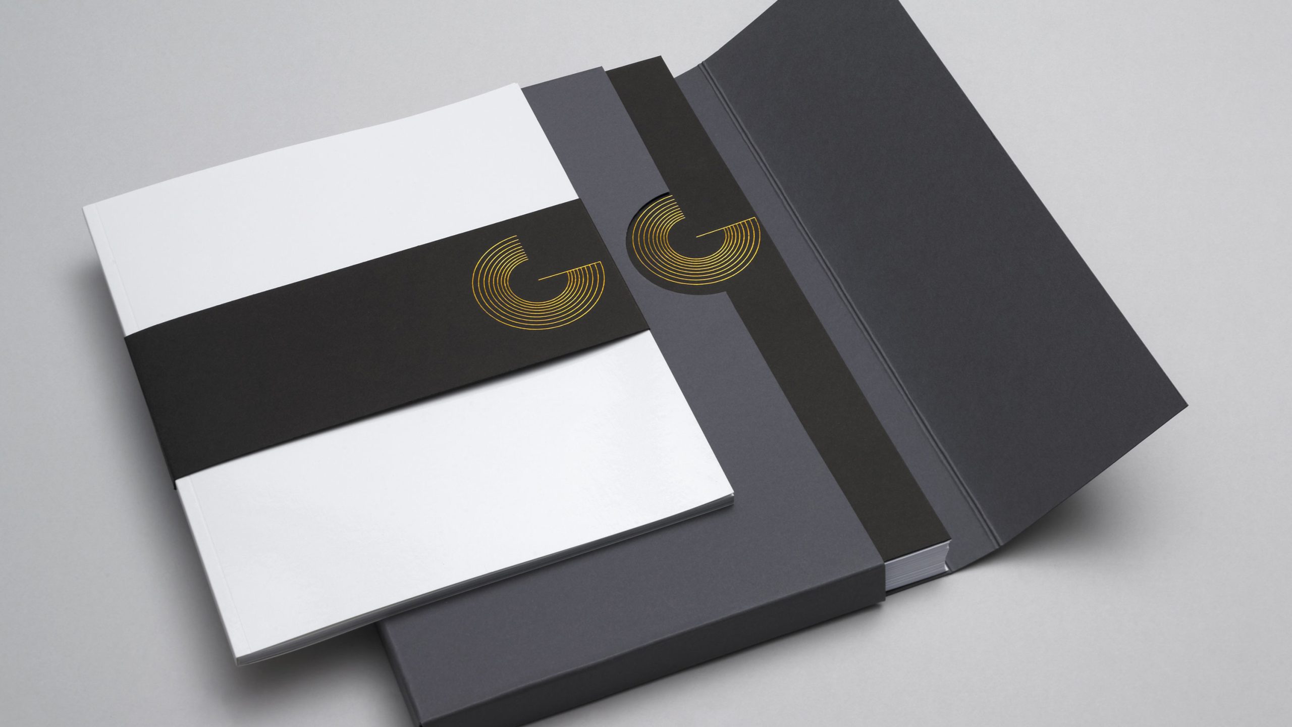
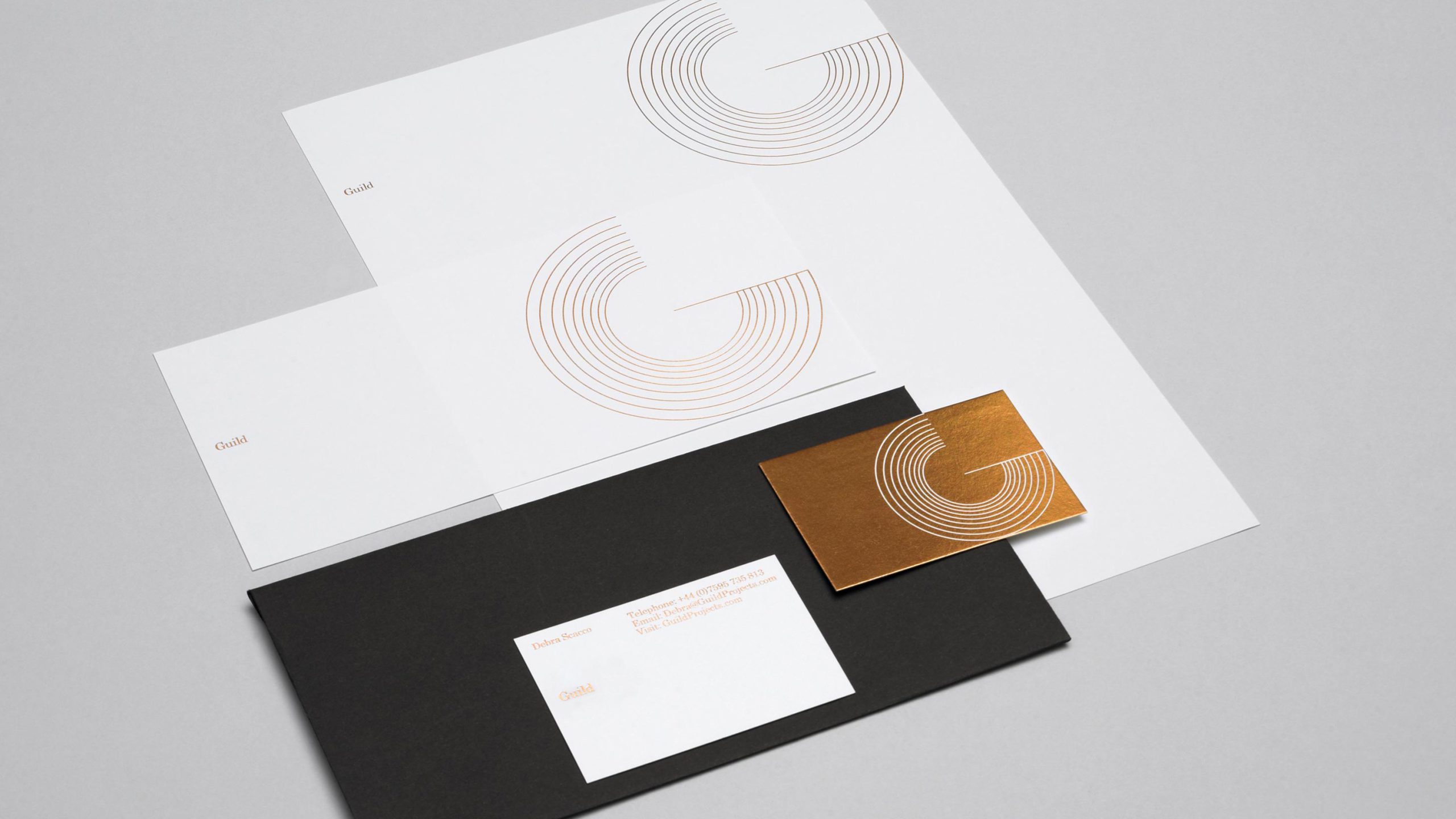
Guild
Archive
2011
Guild was a creative consultancy that assembled, directed and managed tailored creative teams for clients. The brief was to create a brand reflecting heritage and quality while maintaining a modern aesthetic.