
Roche.
Word On The Street.
Roche are one of the world’s largest biotech companies. They came to us to help them with their internal communiations. Specifically their giant screen displays. The brief being to focus on more transformational messaging, continue to build employer brand and celebrate their successes.
Moving away from the previous ‘scattergun’ approach that had lost appeal and interest of their employees we had to find a new framework that would allow focused content to be shown, but also have wide scope and appeal.
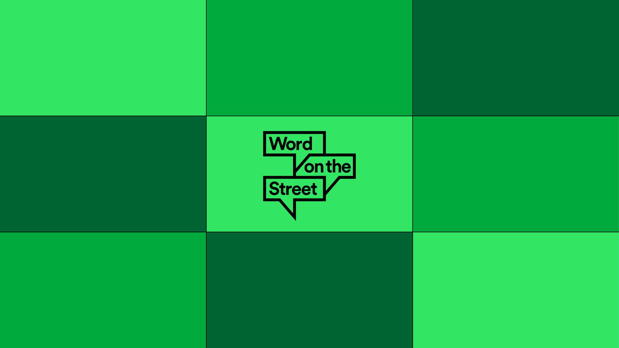
Roche reception areas have a huge bank of 9 screens. We created a way of using them that was more stimulating for the viewer. Display imagery can use the entire surface view available, imagery can be split up into seperate screens and informational copy can be integrated on others. Also (and our favourite part) was showing dynamic and unusual crops of certain imagery repeated within itself across the entire wall.
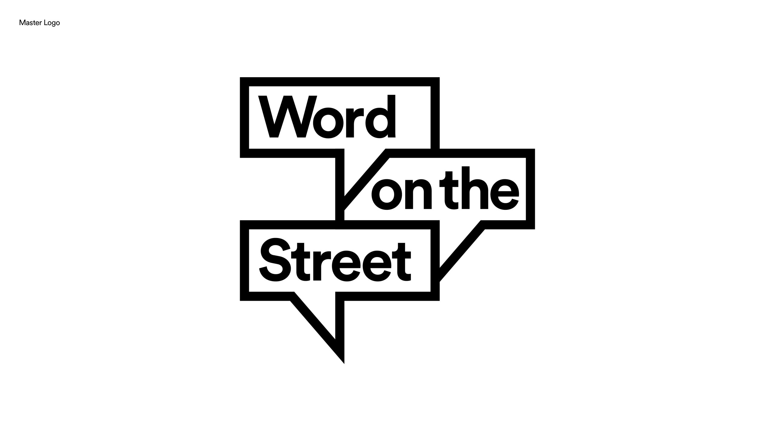
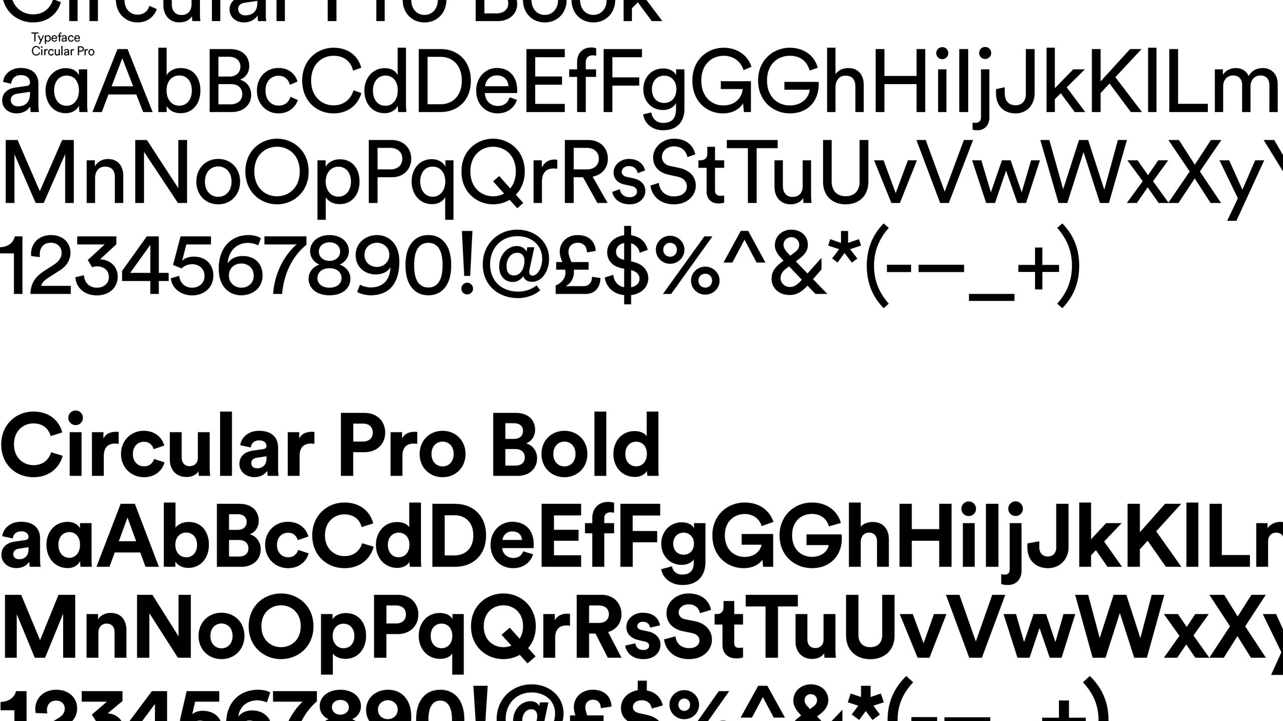
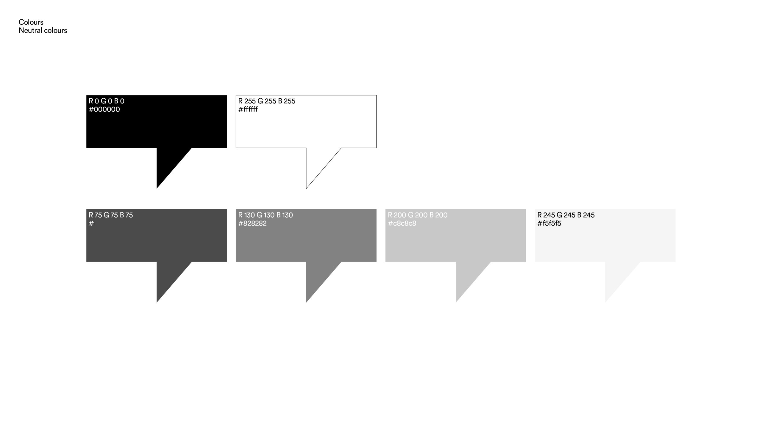
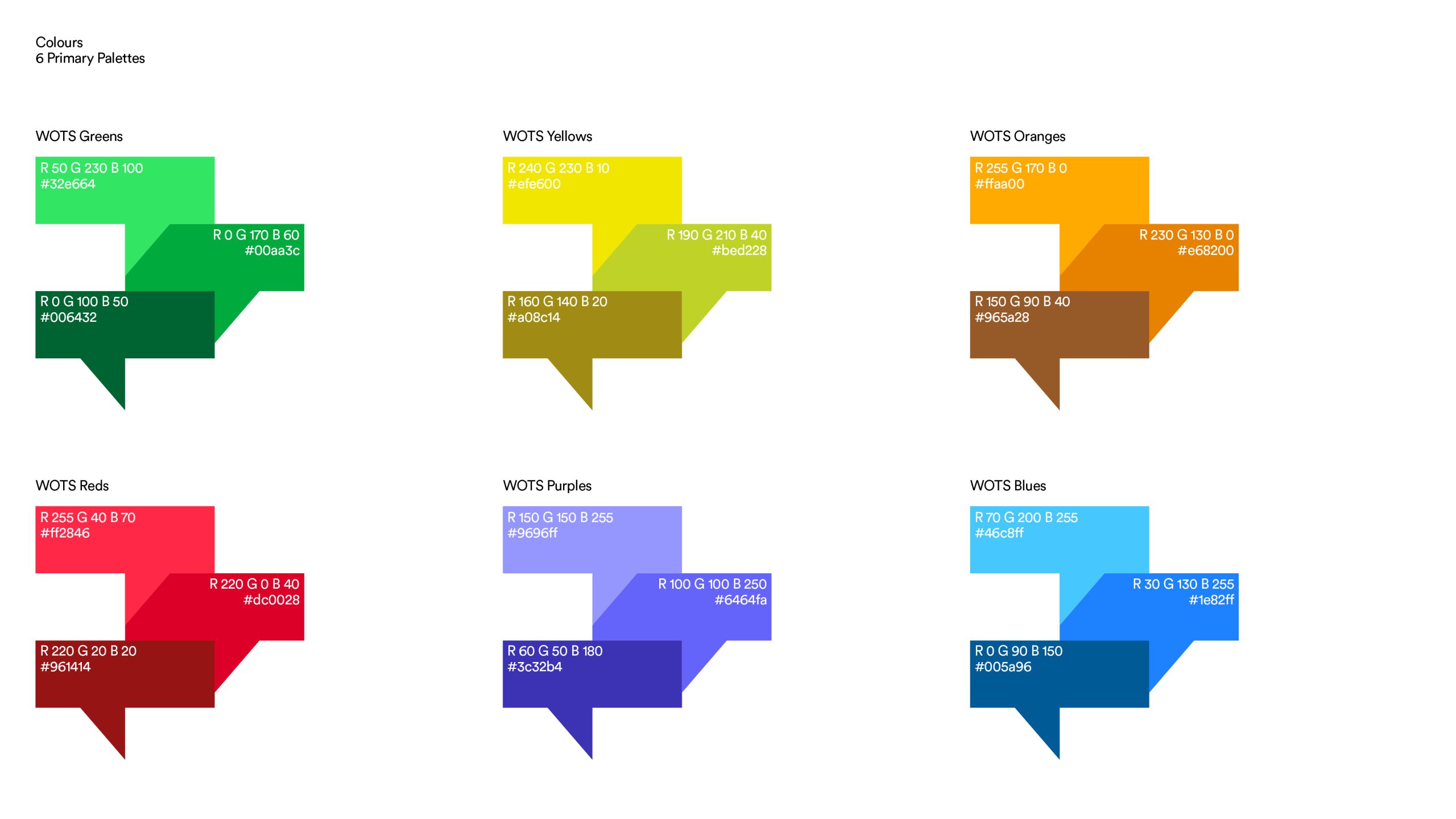
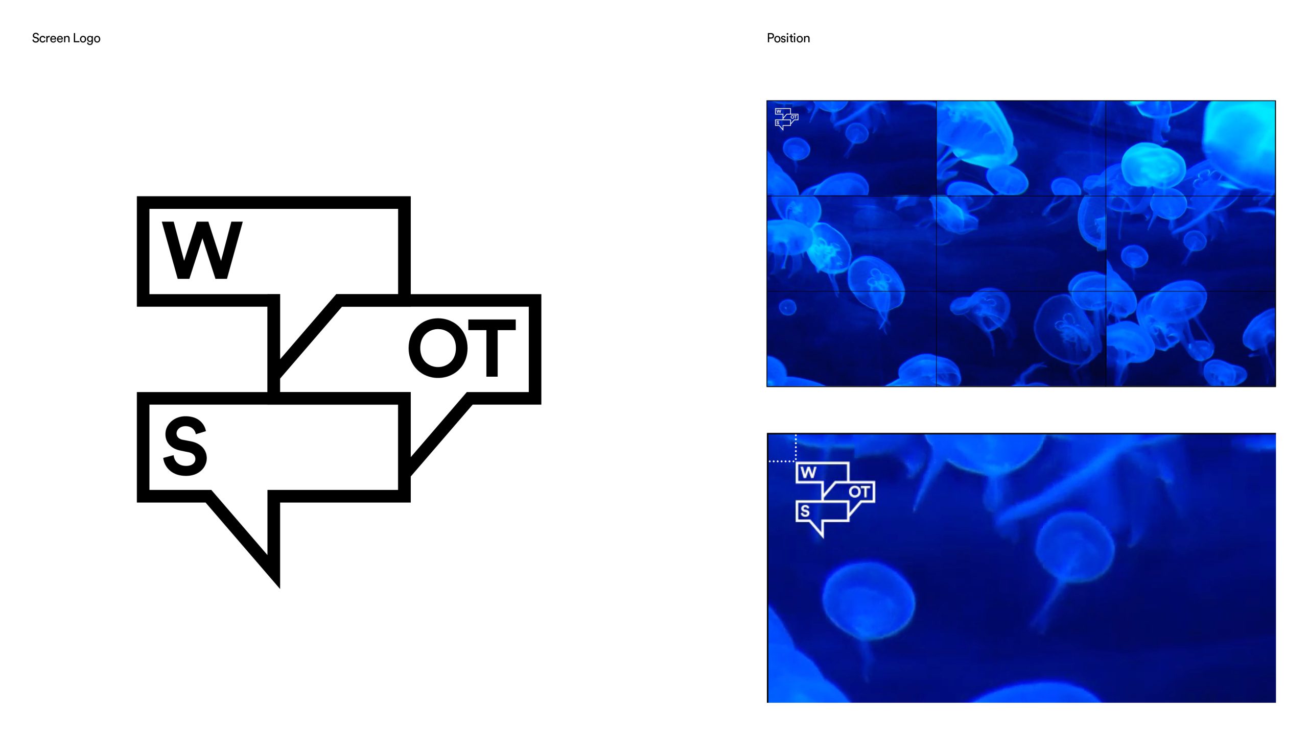
Creating a new identity for the overall project was invaluable. A logo, typeface and colour palette would give a level of cohesiveness, and distinction that the initiative deserved.
A set of themes with different topics were chosen that act as a way to edit new content. These themes will range from nature and envronment to technology and science. All are based on the idea of transformation and connecting to what is relevant and important to both Roche and wider society at the present time.
Work carried out
—
Logo design
Identity design
Animation design
Art direction
Relevant work
Oxera

Basadur