Oxera.
Defining the ‘x’ factor.
Oxera advise companies, policy makers, regulators and lawyers on any economic issue connected with competition, finance or regulation. They are one of the largest and most respected companies in their field, attracting the best economic thinkers in the business.
After carrying out a full rebrand in 2013 Oxera came back for a refresh. A rapid rise in staff coupled with new offices throughout europe and new opportunities made Oxera realise that comminication both internally and externally was equally important.
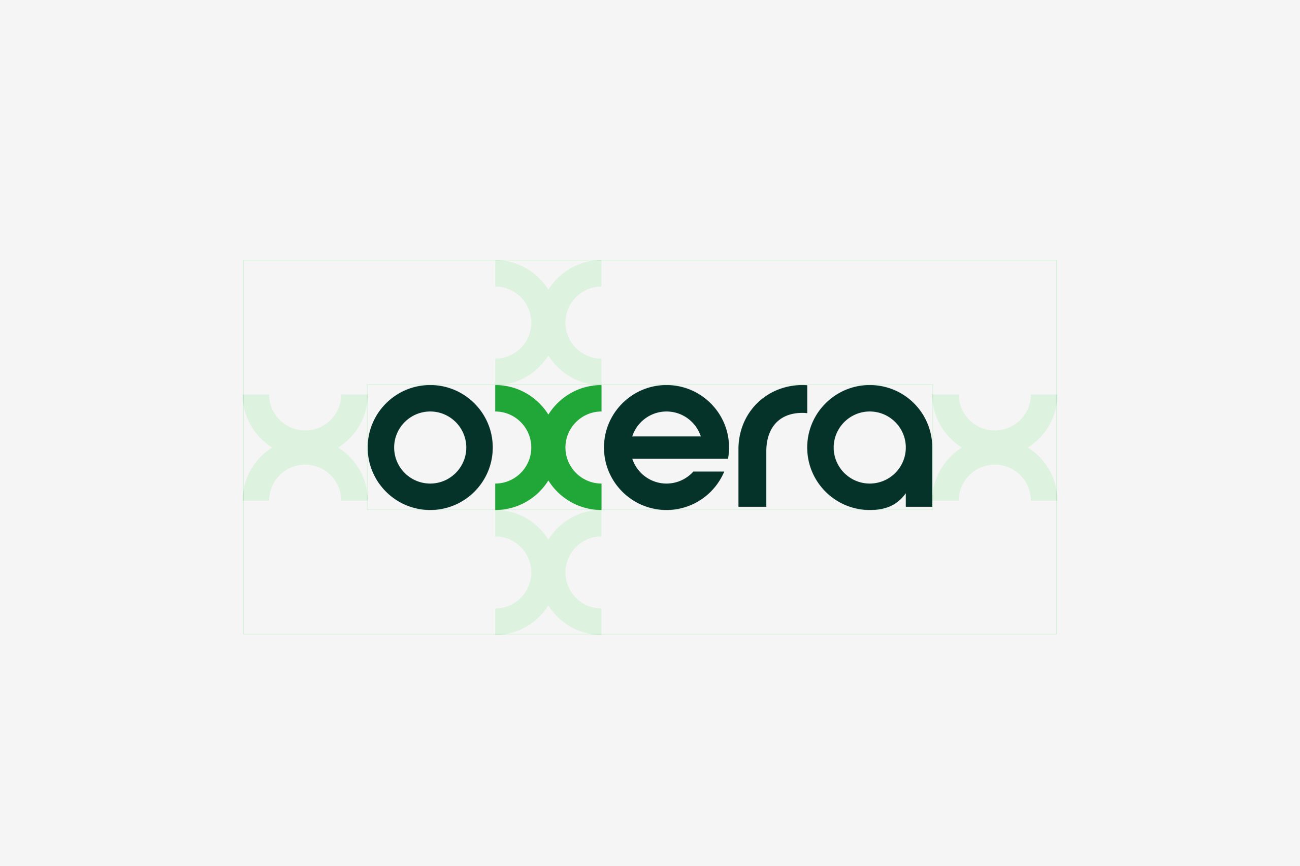
It was decided from the off that the original logo we designed was to be retained. What clients want from Oxera to a certain extent are the answers to problems that are difficult to define - they want the x factor. From the idea of defining ‘x’, this logo almost designed itself. The fact that the name of the company has an ‘x’ in it, and that they deal in numbers, variables and equations presented an obvious opportunity. Learning algebra did come in handy after all.
One of the things we focused on with the refresh was to design and improve internal communications and report generation made by staff.
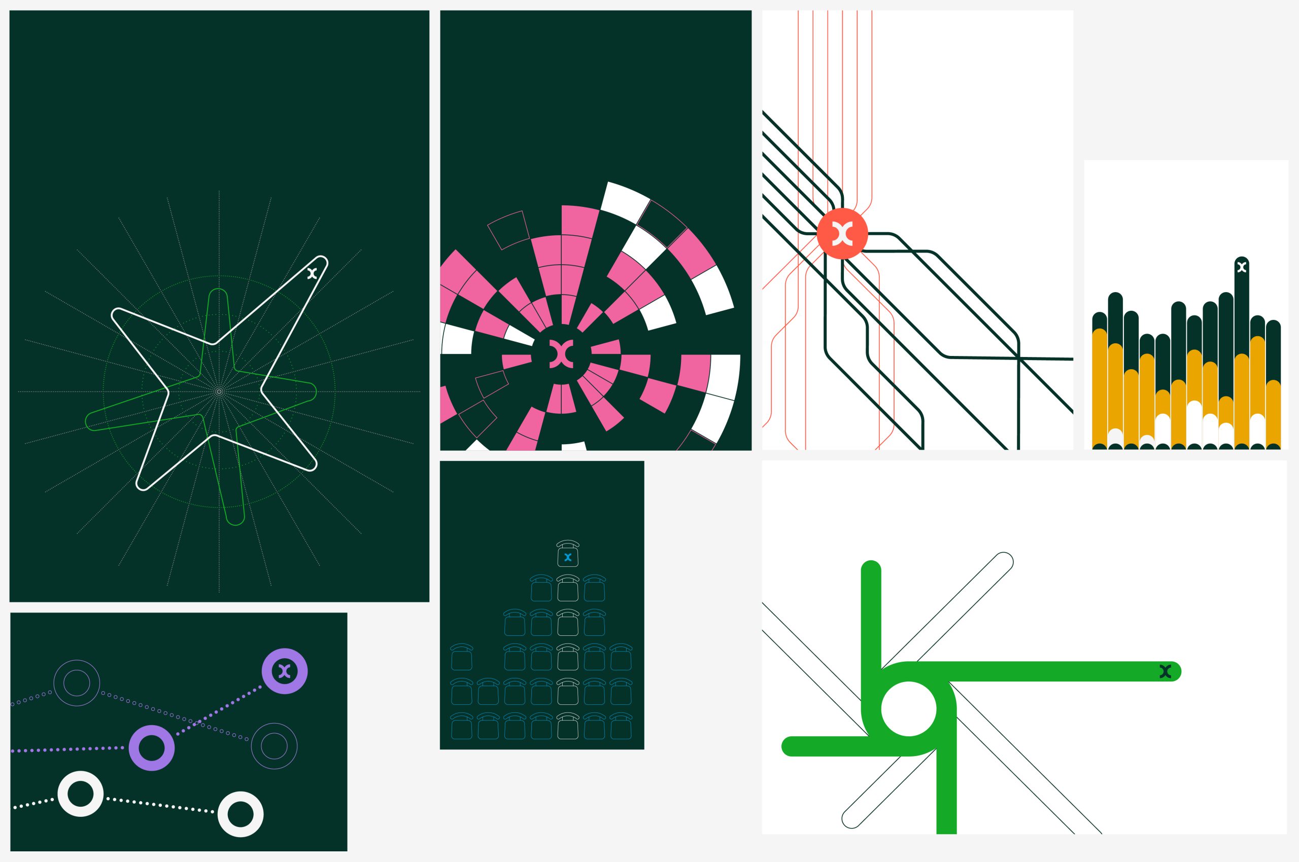
Our updates included a new typeface, colour palette, diagramatic style and photographic direction for both staff and key topic areas that the firm operate in. All have been carefully chosen to represent Oxera’s company values and mission, while also being easily recognisable and versatile. This refresh to the visual identity will be used across all internal and external documents and communications, providing a cohesive and professional look and feel.
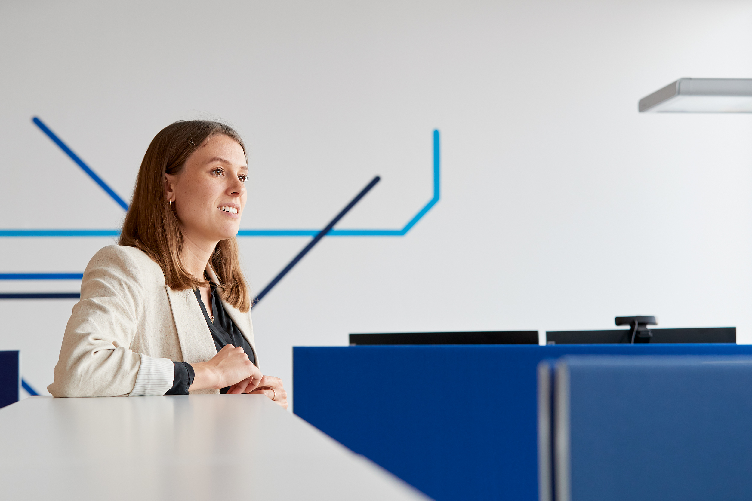
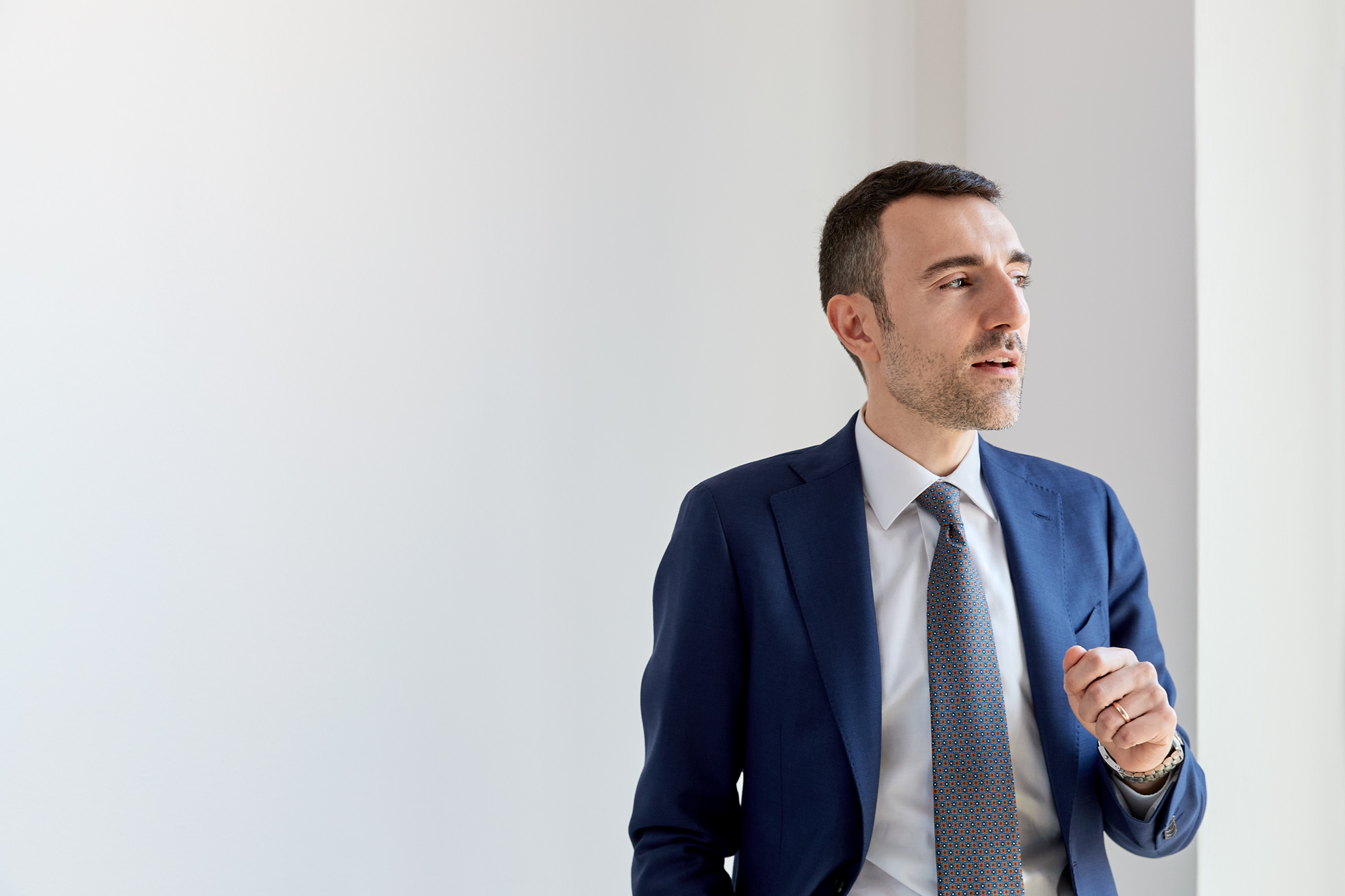
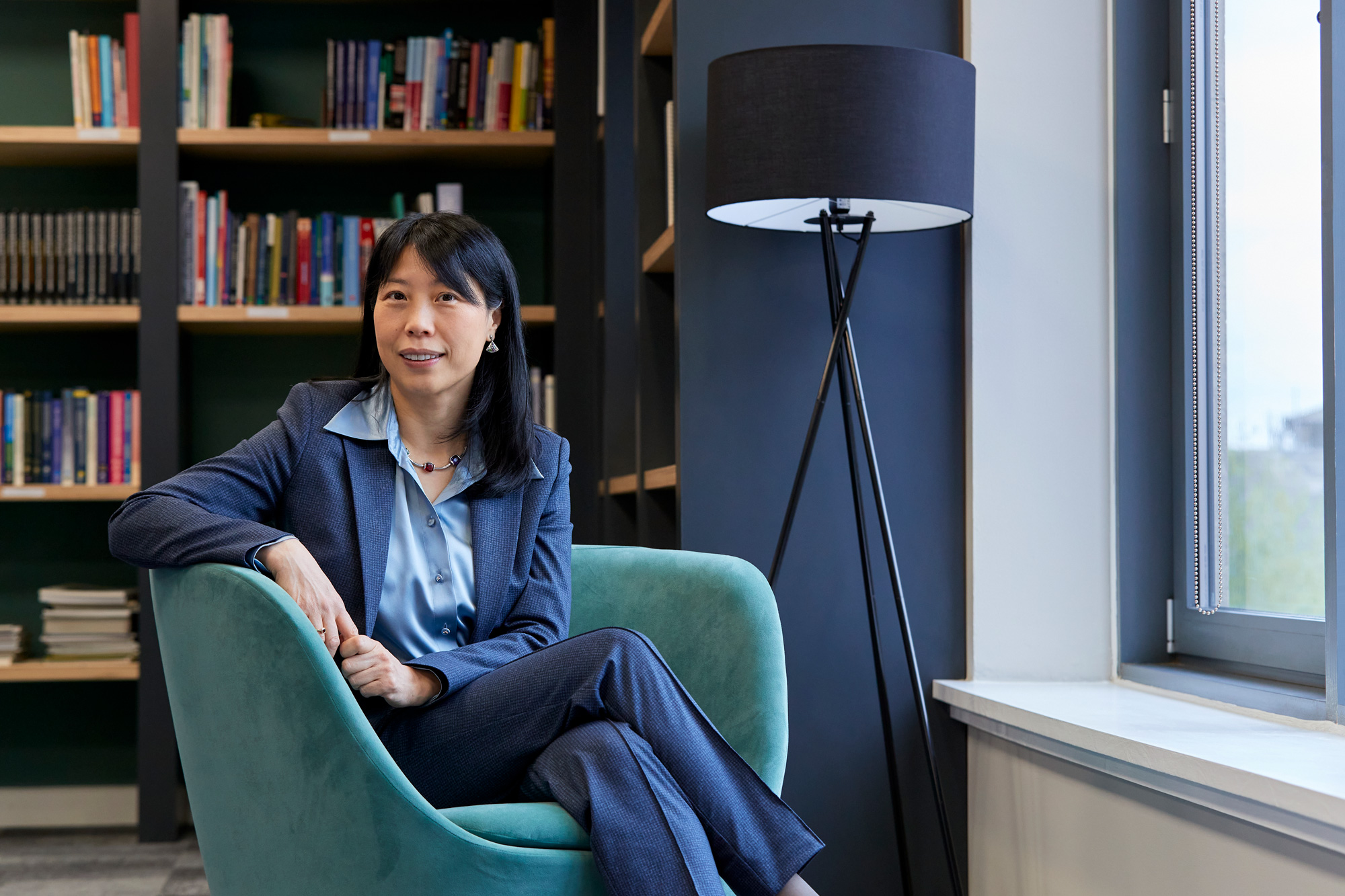
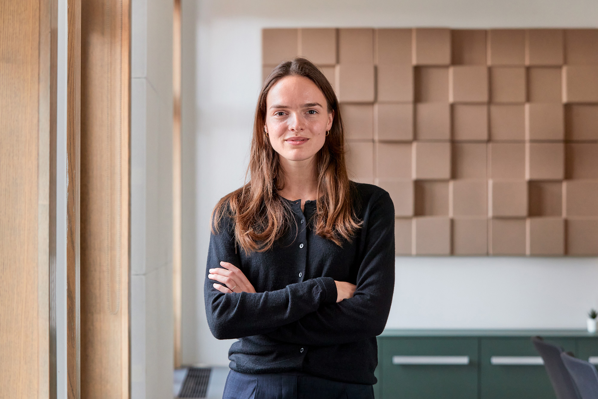
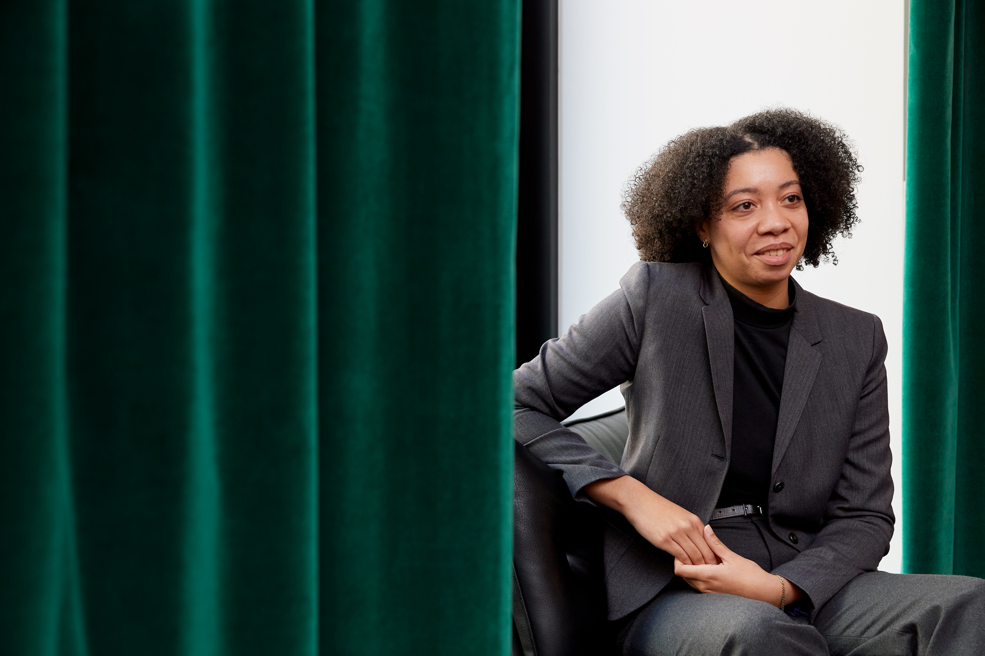
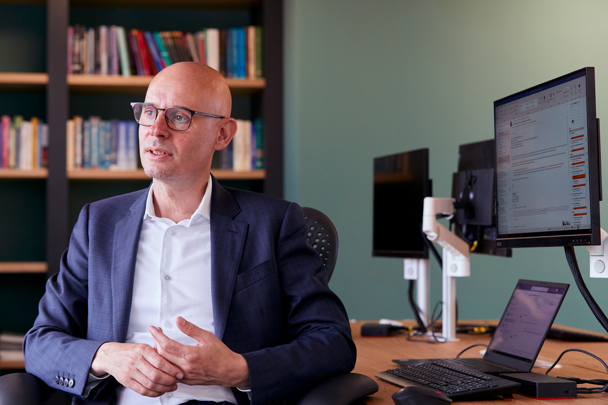
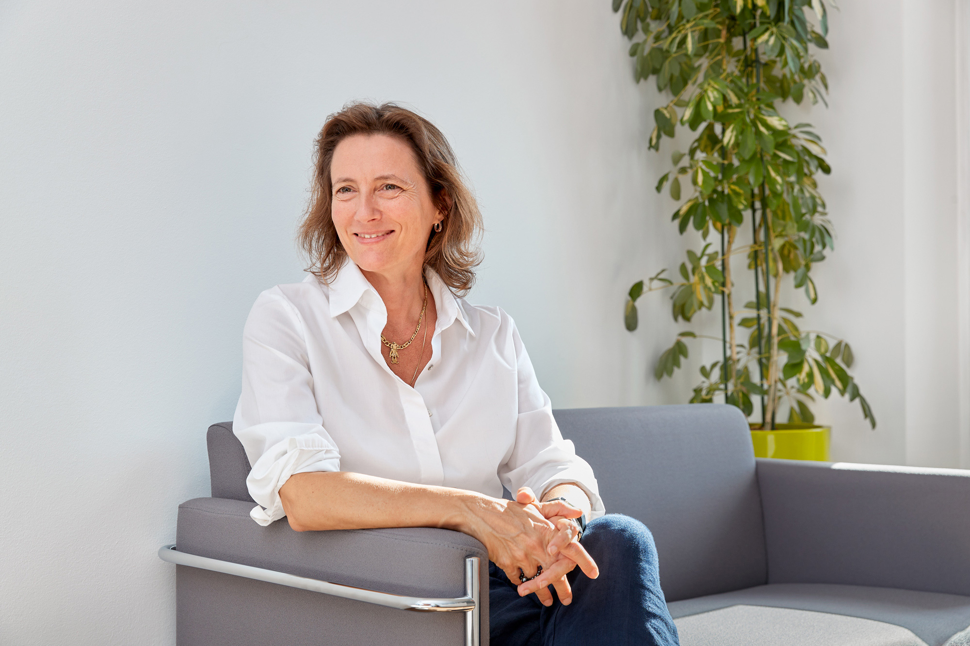
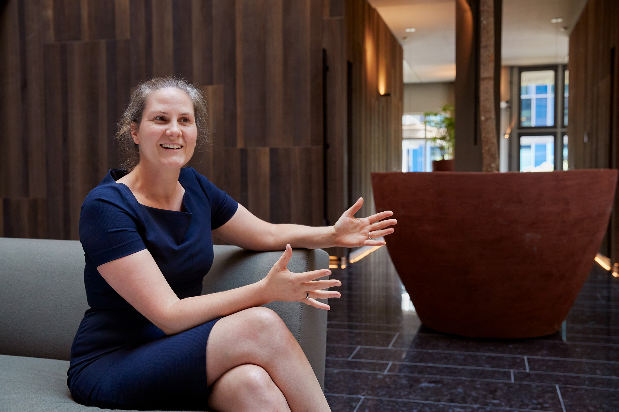
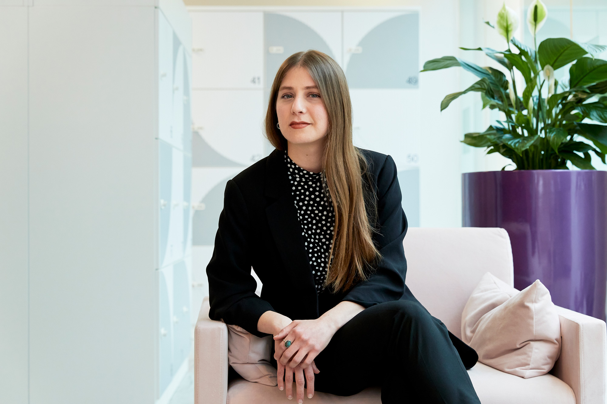
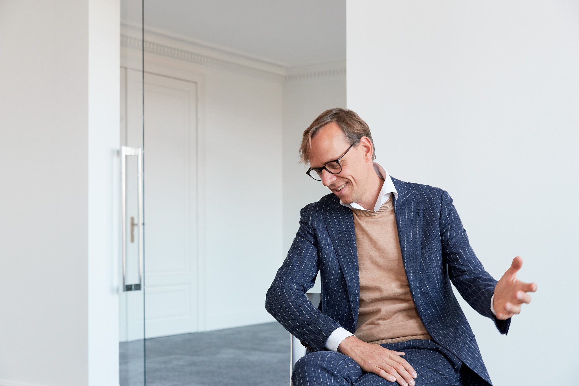
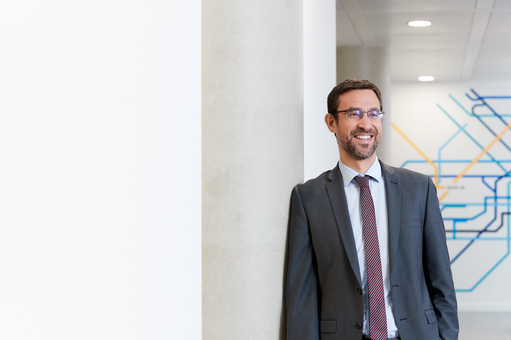
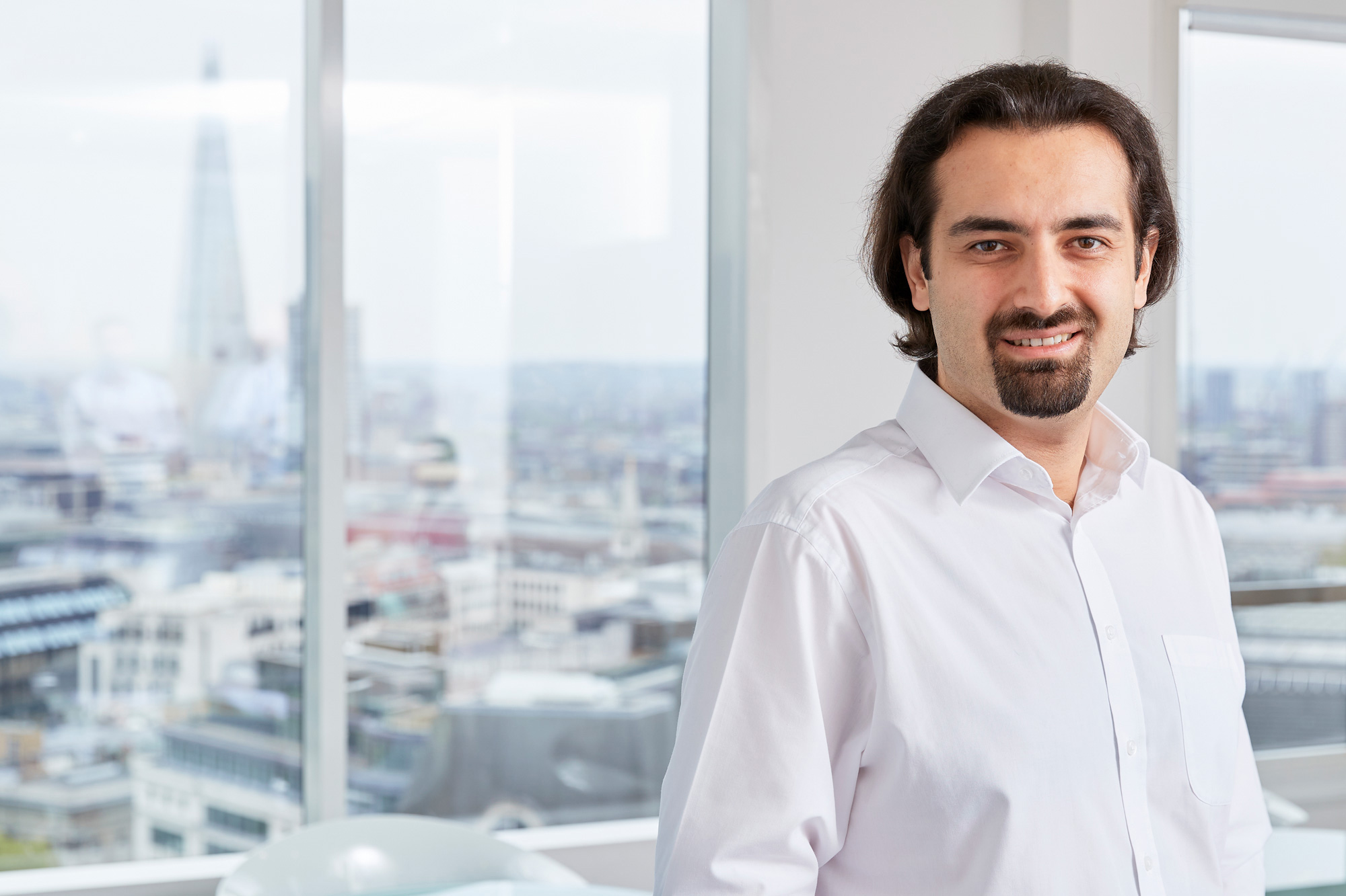
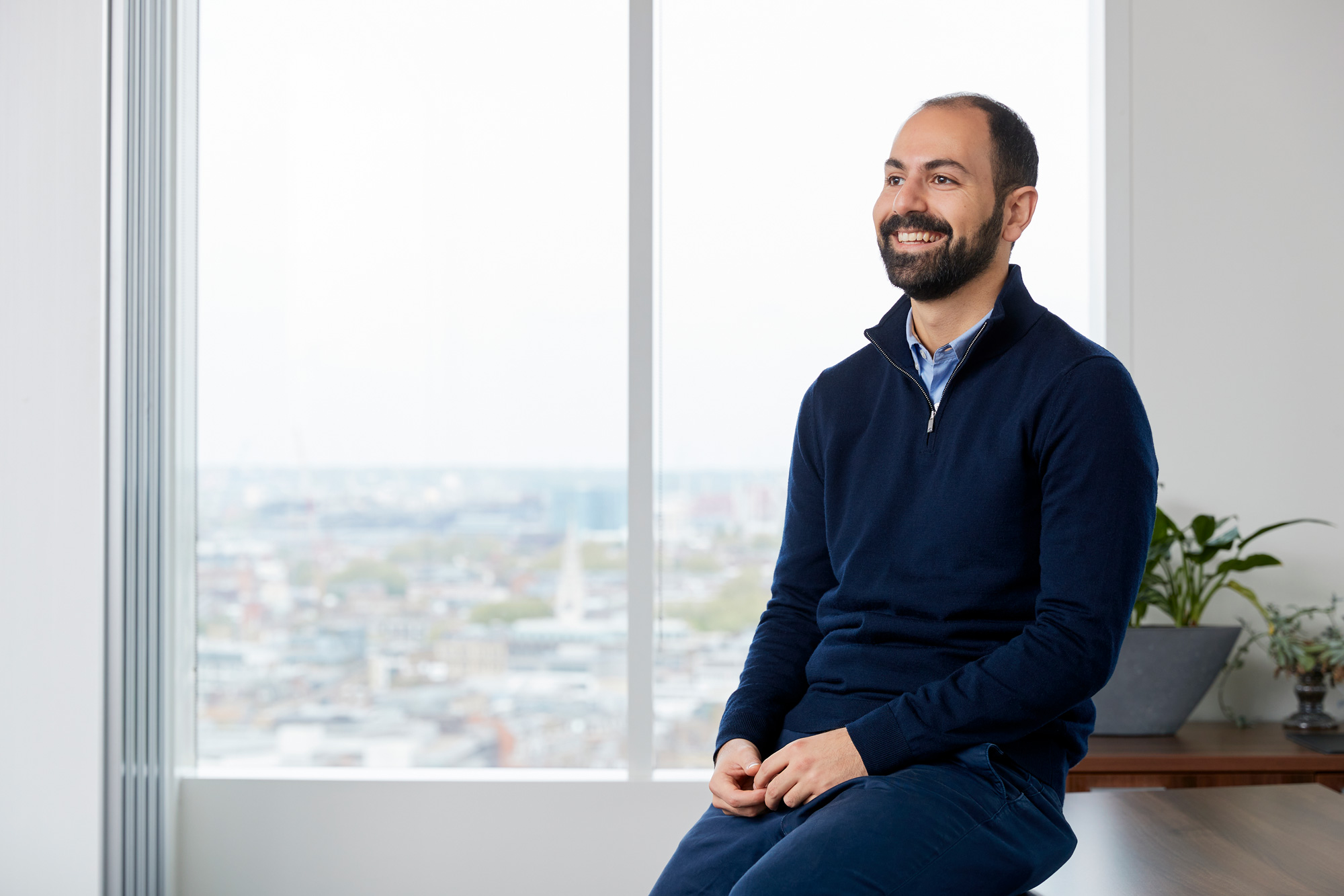
New reportage and formal portraiture was commissioned along with sourced new sector imagery.
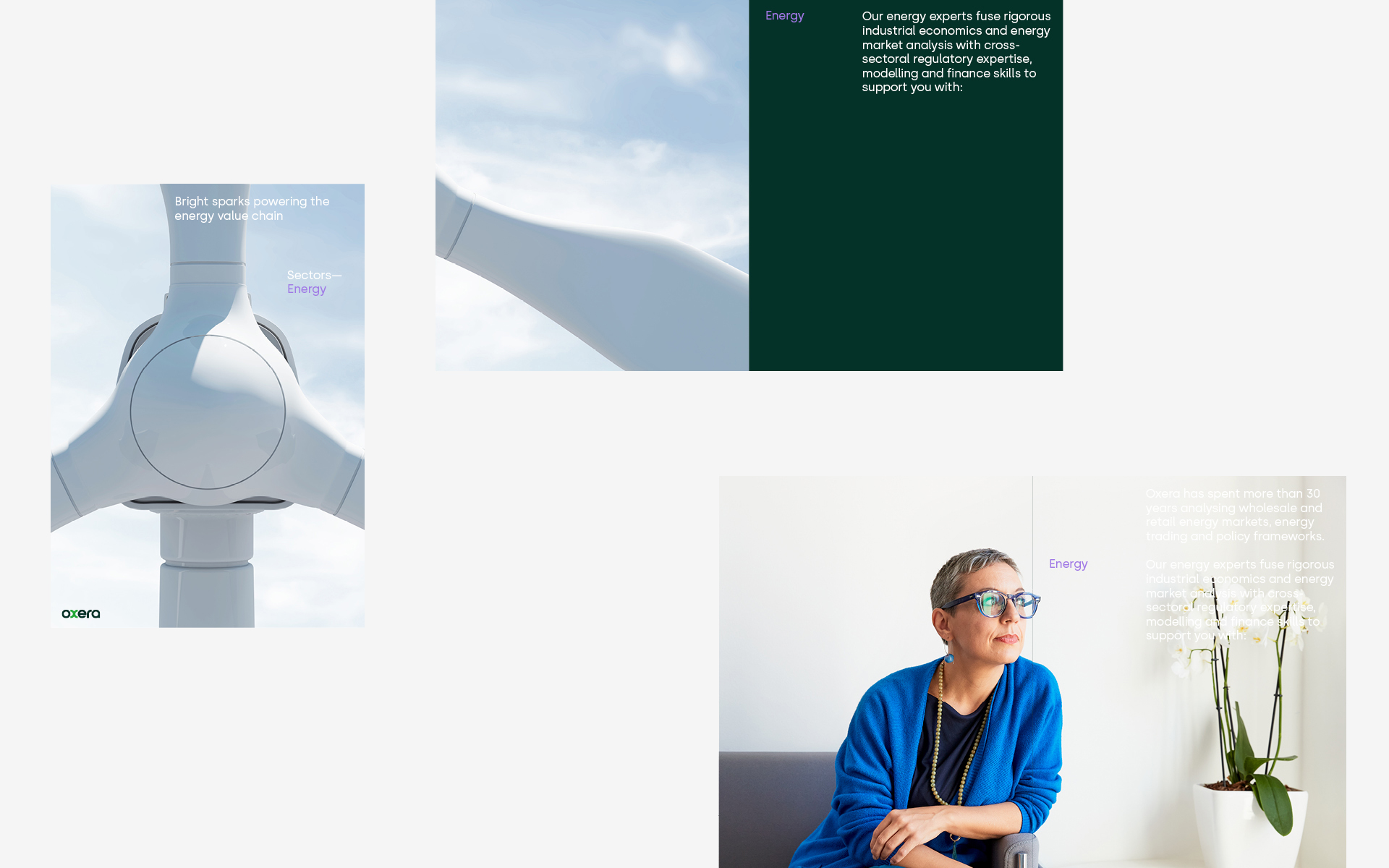
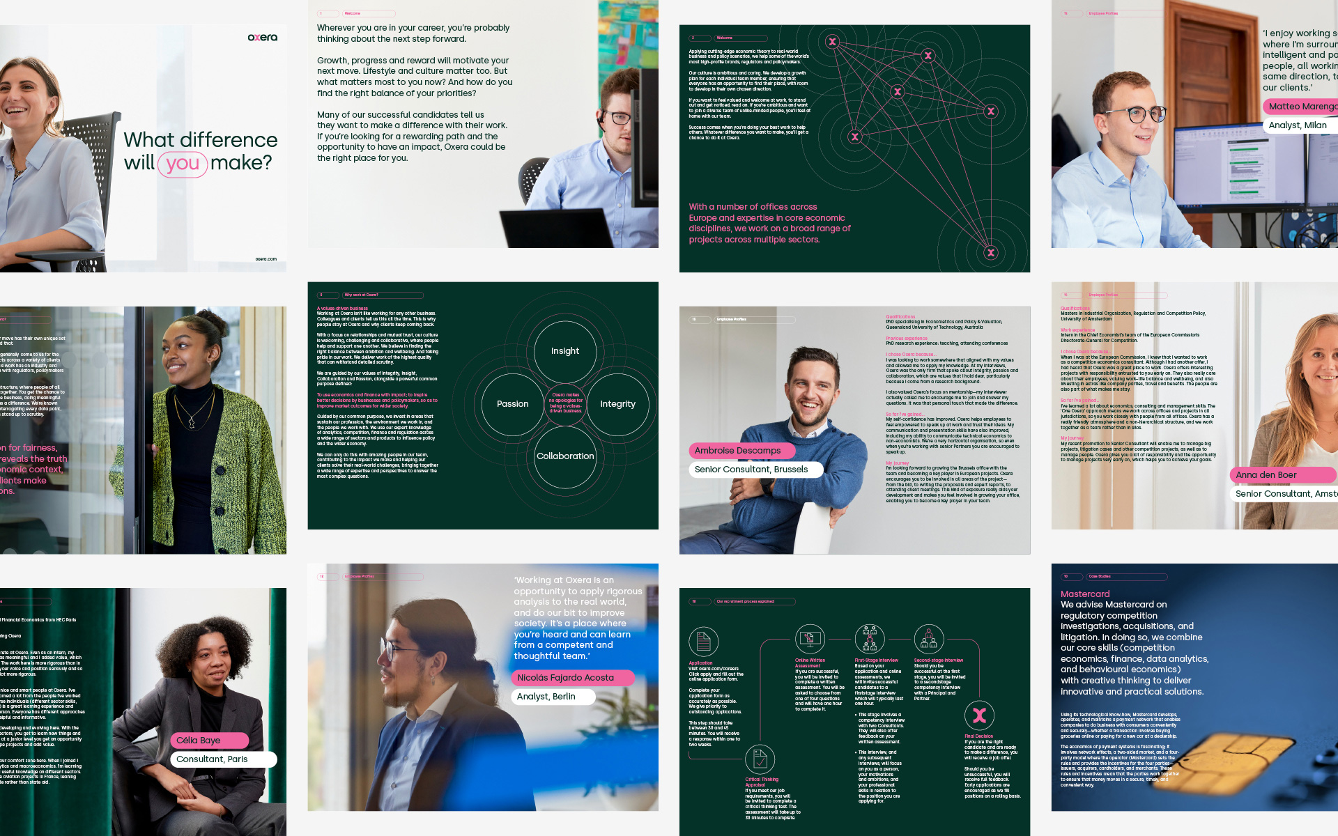
In addition to the visual updates, we have also developed a new set of guidelines that outline how Oxera's brand should be presented in all internal communications and report generation. These guidelines provide clear direction on font usage, color schemes, and imagery (both diagramatic and phototographic), ensuring a consistent and professional look across all materials.
Work carried out
—
Logo design
Identity design
Animation design
Art direction


