
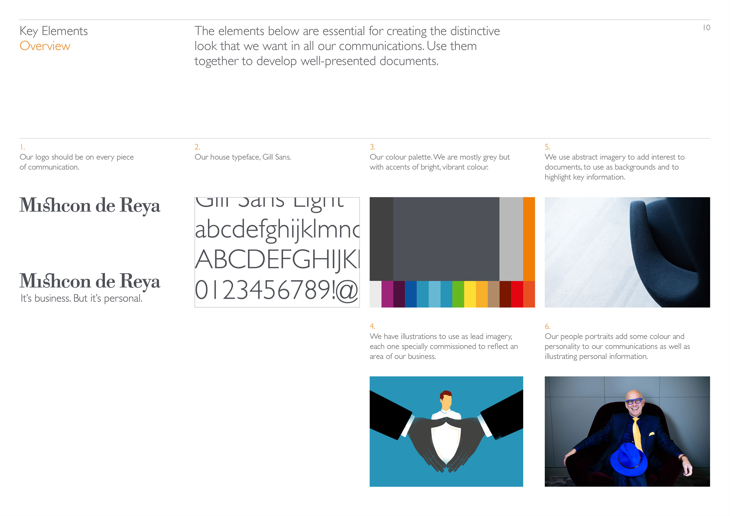
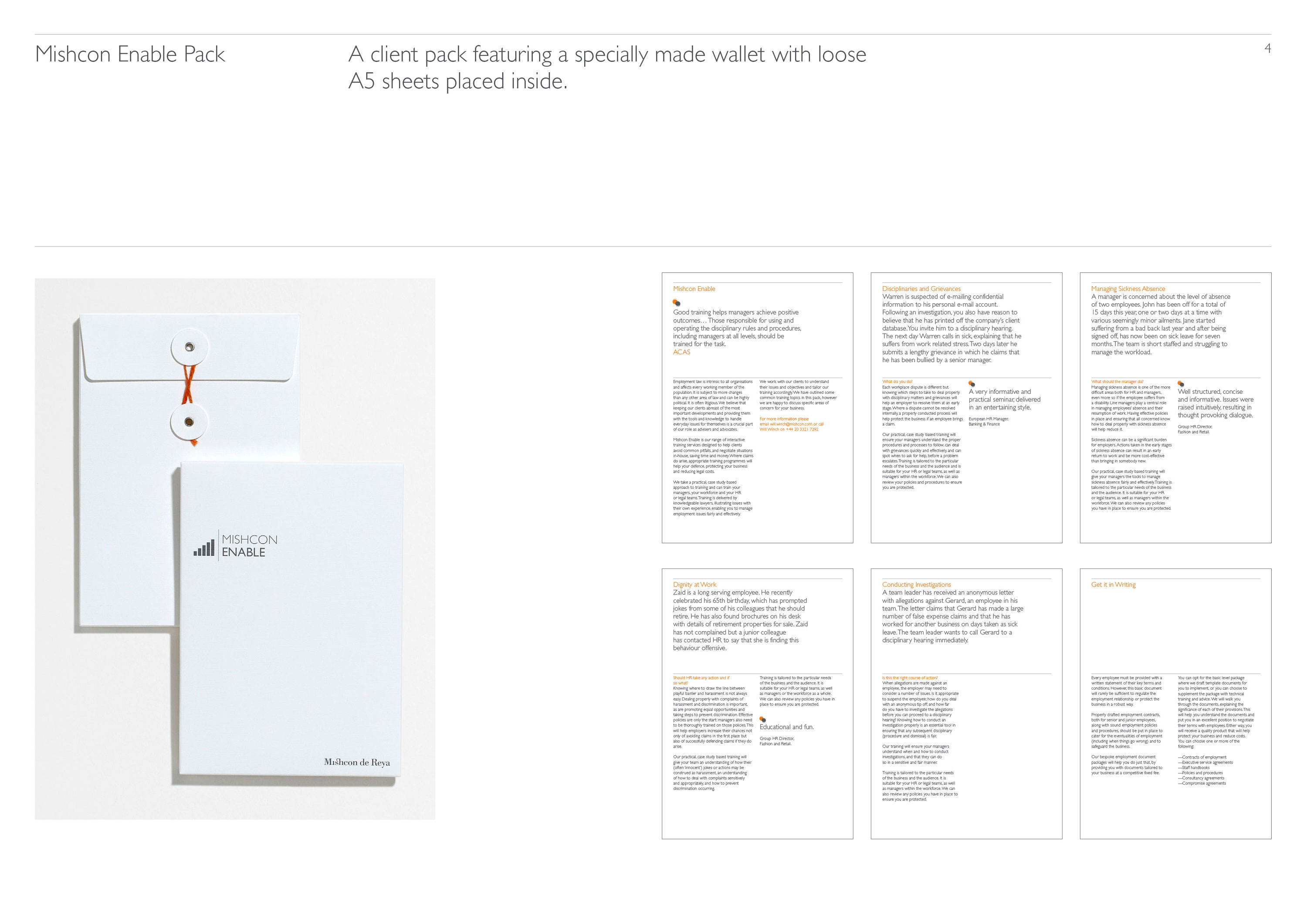
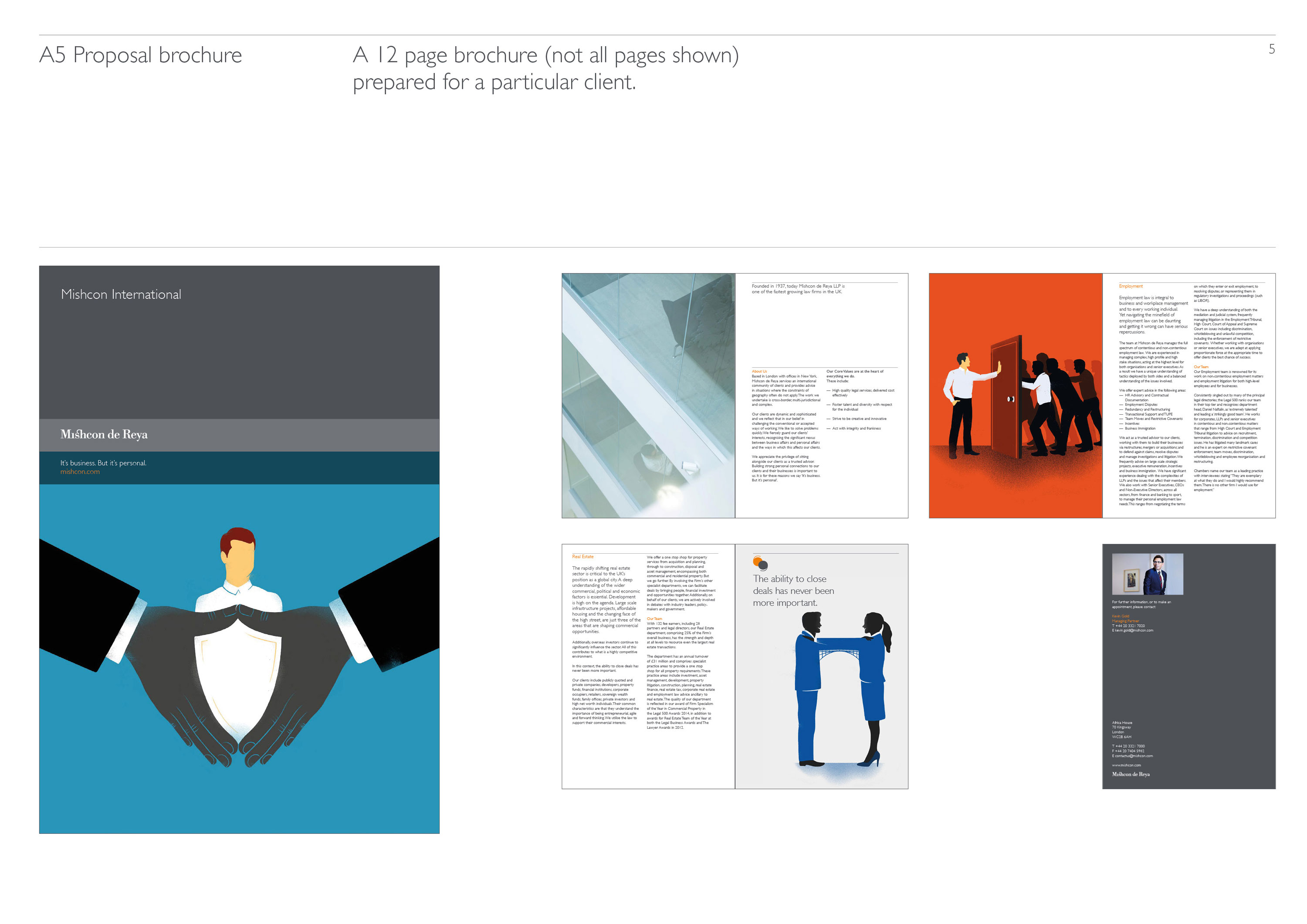
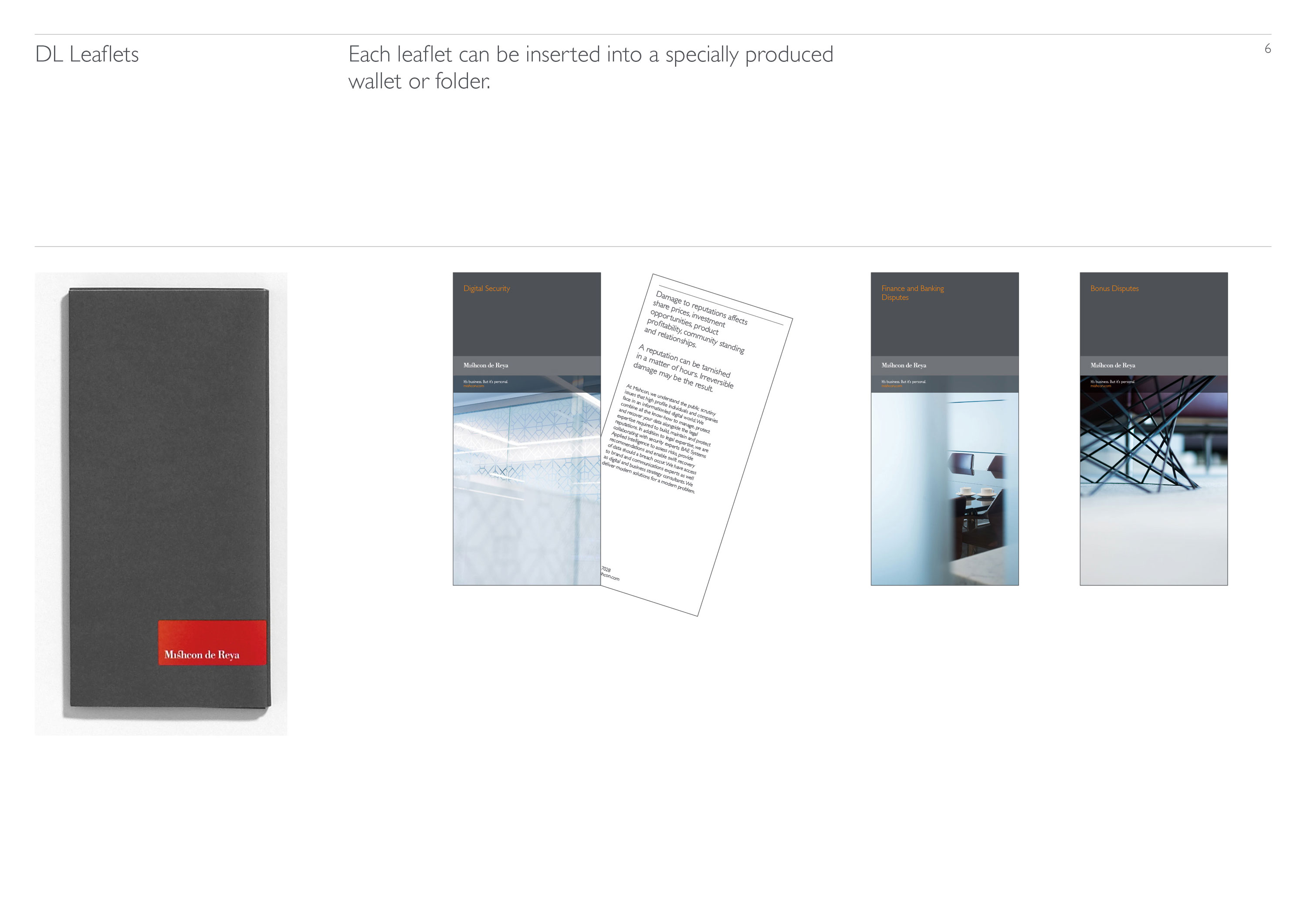
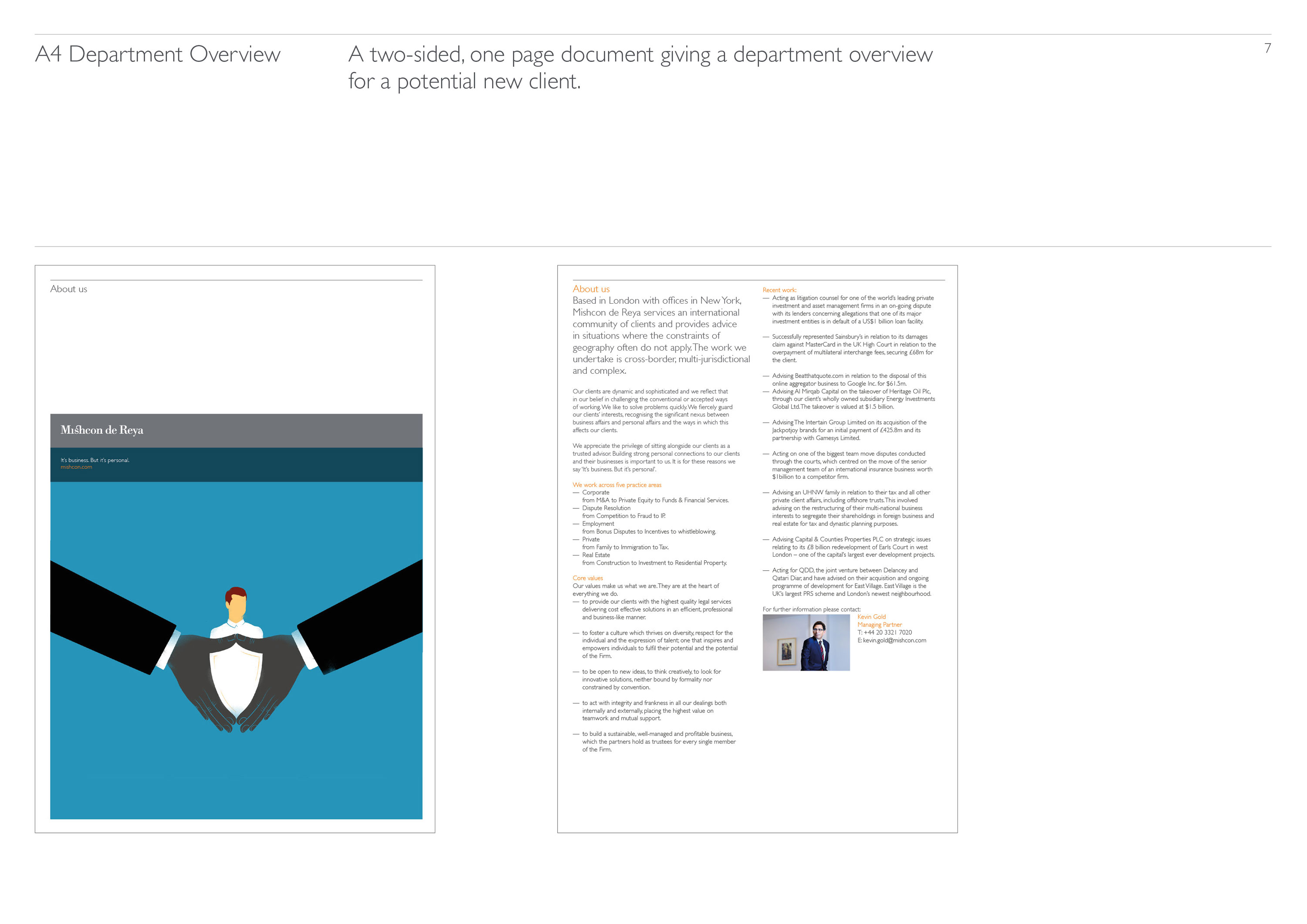
Mishcon de Reya
Refreshing an icon
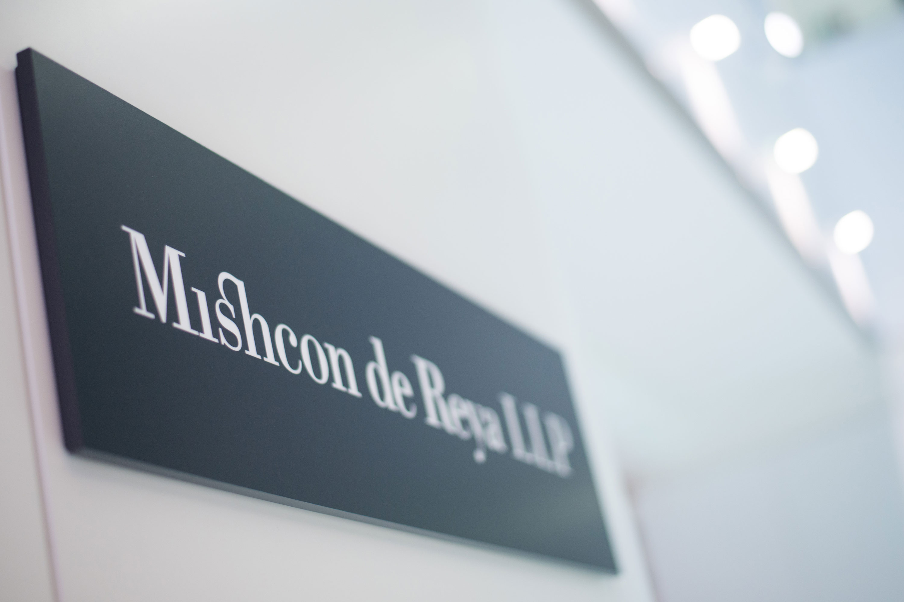
We have worked with internationally renowned law firm, Mishcon de Reya, over 10 years. Our original brief was quite strict – refresh the firm’s identity but keep the existing logo.
This is not an unusual request – a logo is at the heart of all of companies communications, signage and all online activities. Changing it can be a lengthy and costly affair, something that the firm was not willing to undertake at the time.
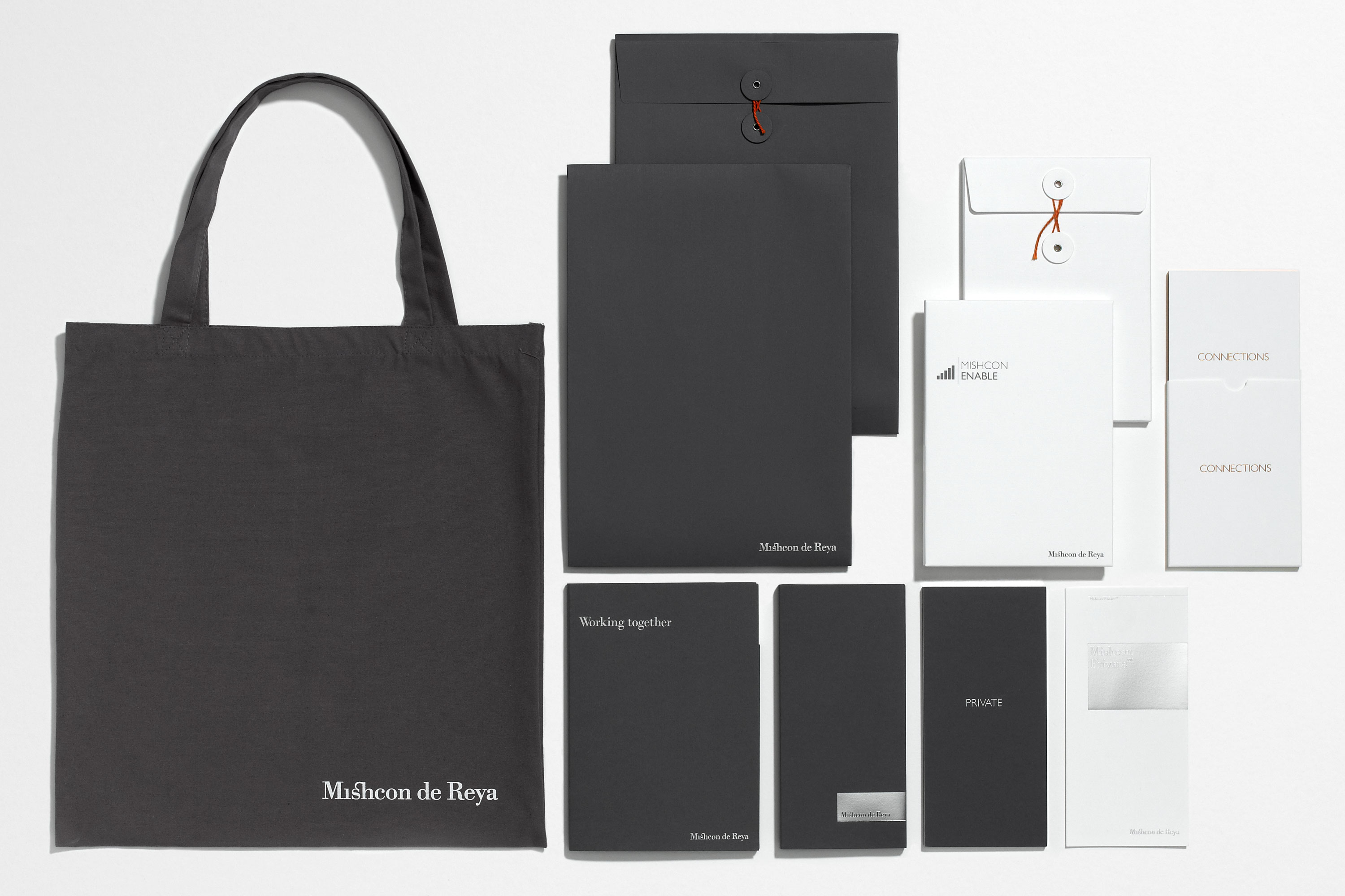
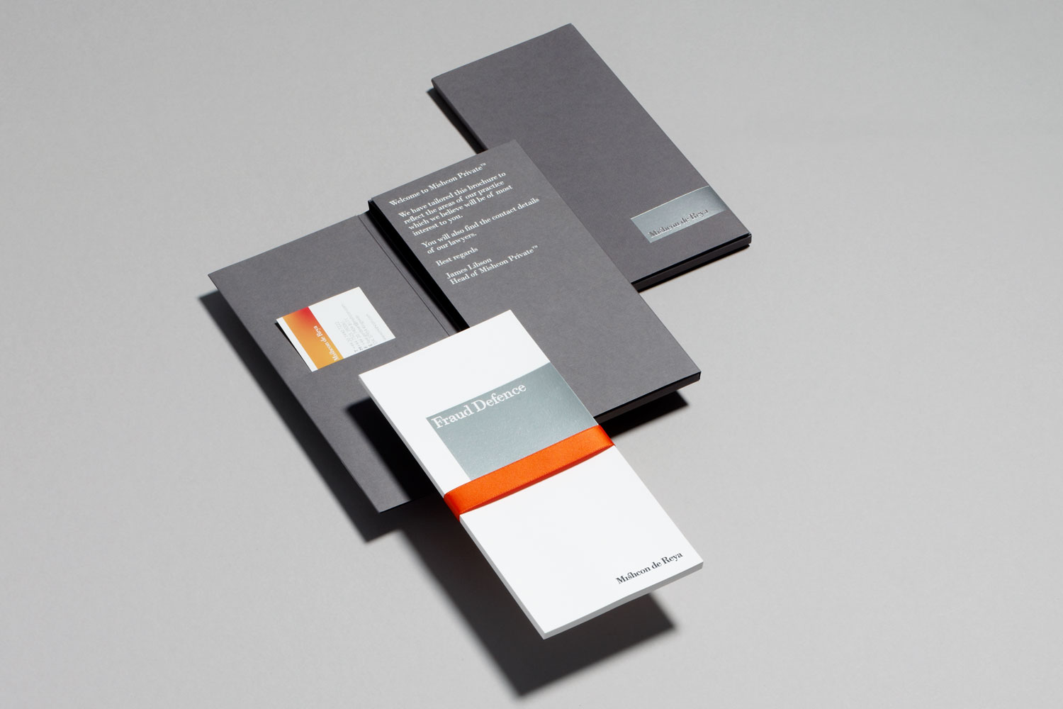
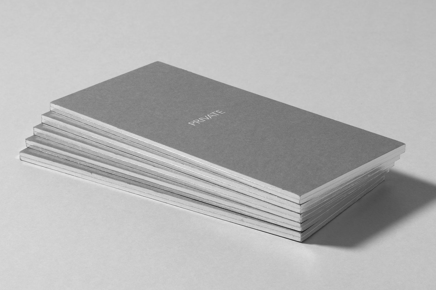
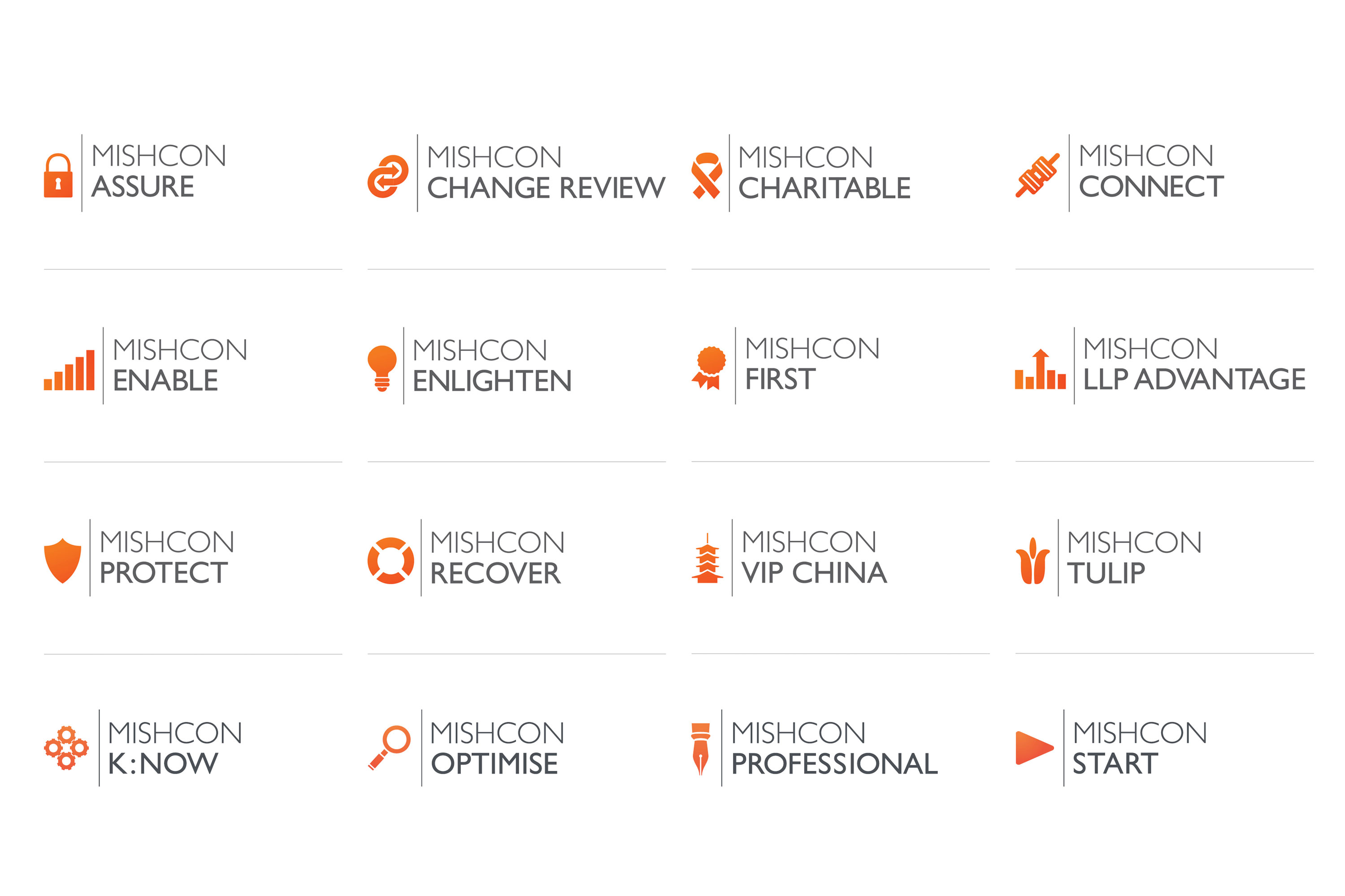
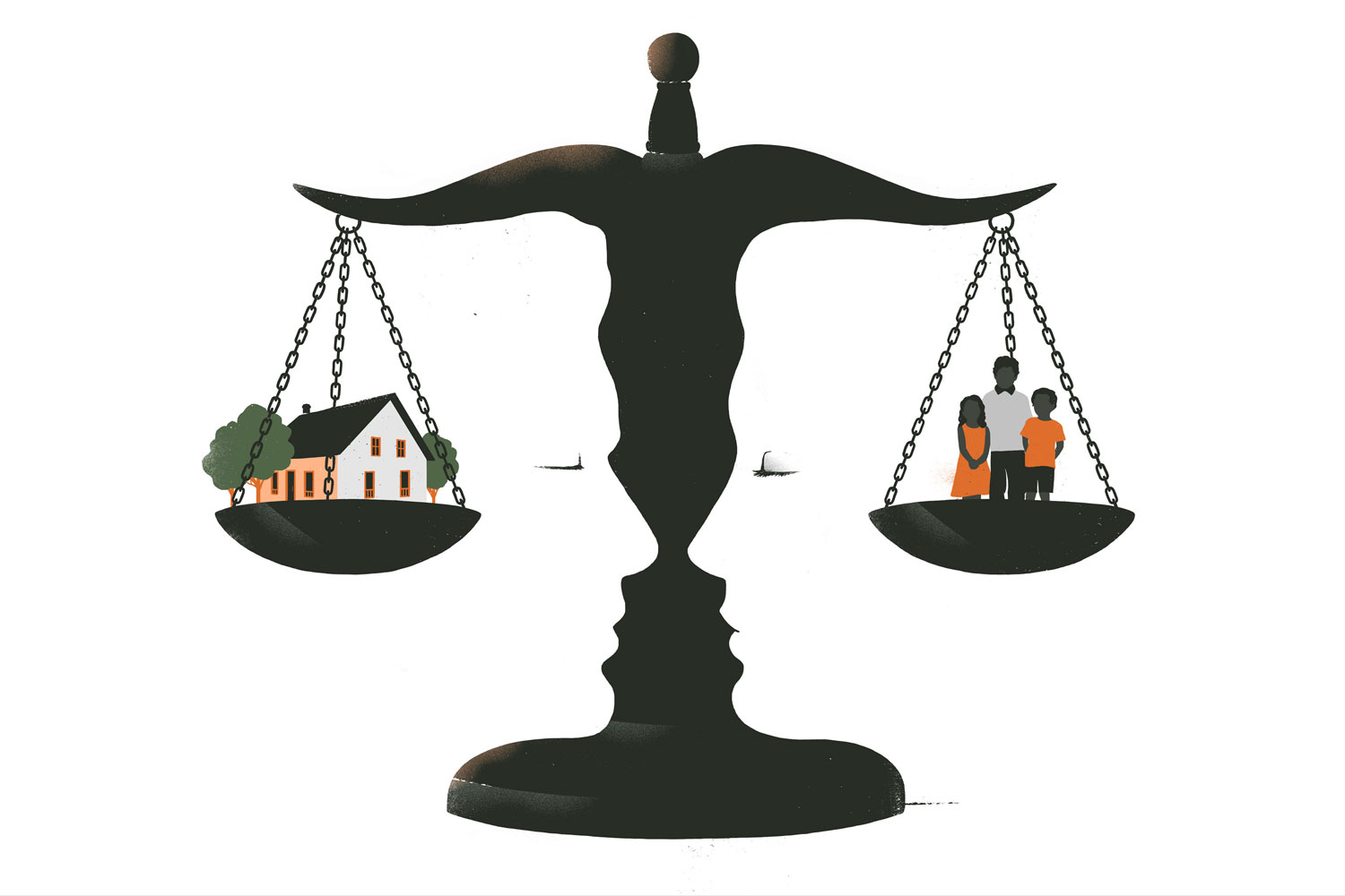
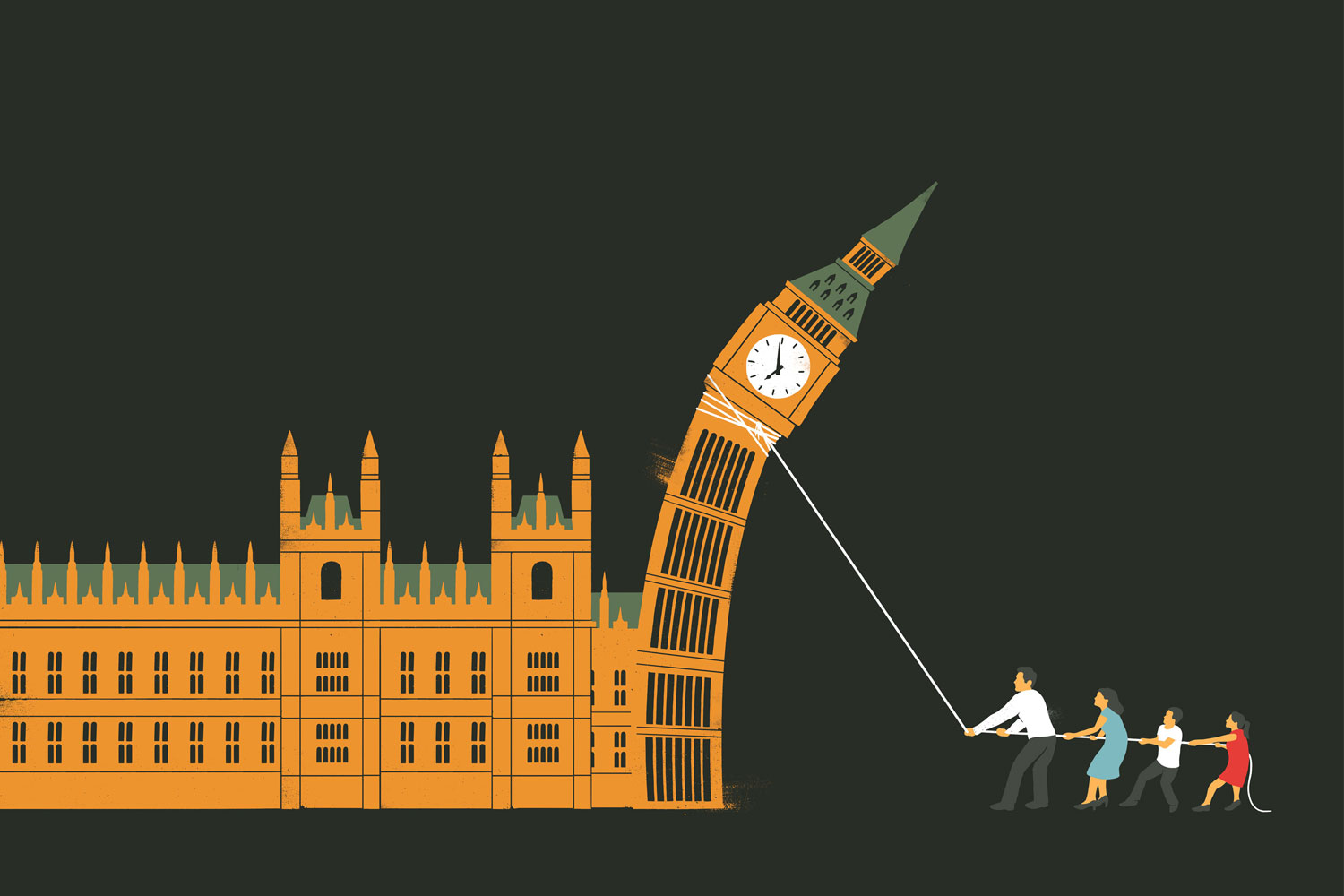
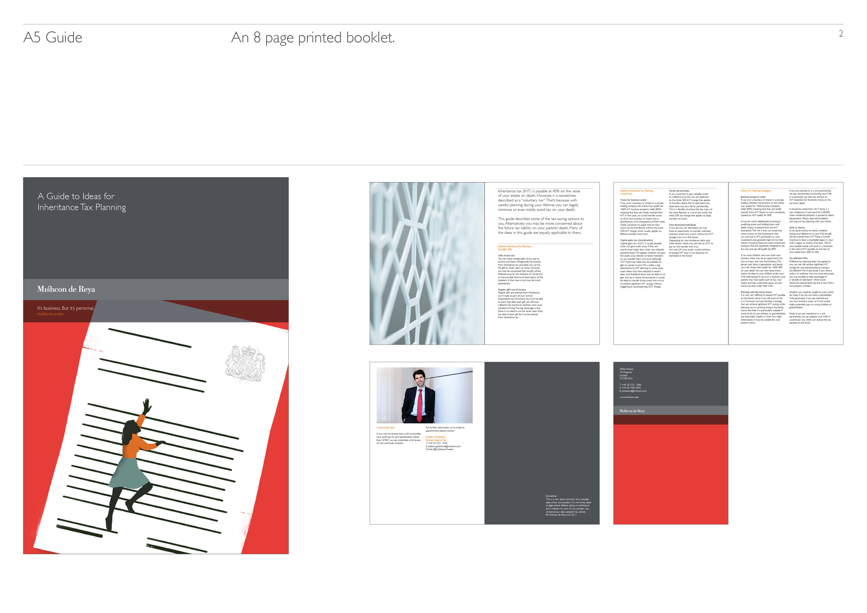
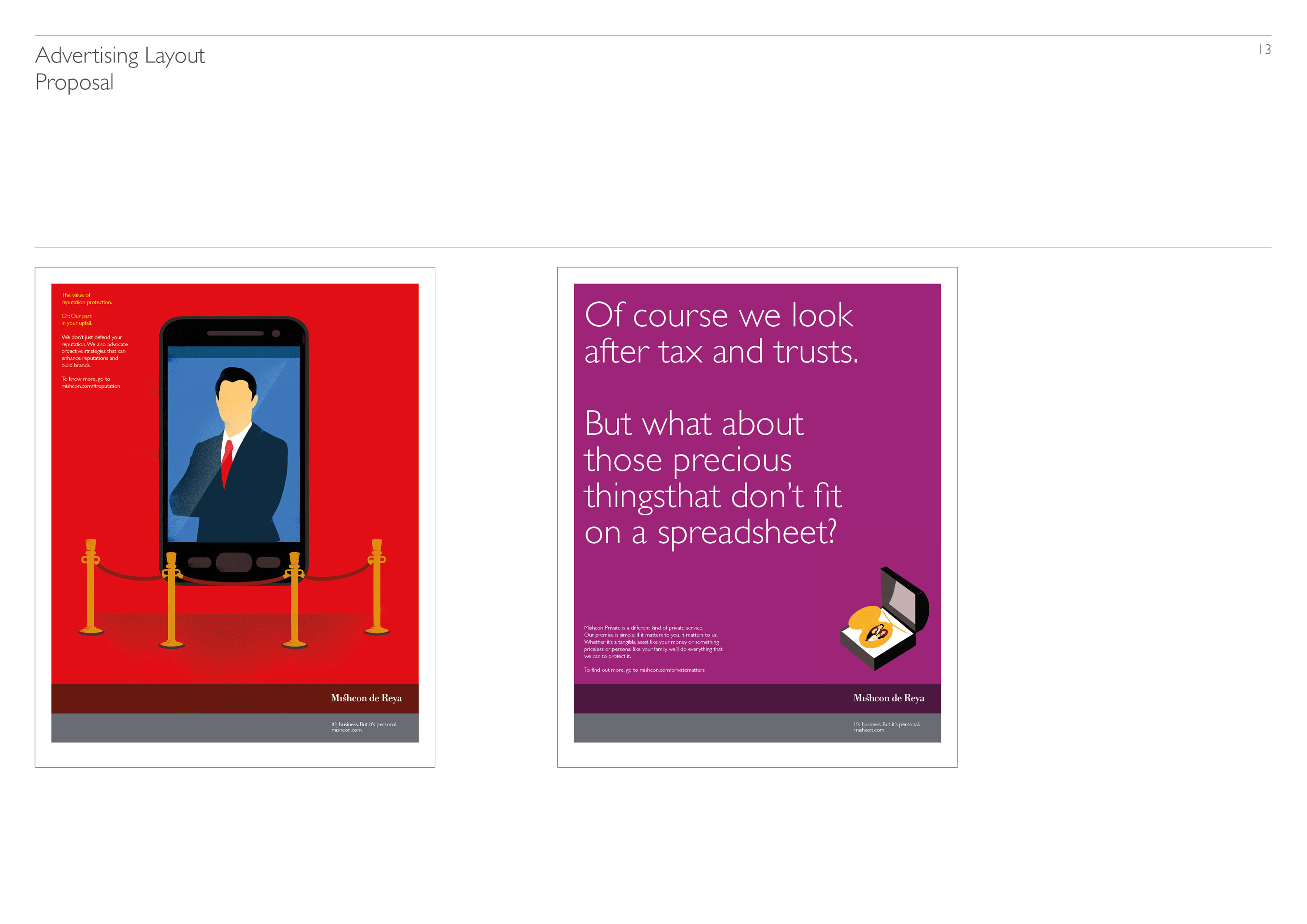
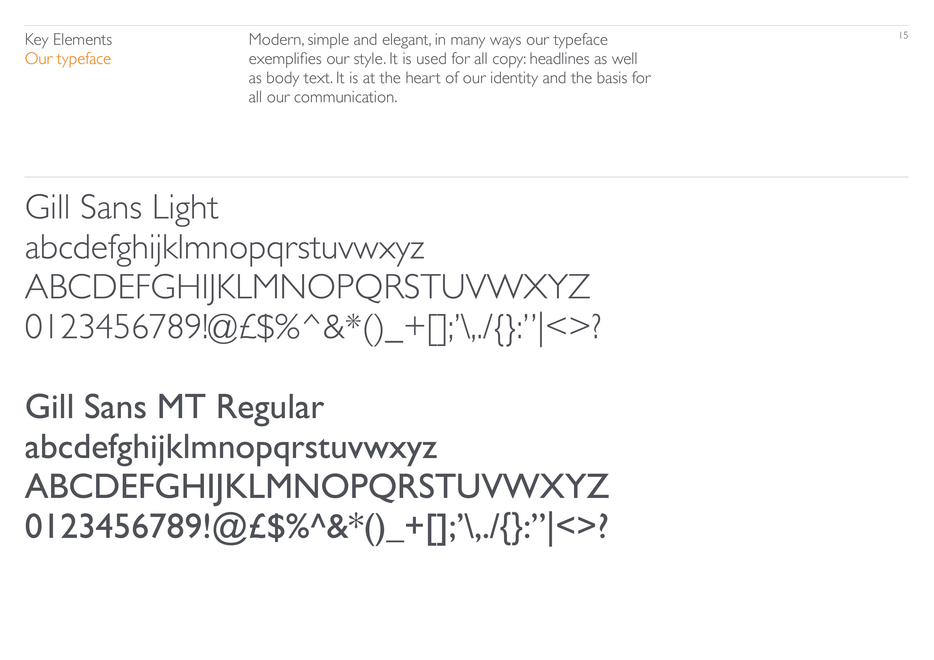
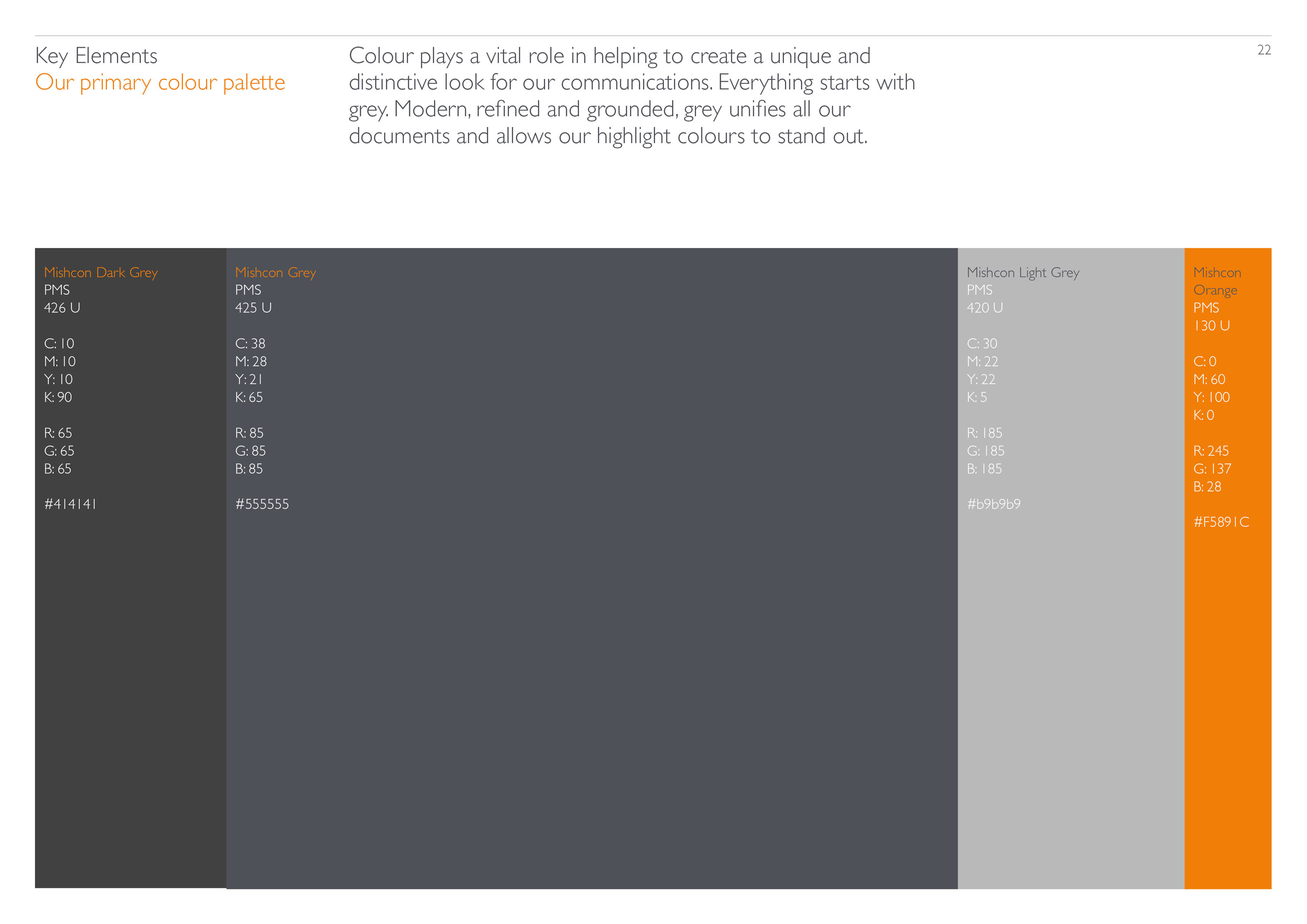
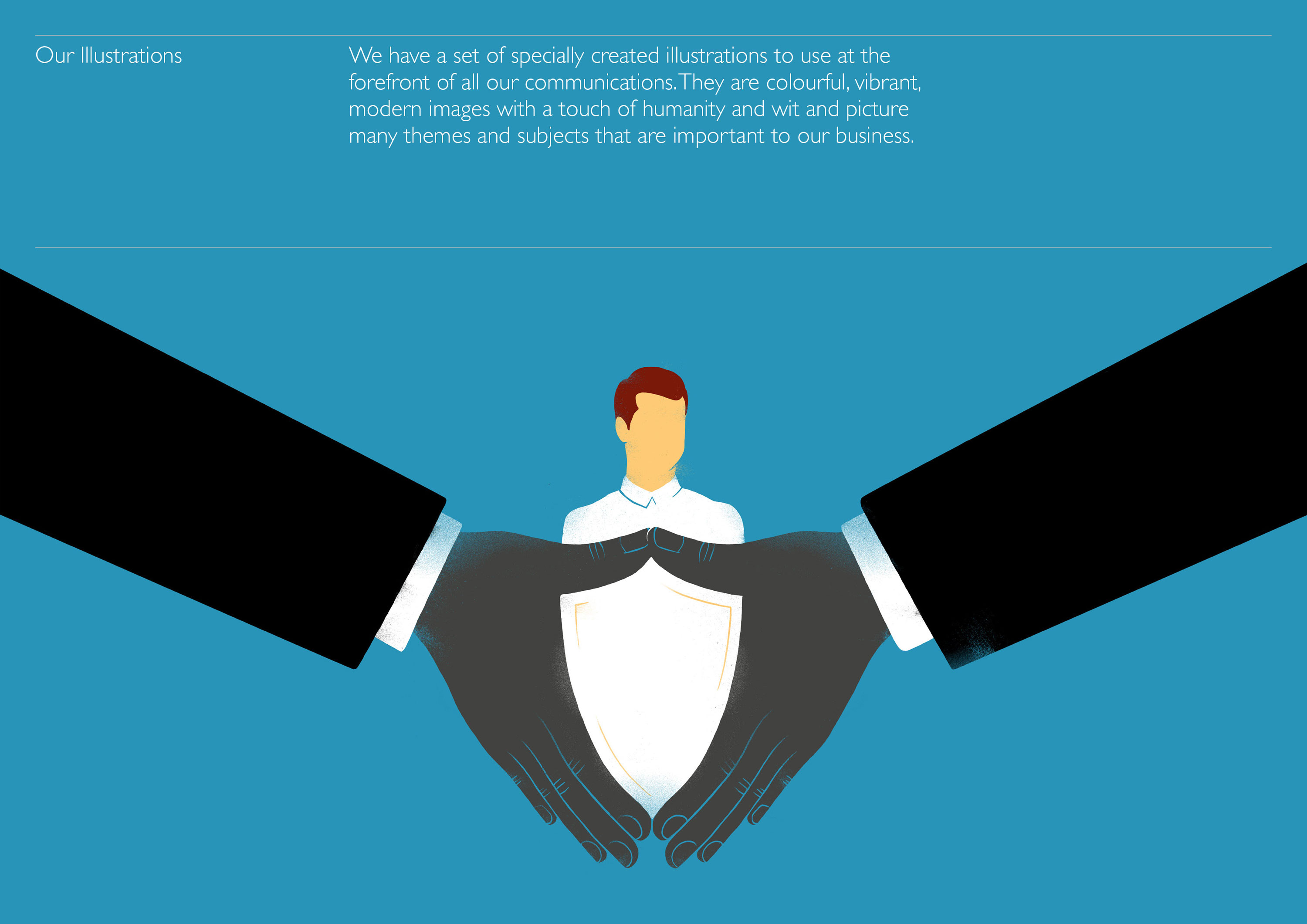
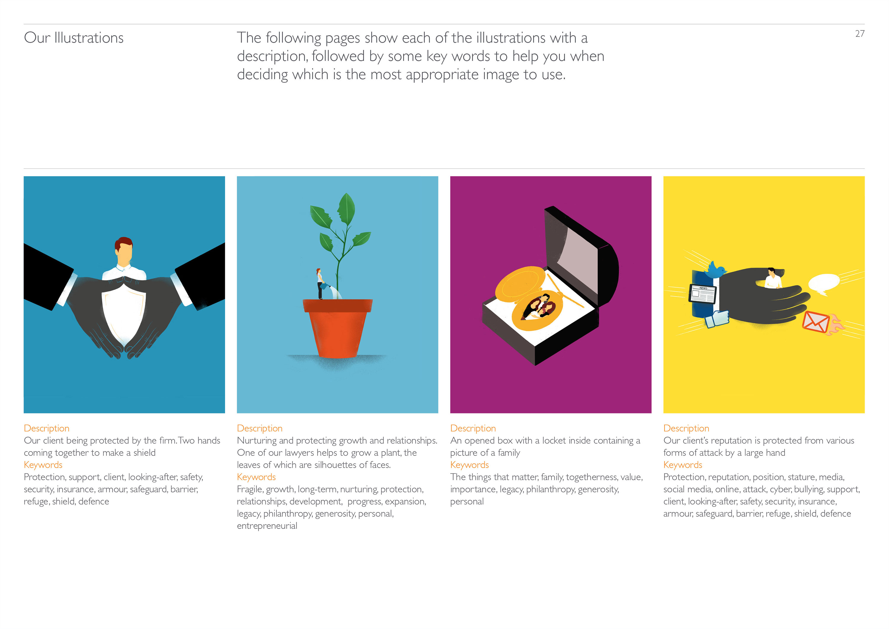
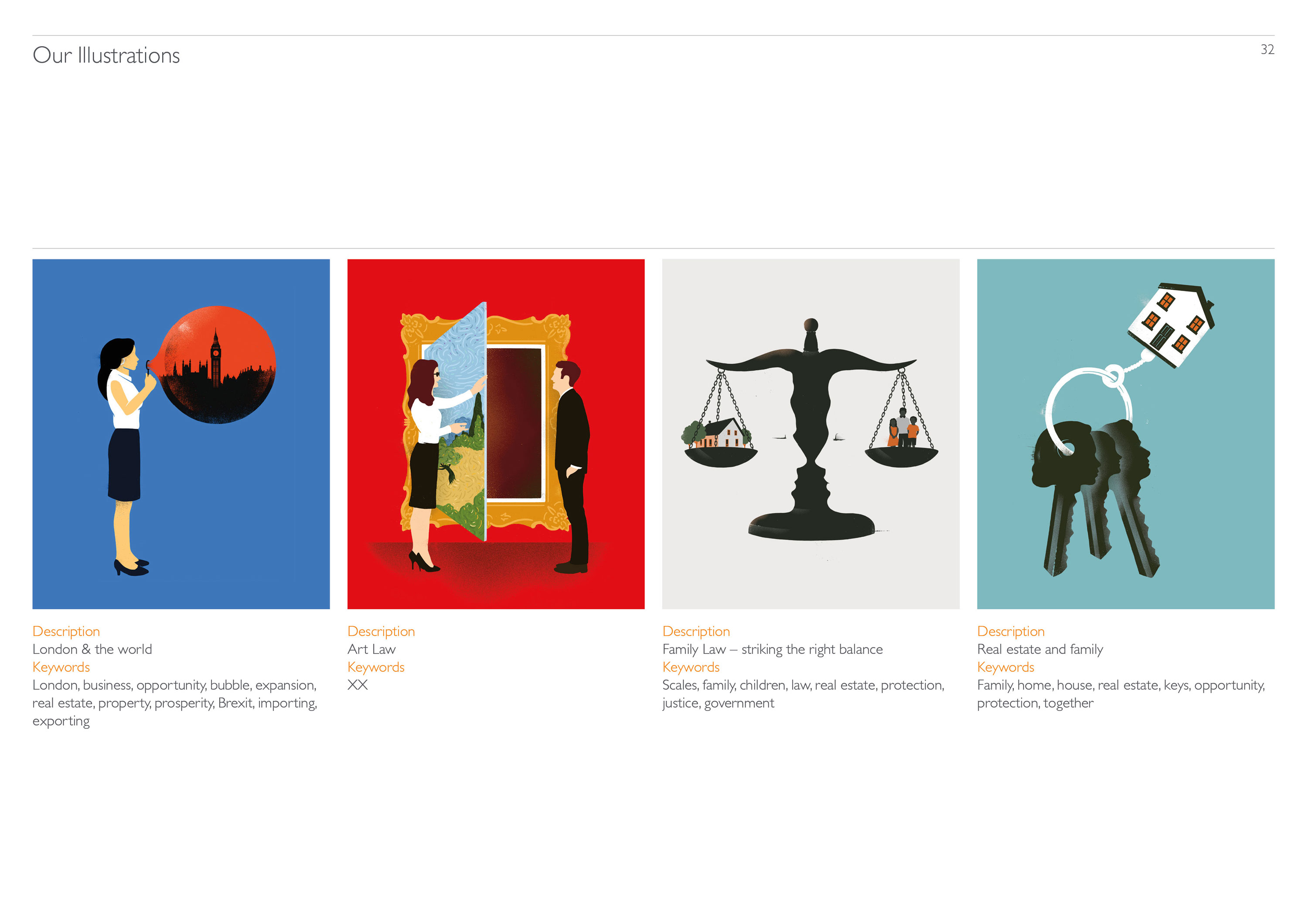
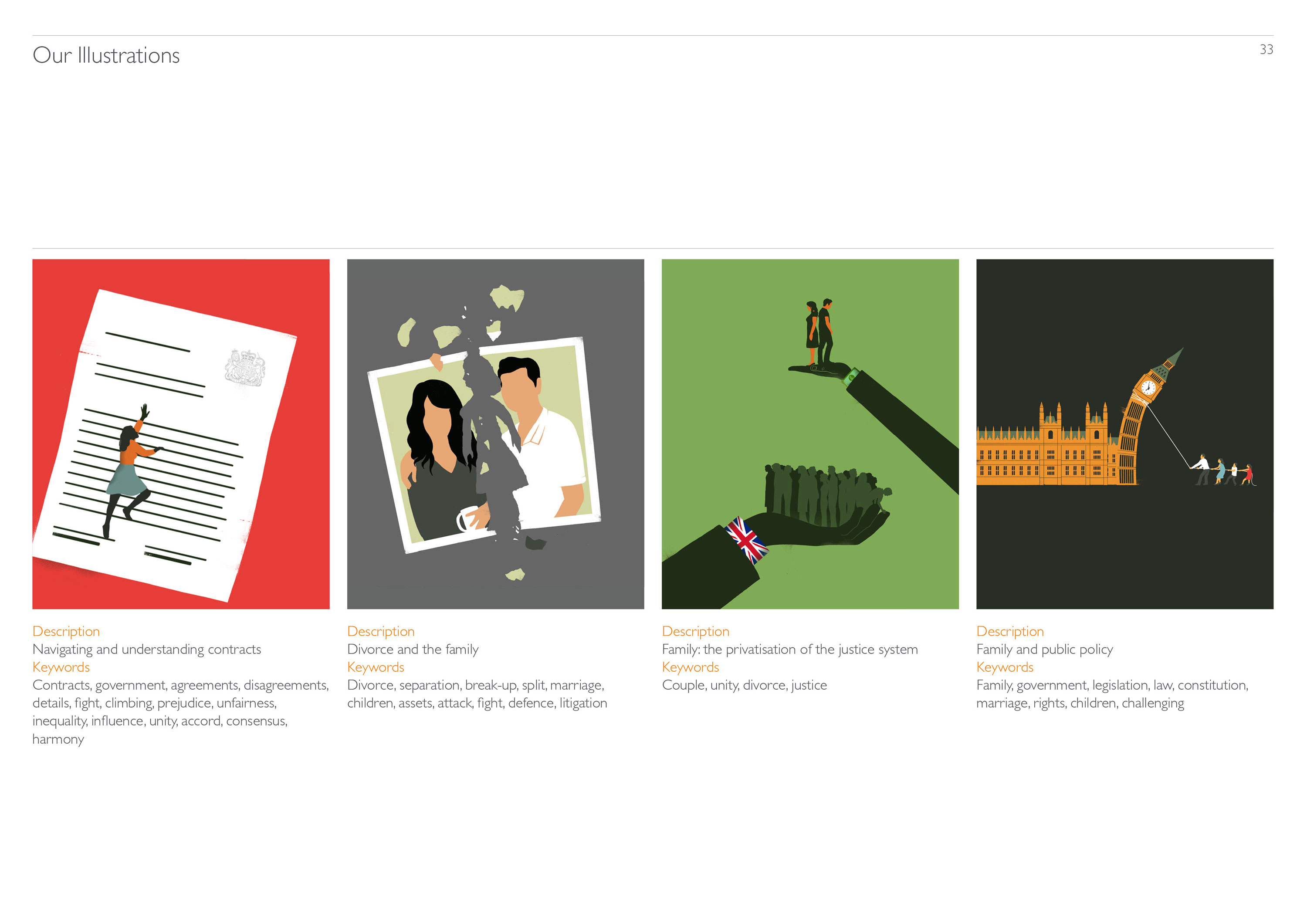
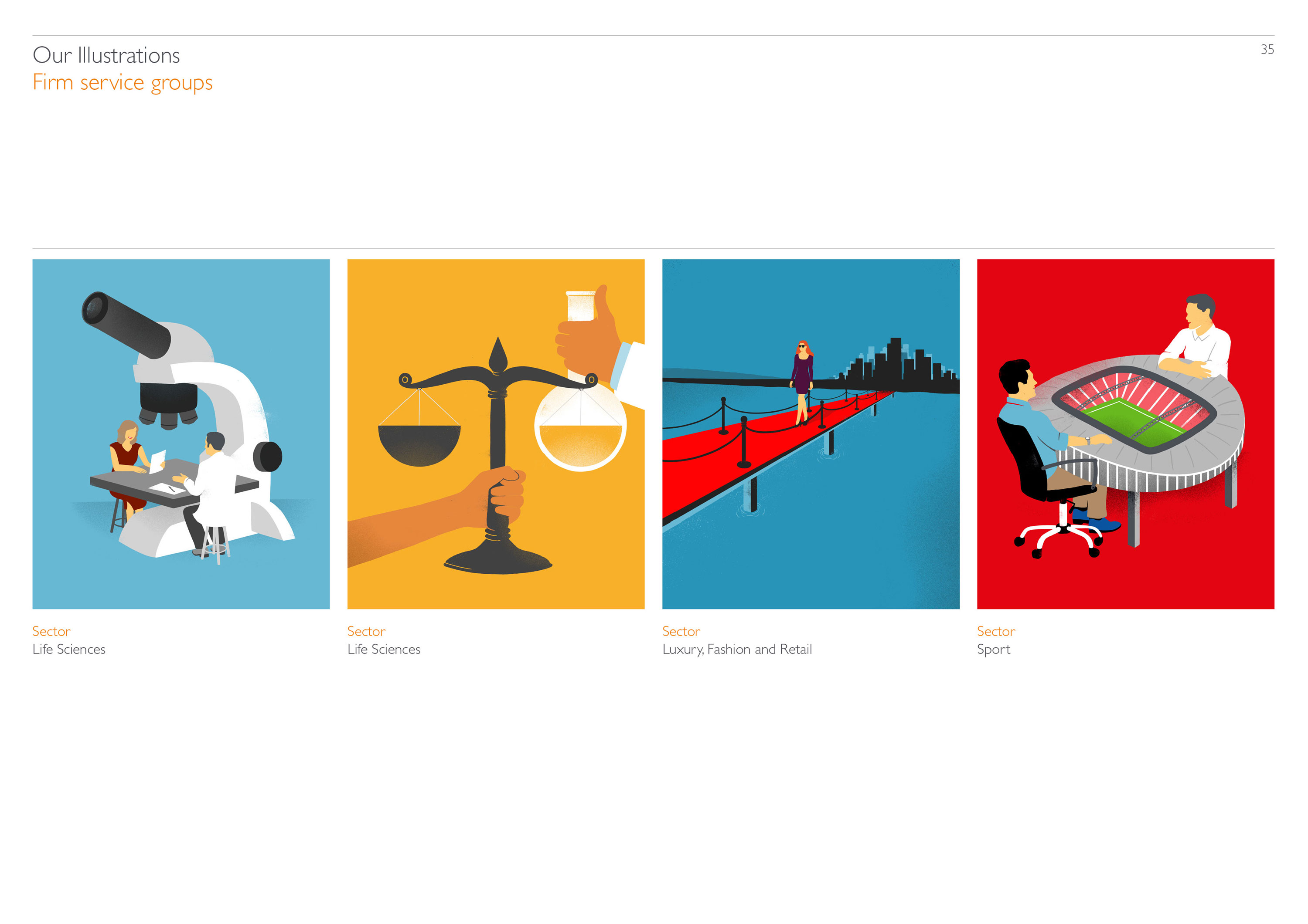
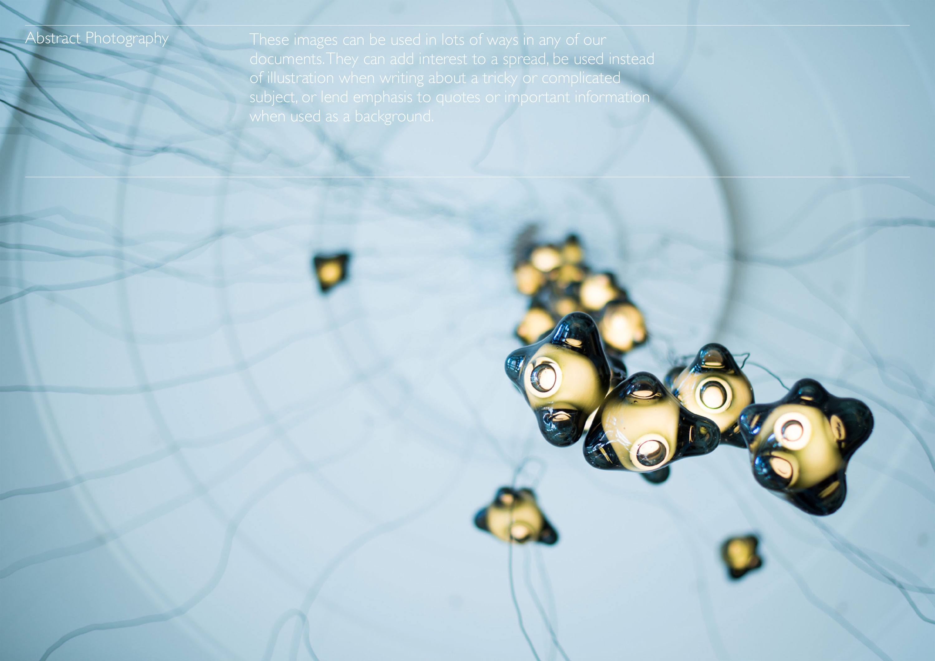
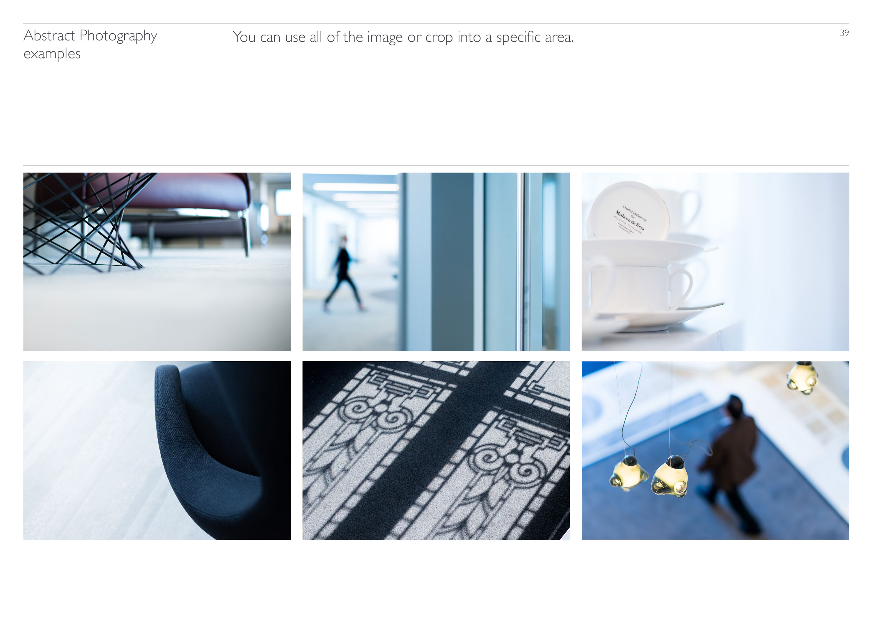
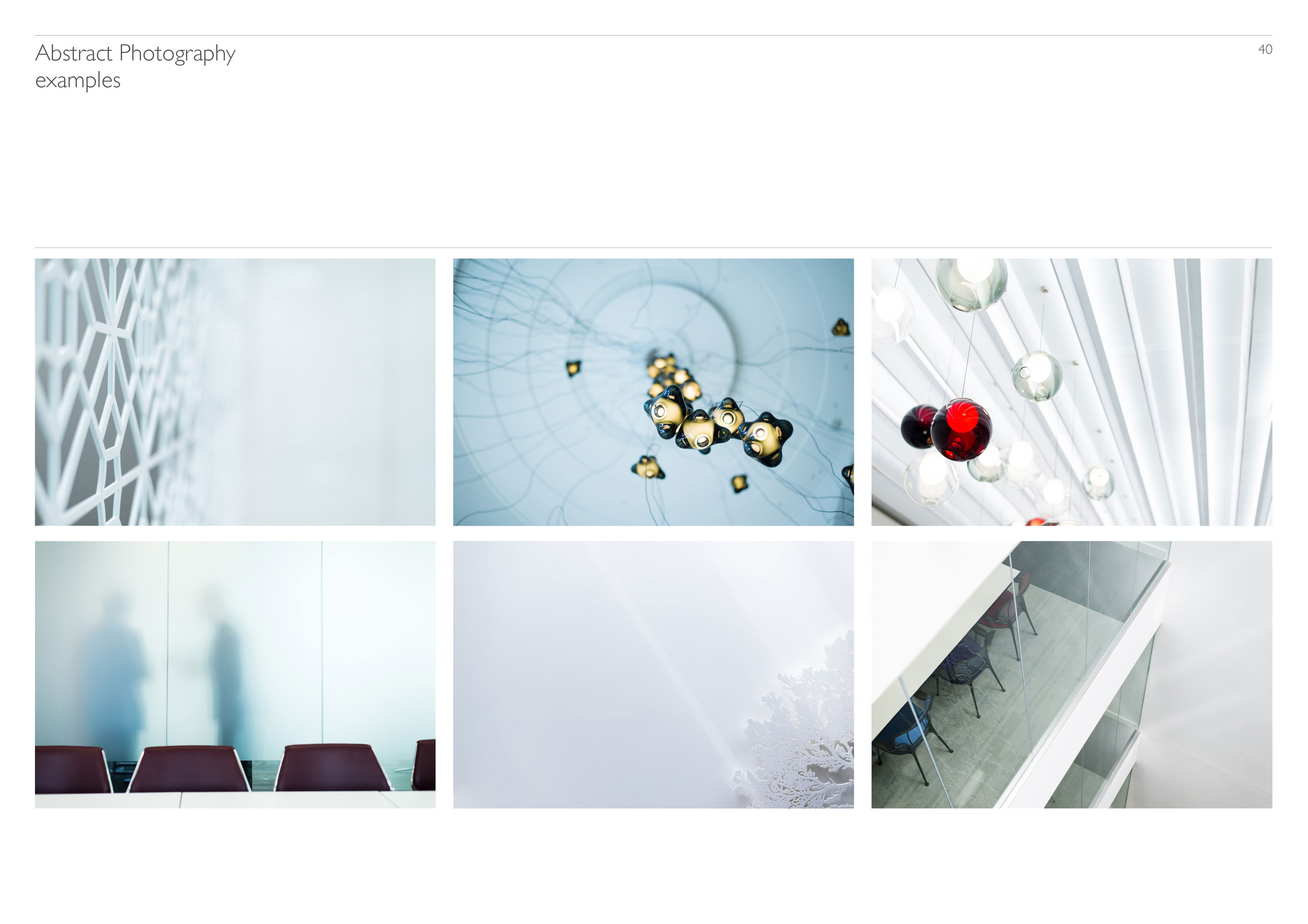
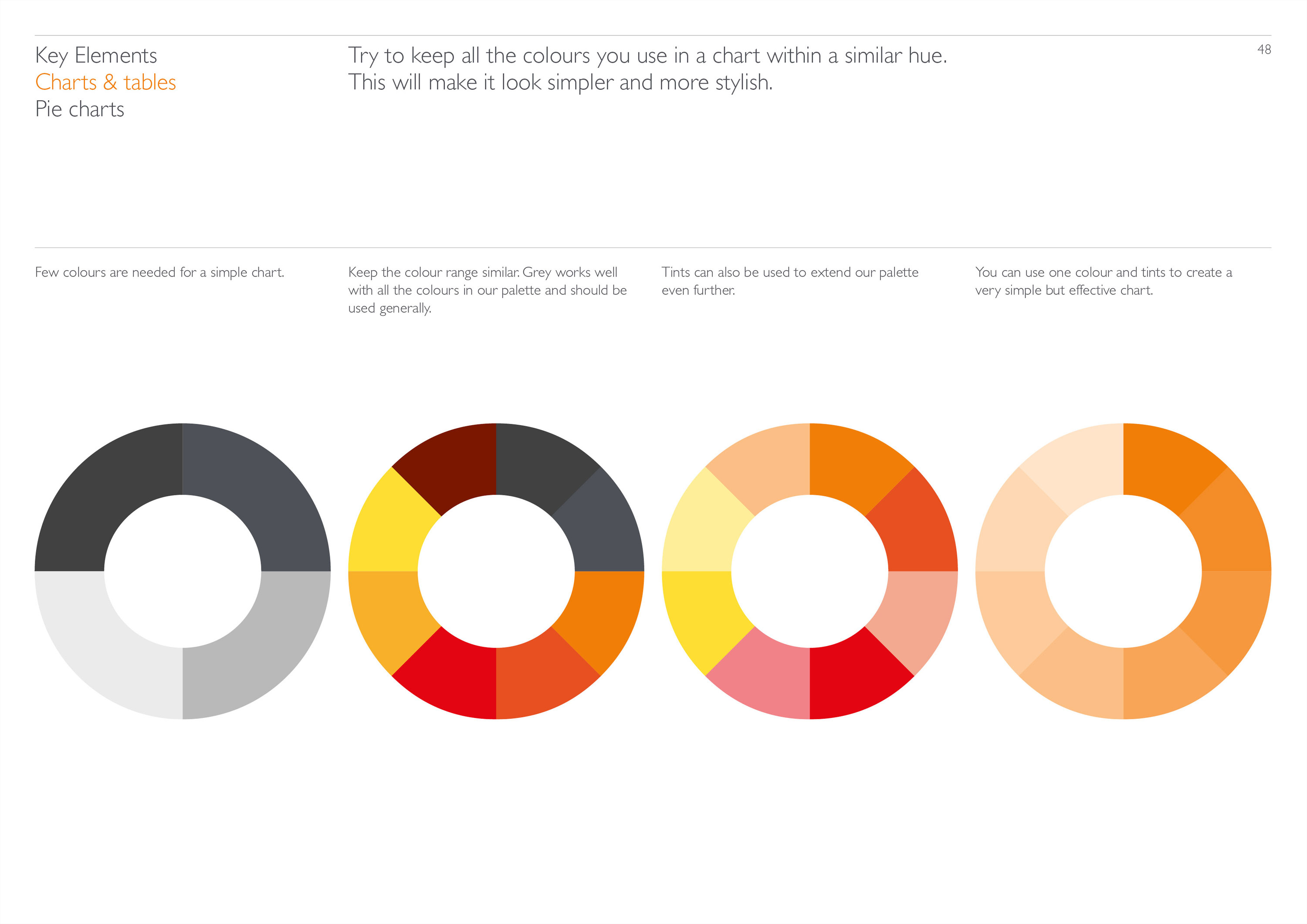
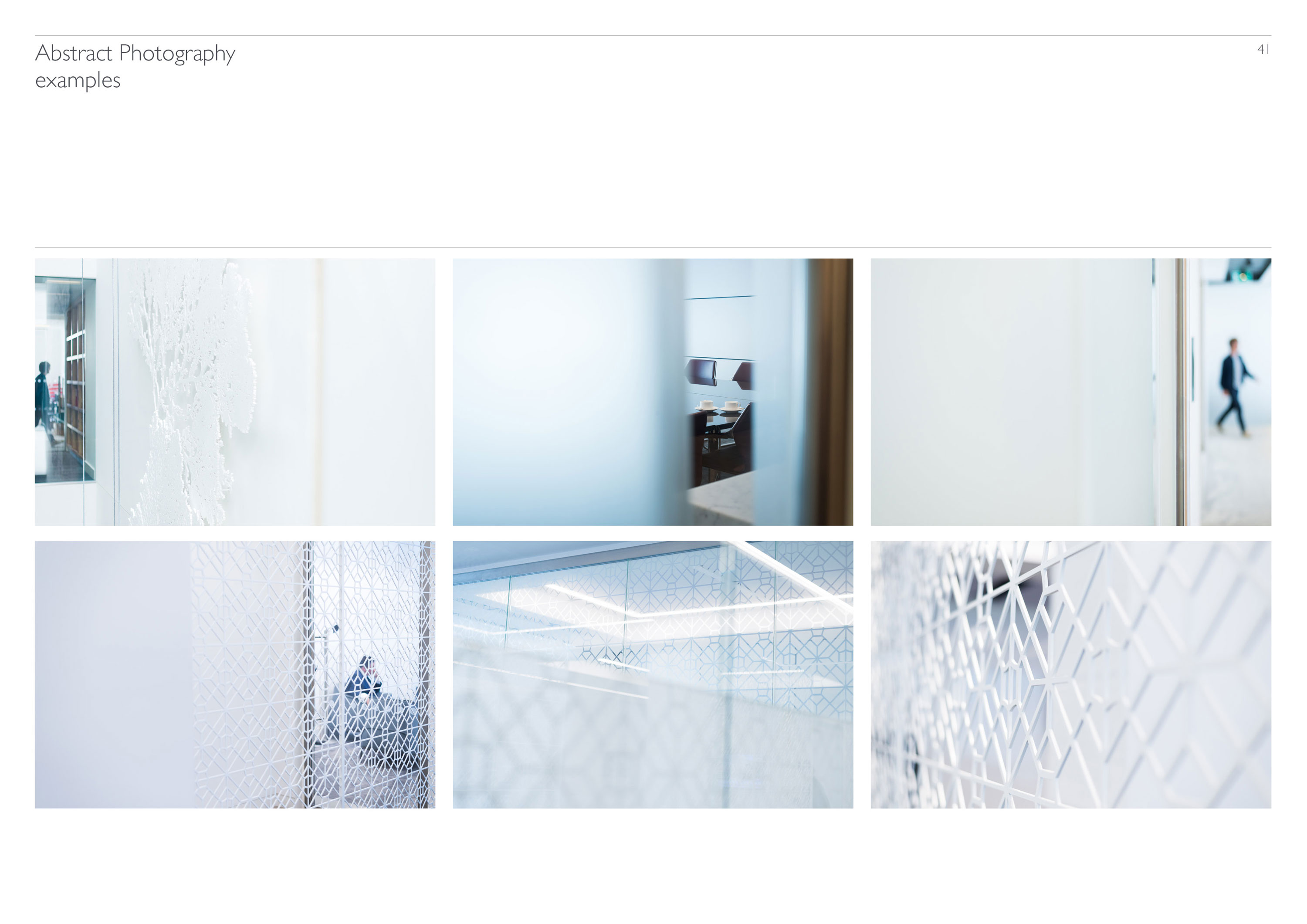
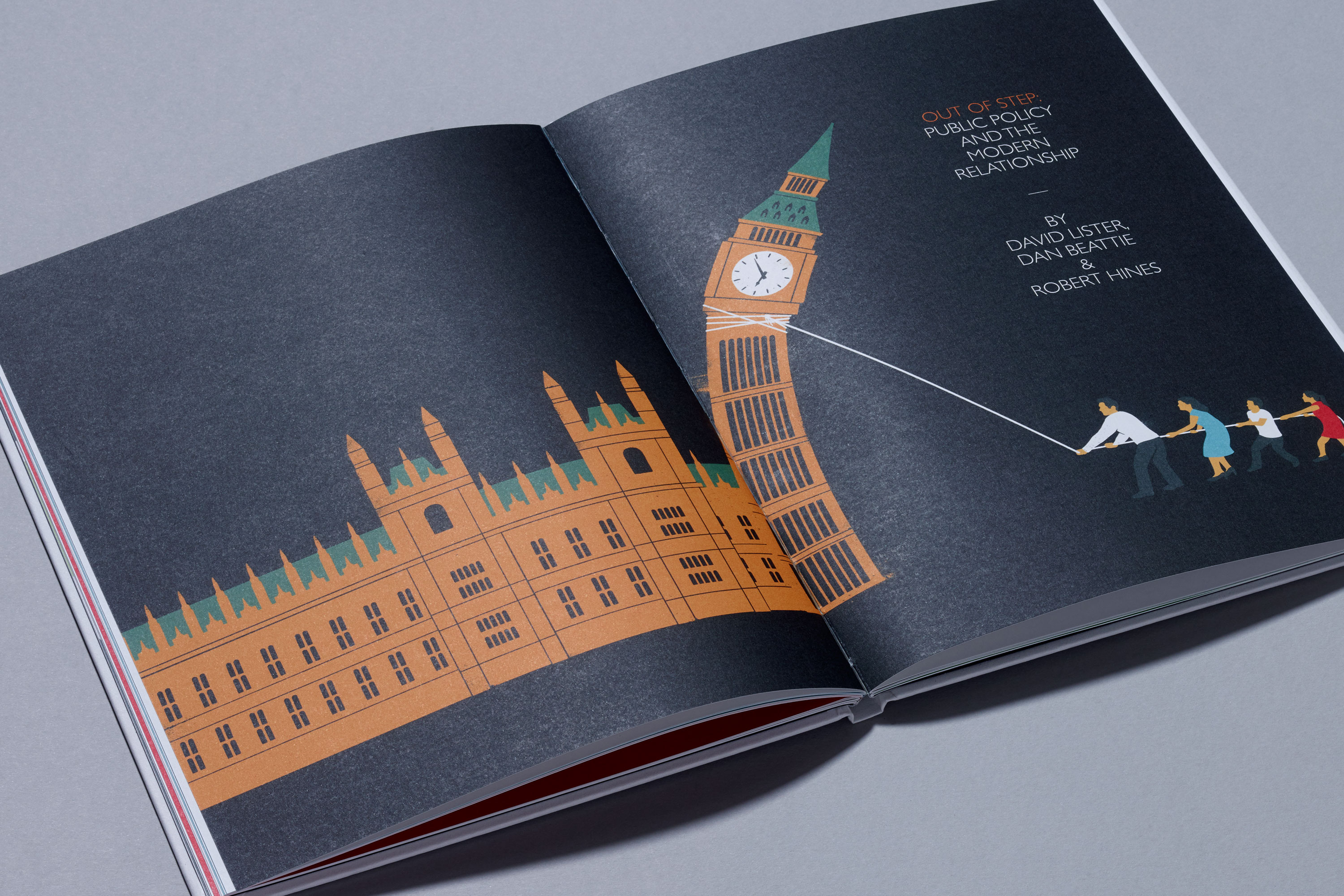
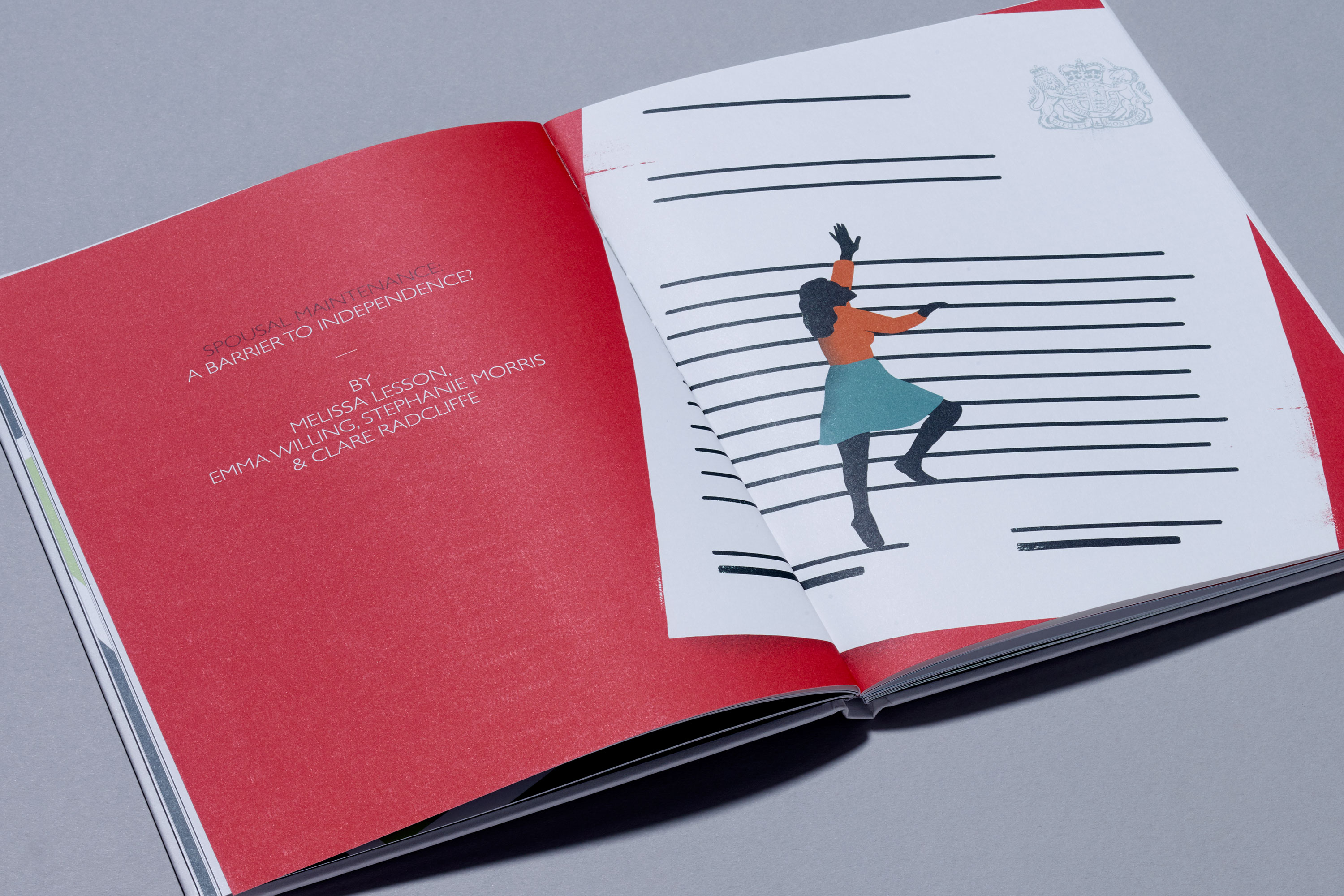
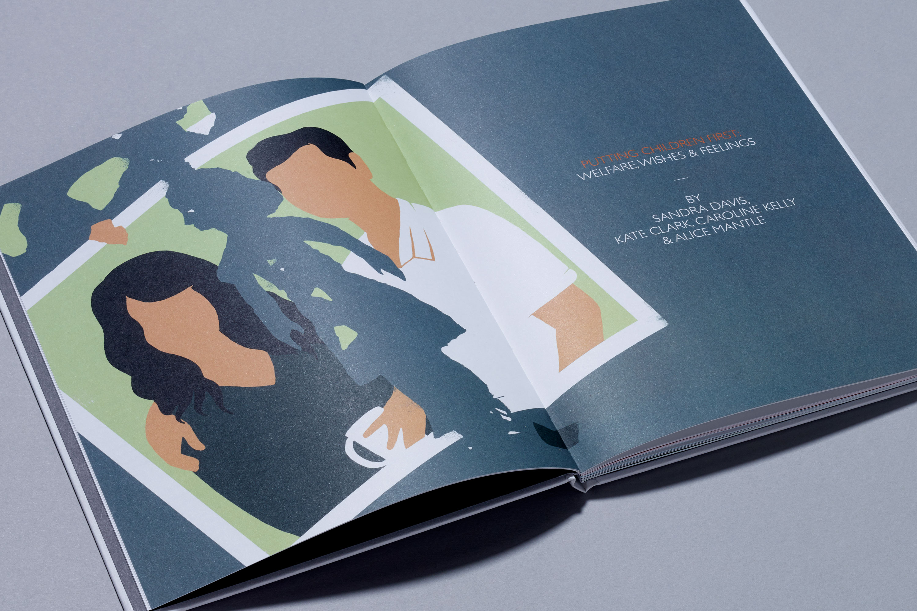
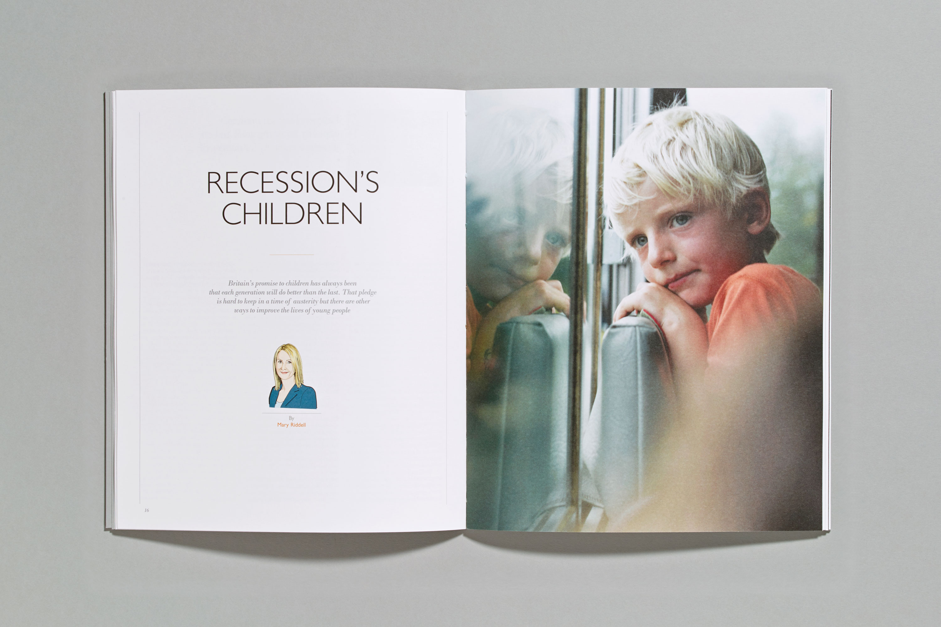
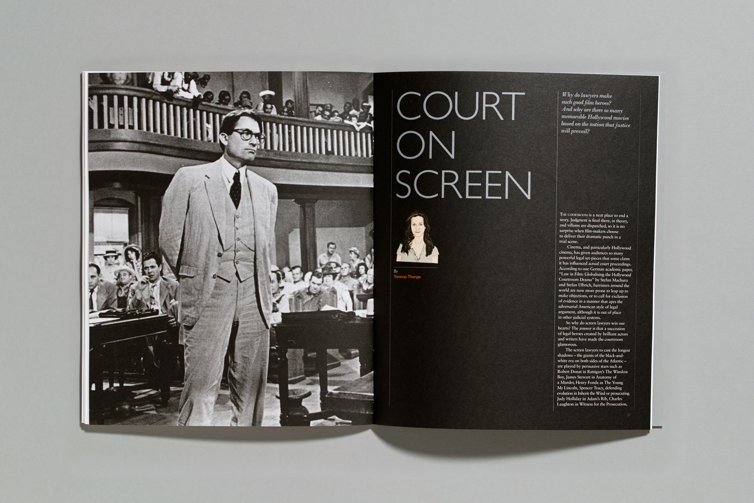
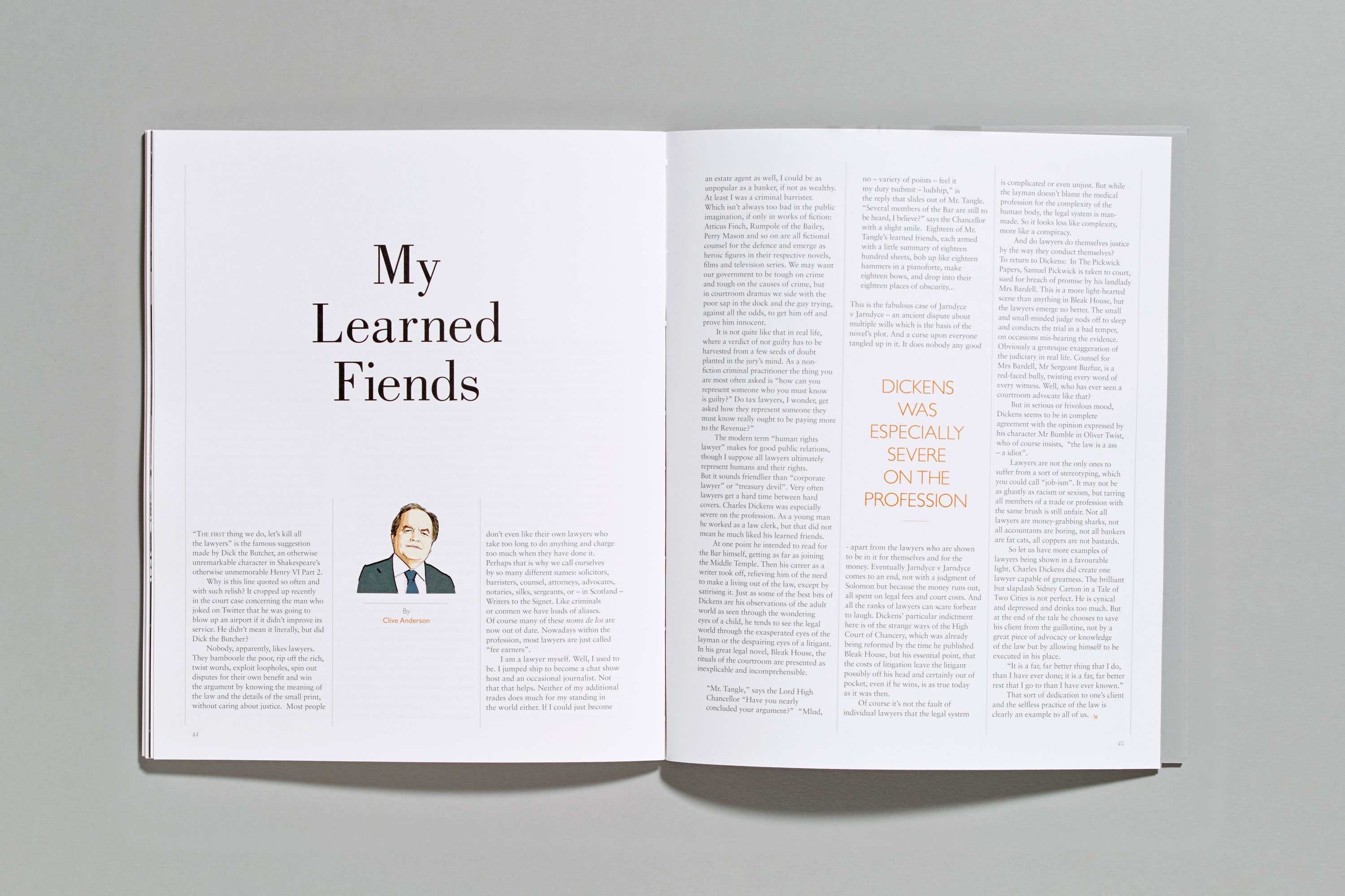
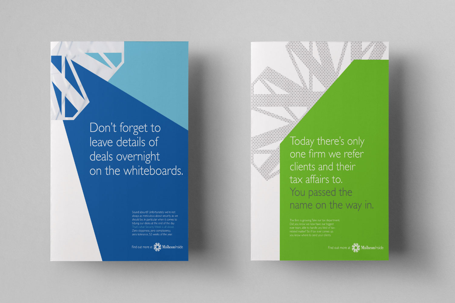
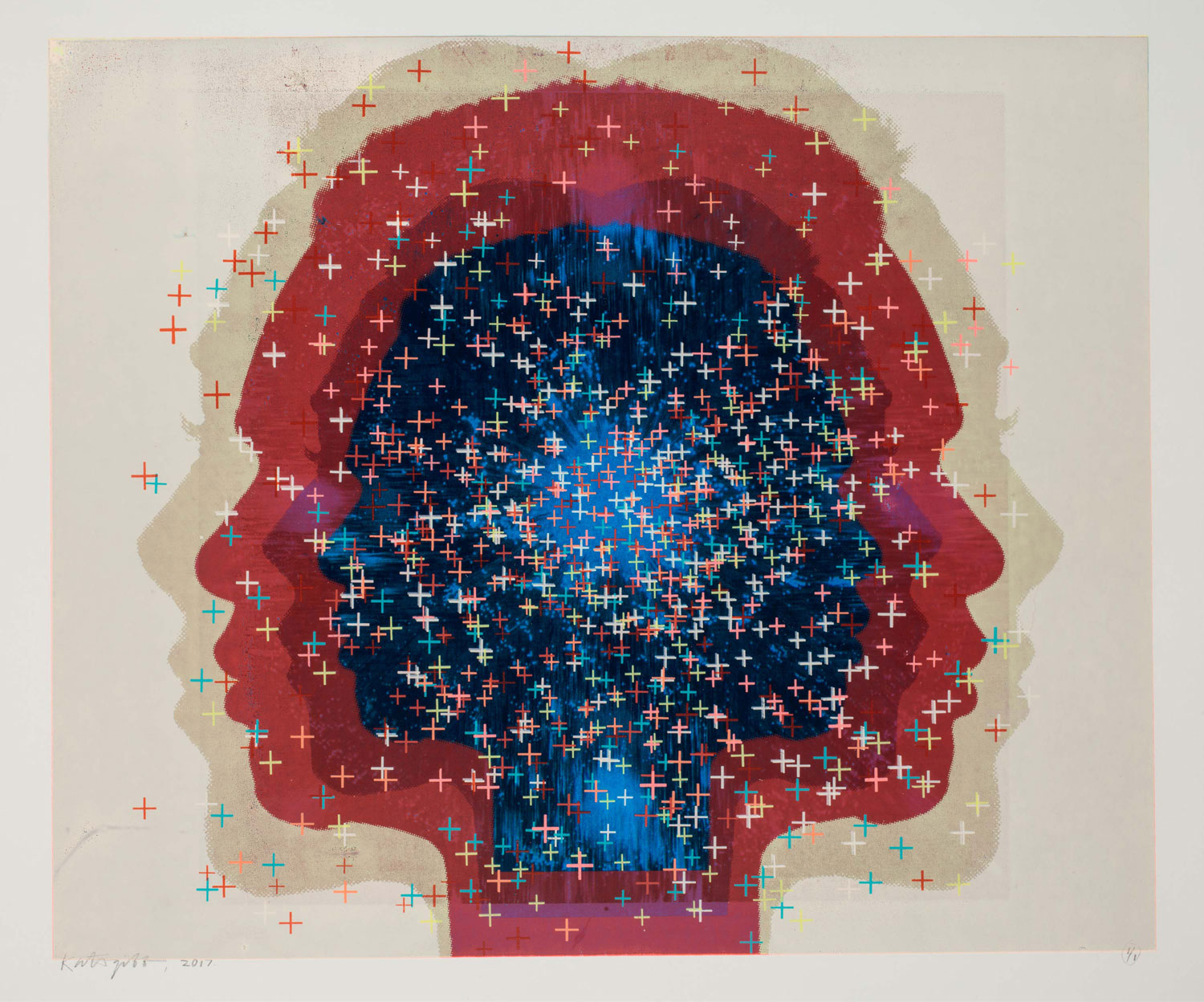
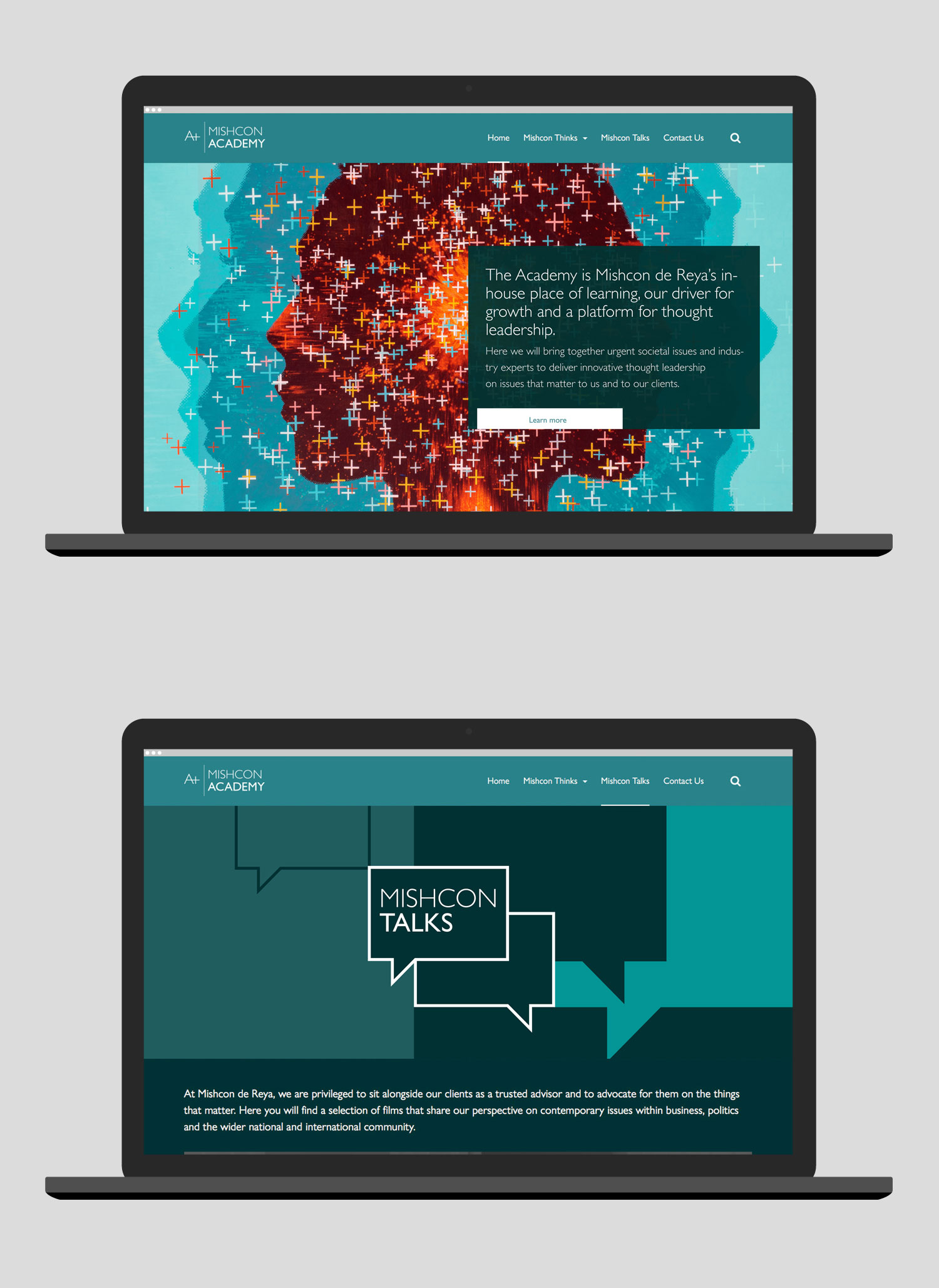
What we could do however, was change the look of the identity that surrounded the logo. From its original state of just two colours (grey and orange) we generated new illustrations and photography along with an expanded colour palette to bring new life into the brand.


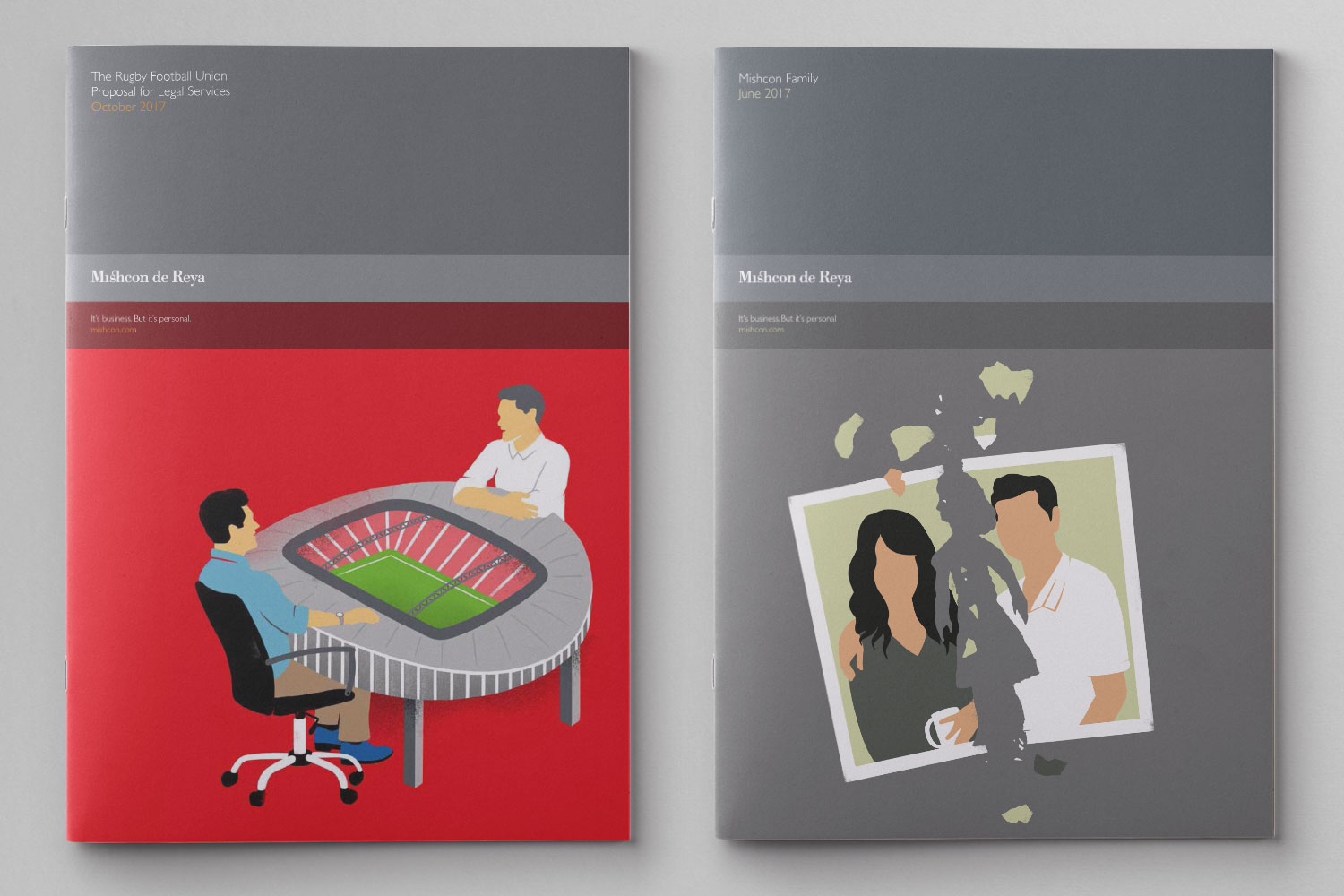
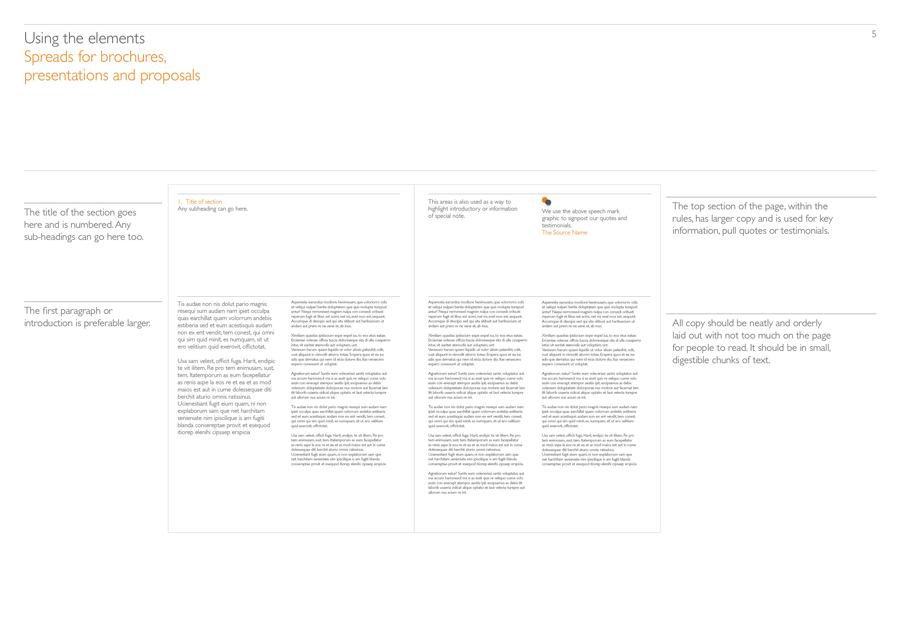
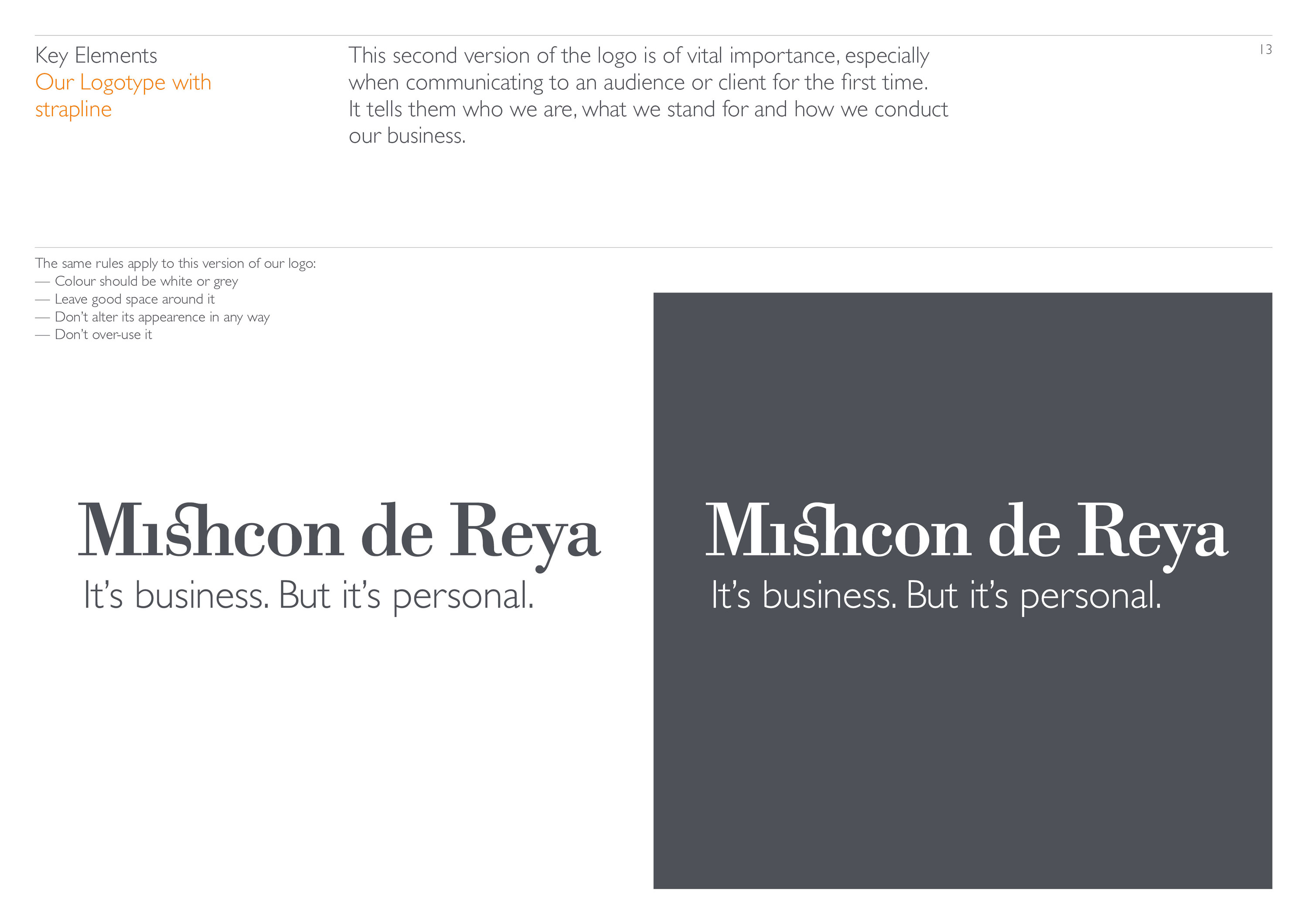
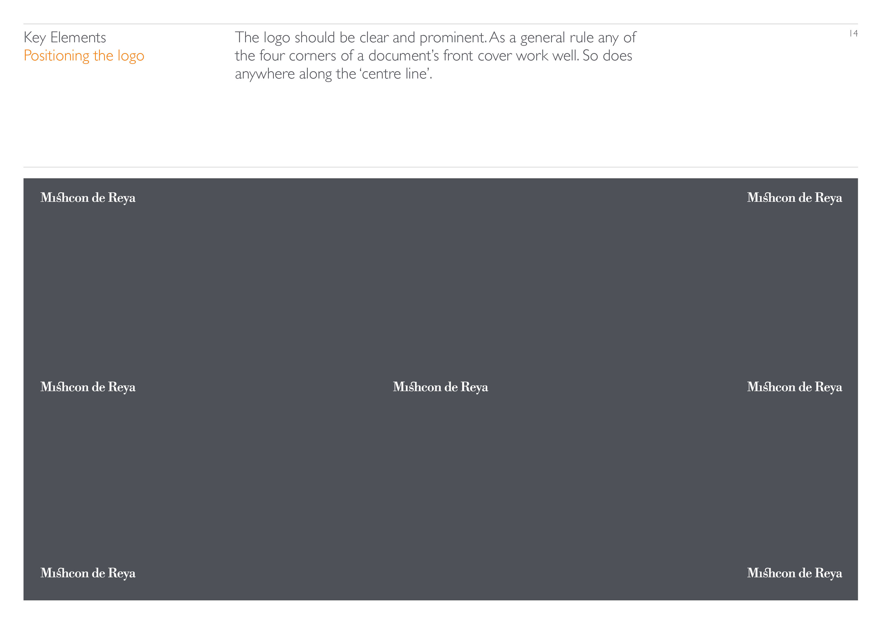
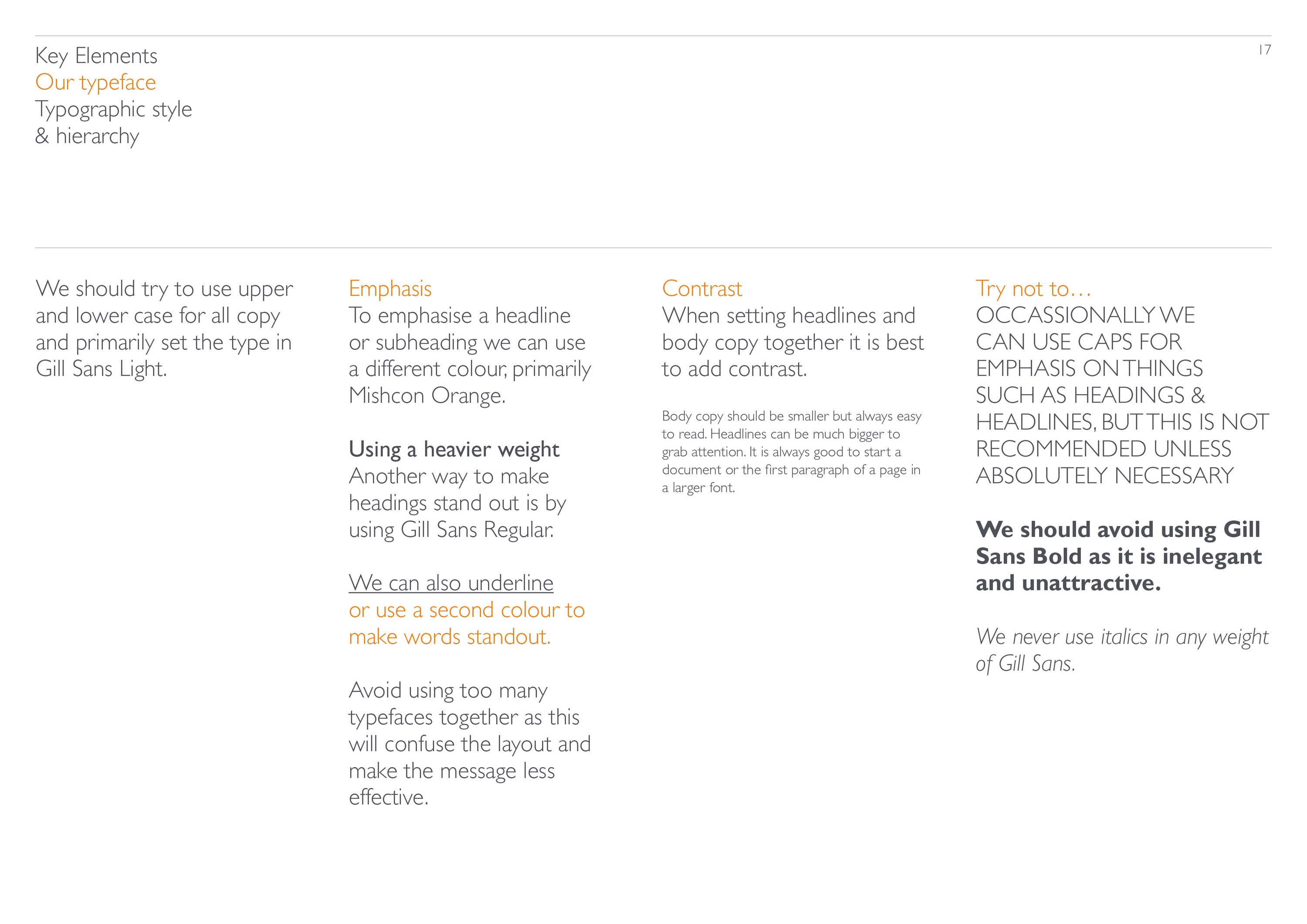
We also created a more detailed set of guidelines that elevated the status of the logo by applying it more rigorously and respectfully.
Our work with Mishcon de Reya is a great example of what can be achieved by building a long term relationship and working closely with a client in order to produce evolving, consistent and fresh visuals across the spectrum of their entire practice.

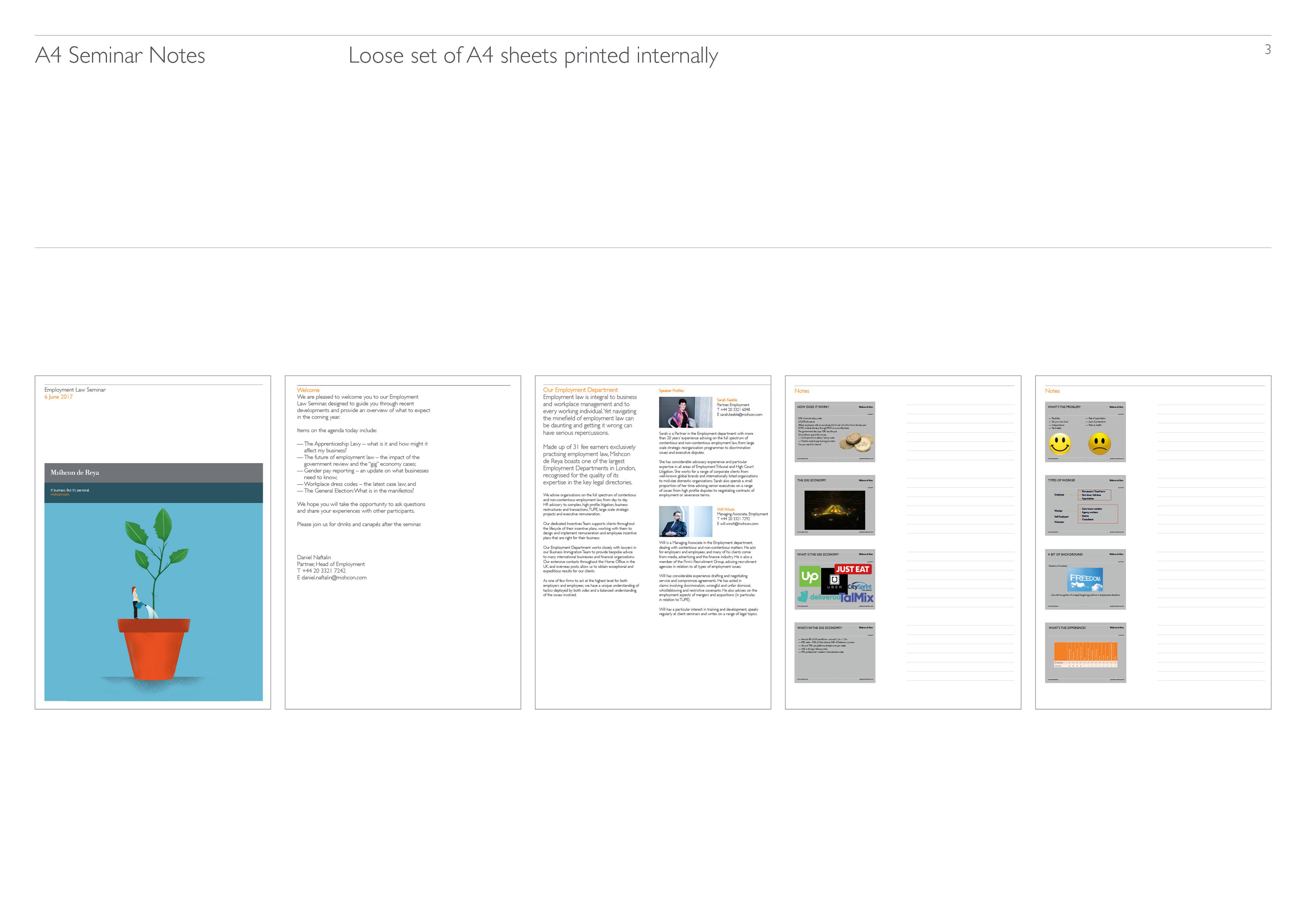
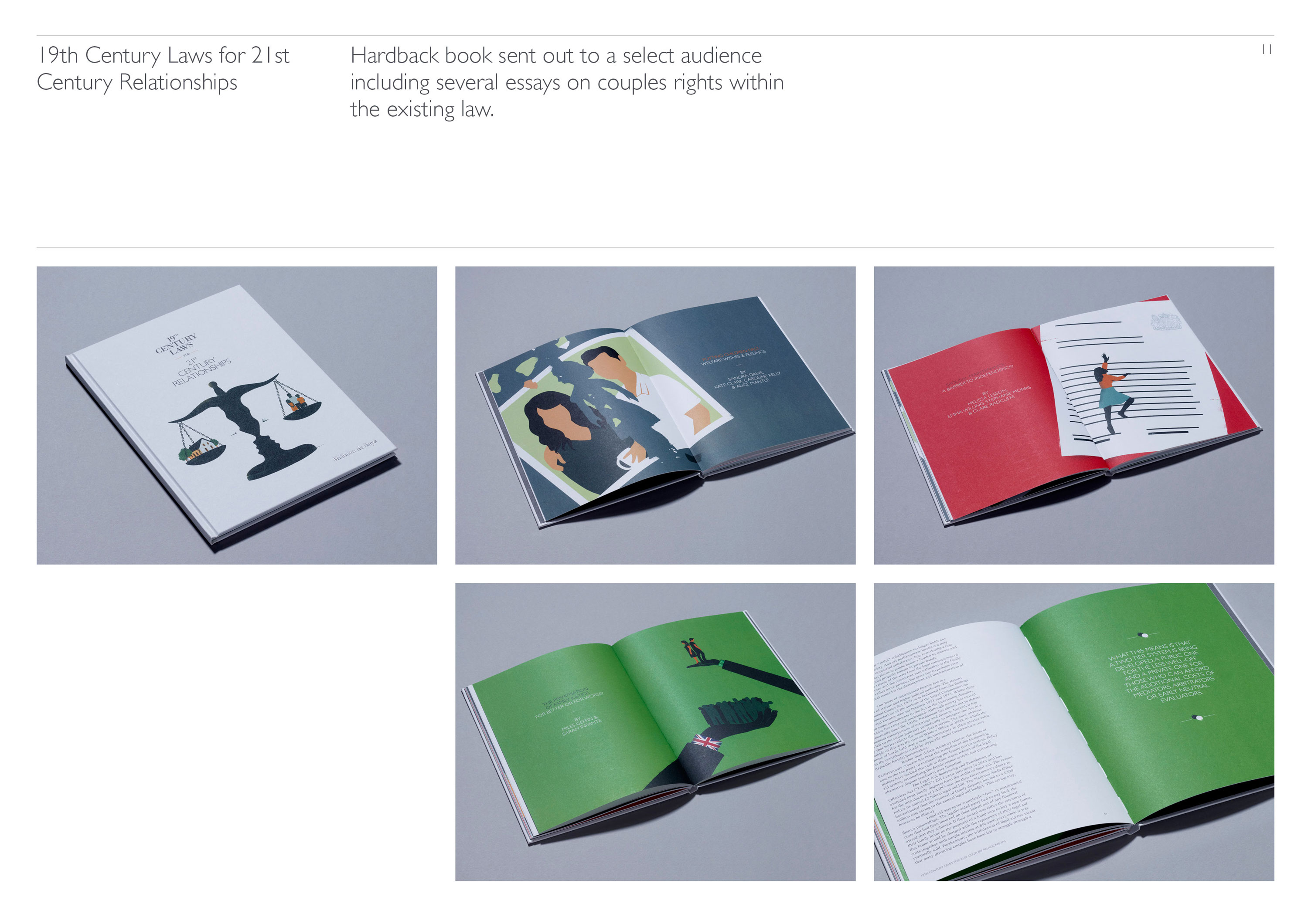
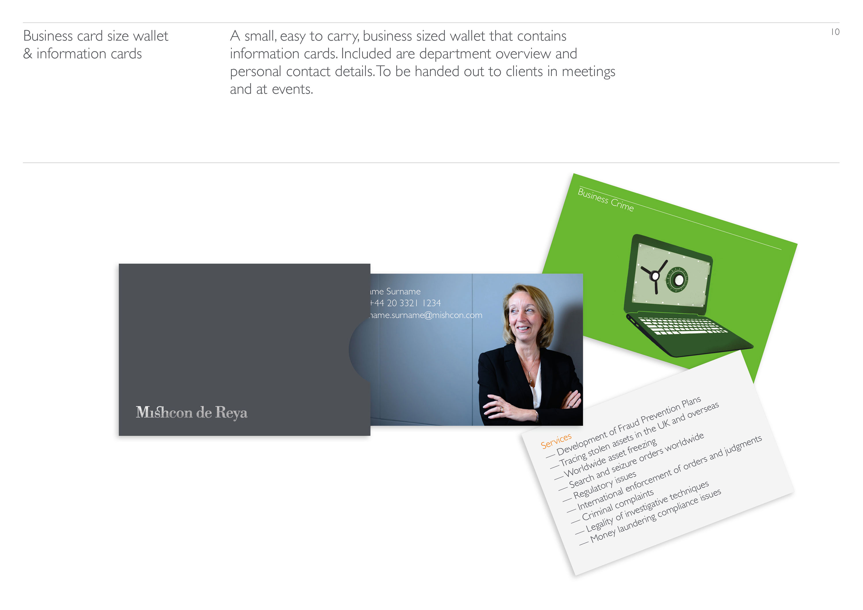

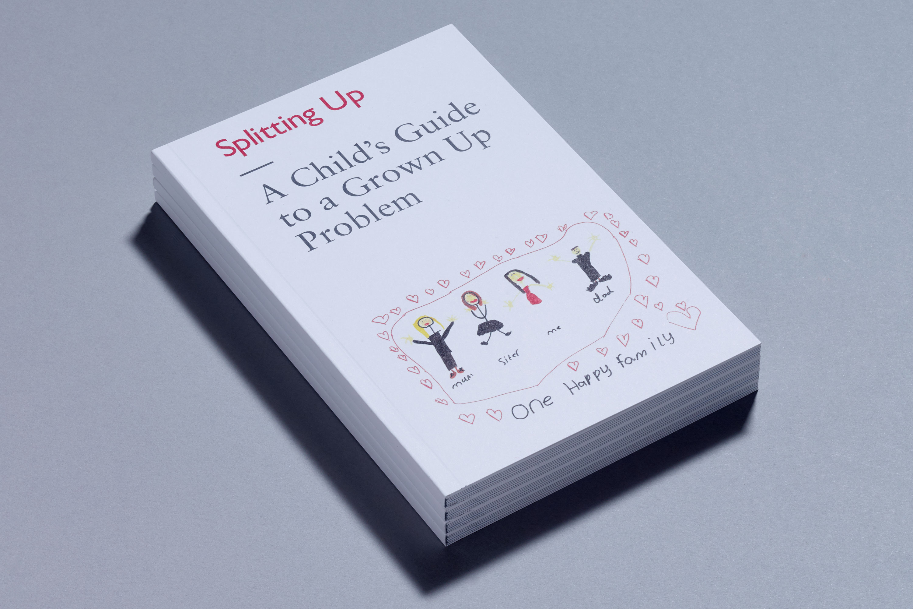
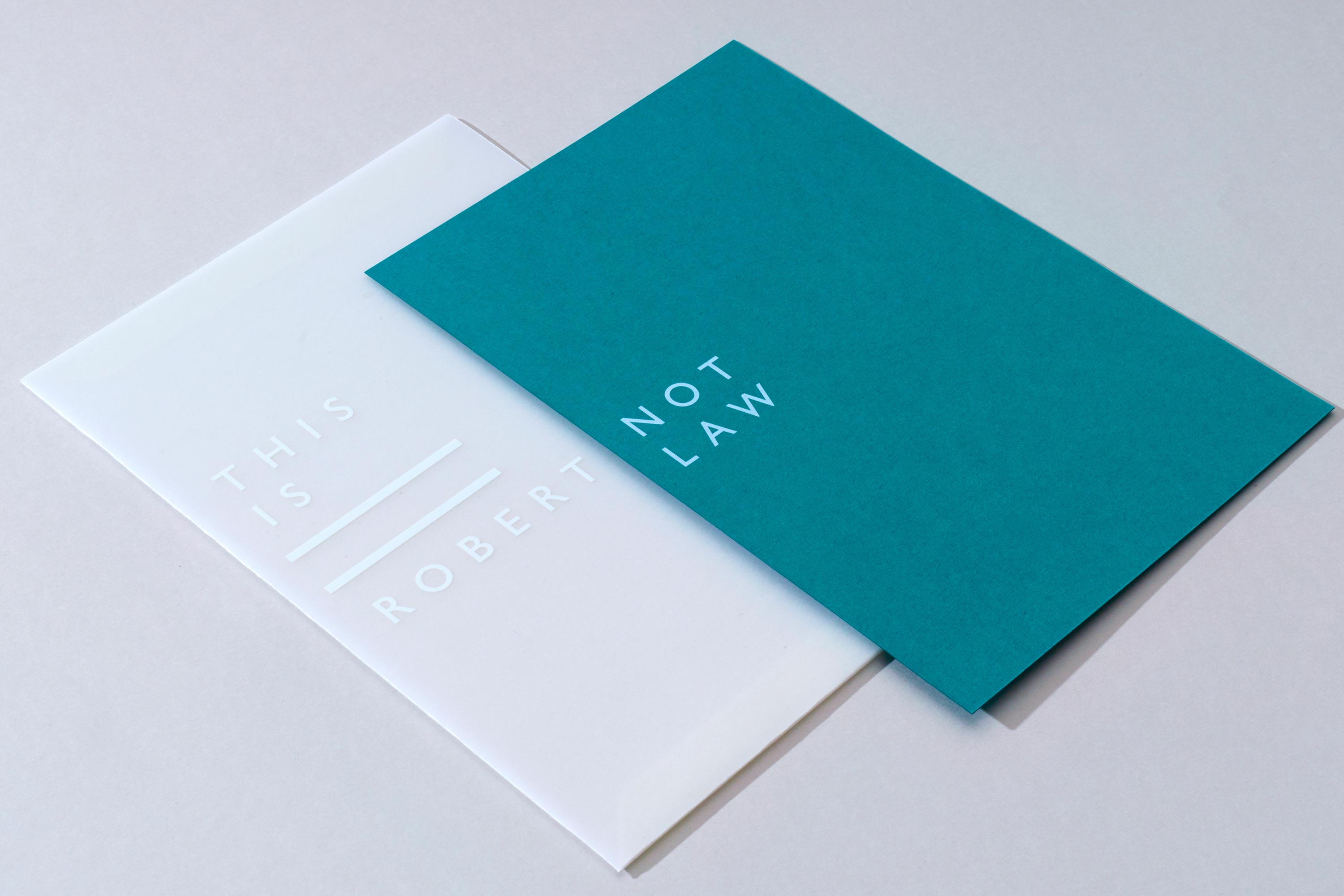
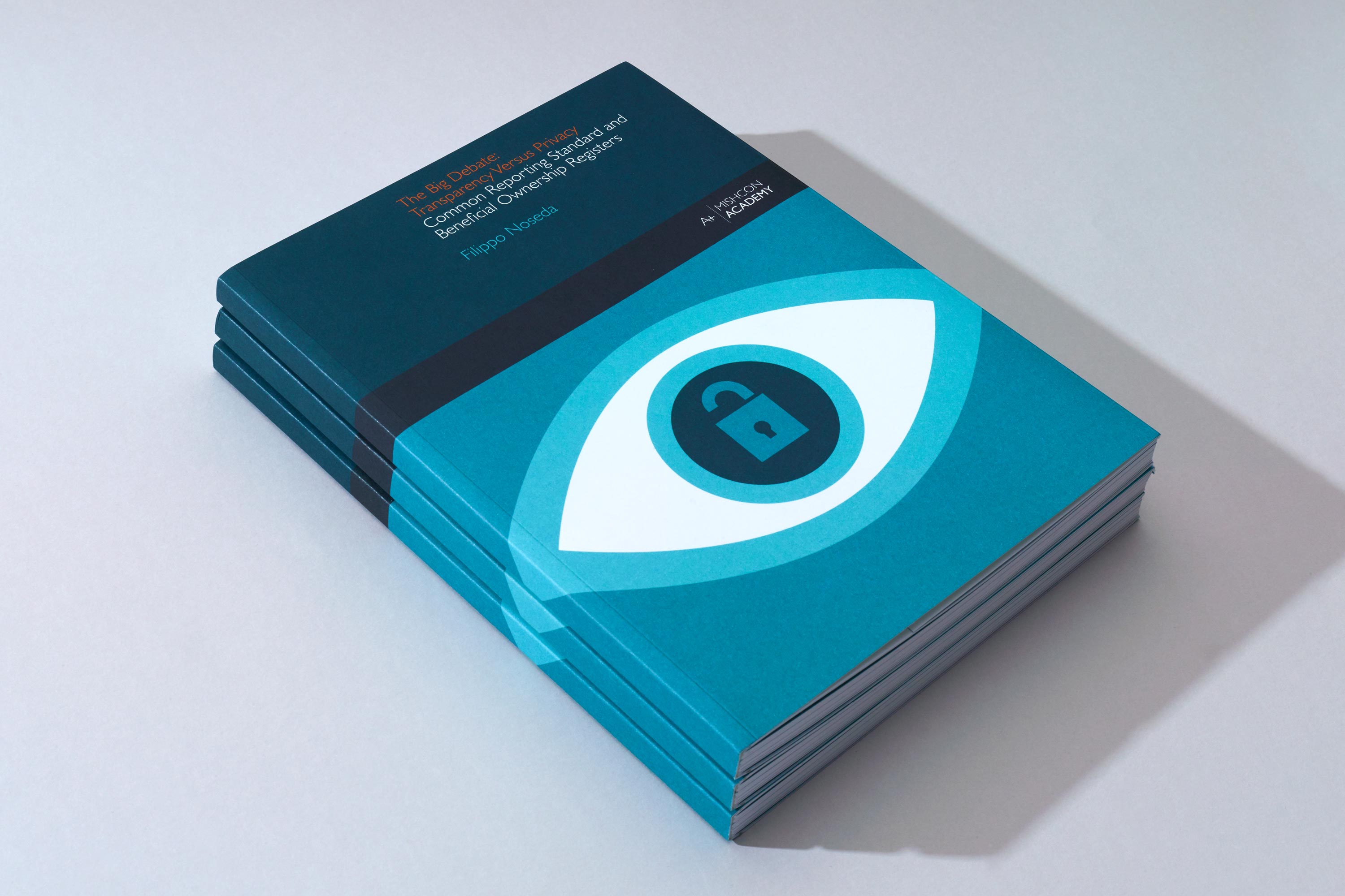
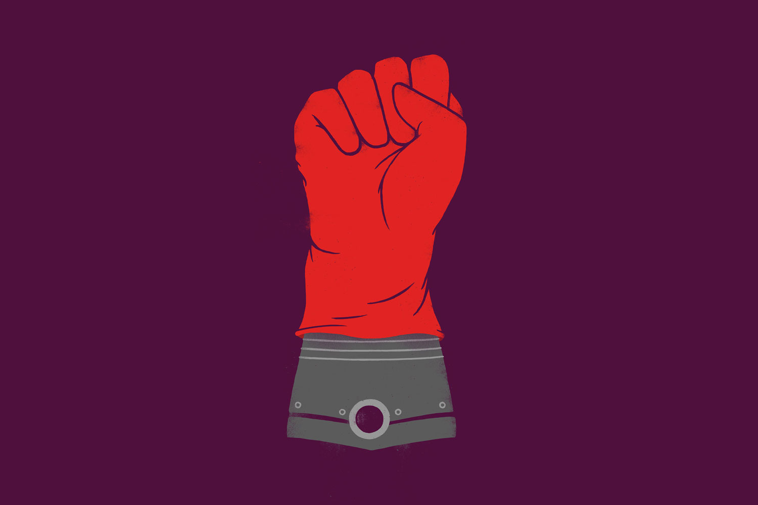
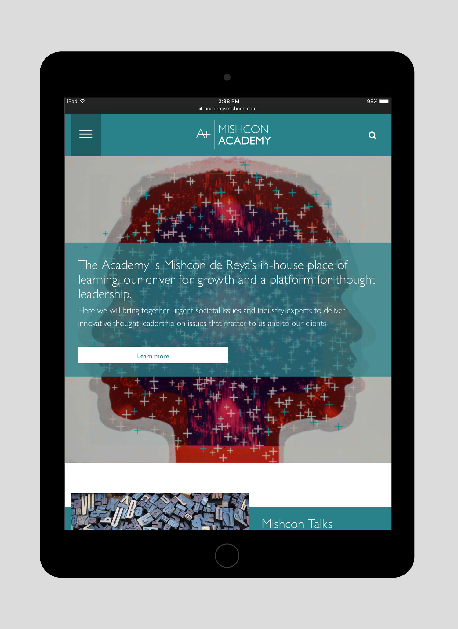
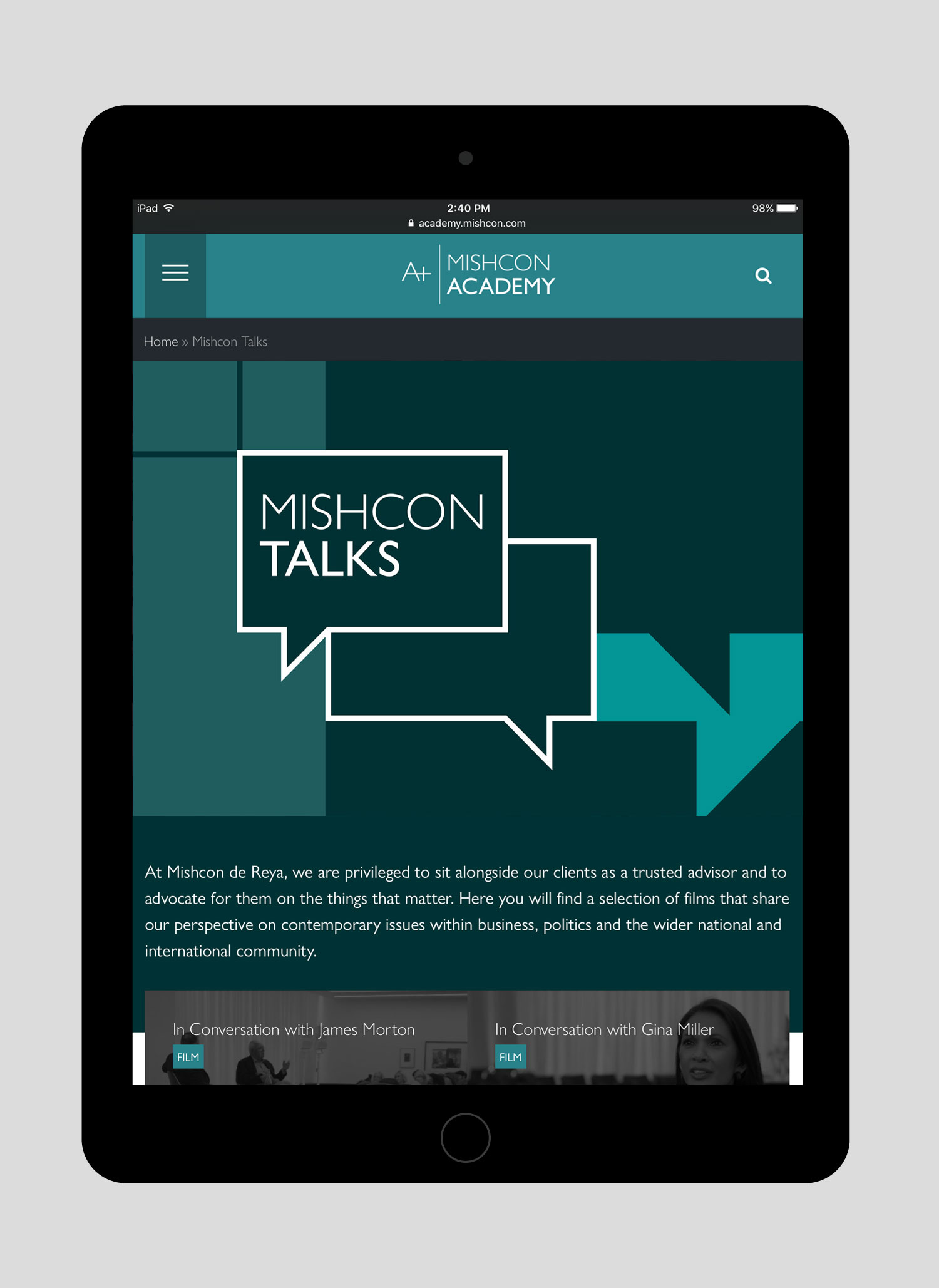
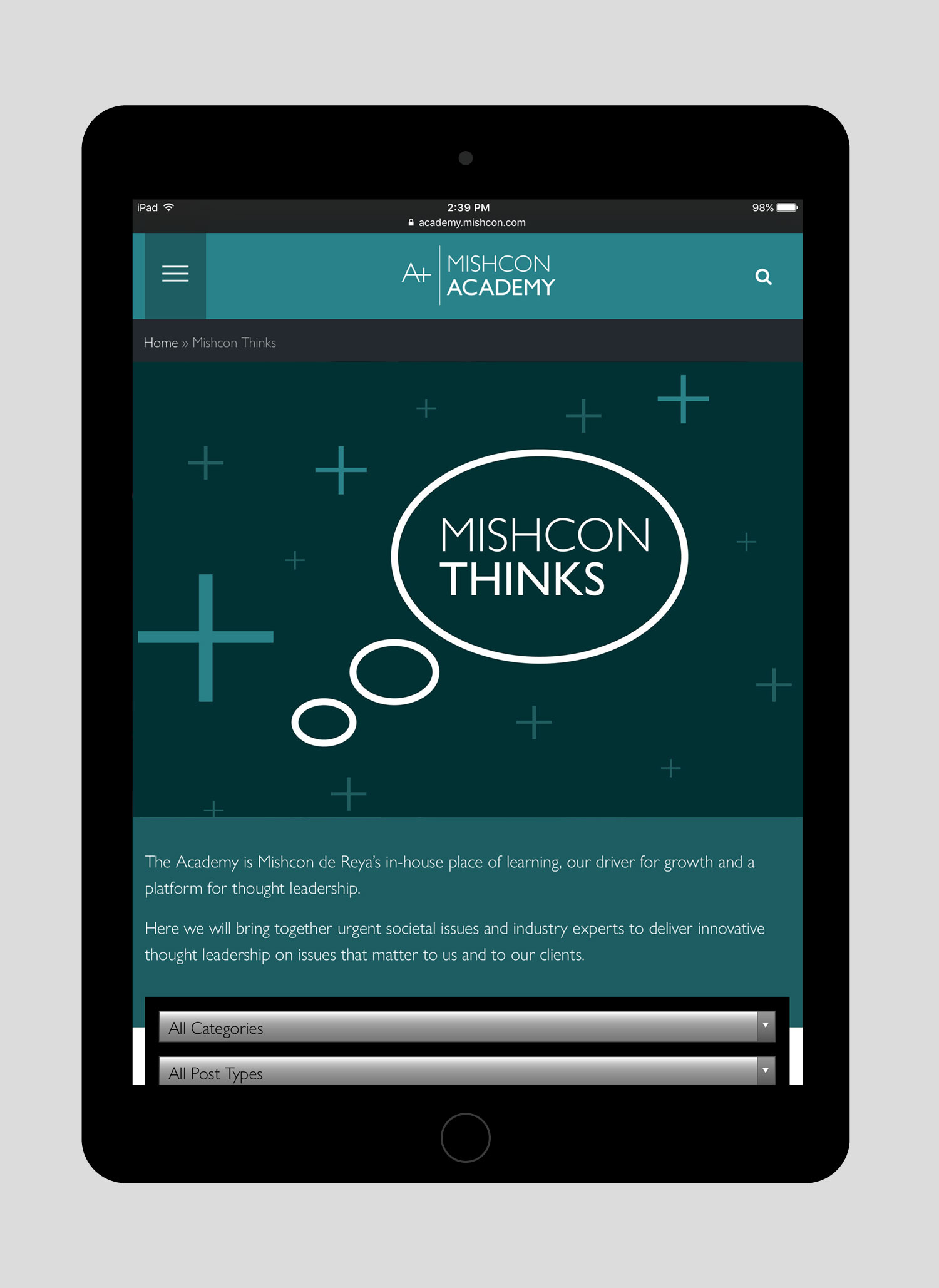
It isn't just the external communication we help shape. We work with Mishcon to bring to life many internal and leading industry initiatives ranging from graduate training to sourcing ethically responsible luxury goods.
Work carried out
—
Brand refresh
Identity guidelines
Art direction
Digital design
Internal communications
Annual reports
Editorial design


Relevant work
Oxera

Rockworth