
Insight Shipping
Starting with simplicity.
As a start-up company it is often difficult to know exactly what your new company stands for. Sometimes it can be difficult to define what it is you do in a way that people will quickly and easily understand.
Insight were the opposite of this. Having been started by people with a history of working for big corporate organisations they wanted to be different; small and agile with a truly personal approach based on mutual trust. Being small they wanted to be diverse and innovative and above all have real integrity.
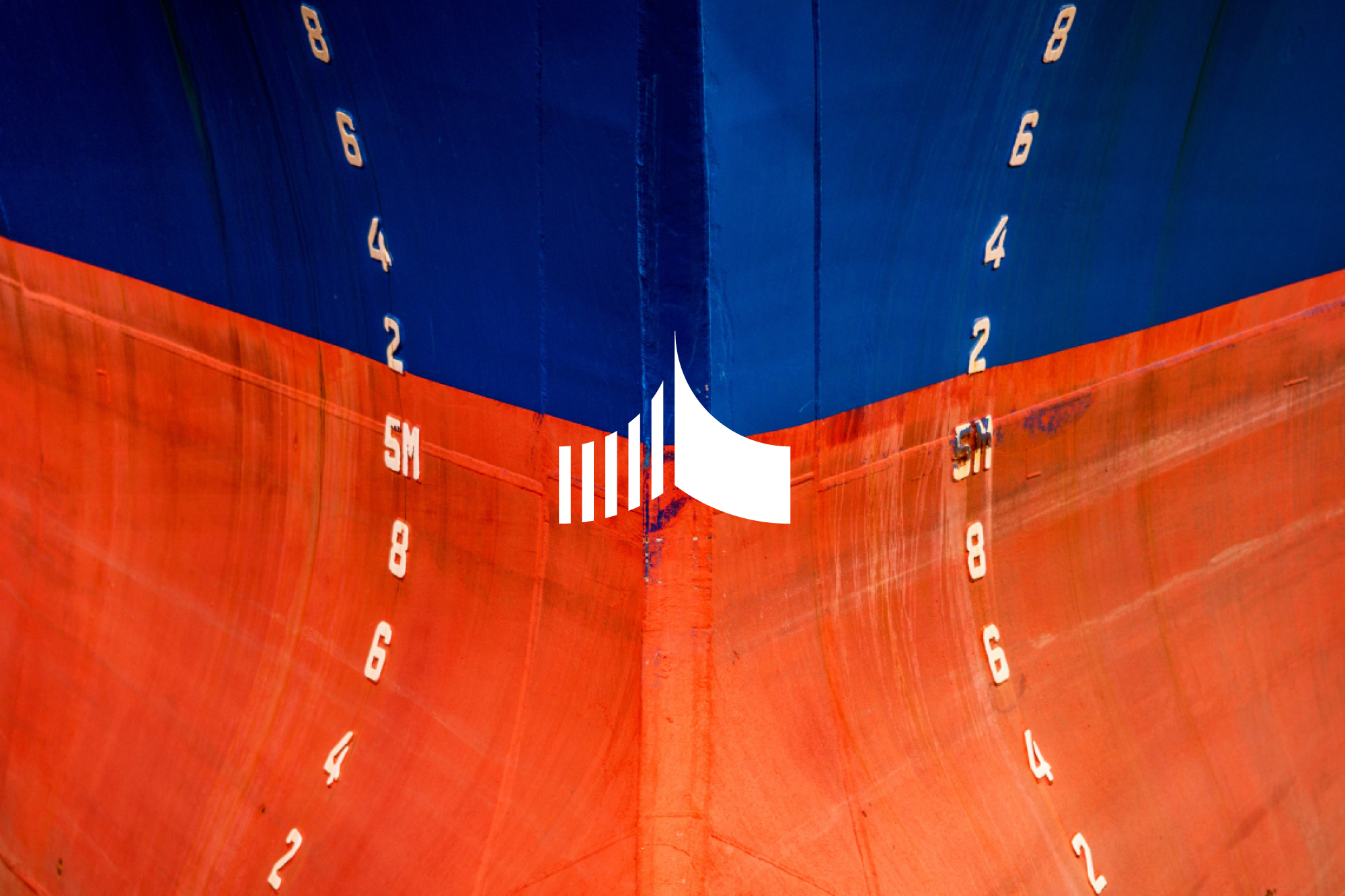
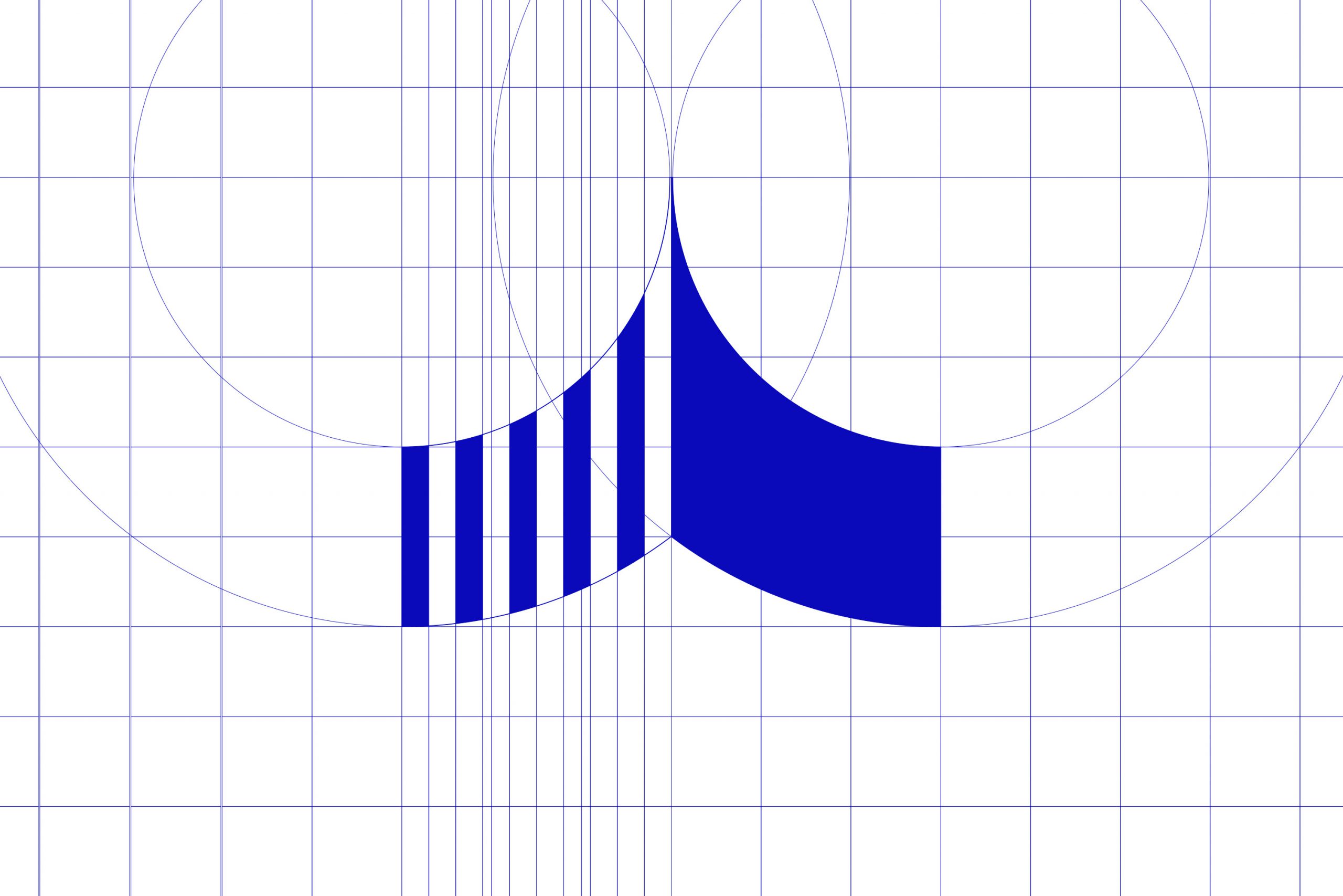
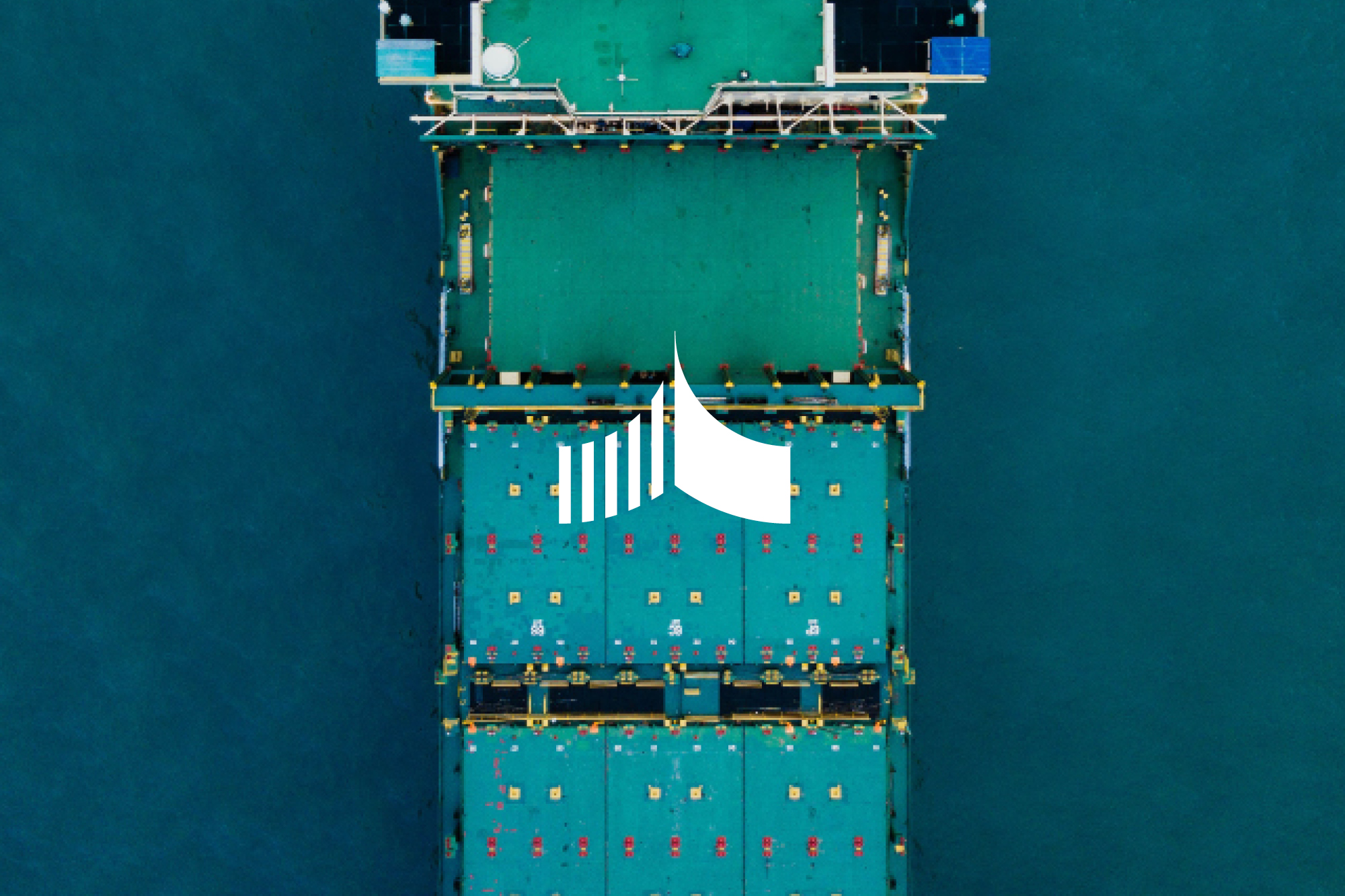
A marque based on a wave shape but also represented relationships forging forward was the simple and elegant solution. As a new company the materials needed at the moment are few but as time goes on the identity will develop and grow.
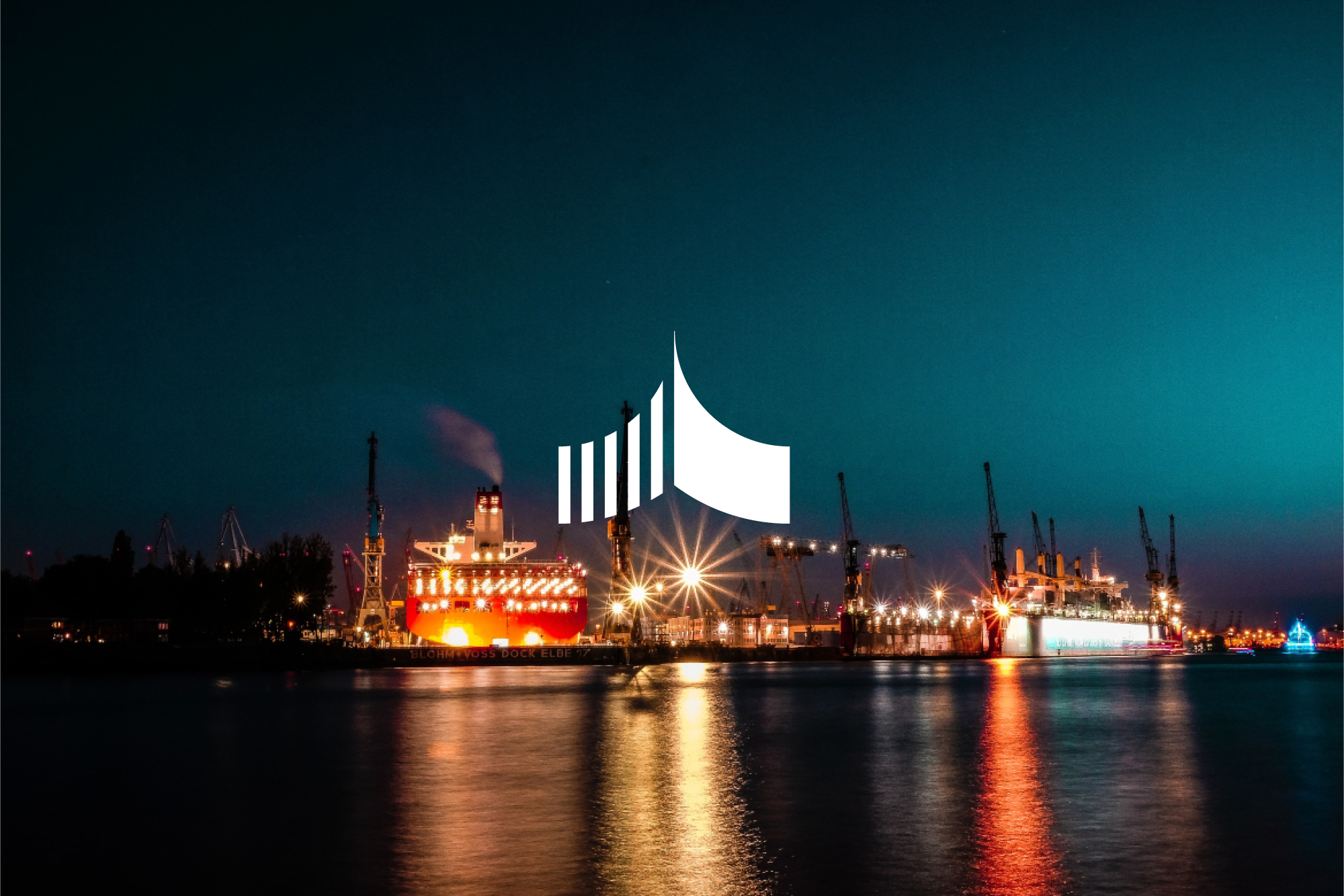
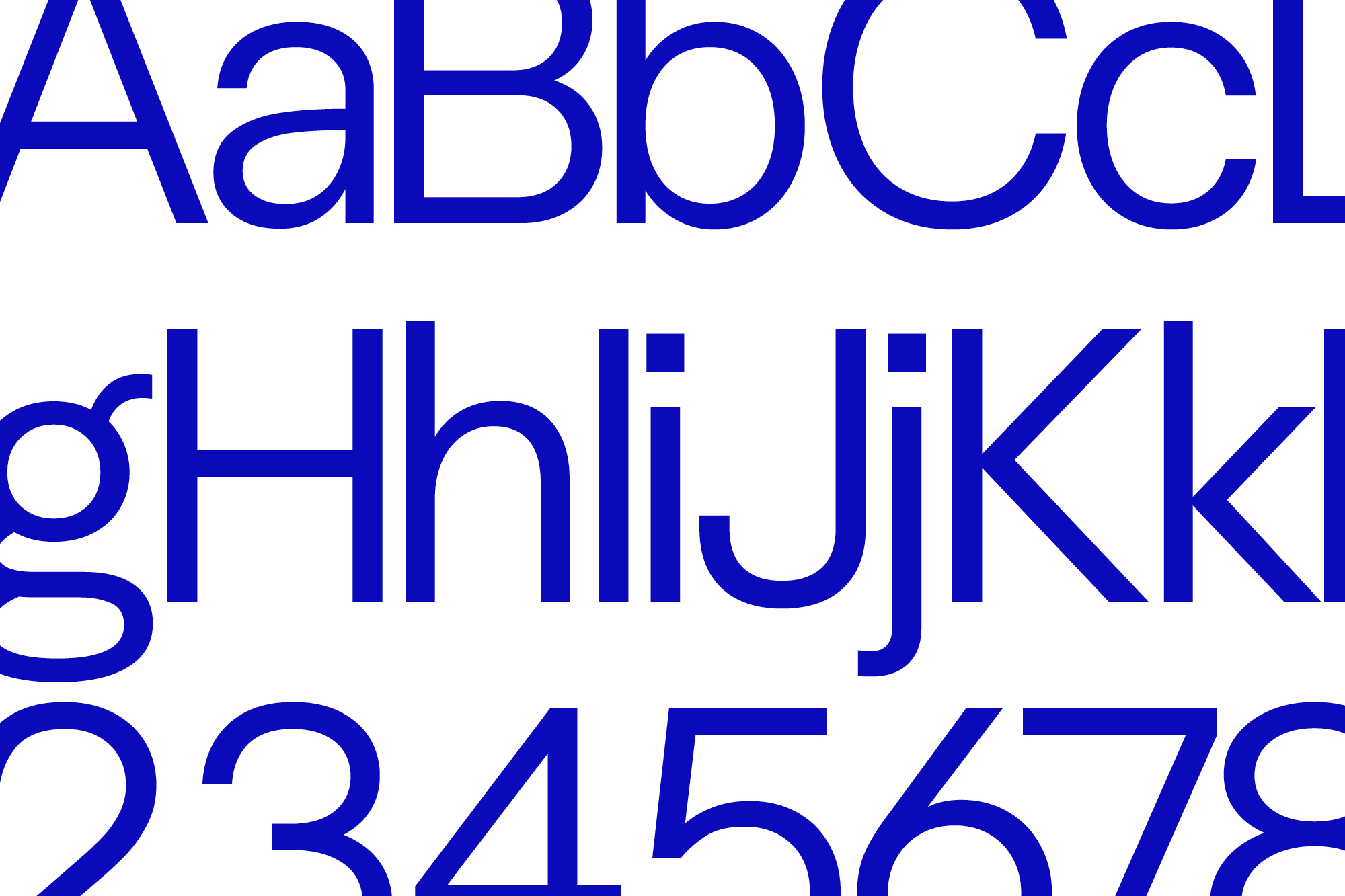


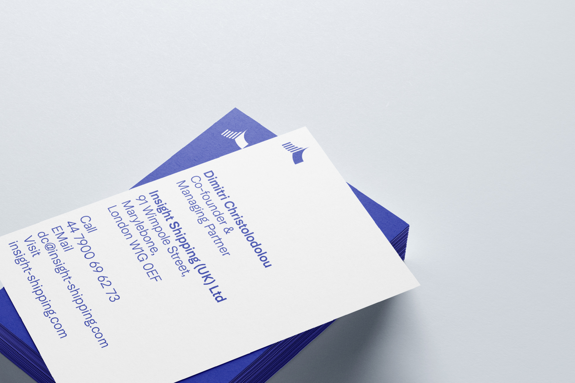
The whole identity is very minimal, only saying what needs to be said without any flowery language. Less is definitely better.
Work carried out
—
Logo design
Visual identity
Iconongraphy
Website design
Relevant work
Sundew

Rockworth