Cordée des Alpes.
Defining a new design standard for a luxury ski resort.
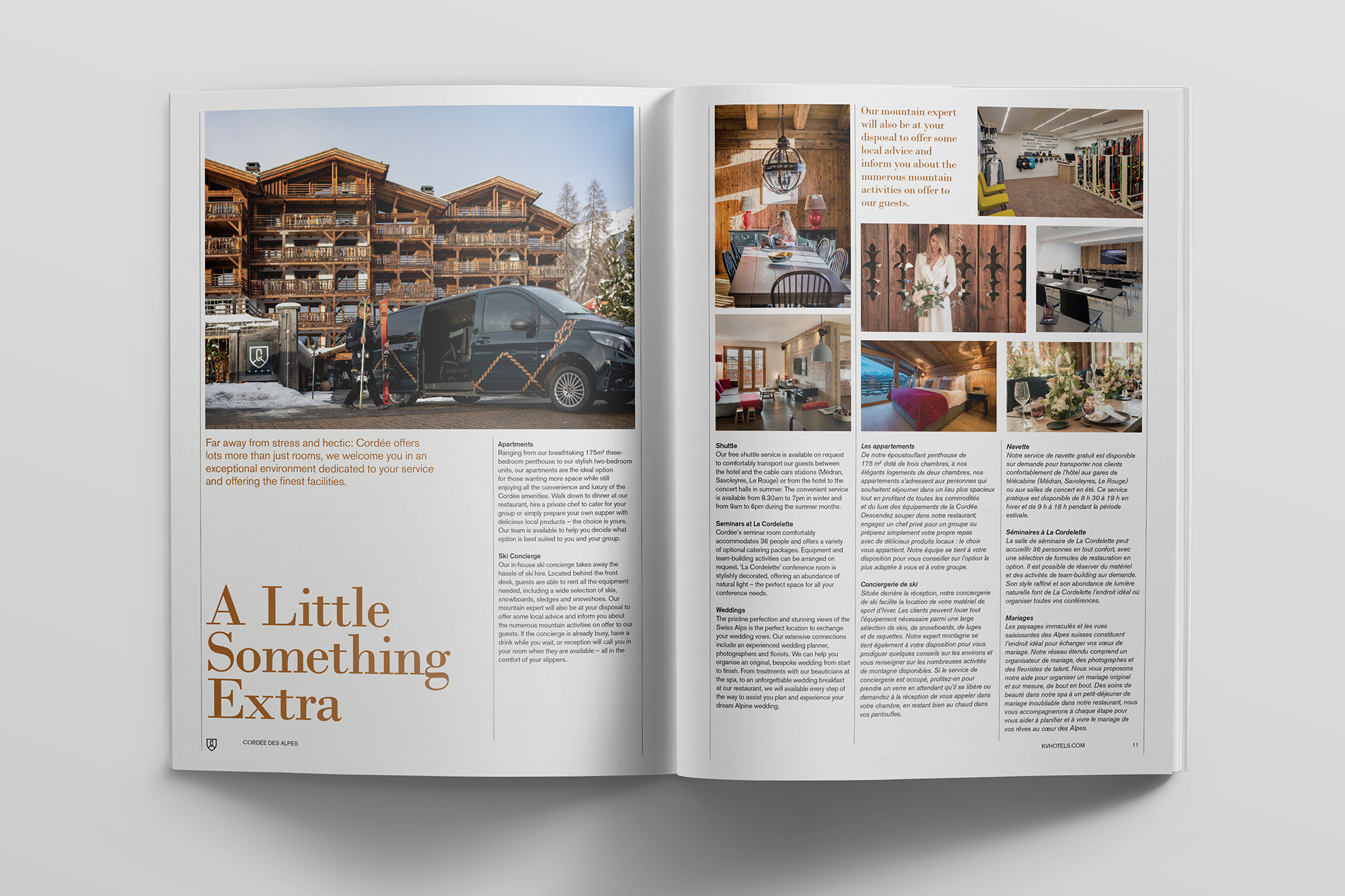
Located in the exclusive ski resort of Verbier in the Swiss Alps, Cordée des Alpes is the brainchild of Marcus Bratter whose vision it was to create something unique – a traditional chalet inspired building but combined with a very modern design style.
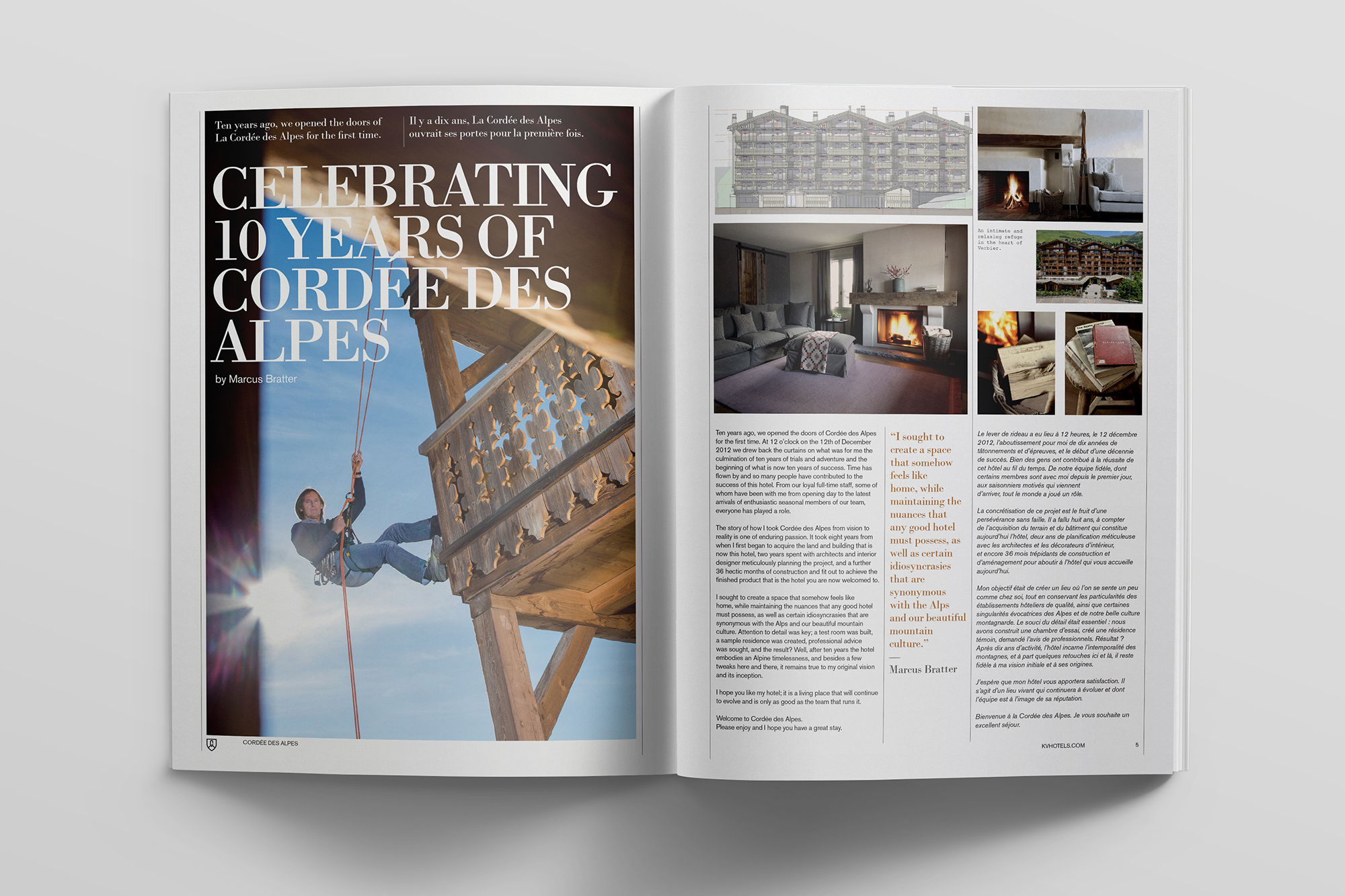
We started working on this luxury hotel, residence and restaurant well before the construction had even begun, creating the identity and marketing materials for potential buyers. It was our first project in what would become an ongoing relationship with the KV Hotels Group.
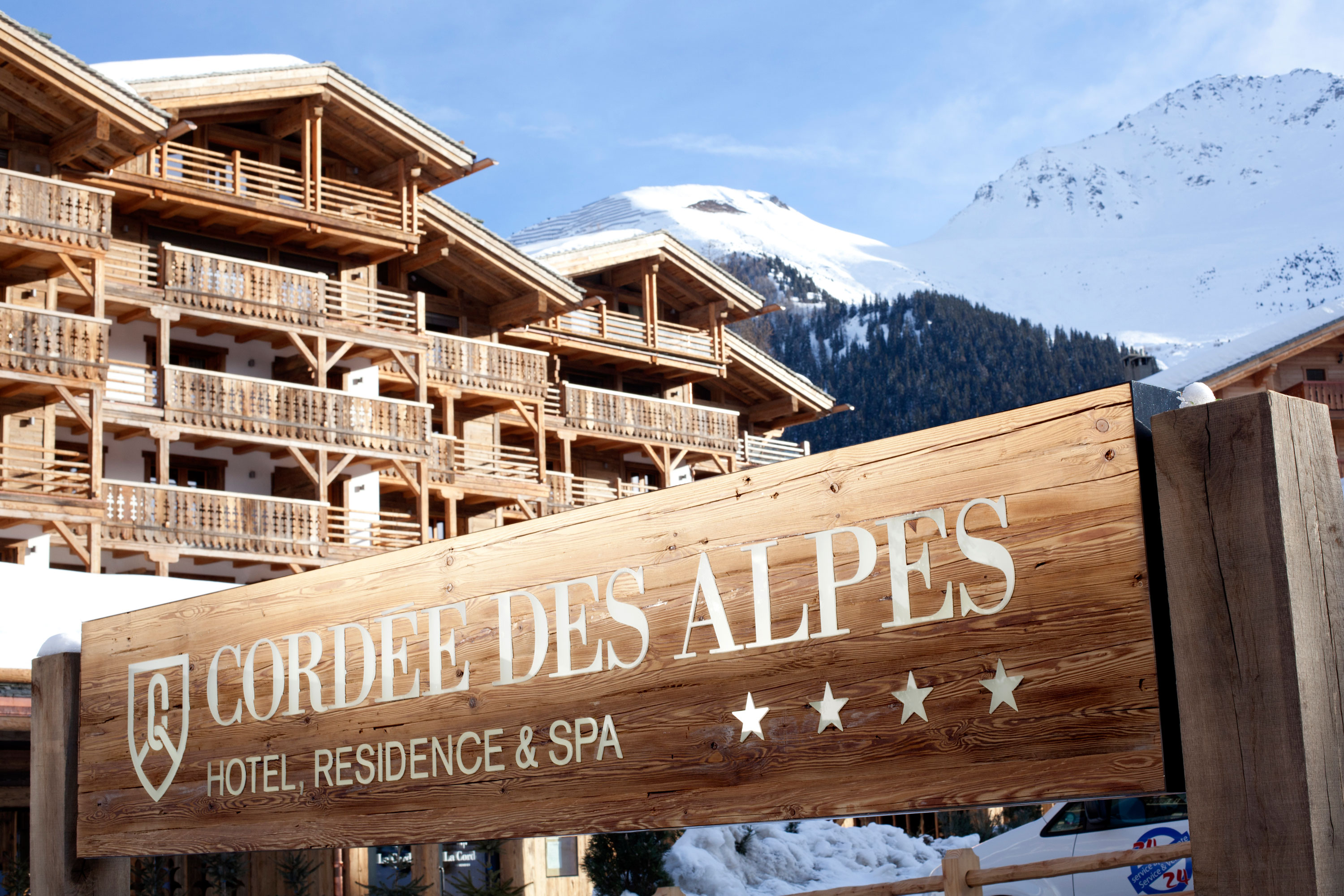
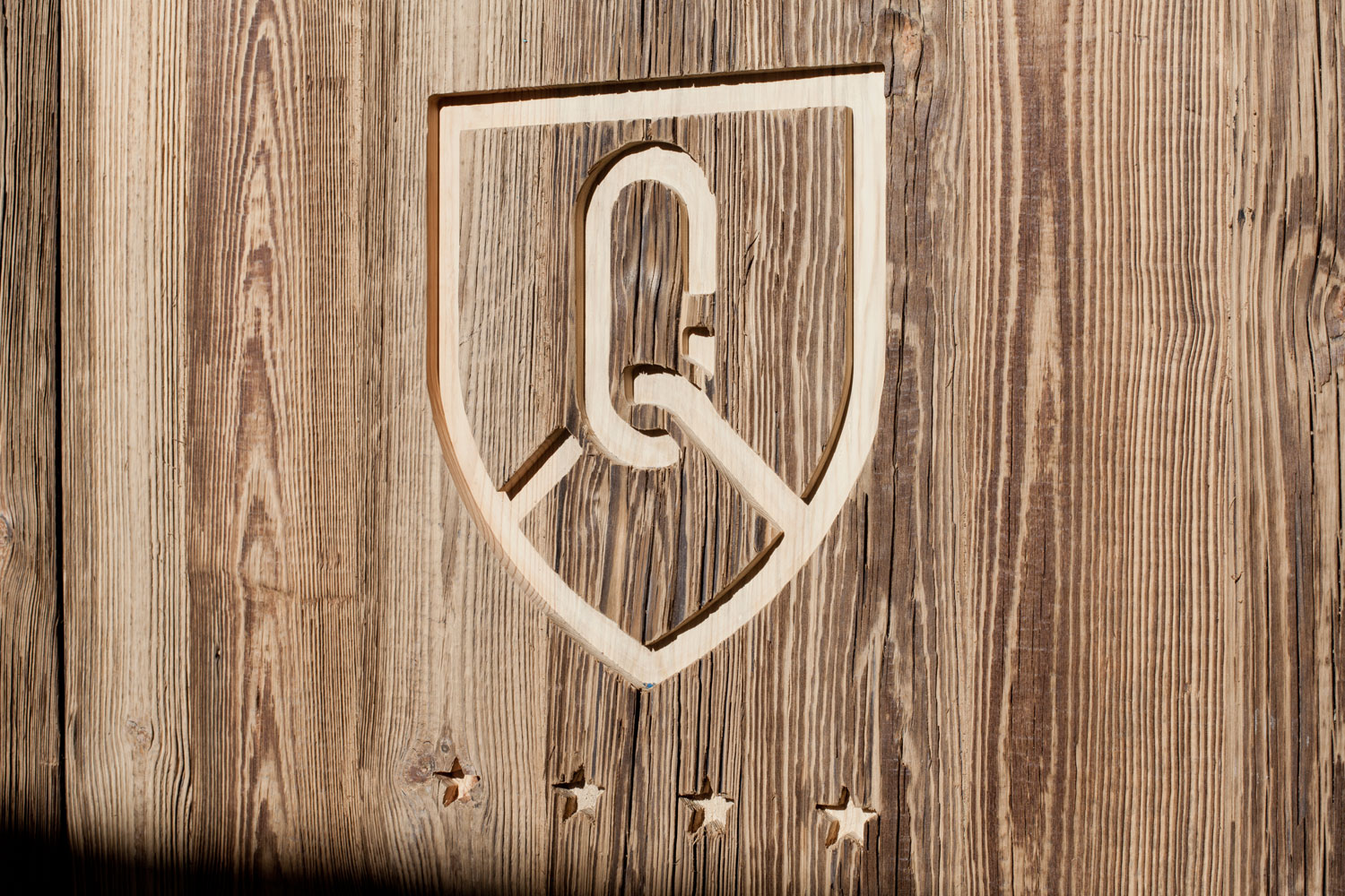
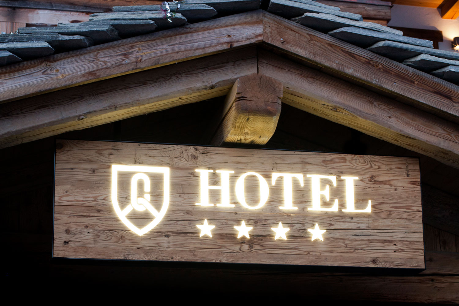
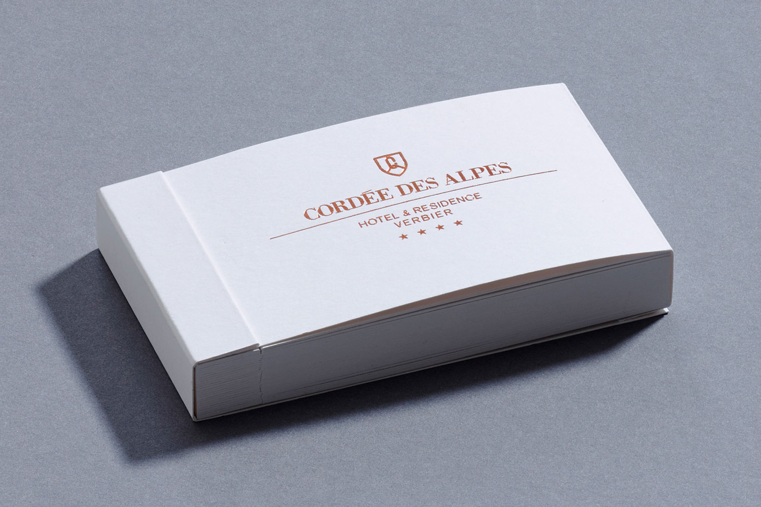
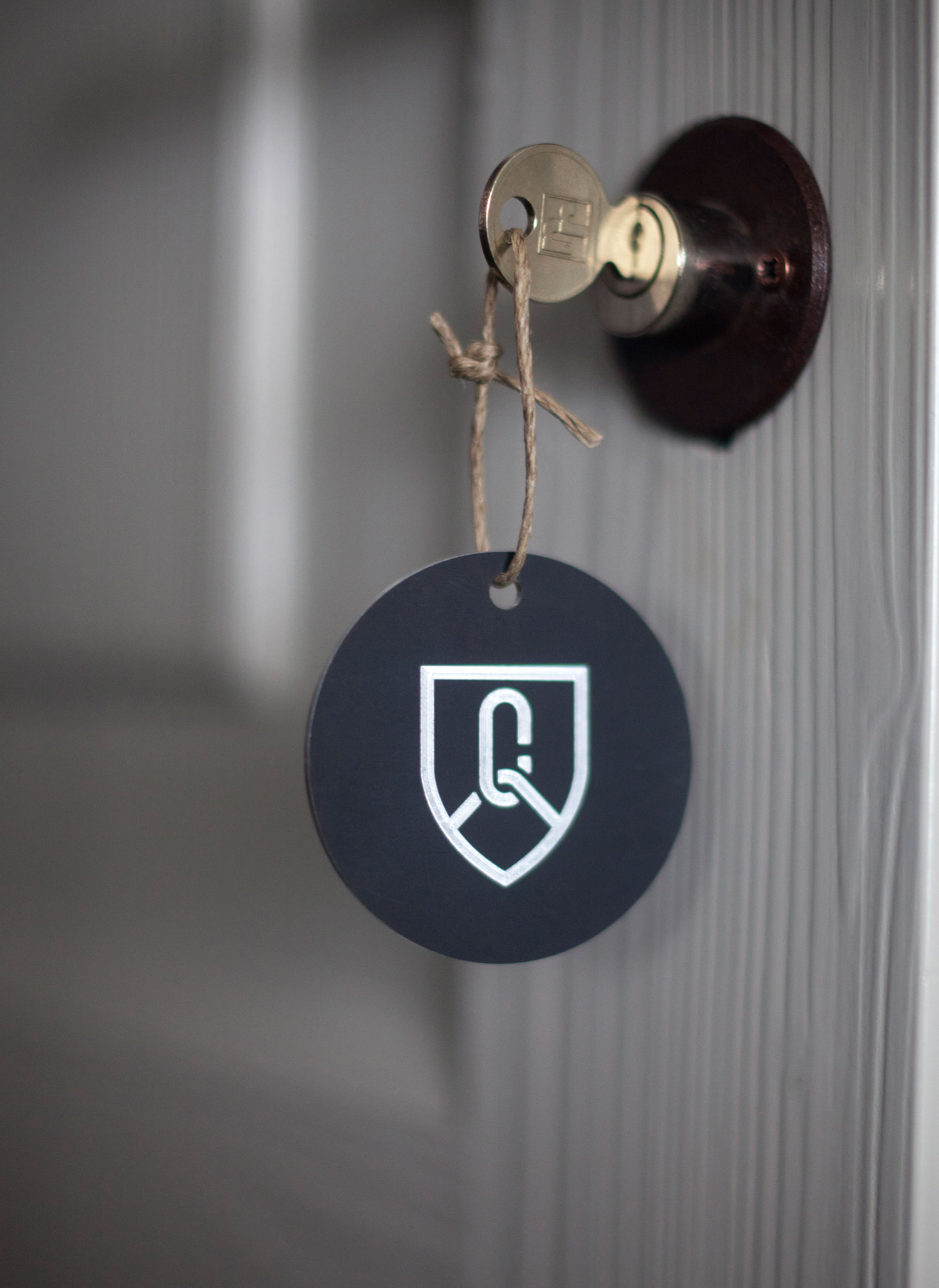
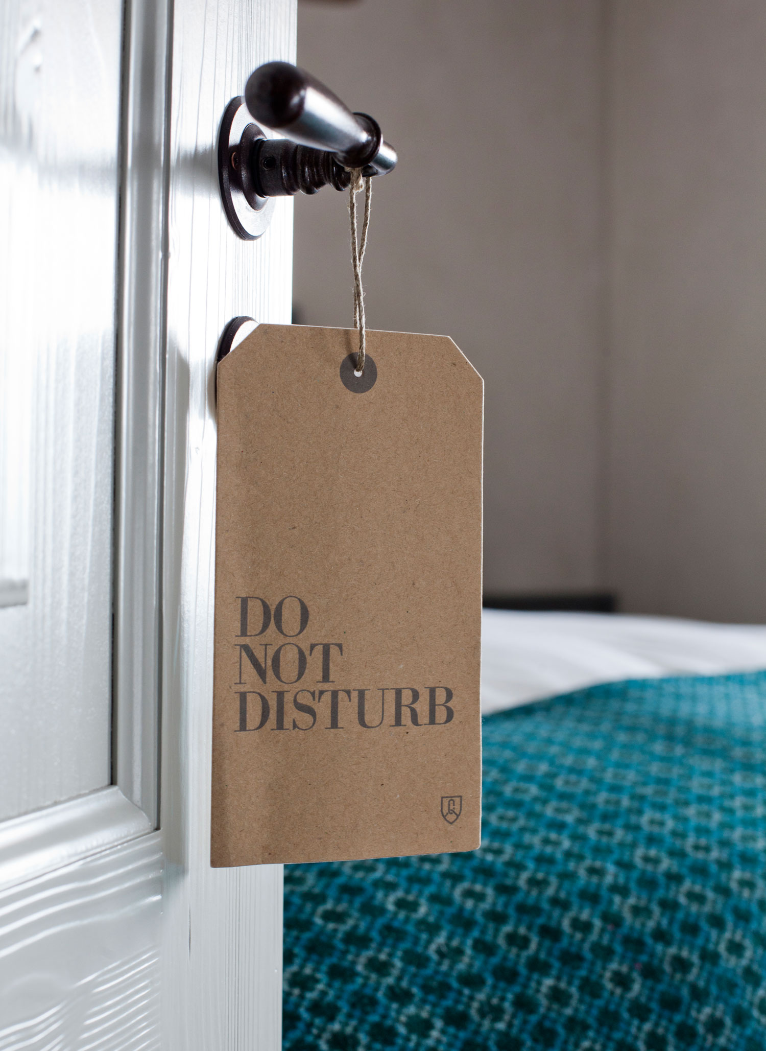
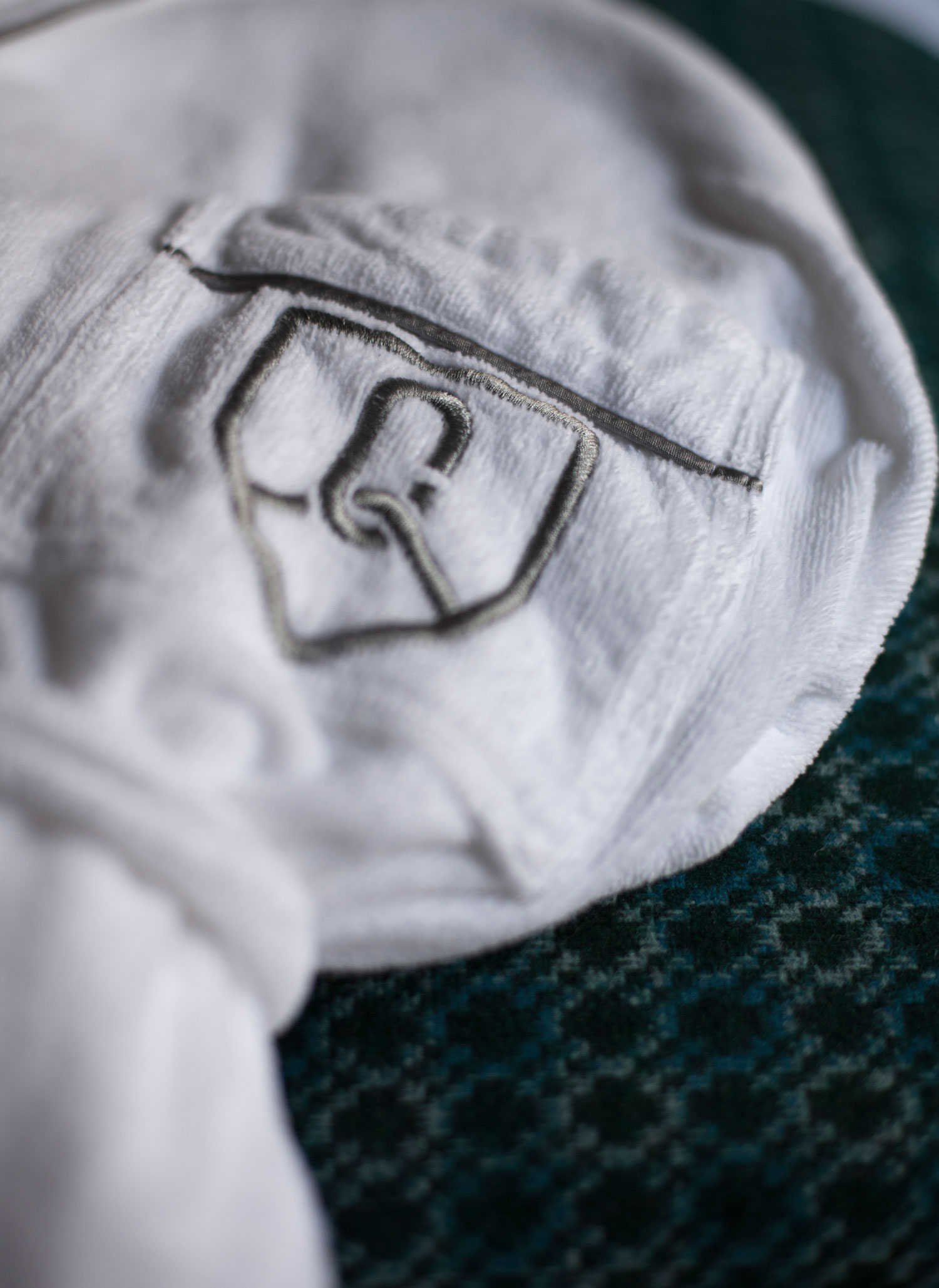
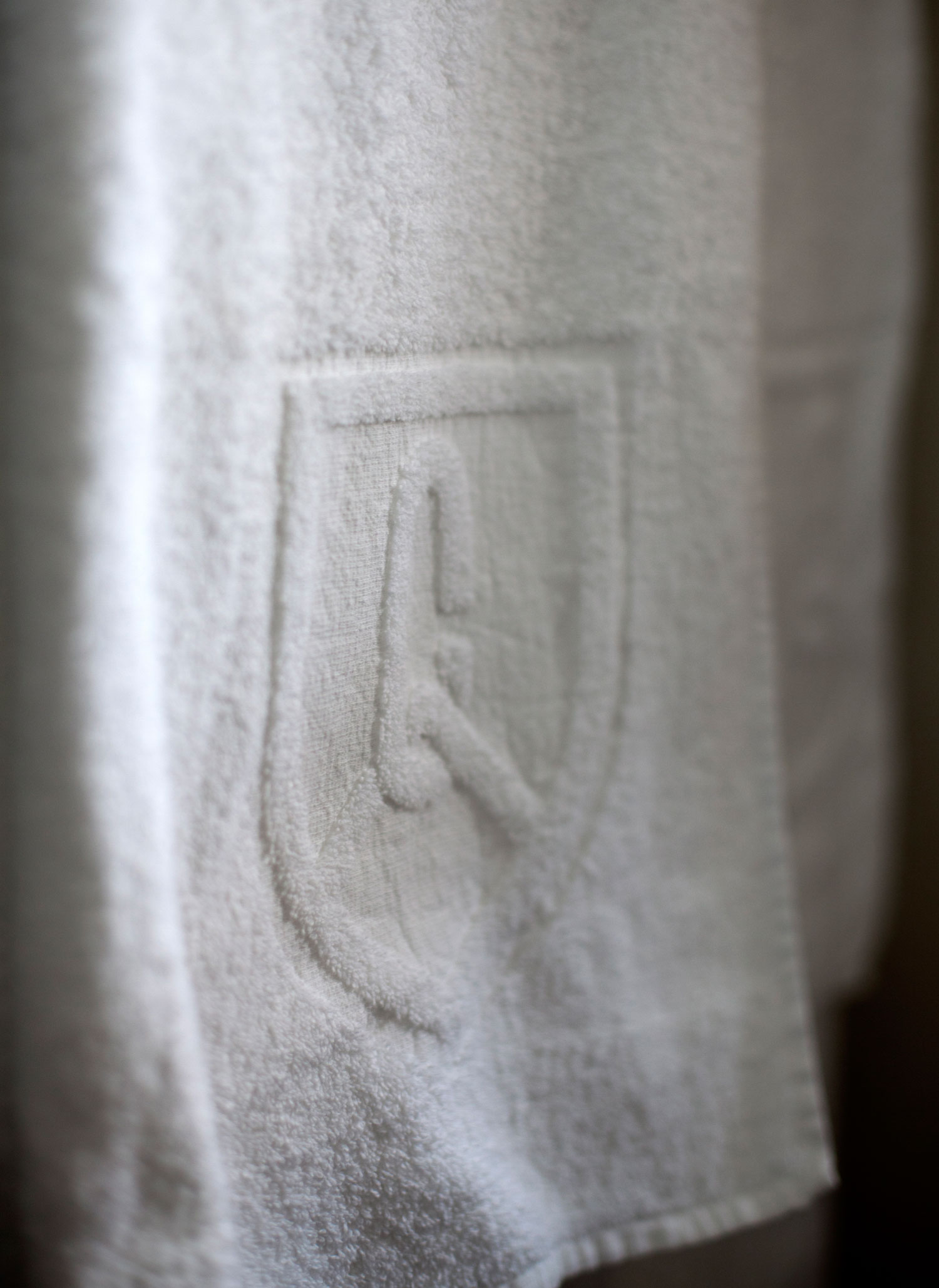
Our logo was inspired by our first visit to the site as we noticed there was an abundance of traditional Swiss symbols that were shields. The name of the hotel refers also to a technique used by mountain climbers – a cordée is a rope that was tied between each mountaineer for safety. Set within the shield we used the initial ‘C’ as the heart of the marque, which is also shaped like a carabina and through it is the rope, which resembles the shape of an ‘A’ or a mountain.
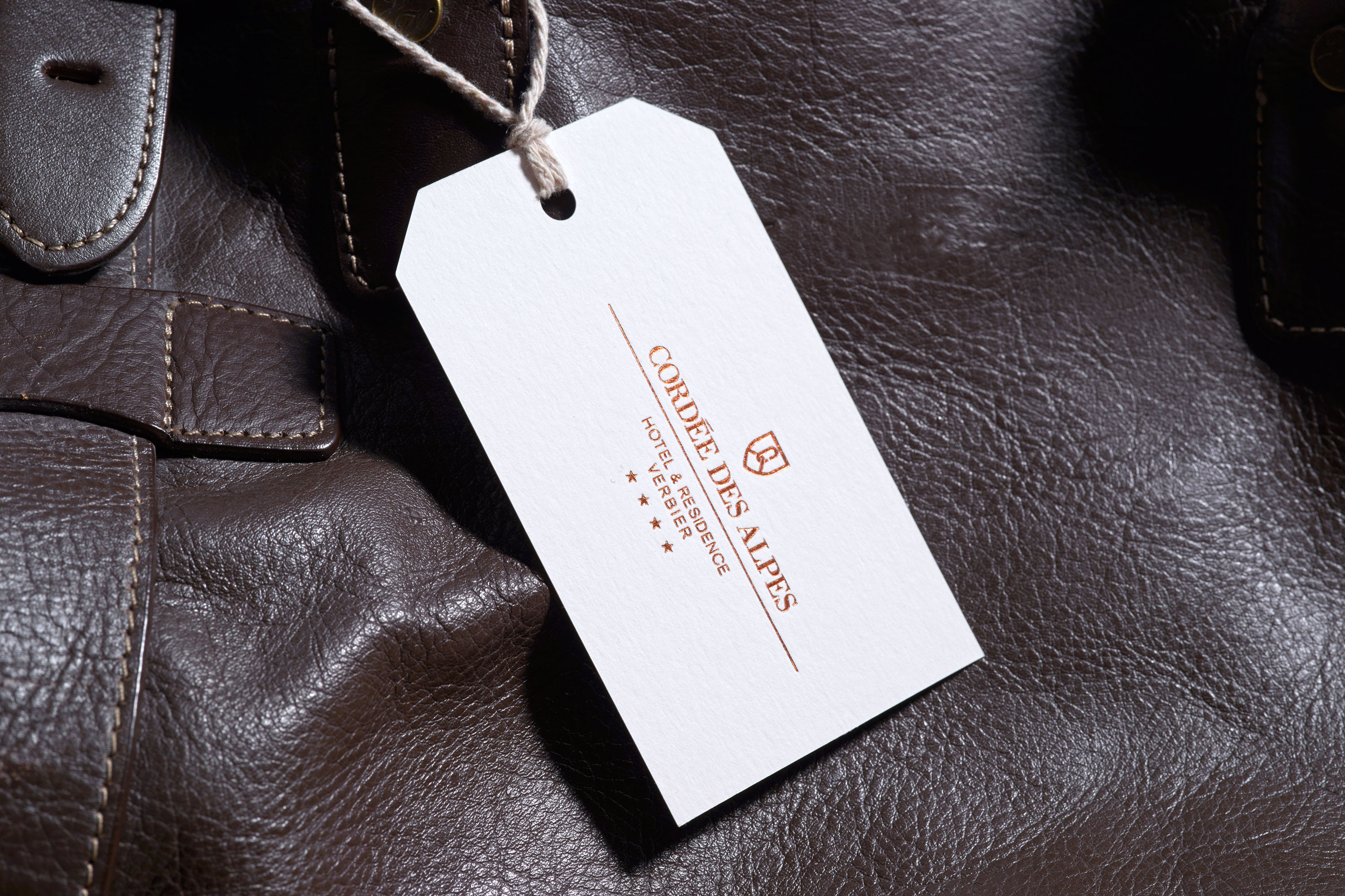
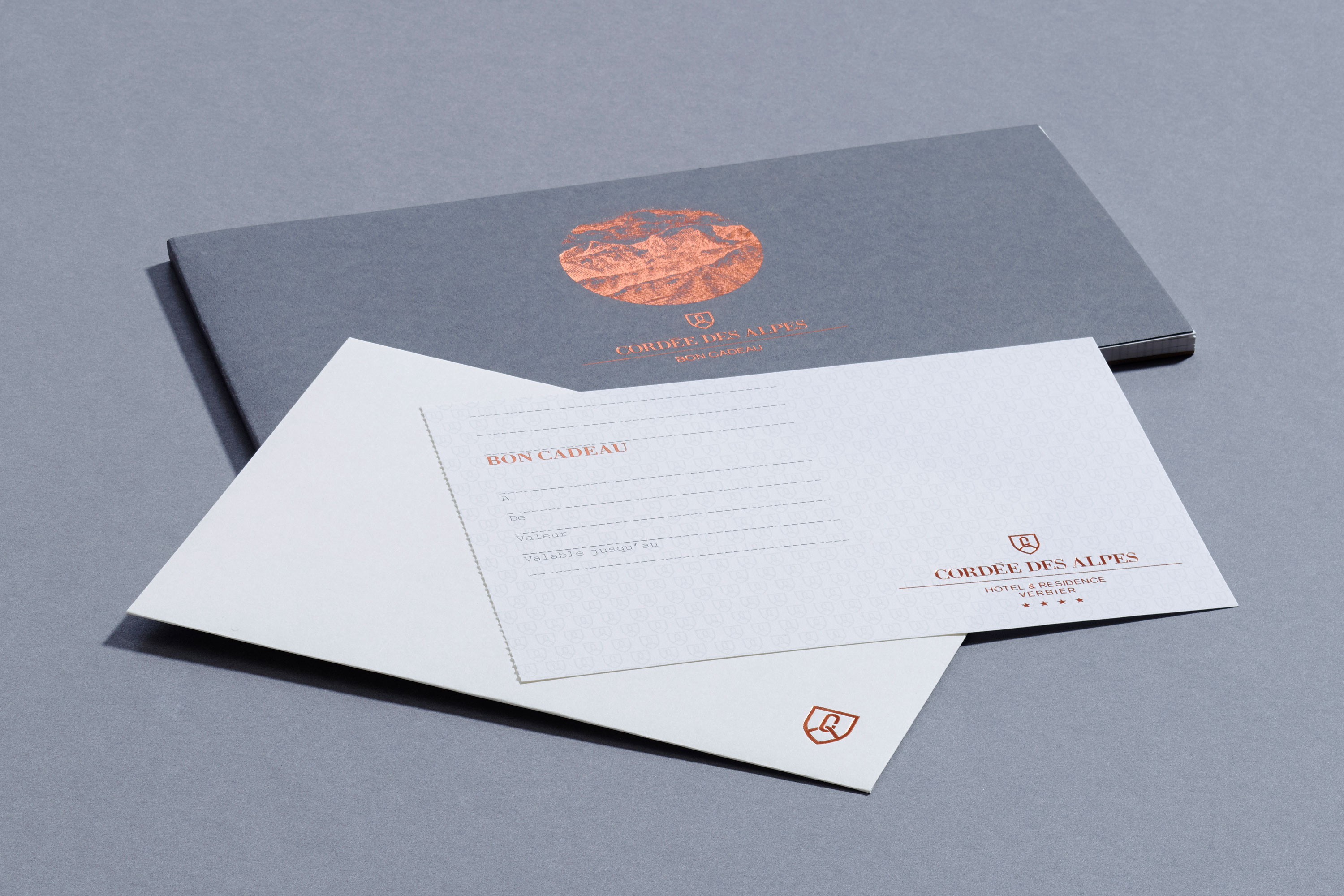
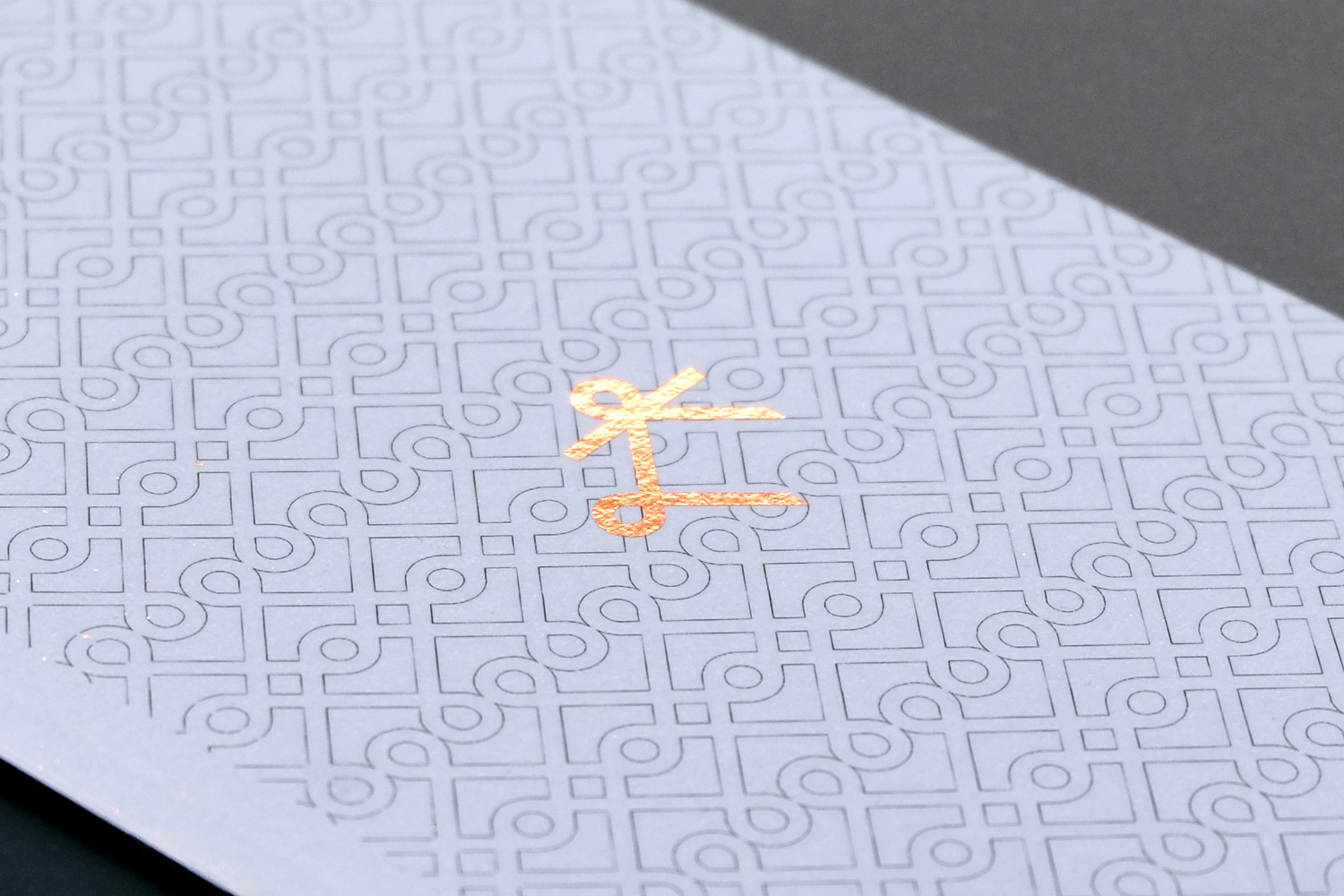
Another observation of the area was the use of copper throughout the homes and buildings of Verbier for gutters and architectural features. Not only practical but this set against the hue and texture of wood used in their construction made for a great colour palette for the wider identity. We use natural tones of grey and off white, foil-stamping the logo in copper across all related hotel materials.
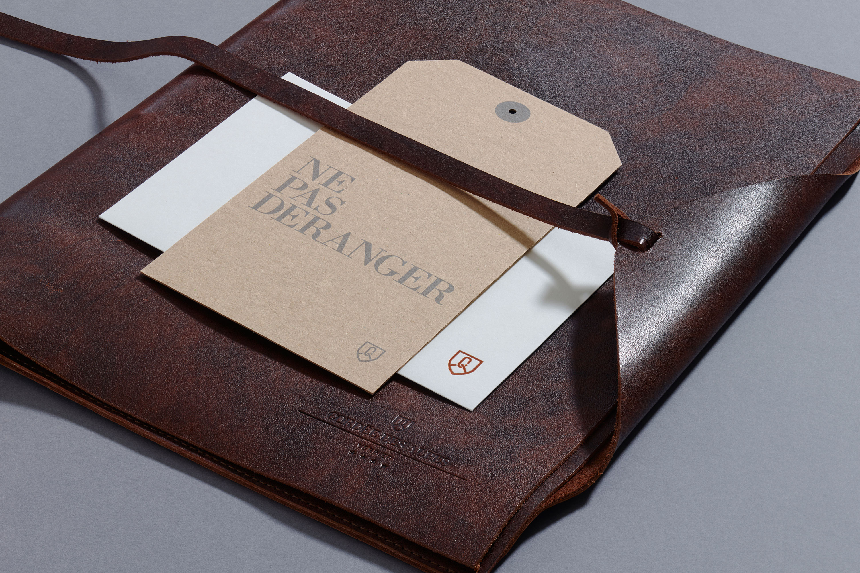
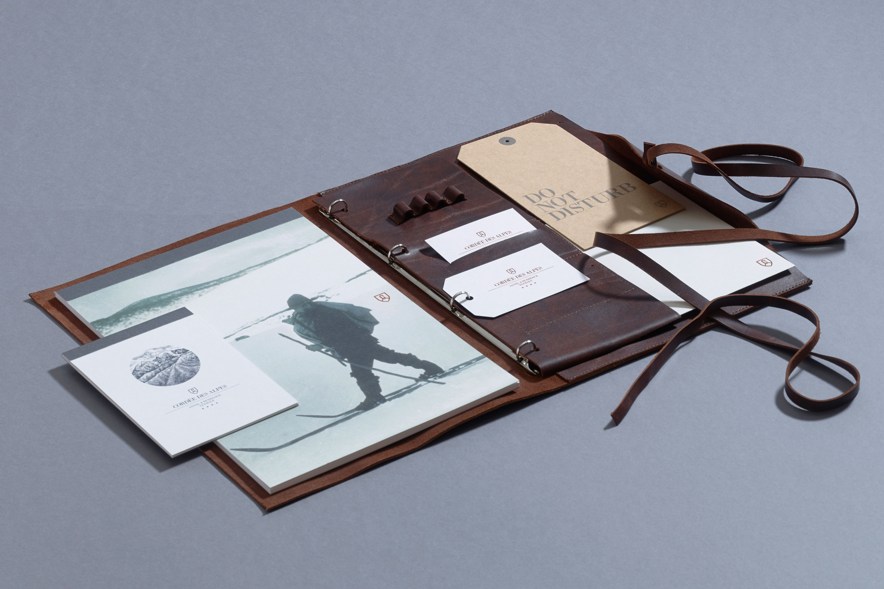
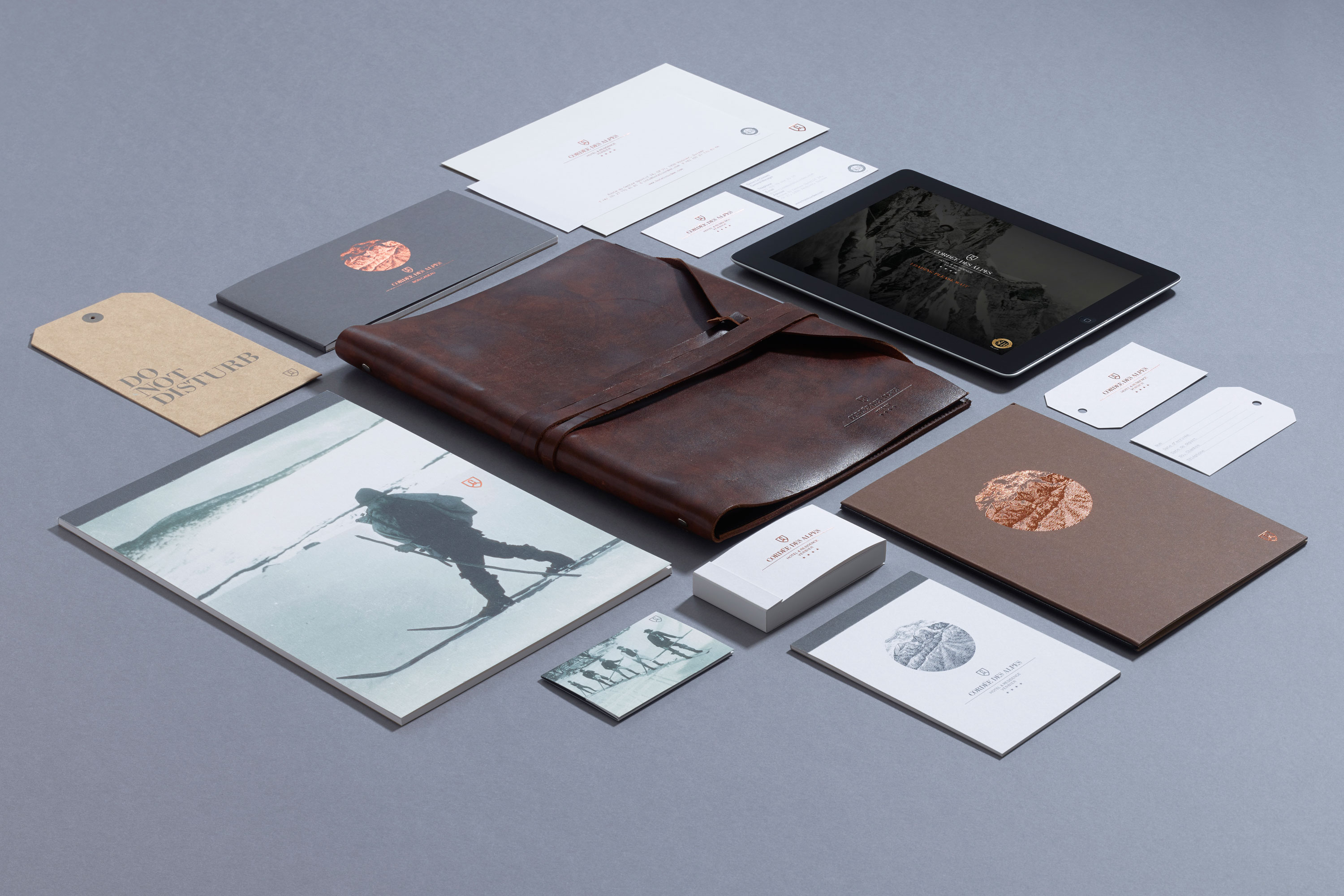
Work carried out
—
Identity design
Logo design
Art direction
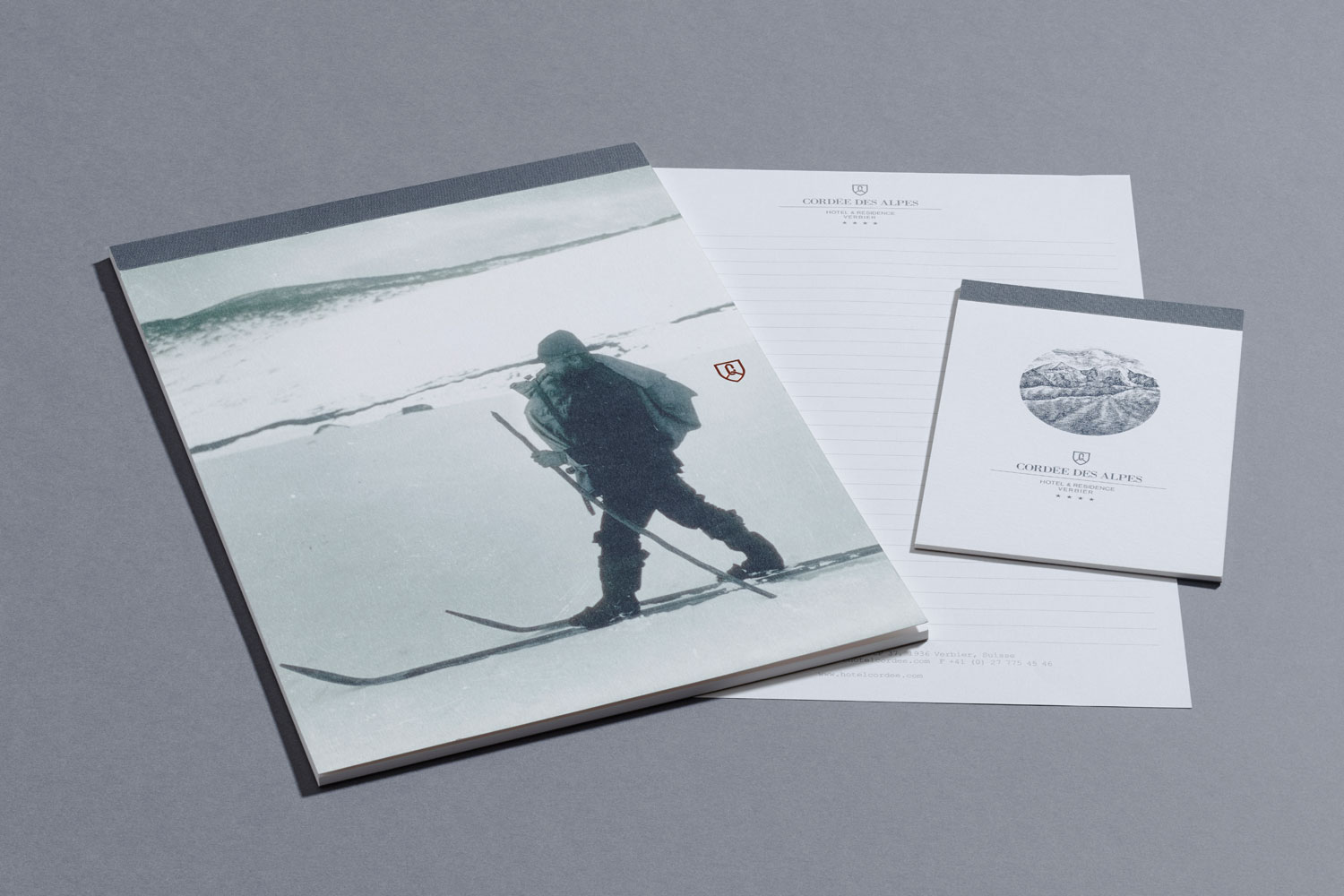
Marketing materials
Wayfinding + signage
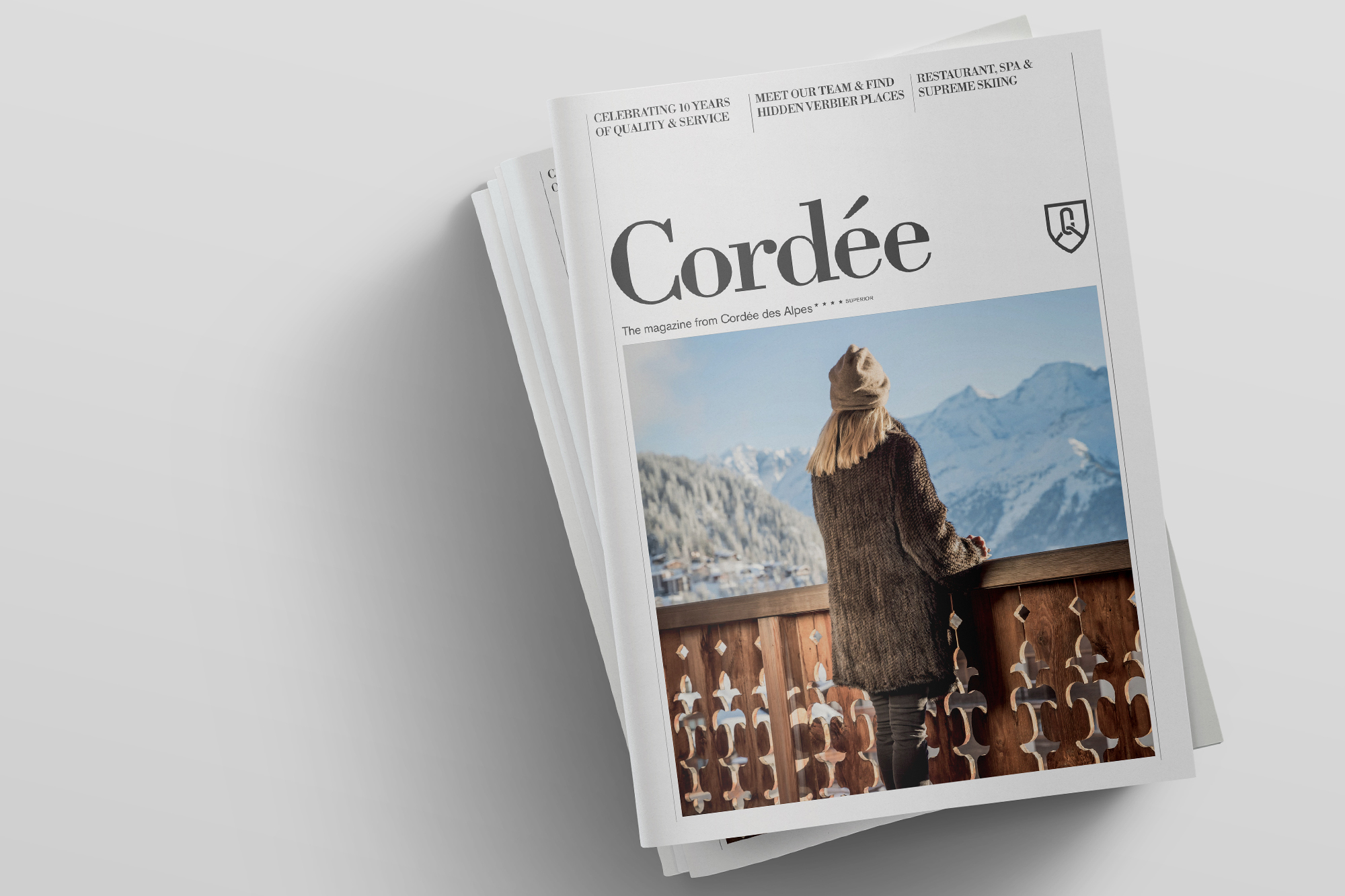
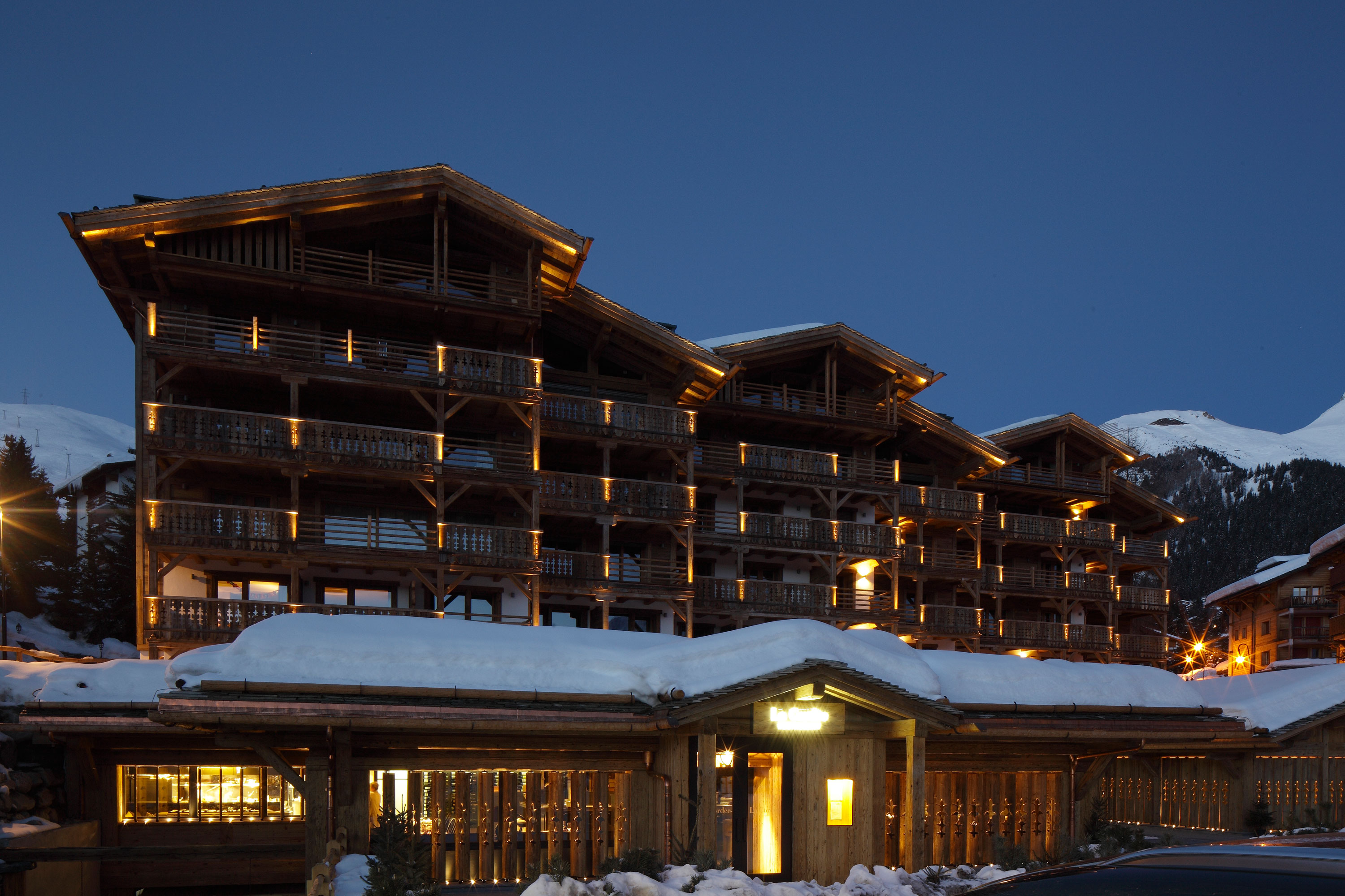
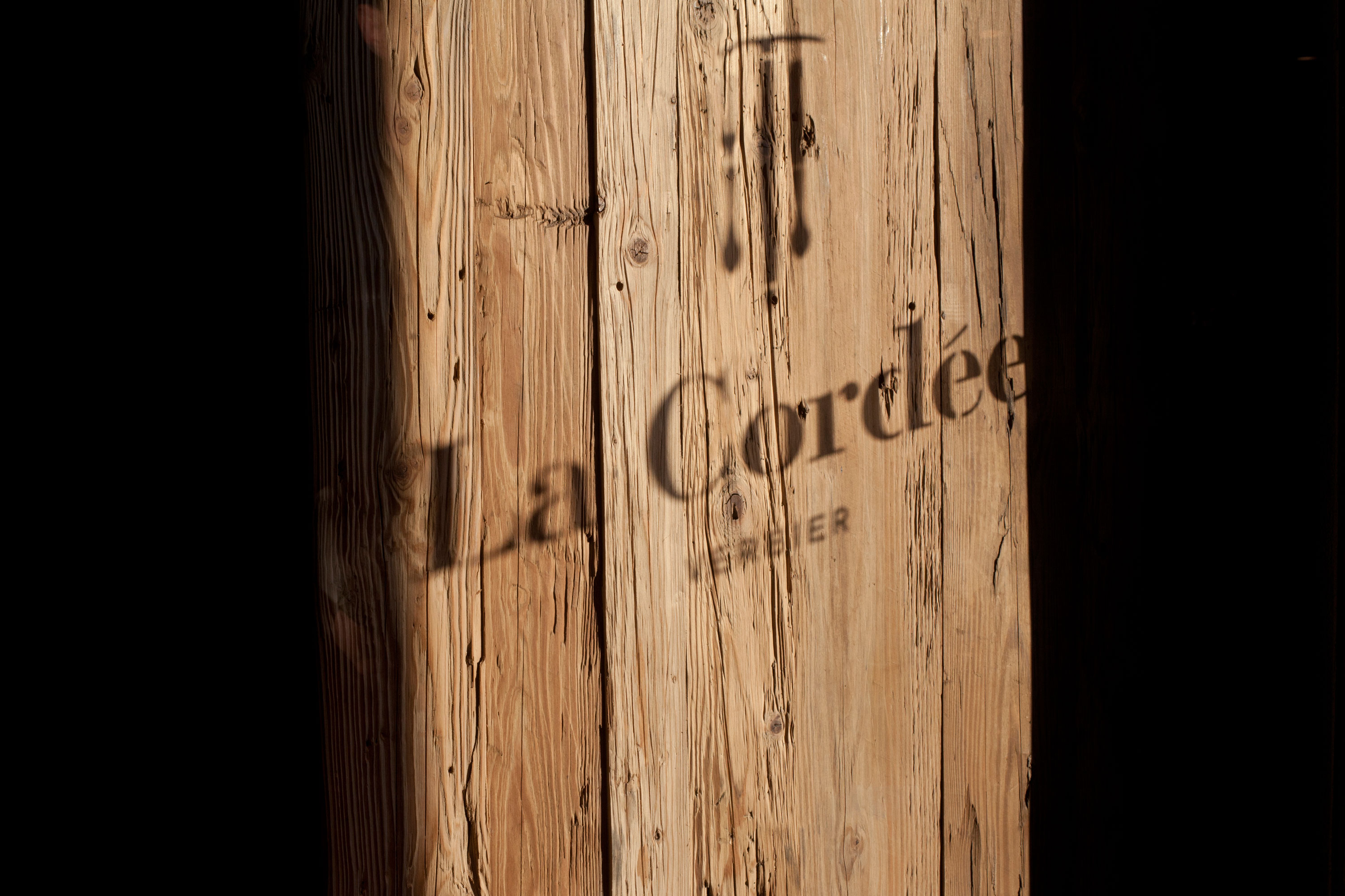
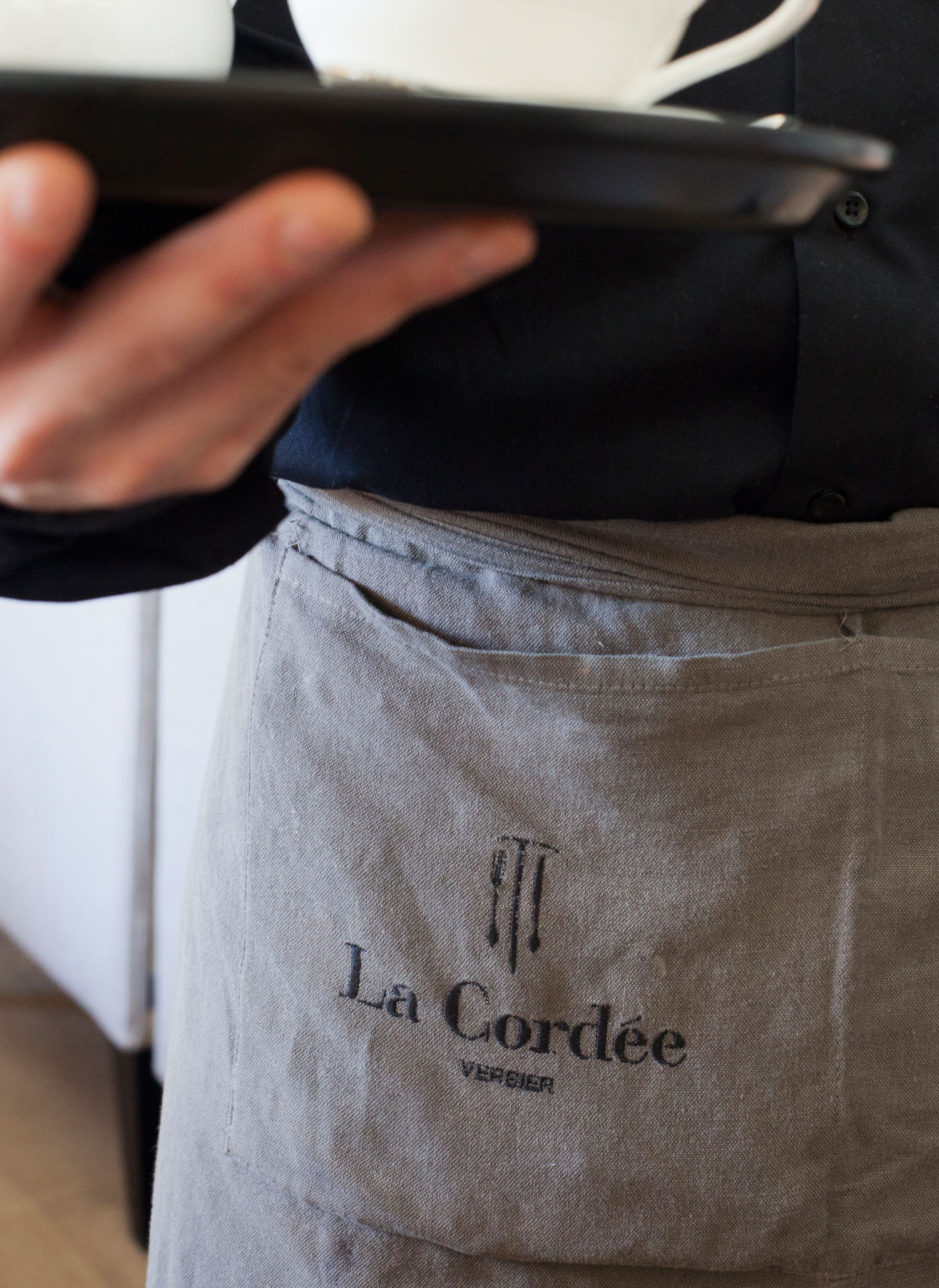
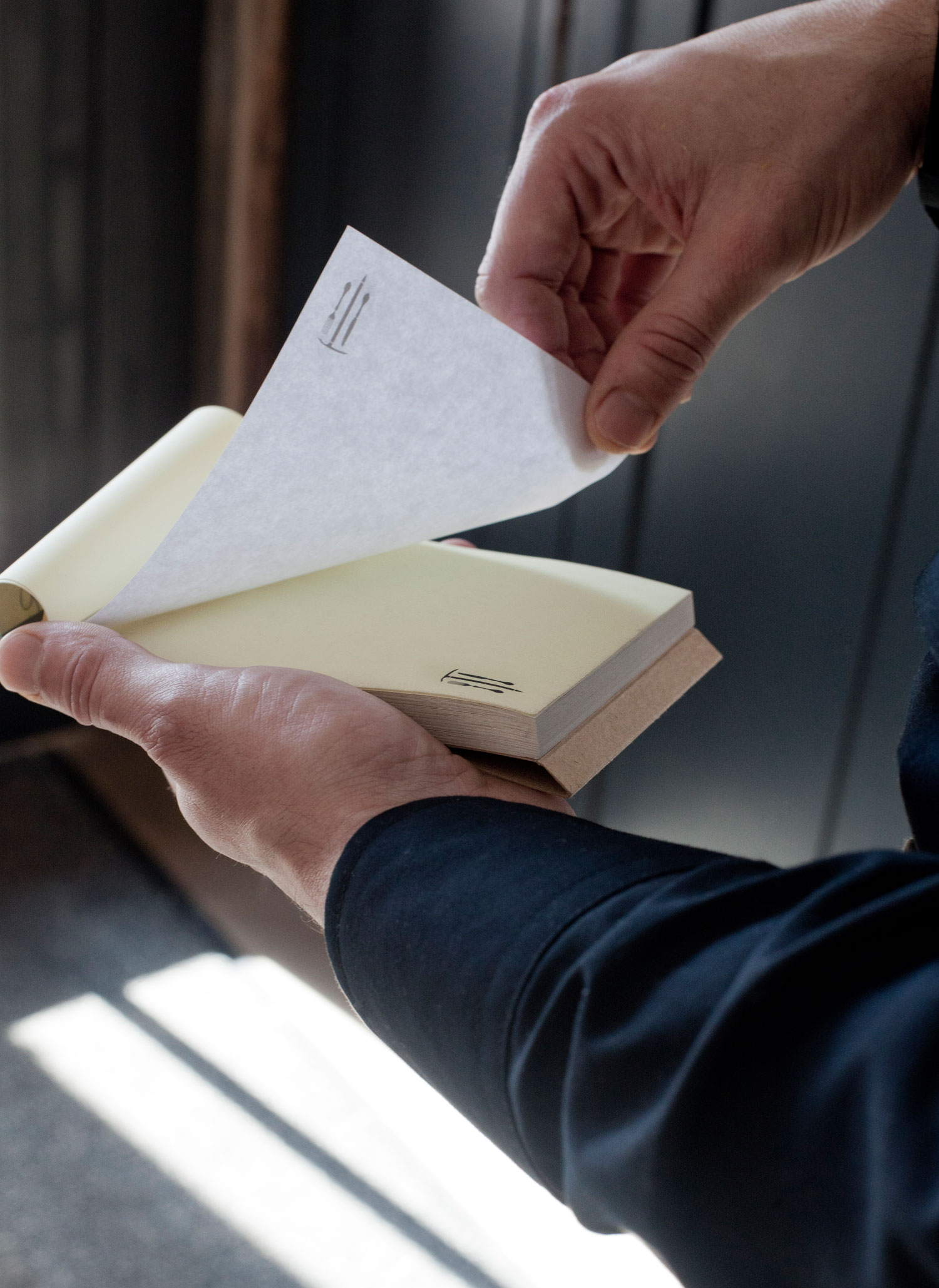
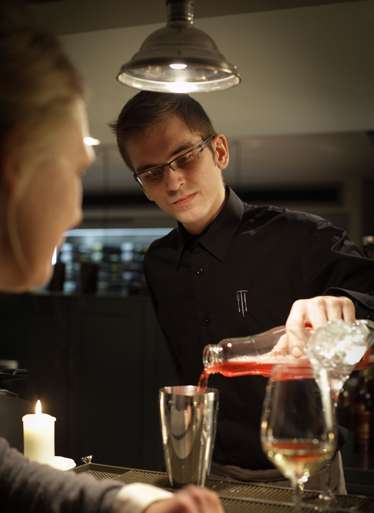
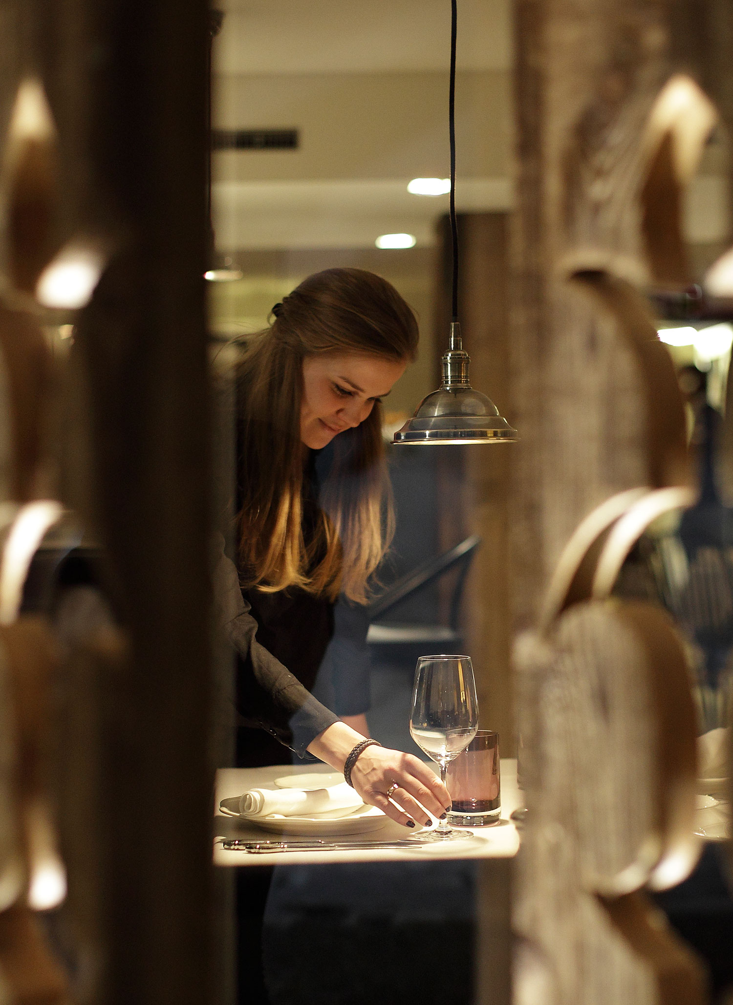
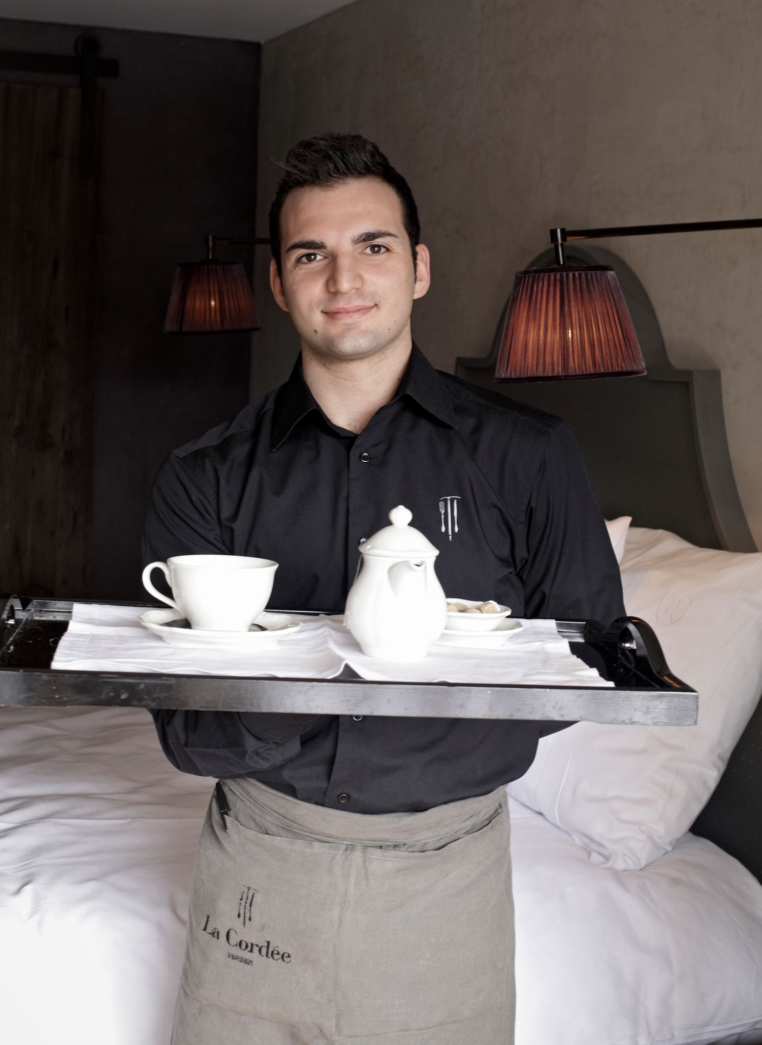
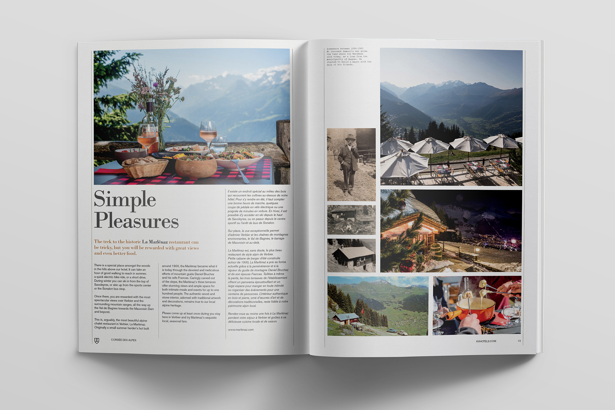
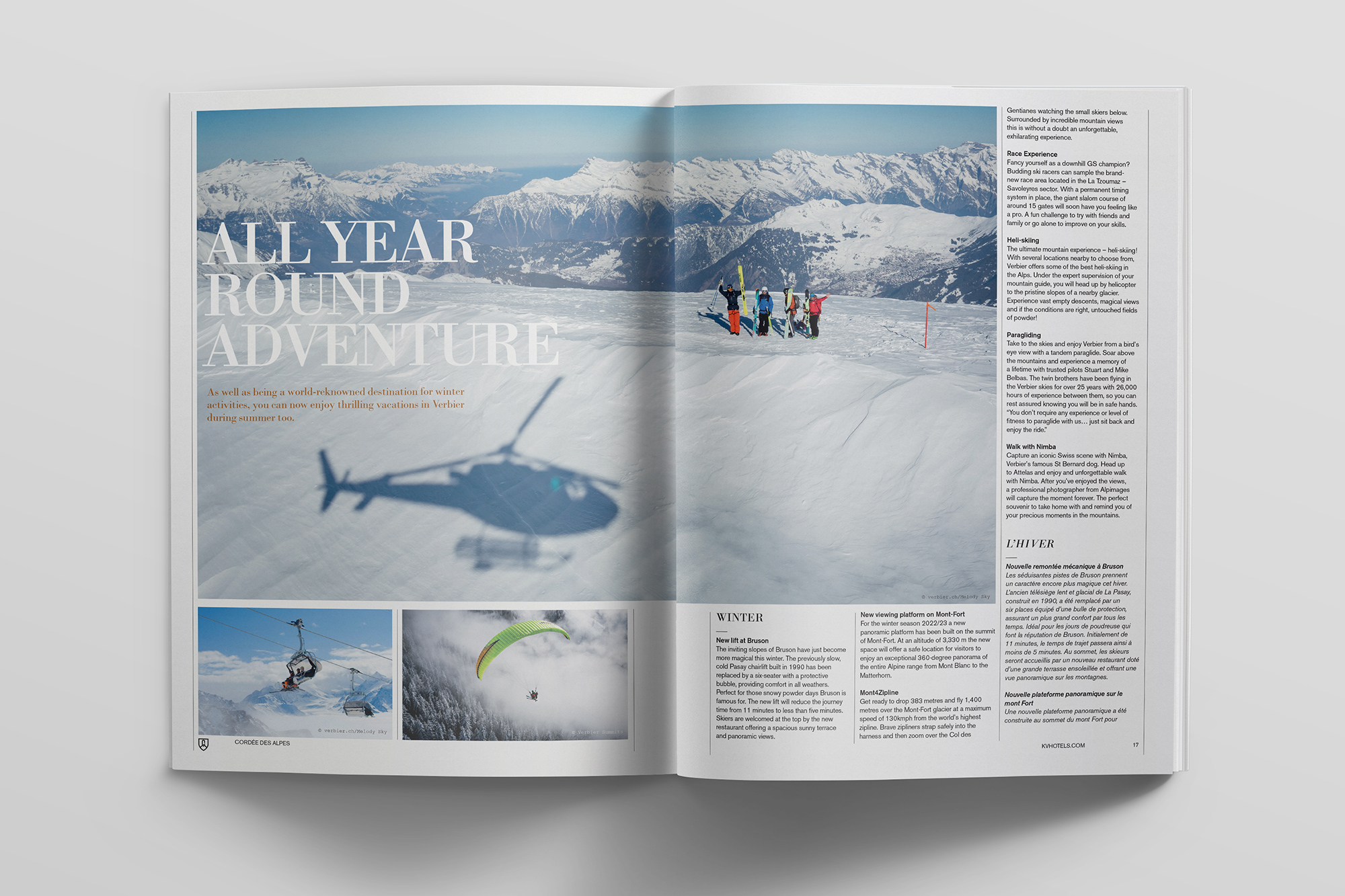
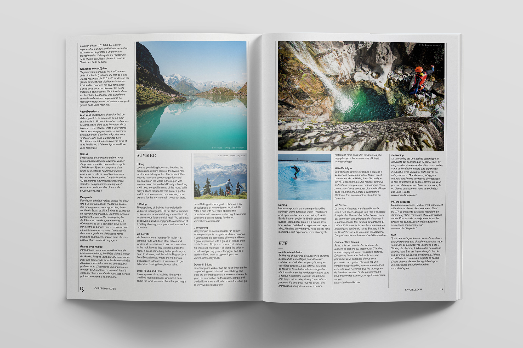
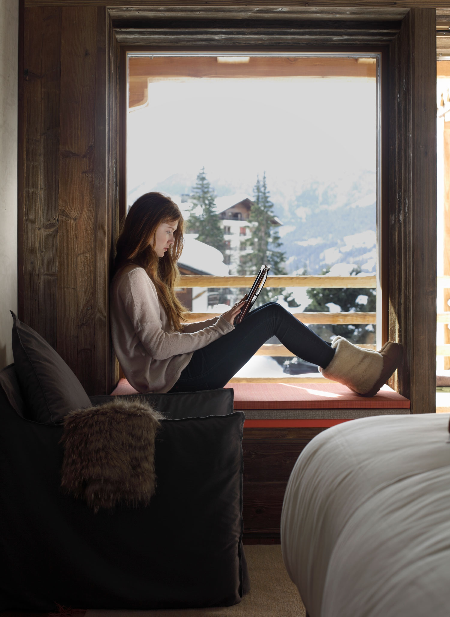
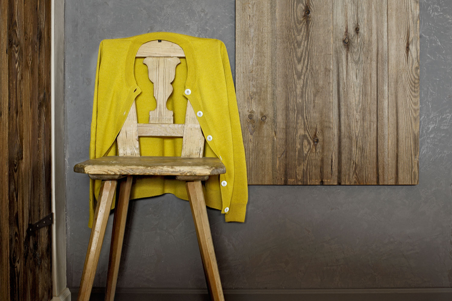
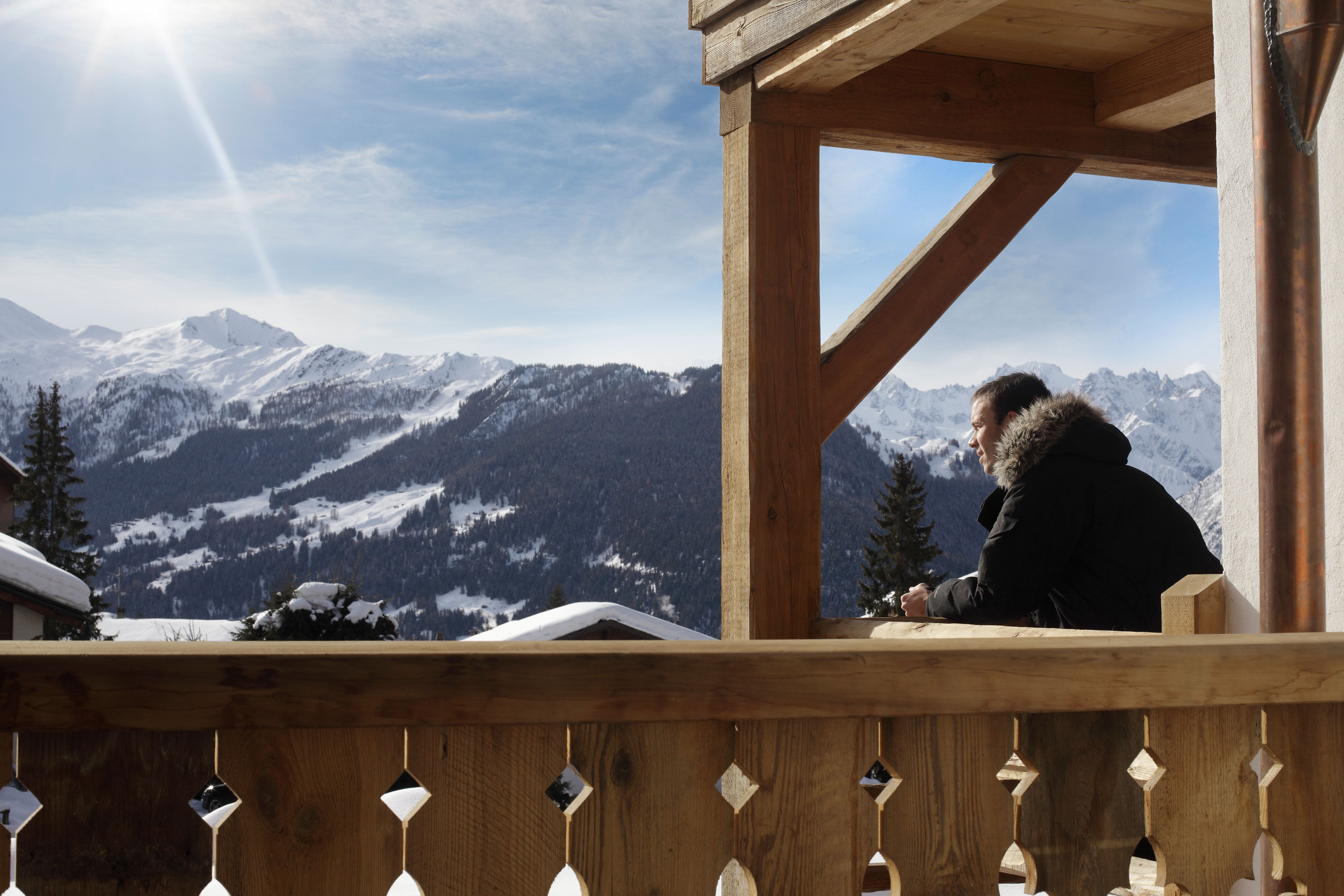
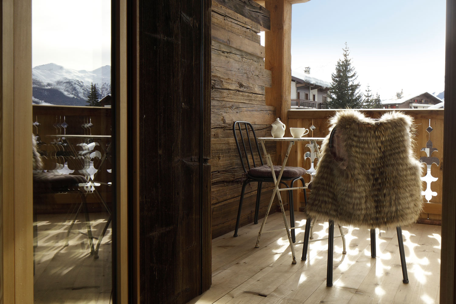
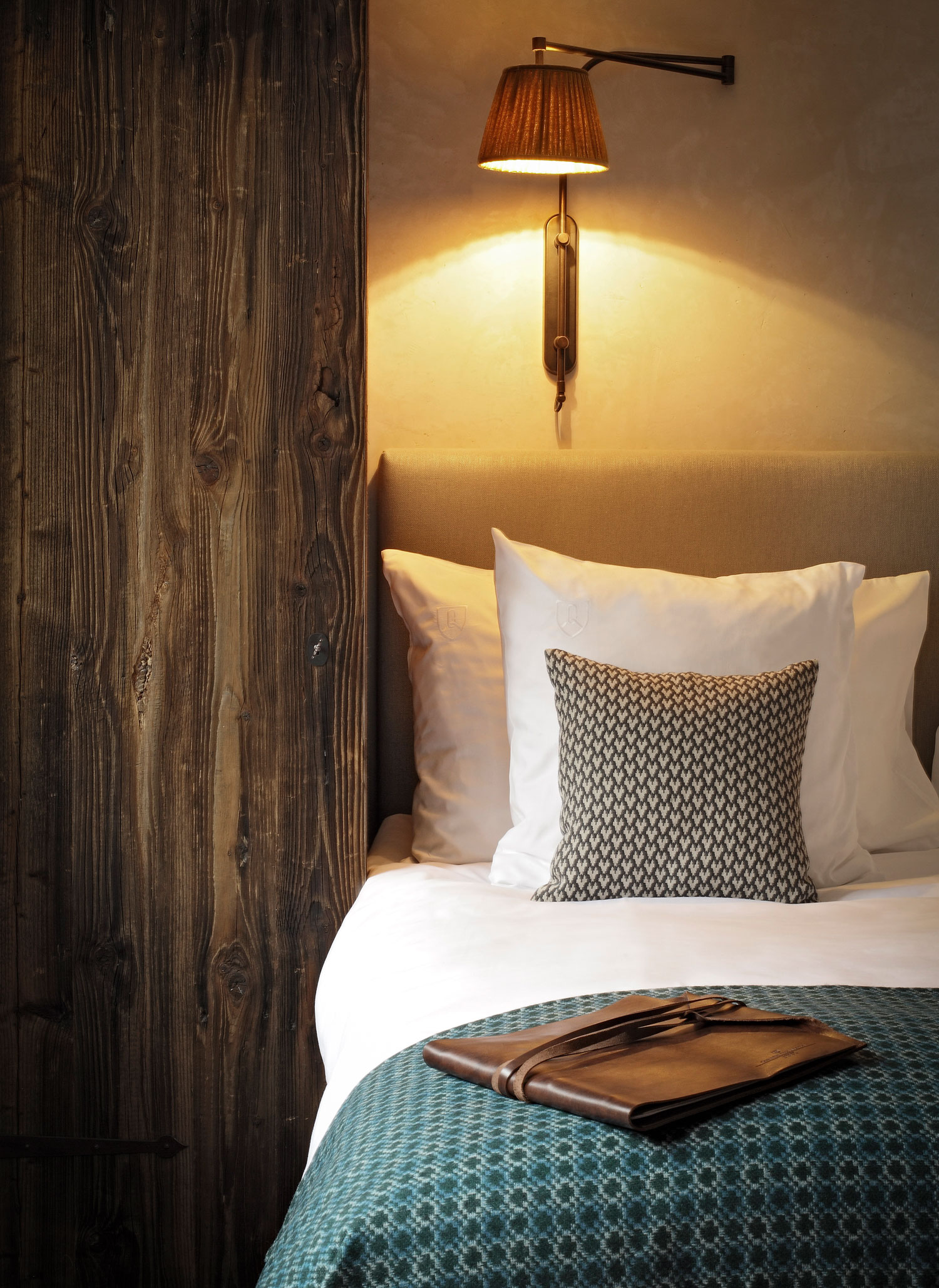
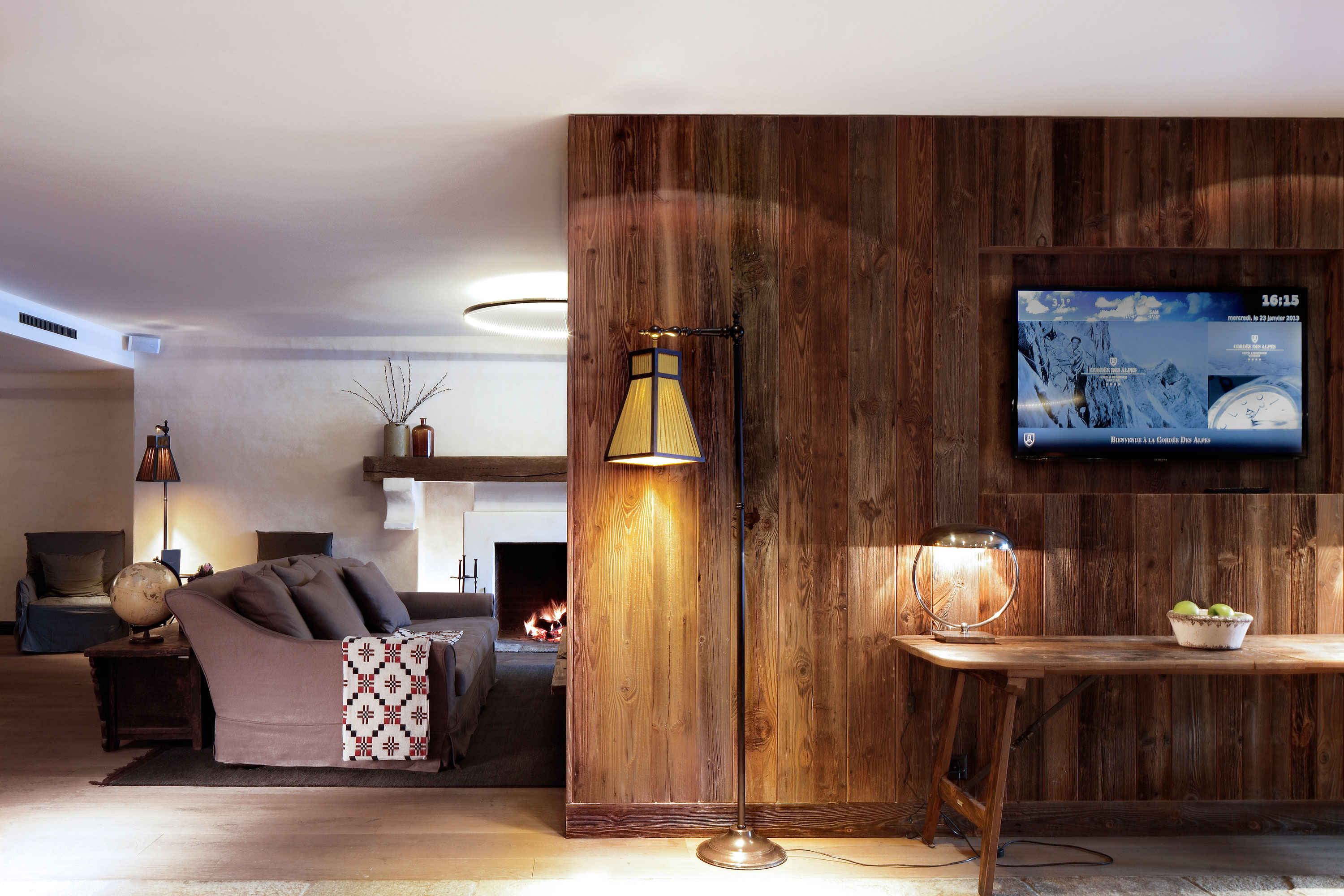
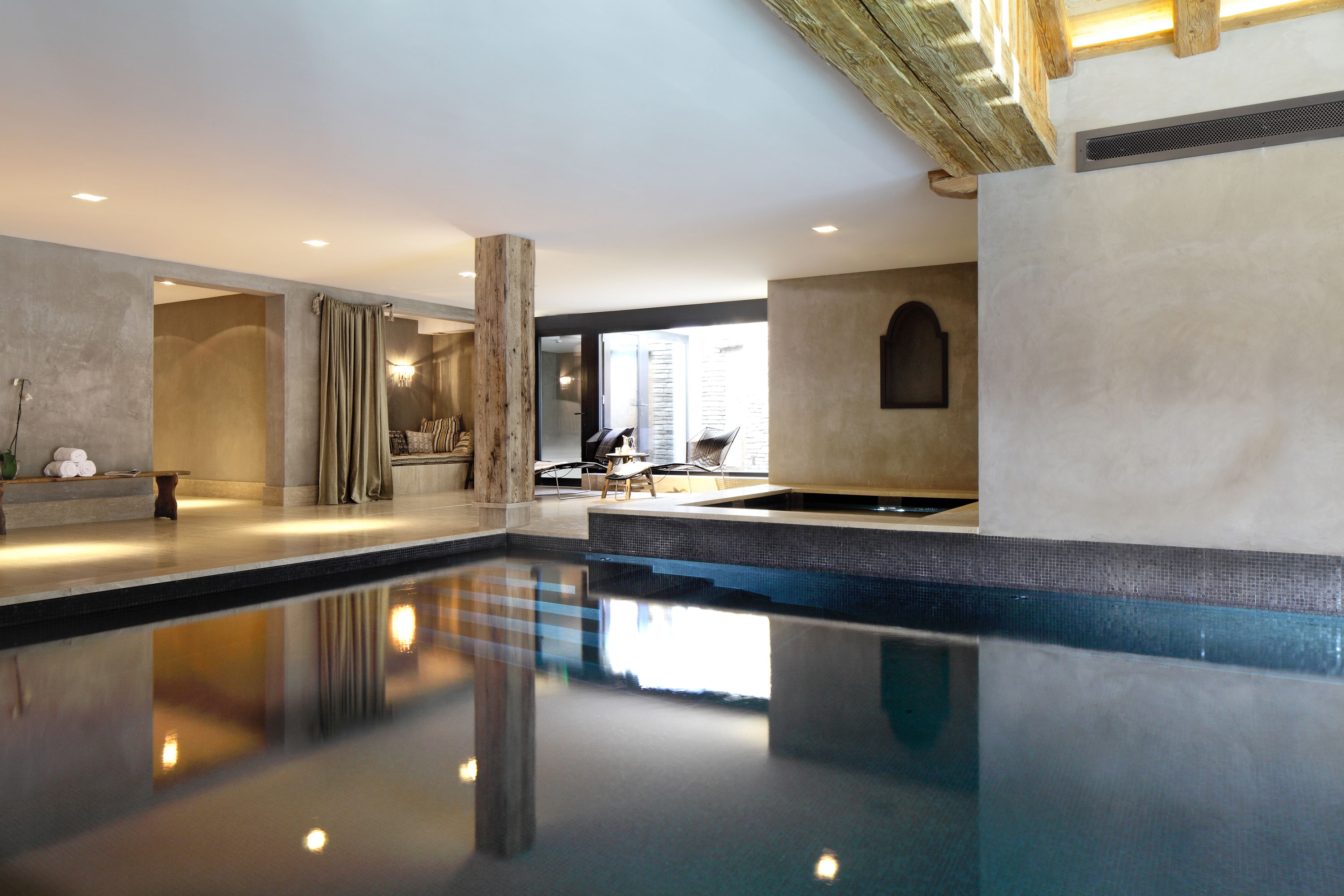
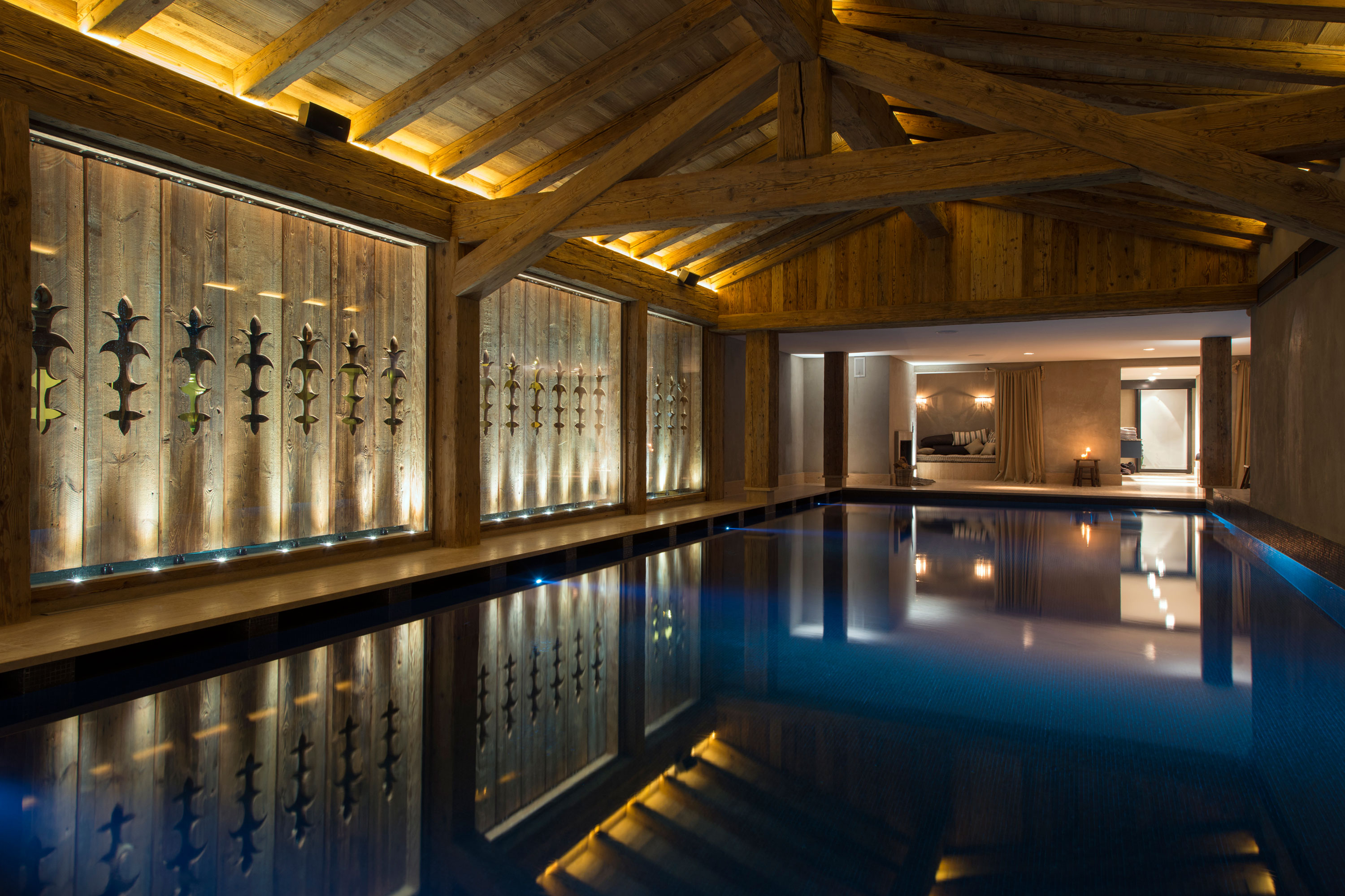
Along with the identity we art directed imagery that set the tone and standard of the resort. Creating this suite of images allowed hotel and marketing staff to pick and use relevant imagery themselves with confidence — no going off-piste with their own imagery!

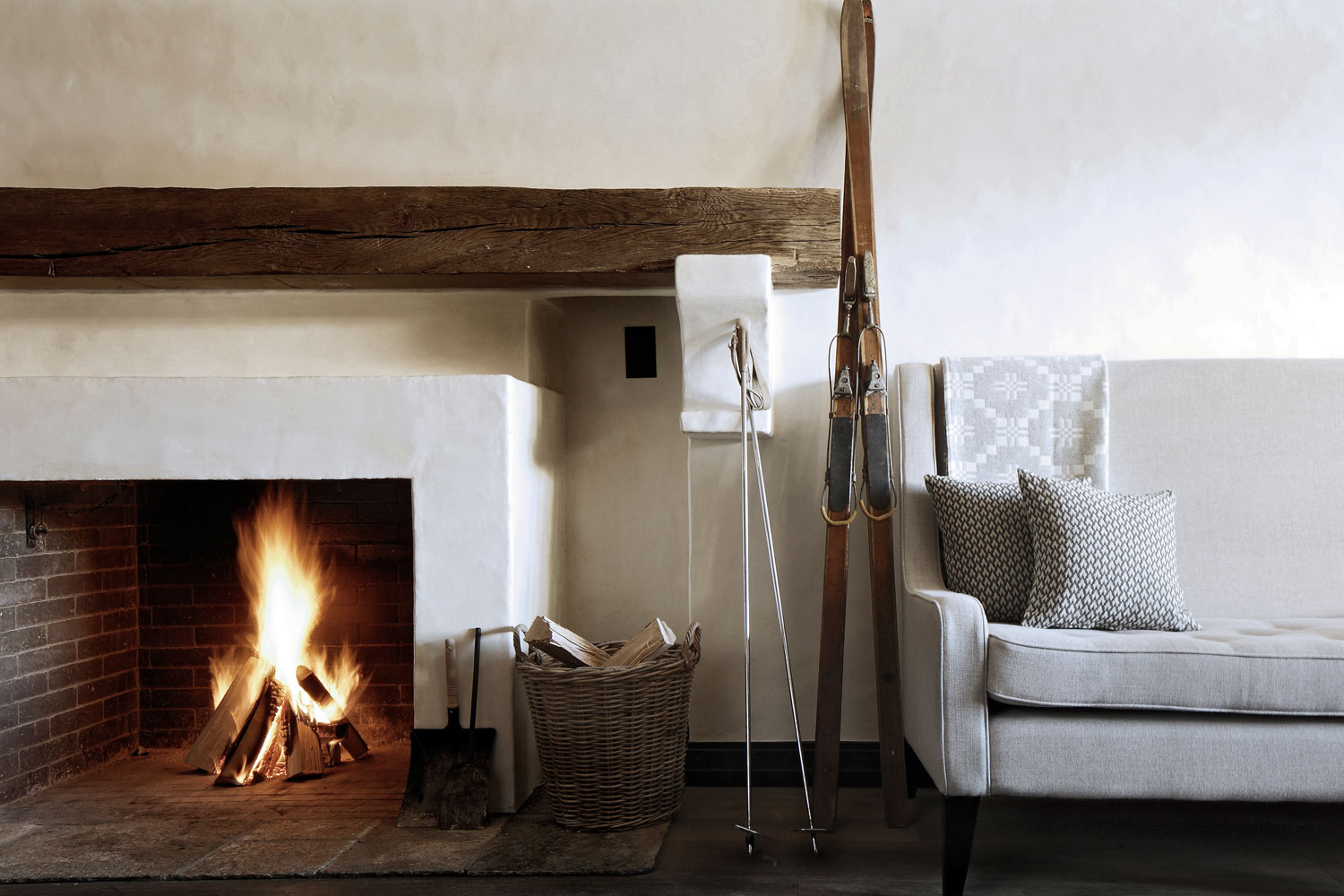
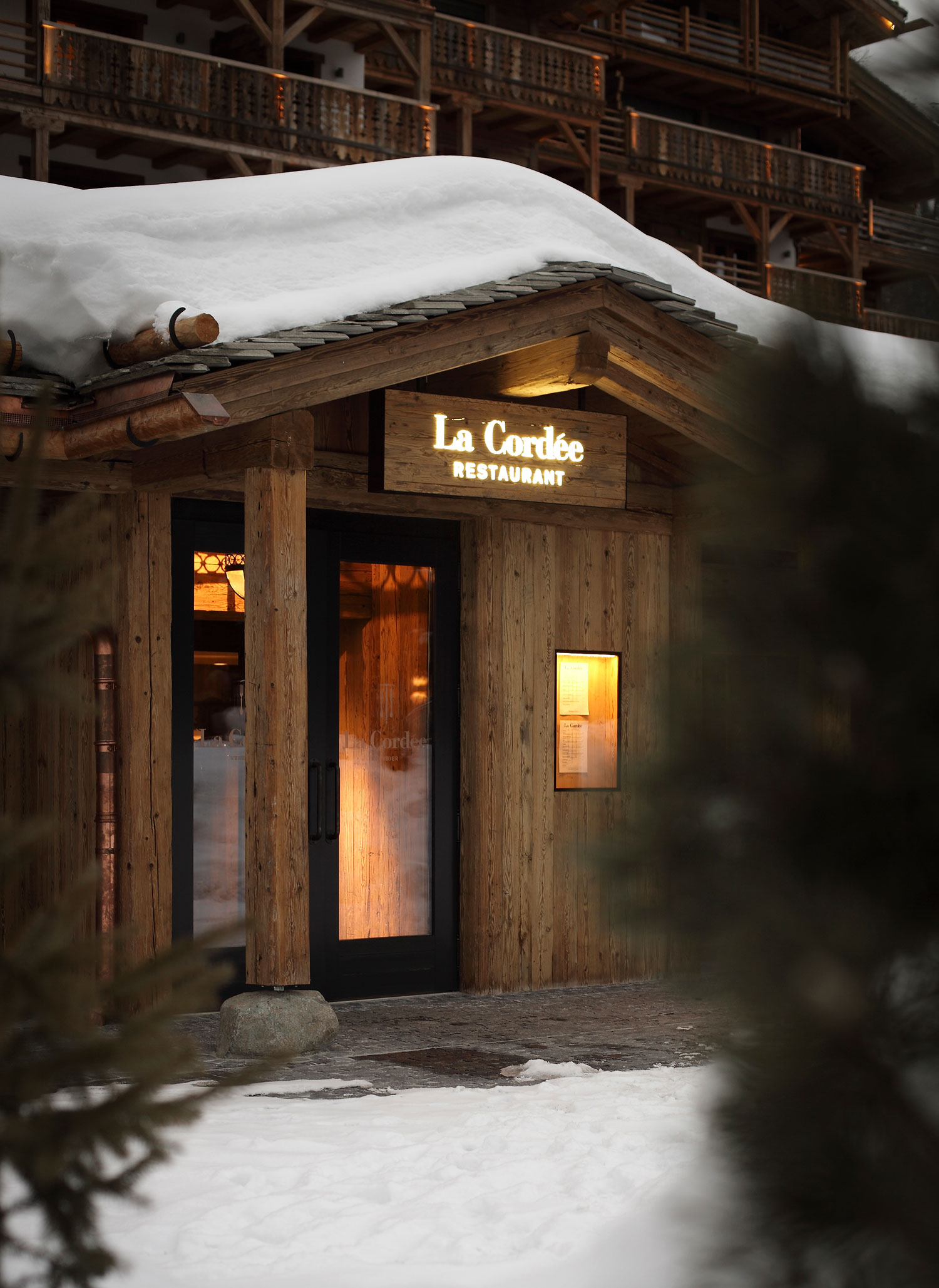
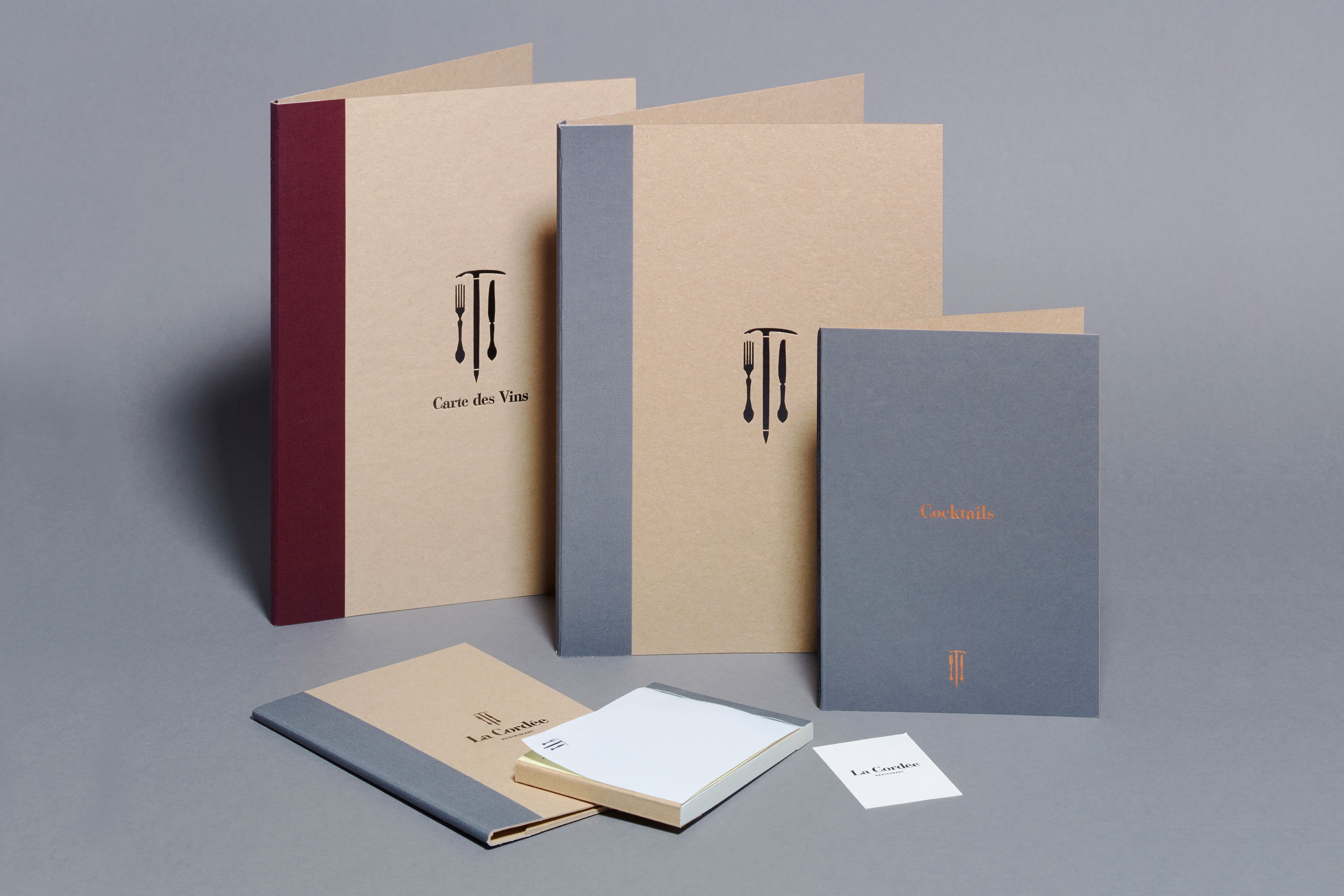
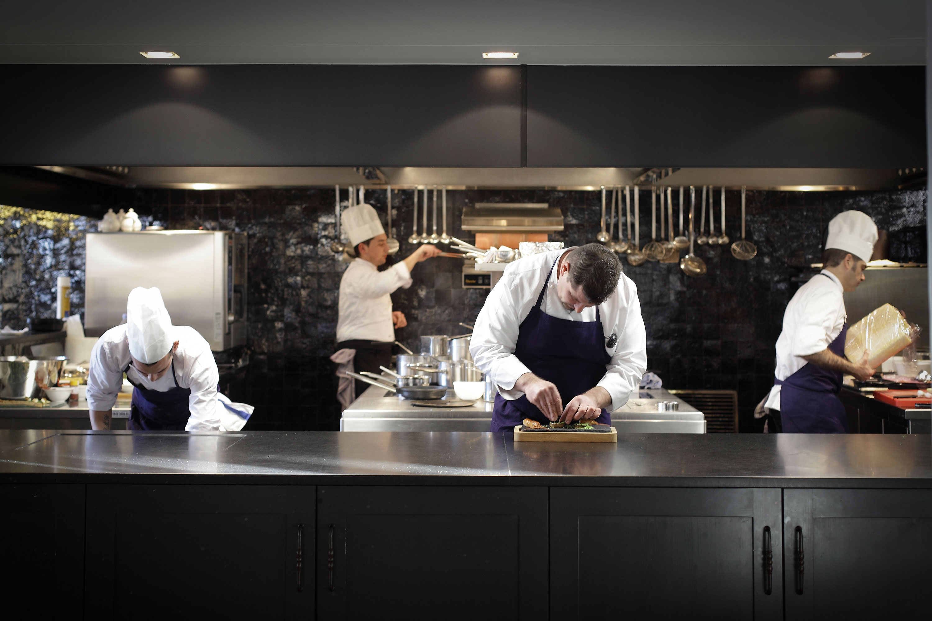
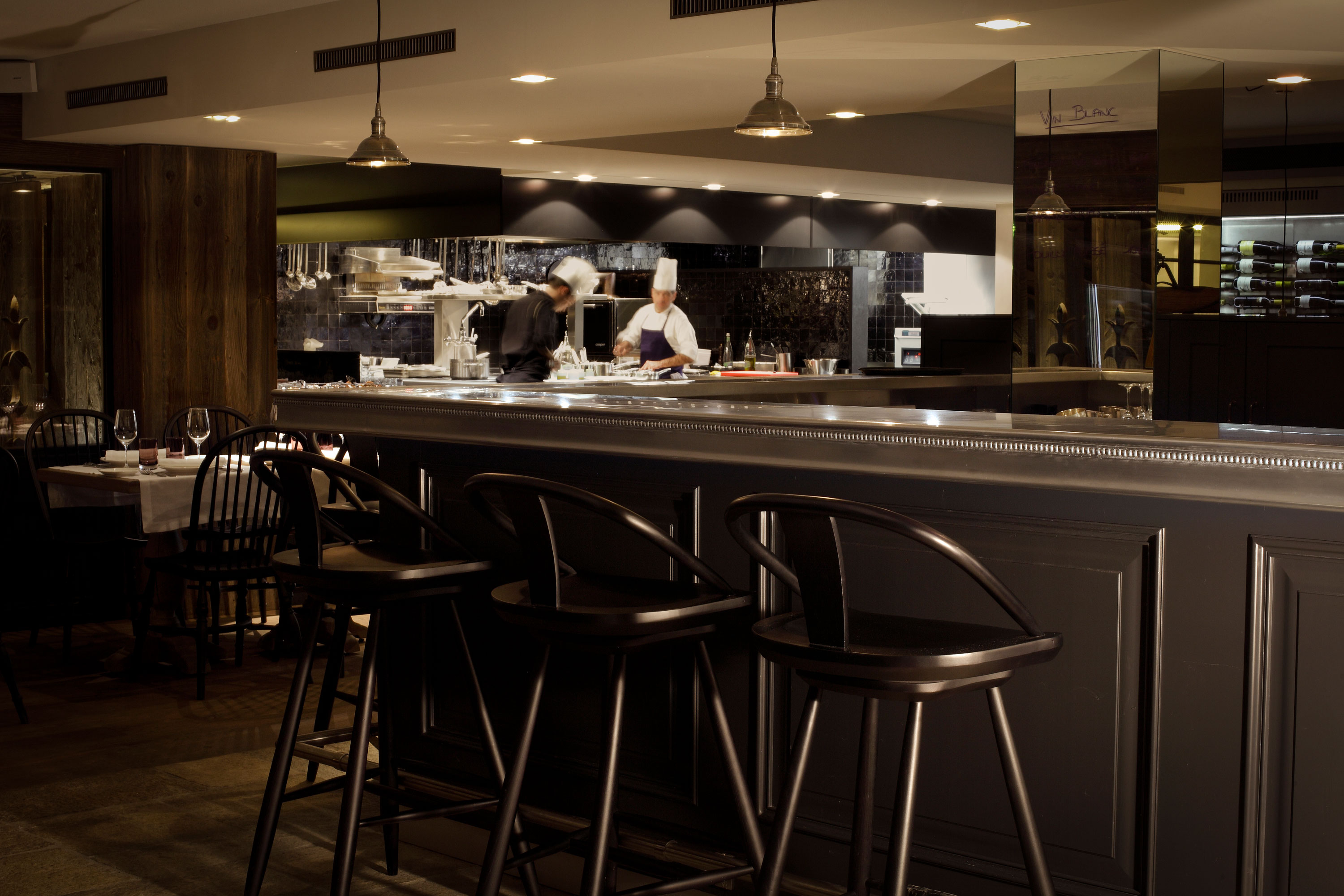
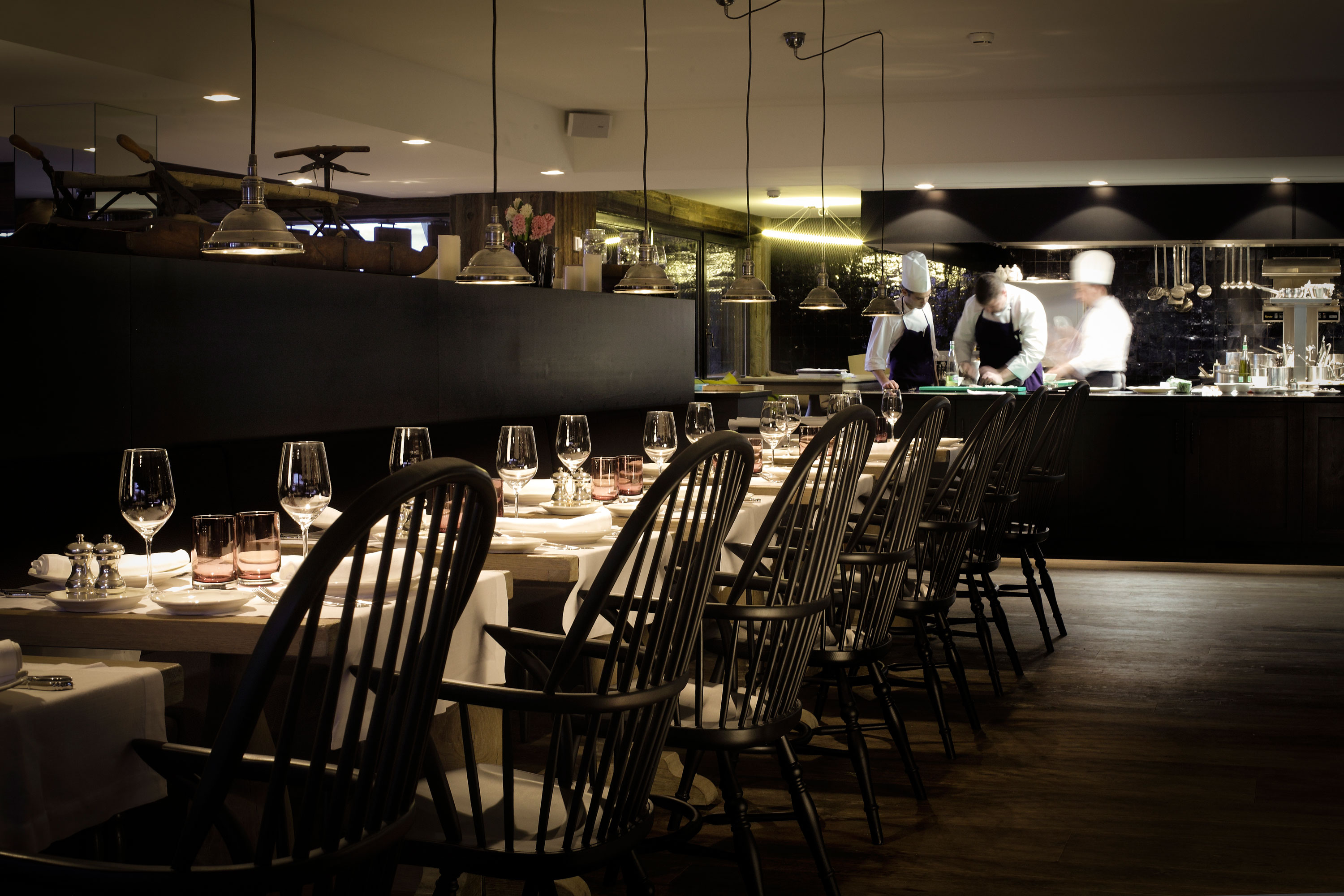
Once the hotel and residence work was complete we began the same procedure with their restaurant, La Cordée.
