
Basadur.
A framework for innovation.
How do you change a logo that a company does not want to change and their customers recognise as a marque of real quality and distinction?
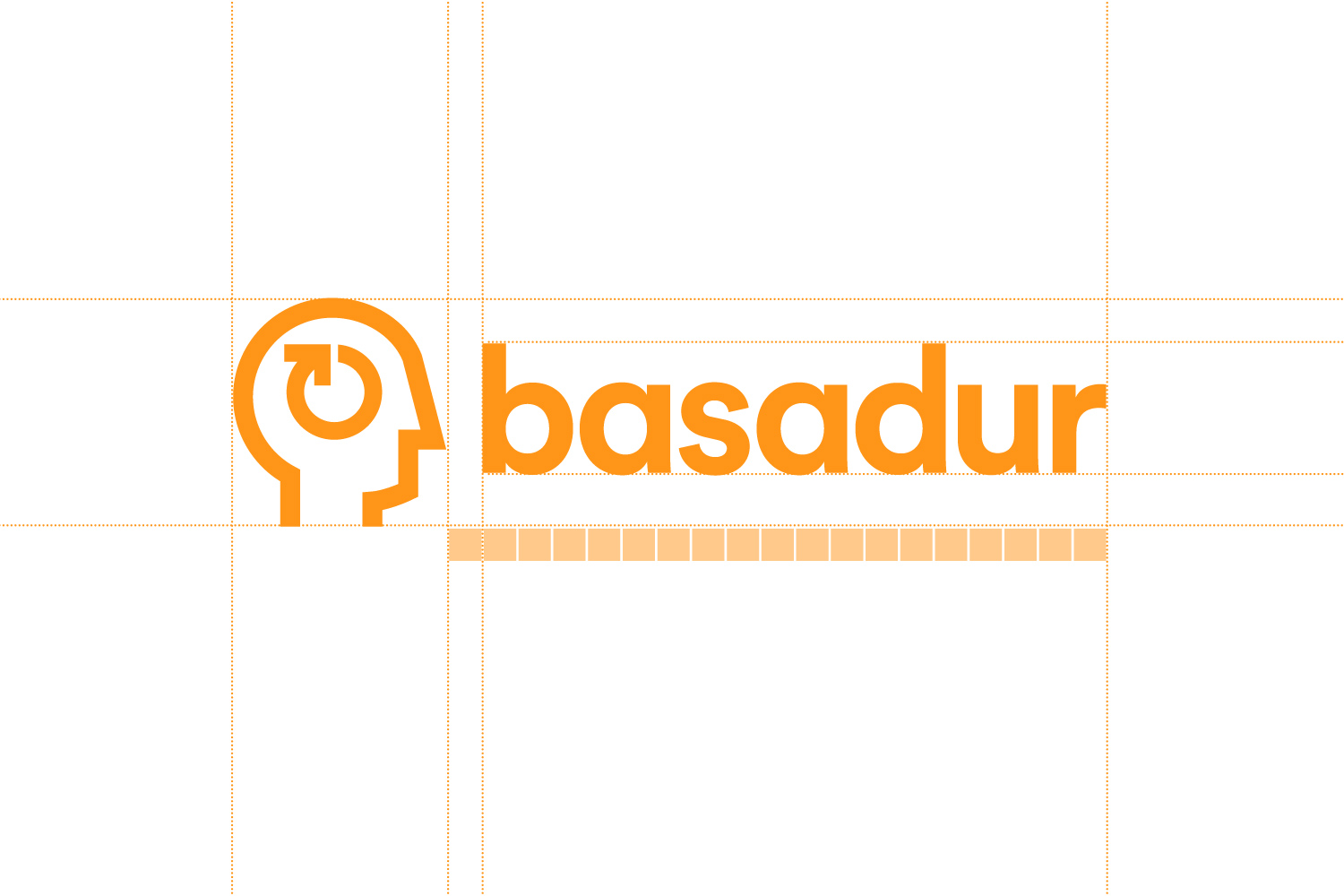
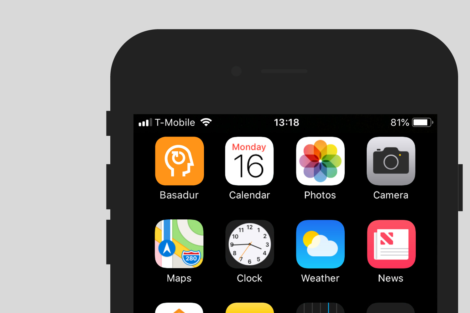
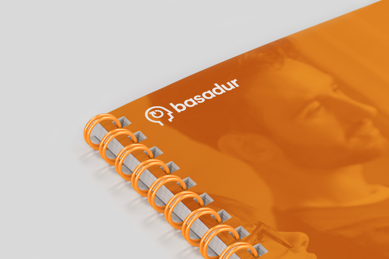
The answer was with great care and respect. However, it was clear that the current identity had become dated and needed modernising. We simplified the logo, retaining the main head icon and arrow but redrawing it to be bolder and combining it with a much more modern, contemporary typeface. The colours become more vivid and we applied the new logo in a much more consistent and cohesive way.
The more we progressed with the updating of the identity, the more Basadur got on board with the new approach.
By the end we had a client that fully appreciated and embraced the new modern look.
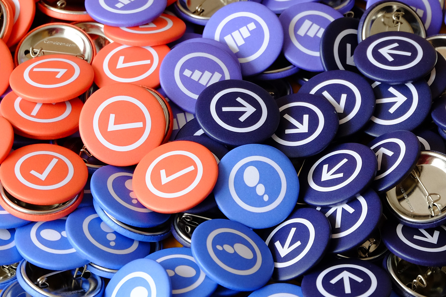
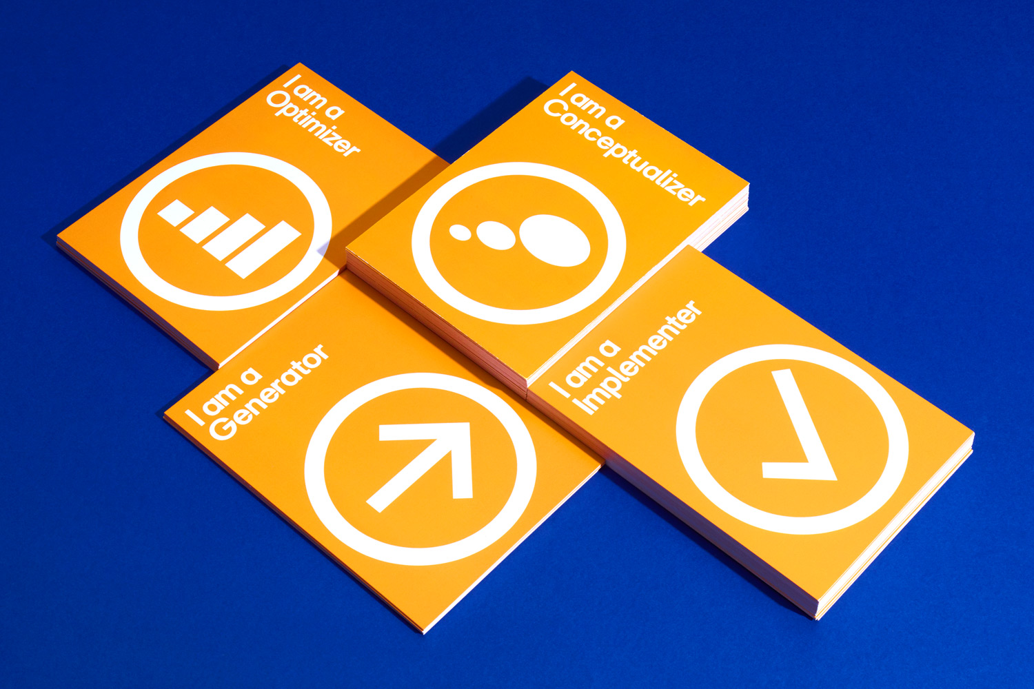
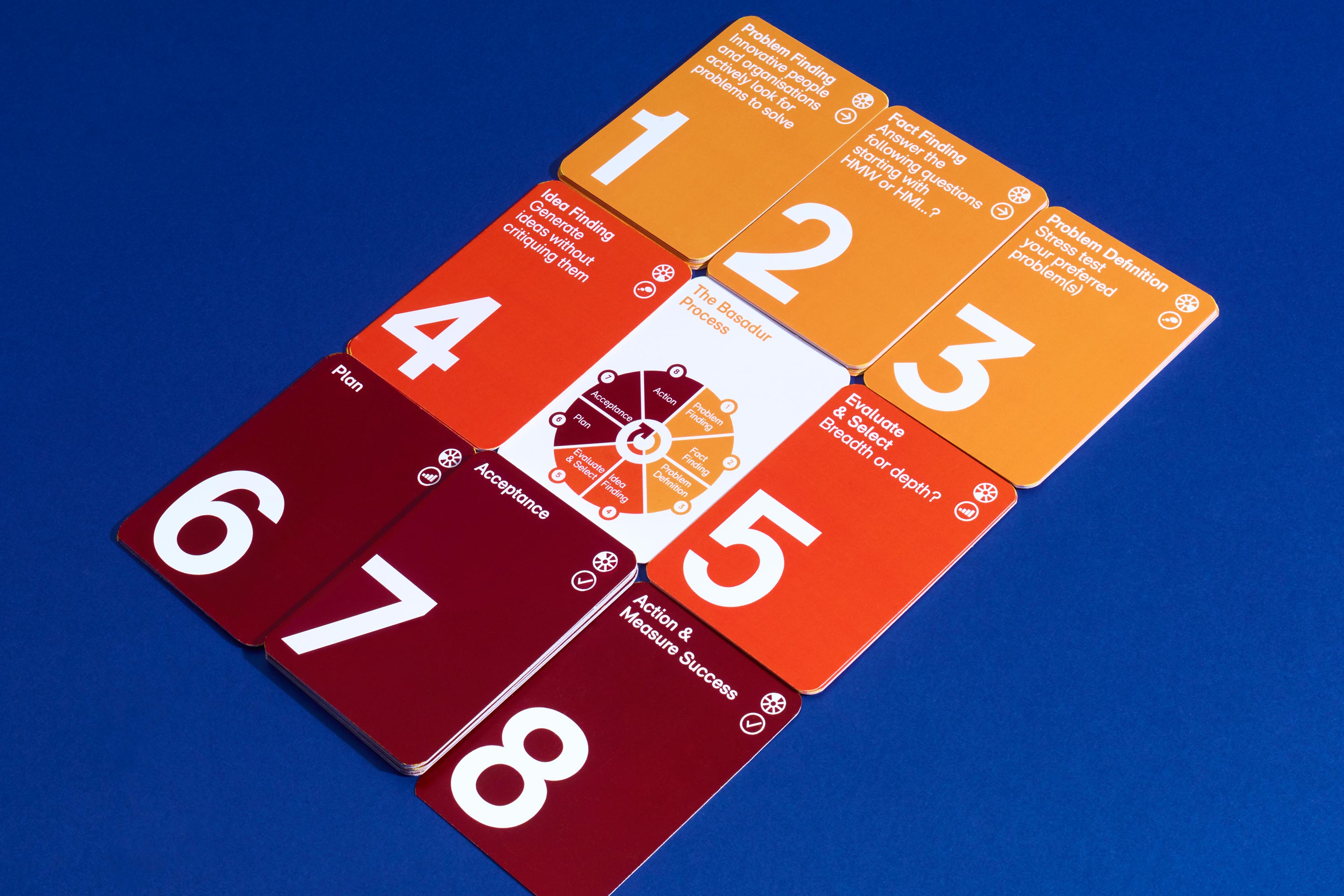
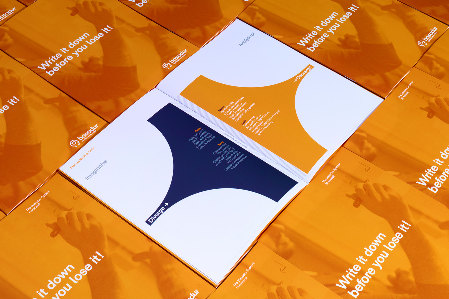
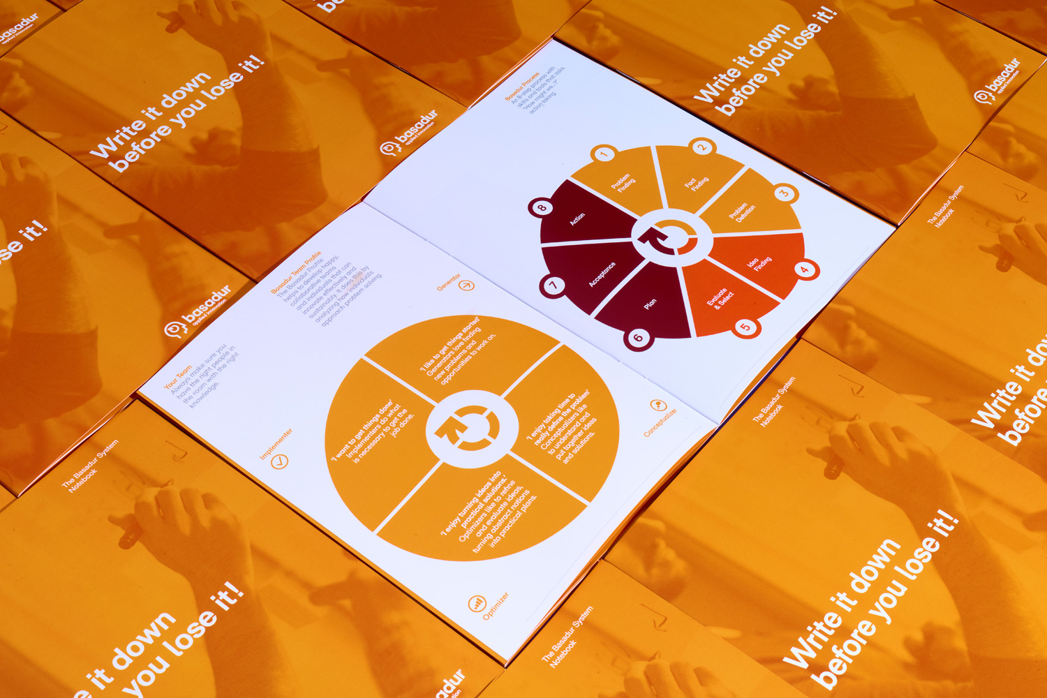
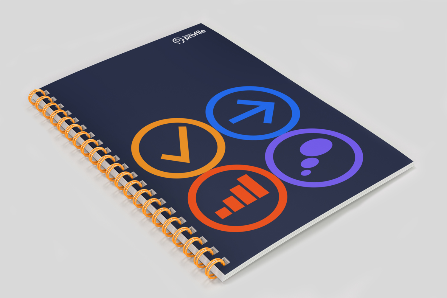
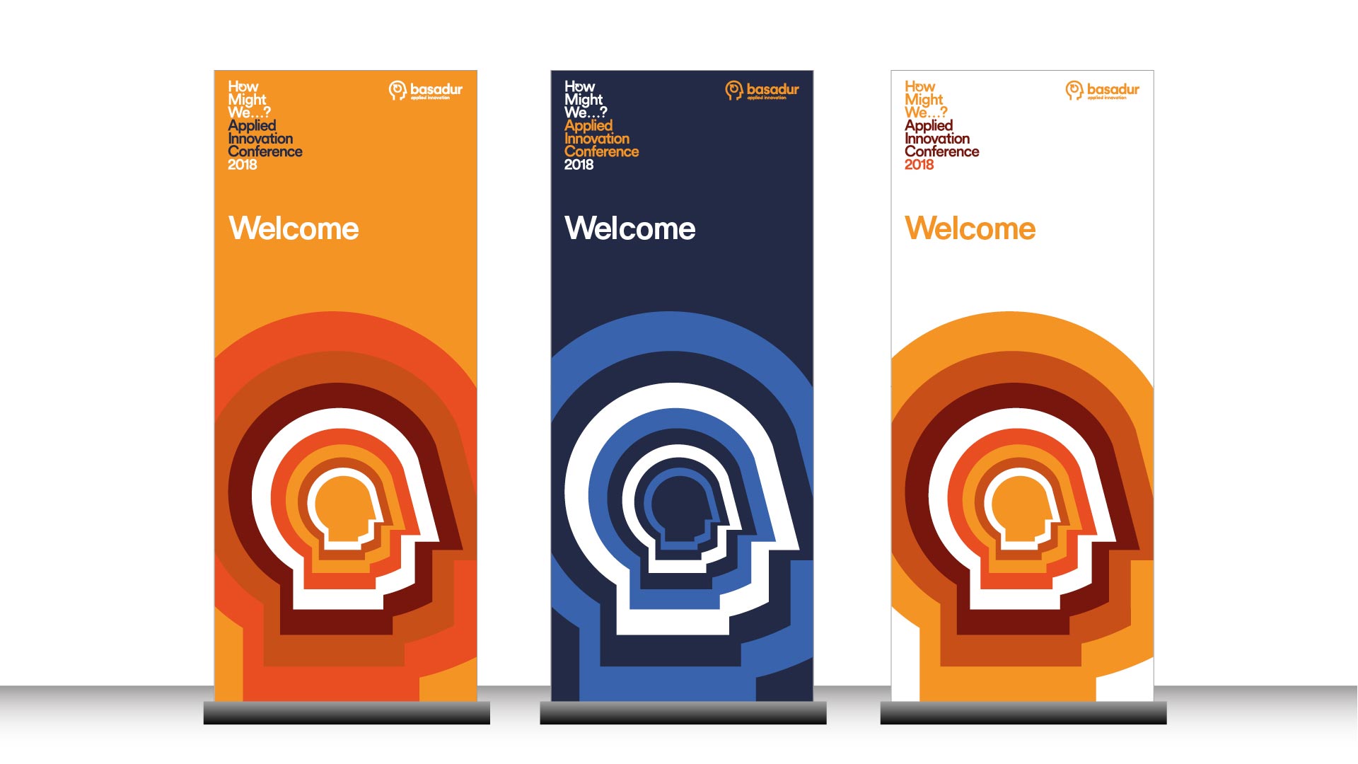
The logo was also the starting point of reference for designing a family of icons used to illustrate various points from the framework.


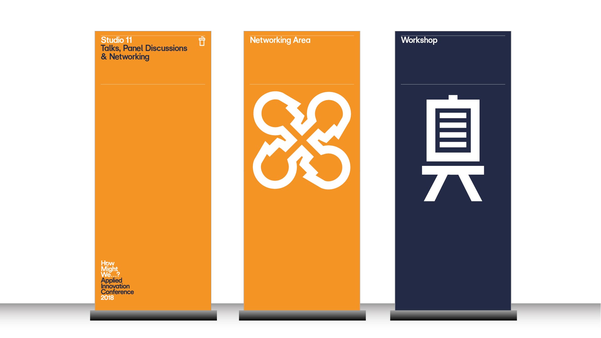
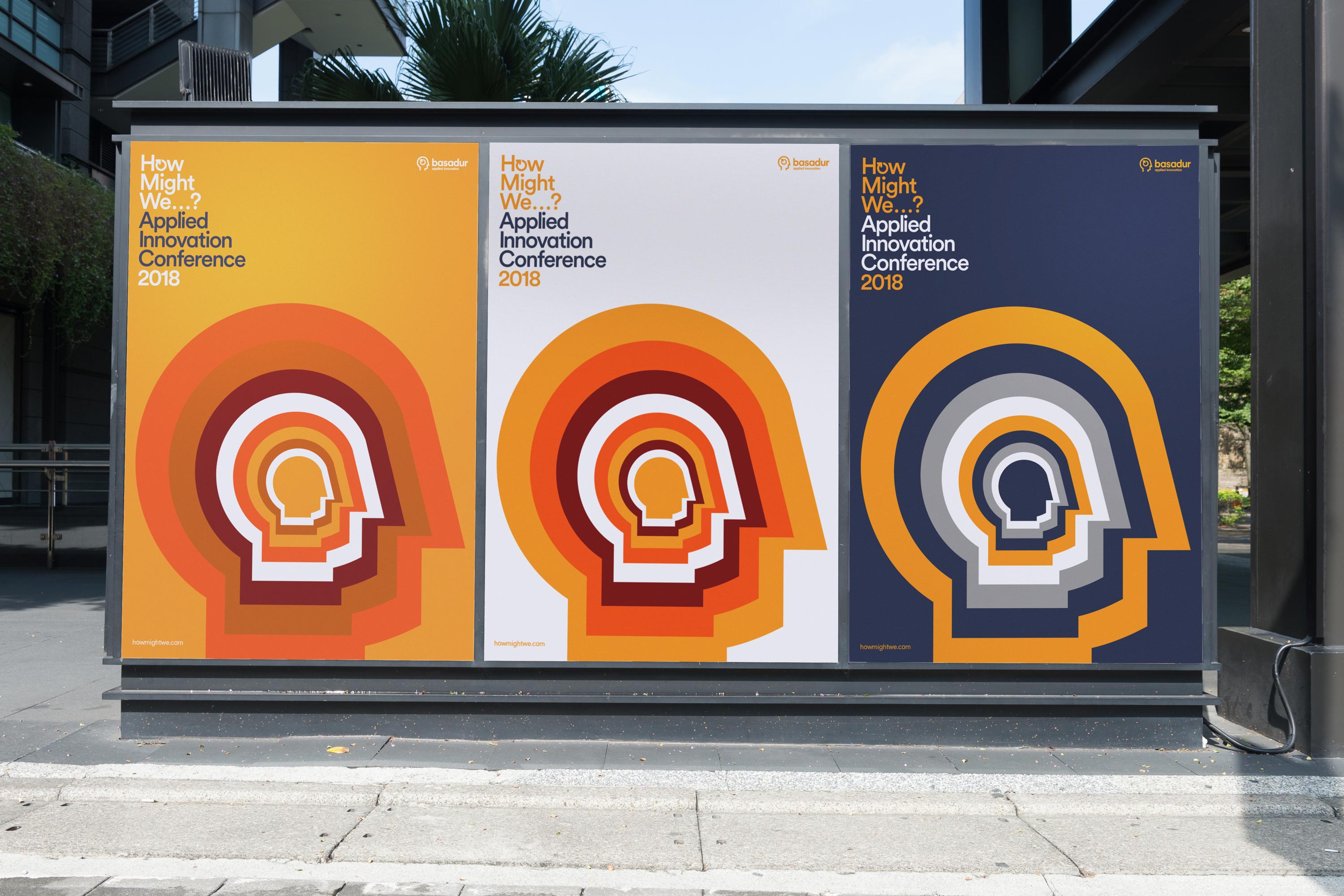
We immediately had the opportunity to practice what we preach by implementing our new identity and use it as a basis to design an event identity, one that would be used at the venue on various materials, merchandise and signage.
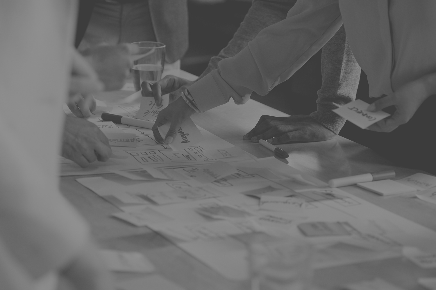
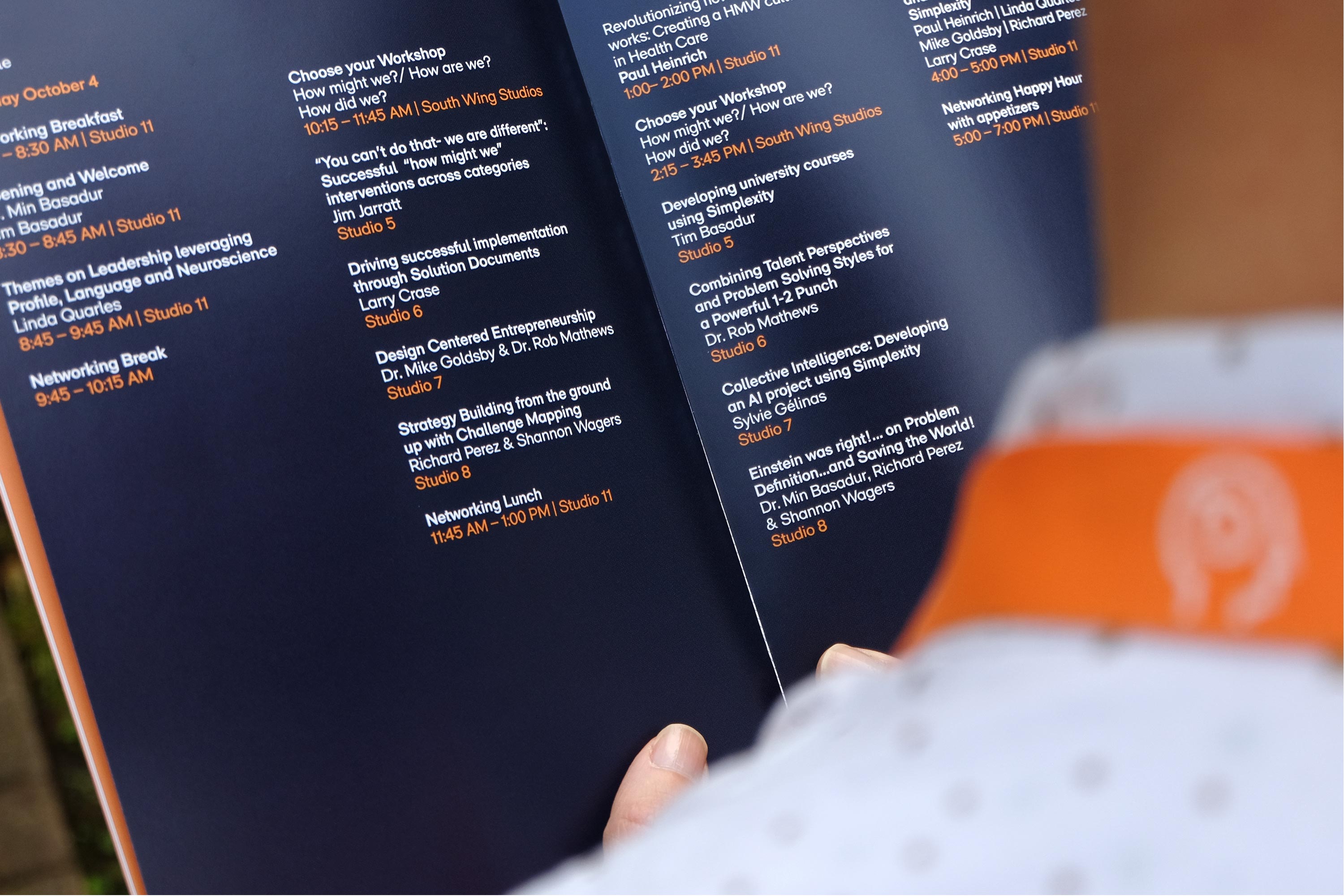
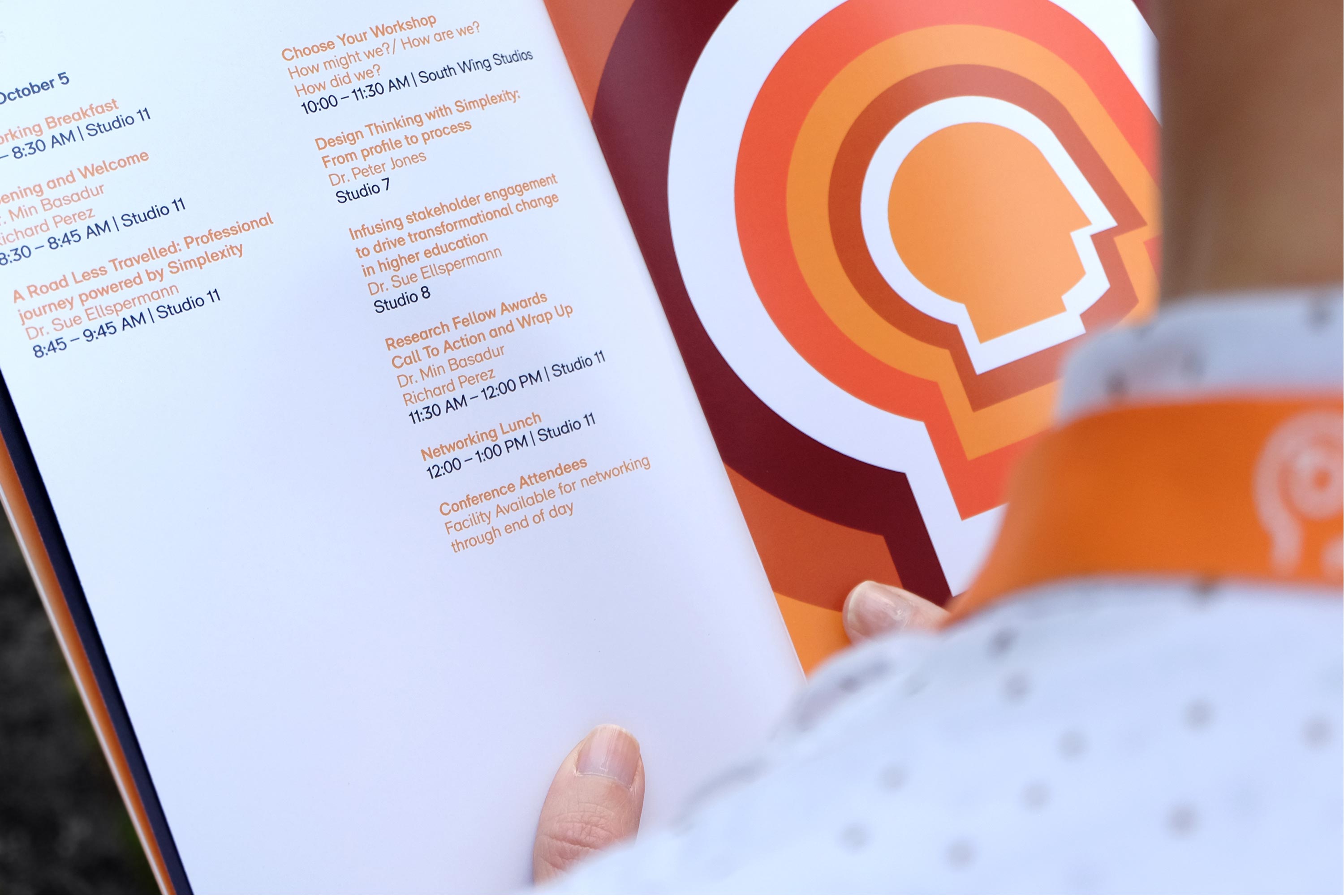
The very first Basadur Applied Innovation Conference took place at P&G’s headquarters in Cincinnati. It gathered together a select audience of innovation practitioners and representatives from organisations who have benefited from working with the unique Basadur Innovation process.
Work carried out
—
Brand refresh
Logo redesign
Iconongraphy
Art direction
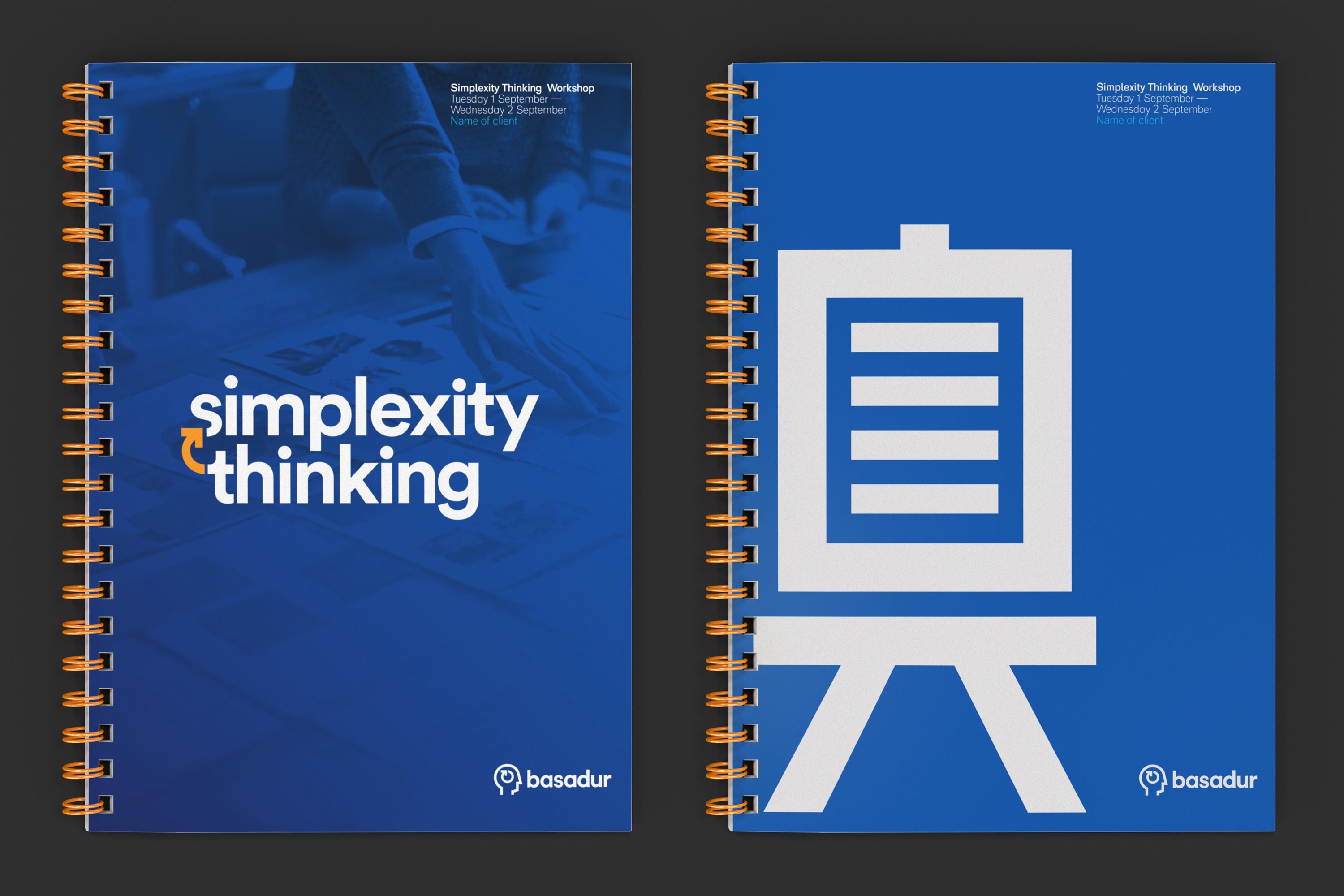
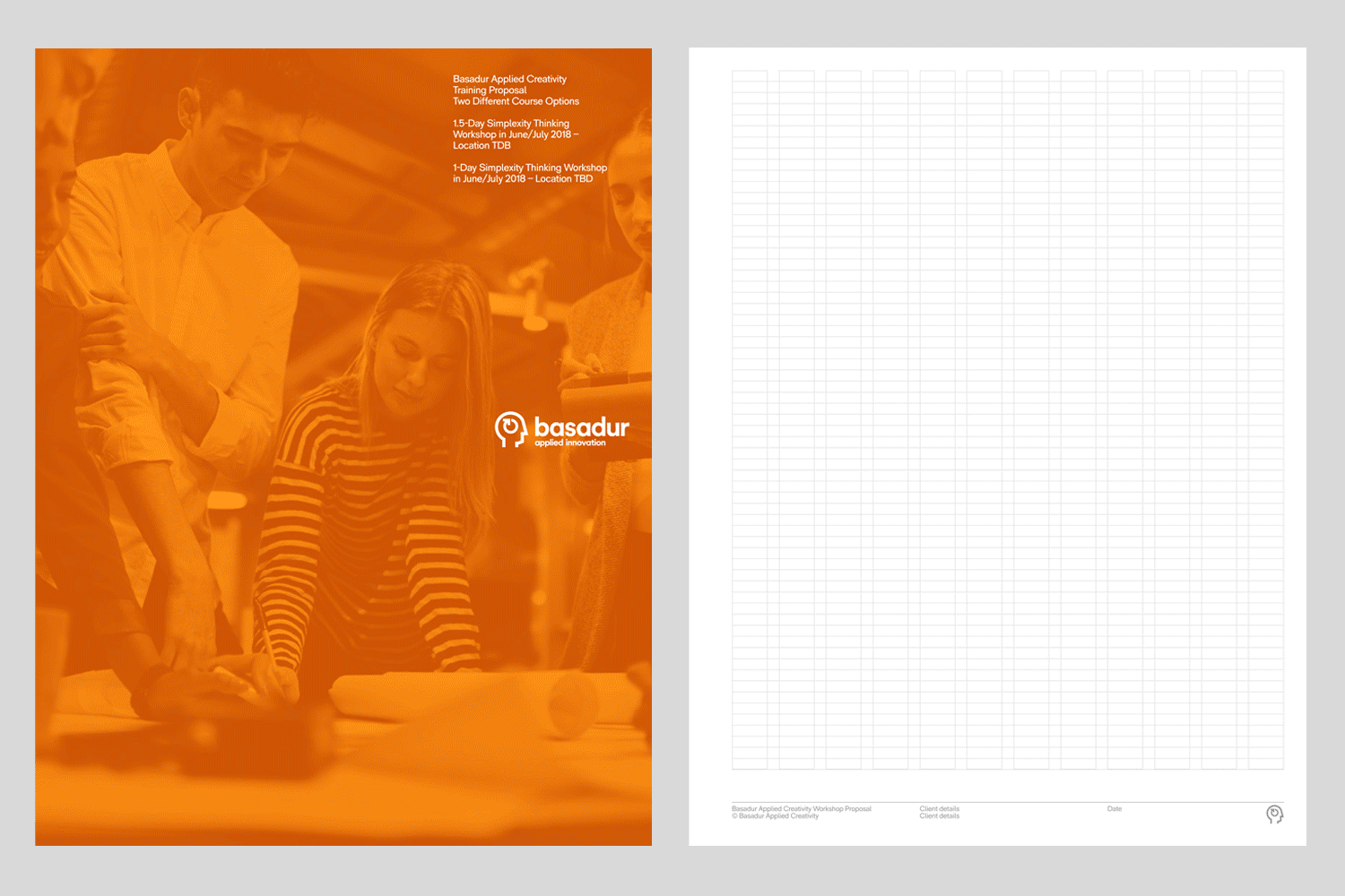
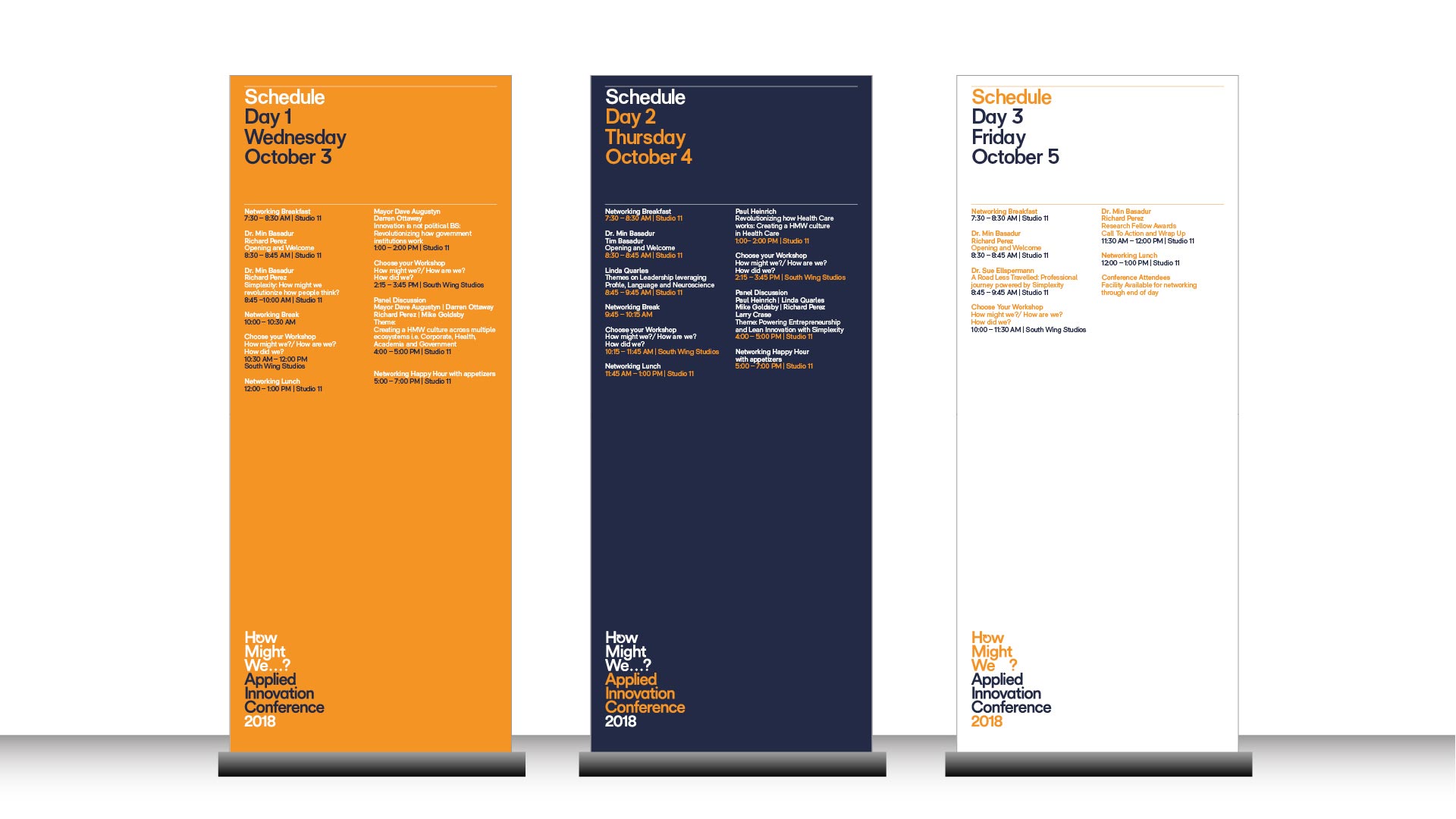
Template design
Event identity
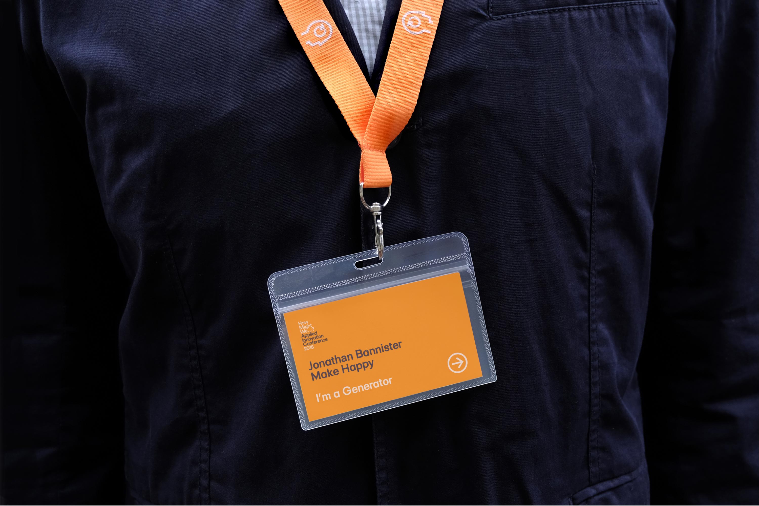
Conferance materials
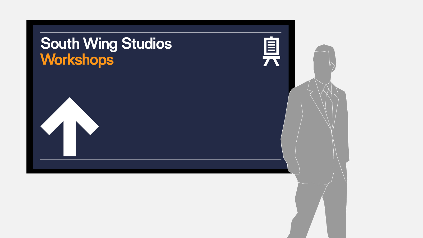
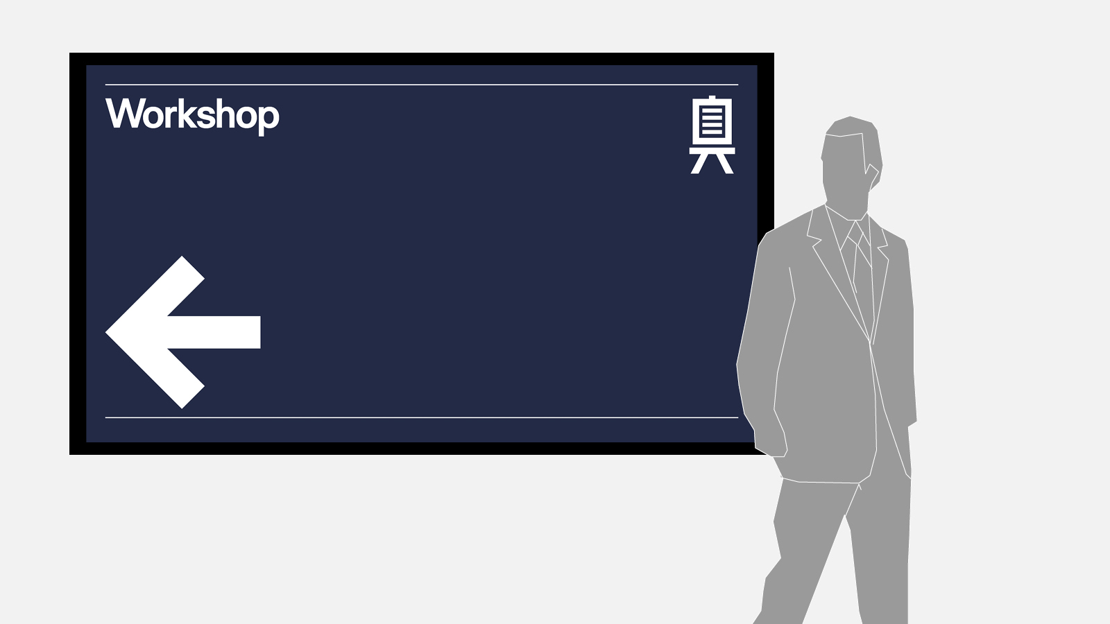
Wayfinding + signage
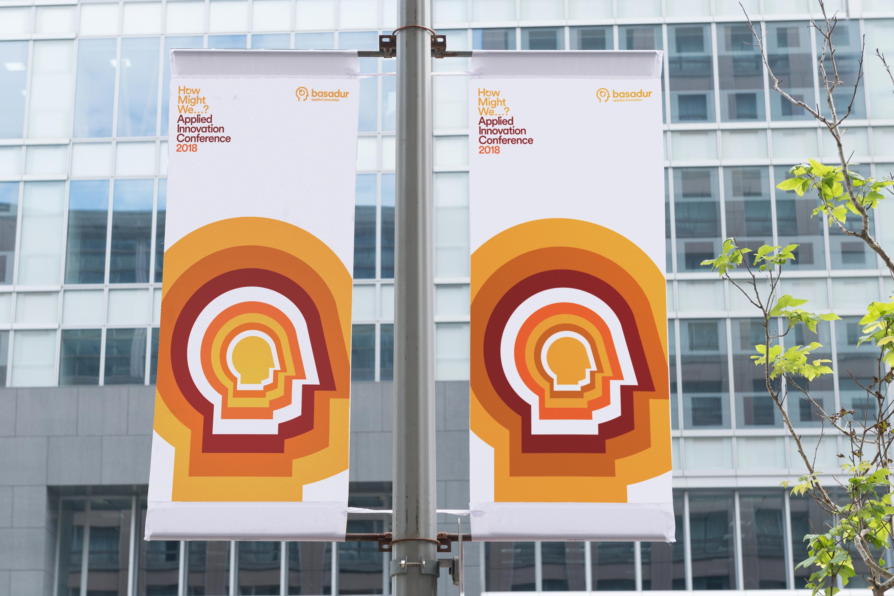
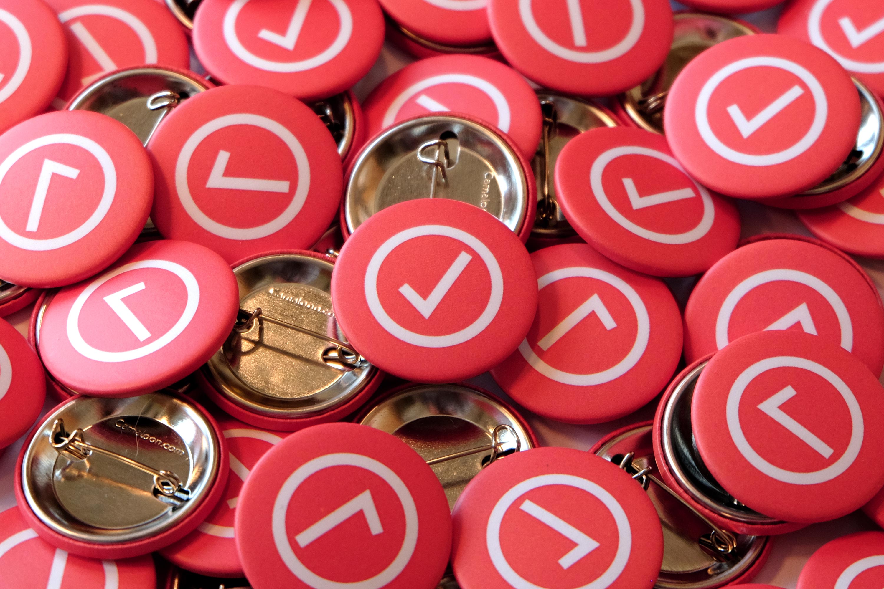
For the three days of the conference we turned the venue into a sea of orange. Combining the main brand colour to help signify to people where to go and using an illustrative take on the Basadur logo, we established an eye-catching identity for the event.


Relevant work
Oxera

Rockworth