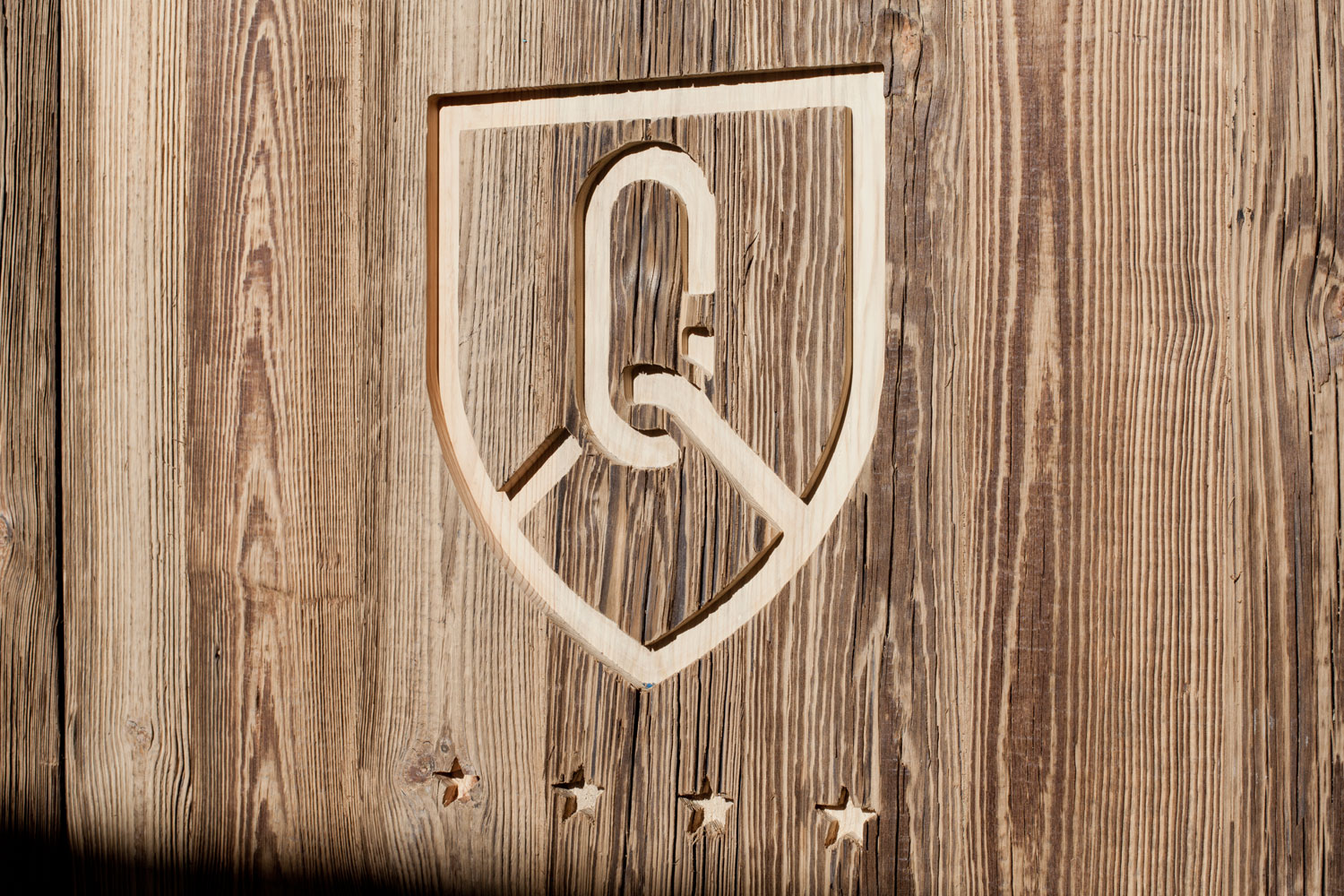
KV Hotels Group
Creating a consistent quality of service and experience.
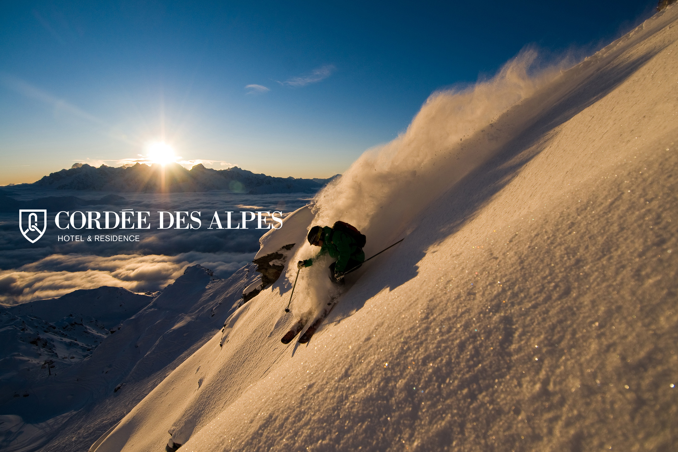
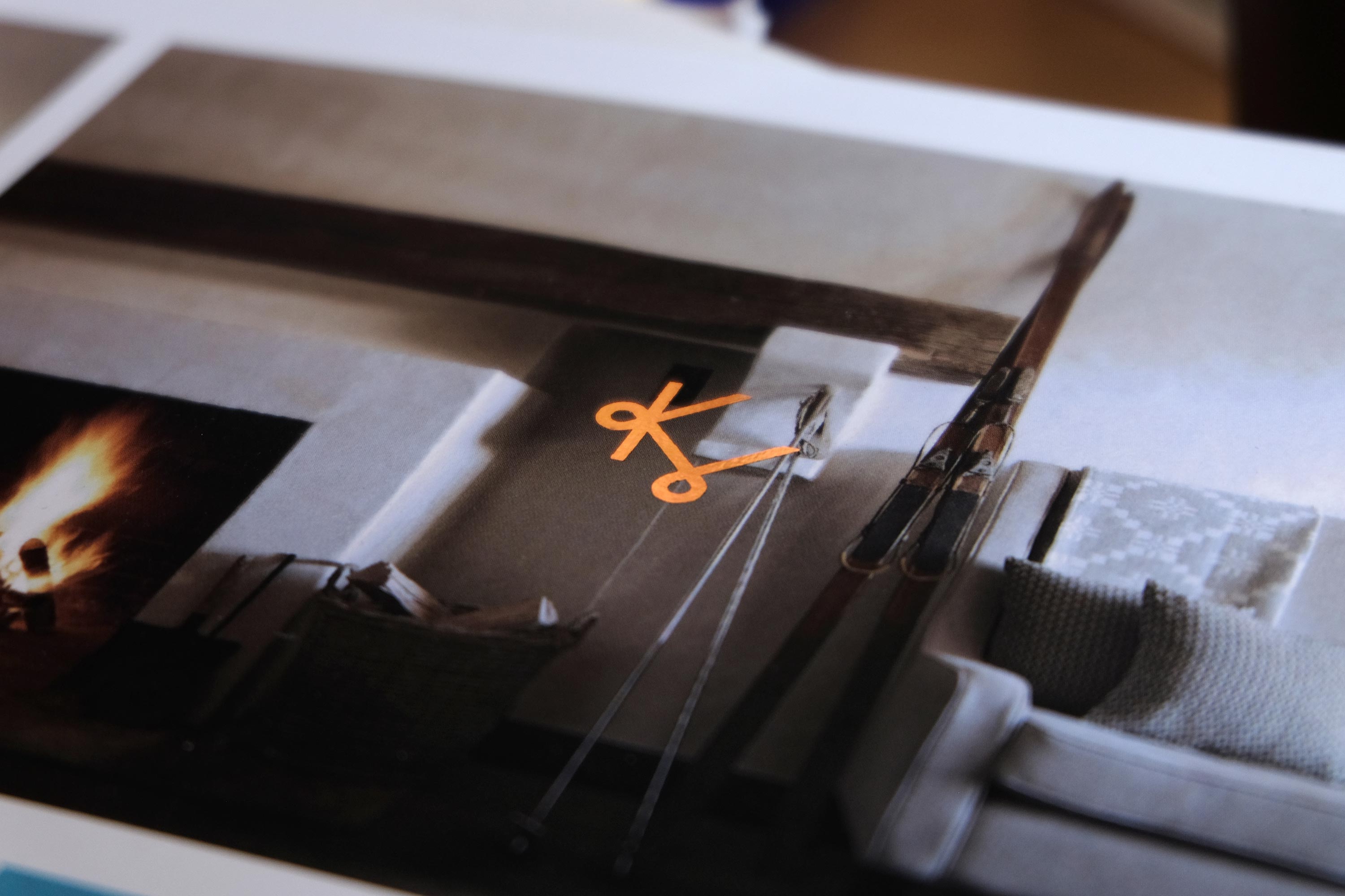
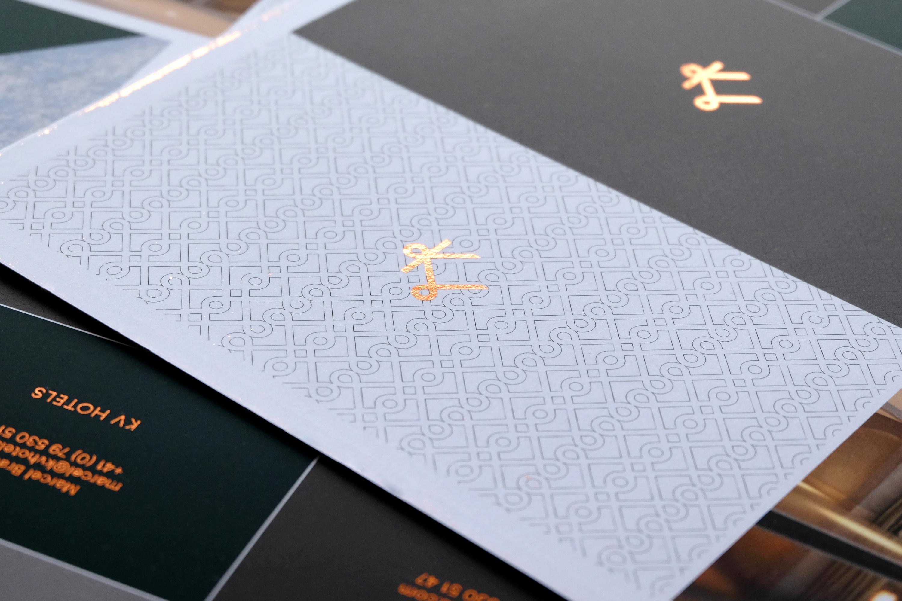
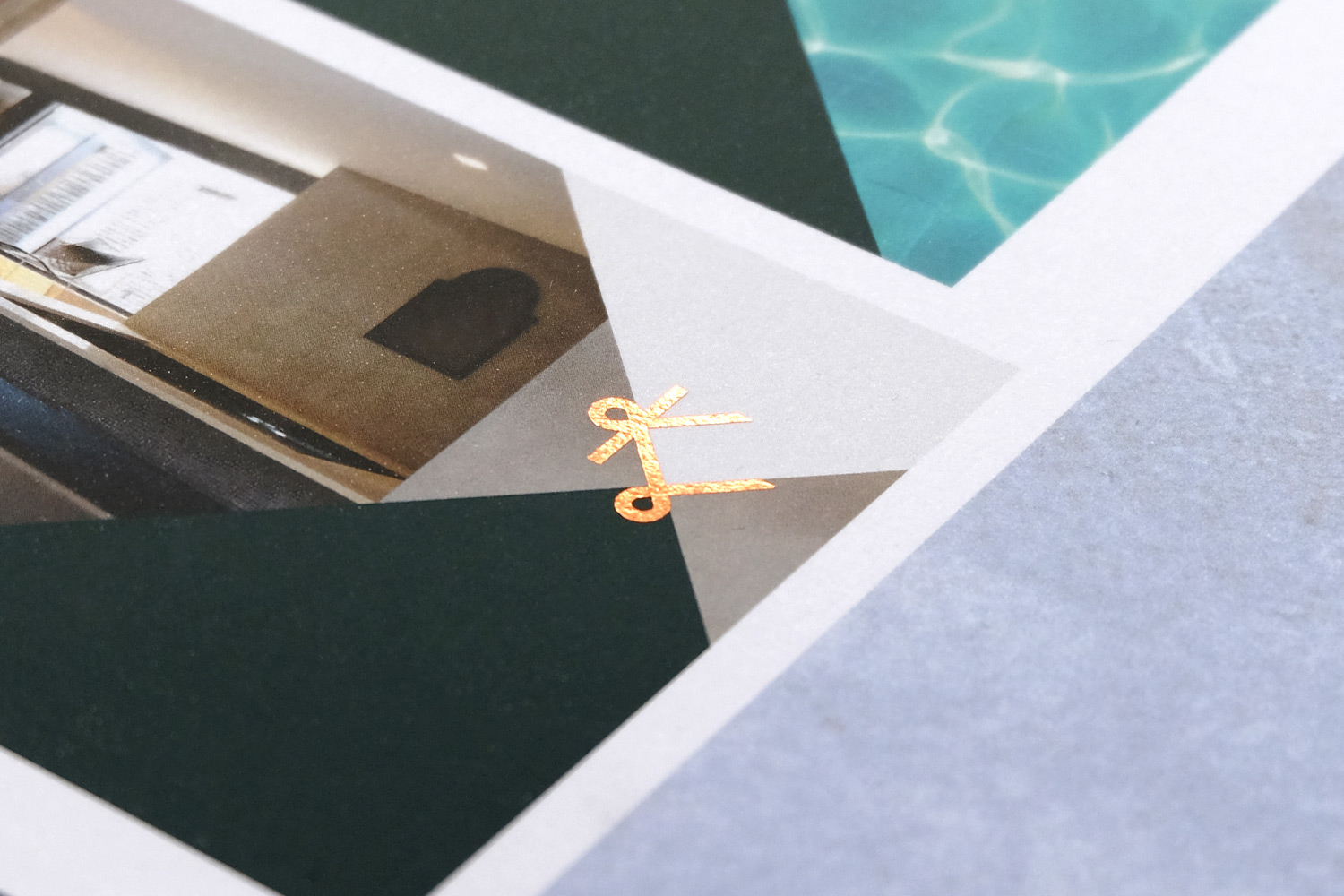
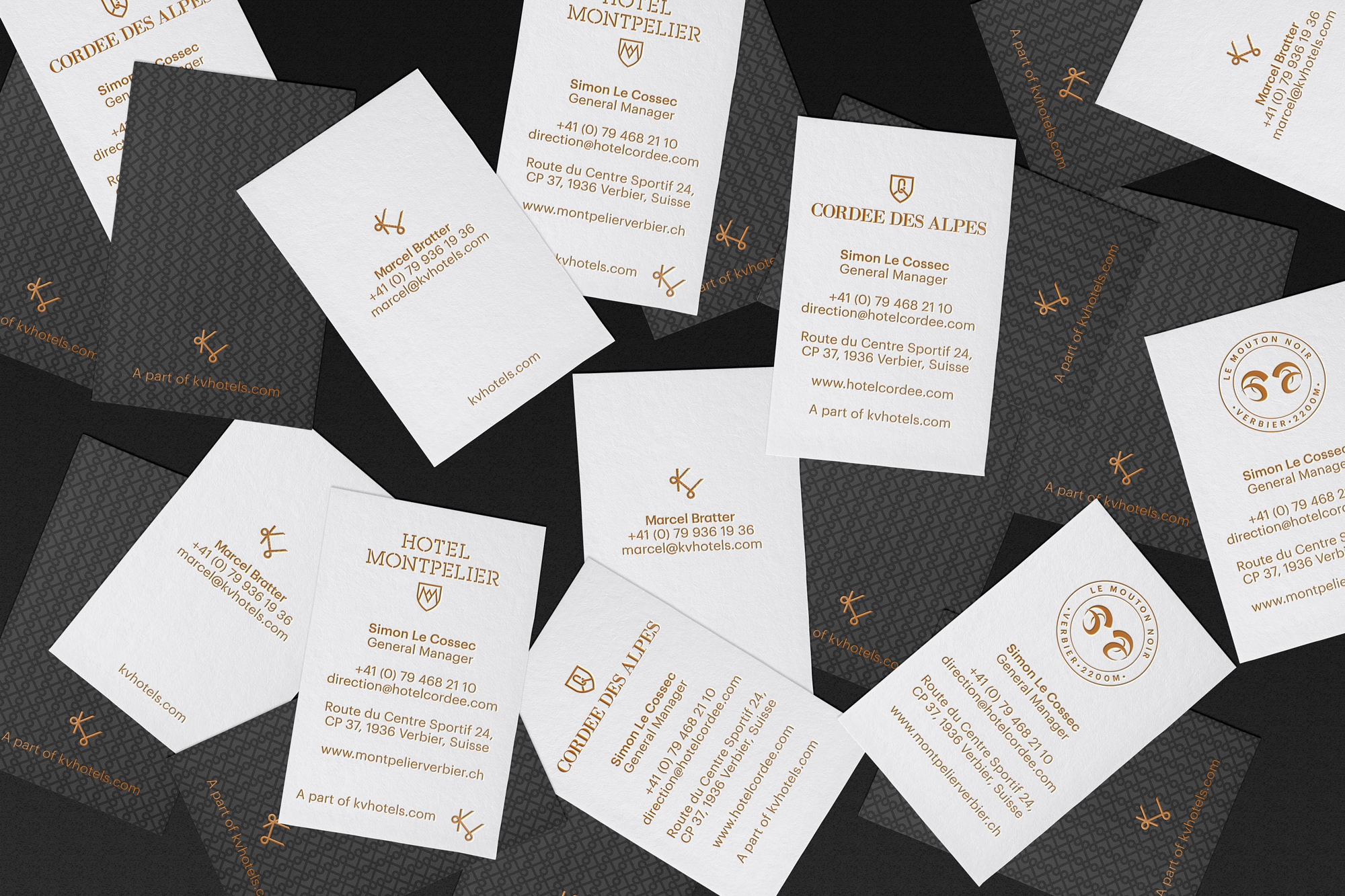
Primarily located in the renowned Swiss ski town of Verbier, KV Hotels is a group of hotels, residences, bars and restaurants designed to create an exceptional, luxury environment and provide guests with a range of unique experiences.
We have been working with the KV Hotels Group for over 10 years now, starting with the identity for the flagship Cordée des Alpes Hotel and continue to provide complete design services for all of their businesses.
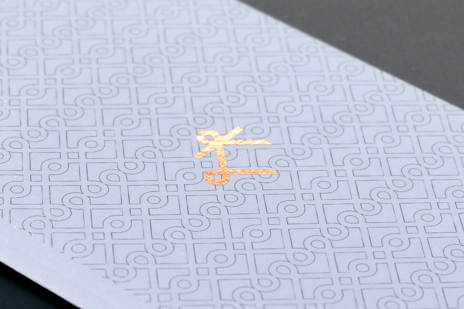
As their businesses diversify and grow, so does the range of opportunities to create relevant and dynamic design materials for new audiences in different locations.
Work carried out
—
Logo design
Visual identity
Art direction

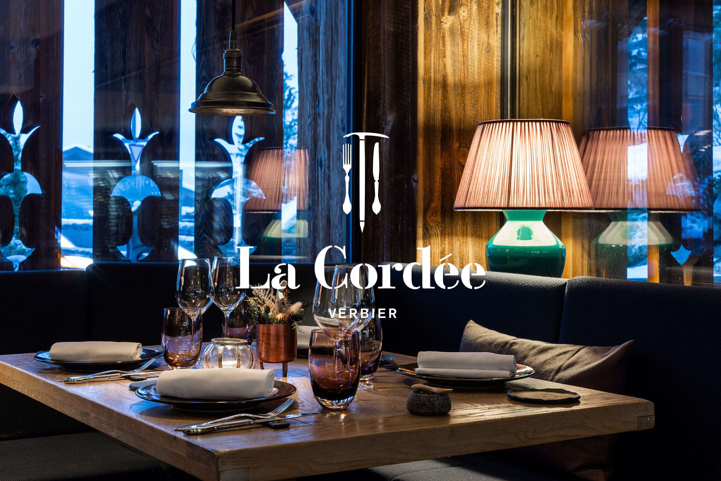
Cordée des Alpes + La Cordée
View full project here
Work carried out
—
Logo design
Visual identity
Art direction
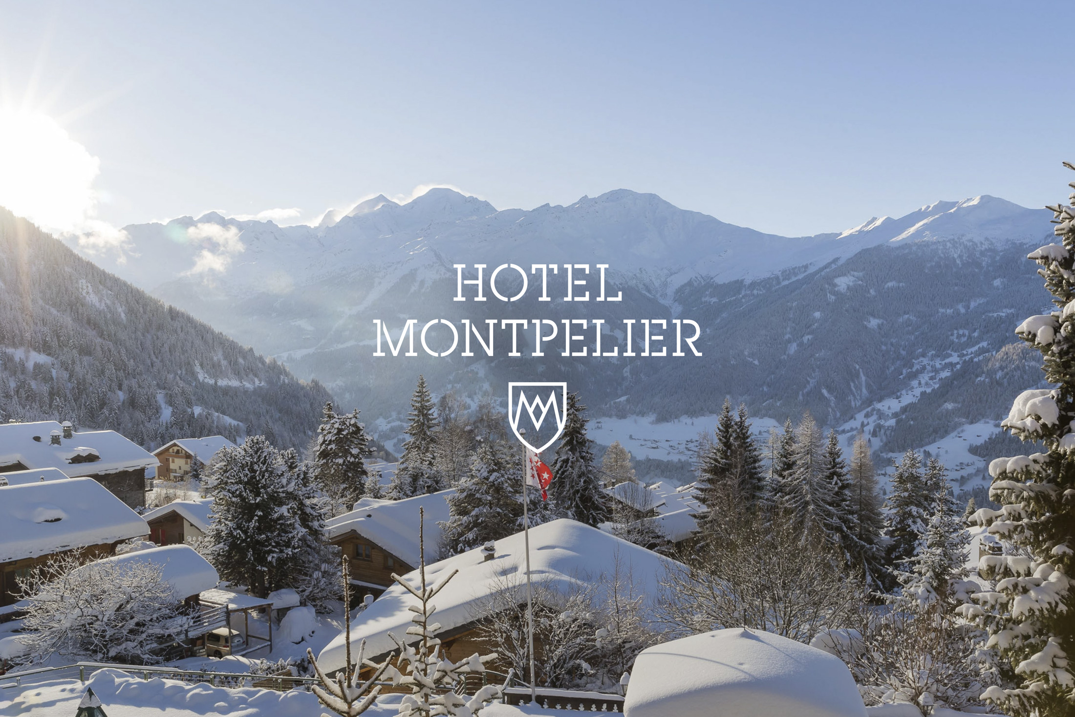
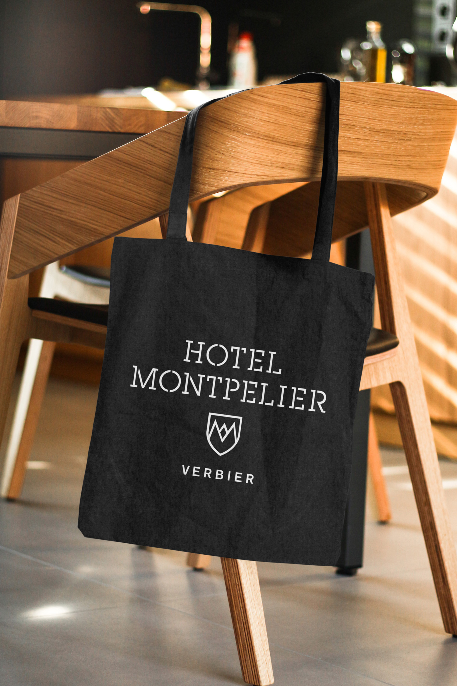
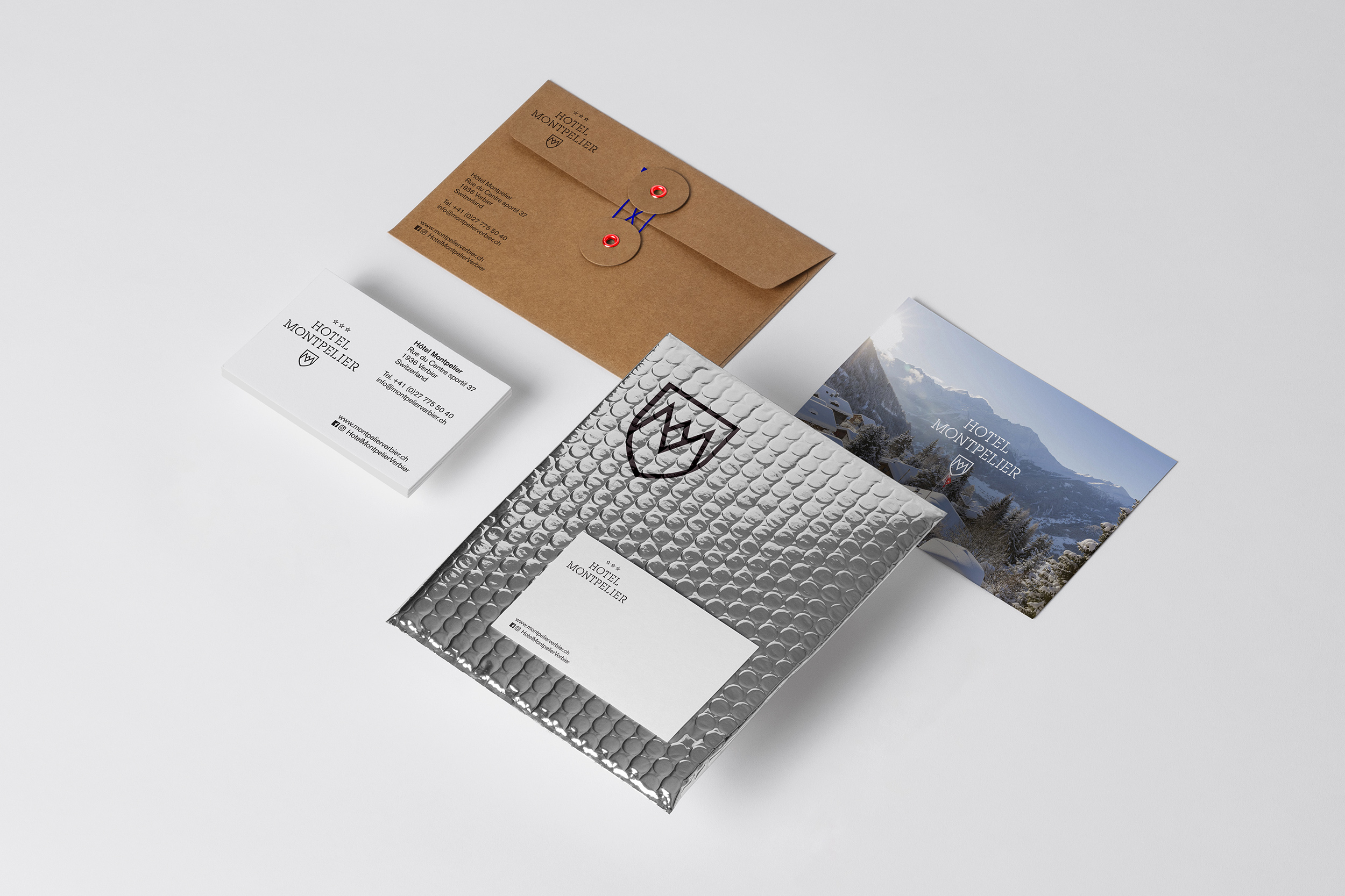
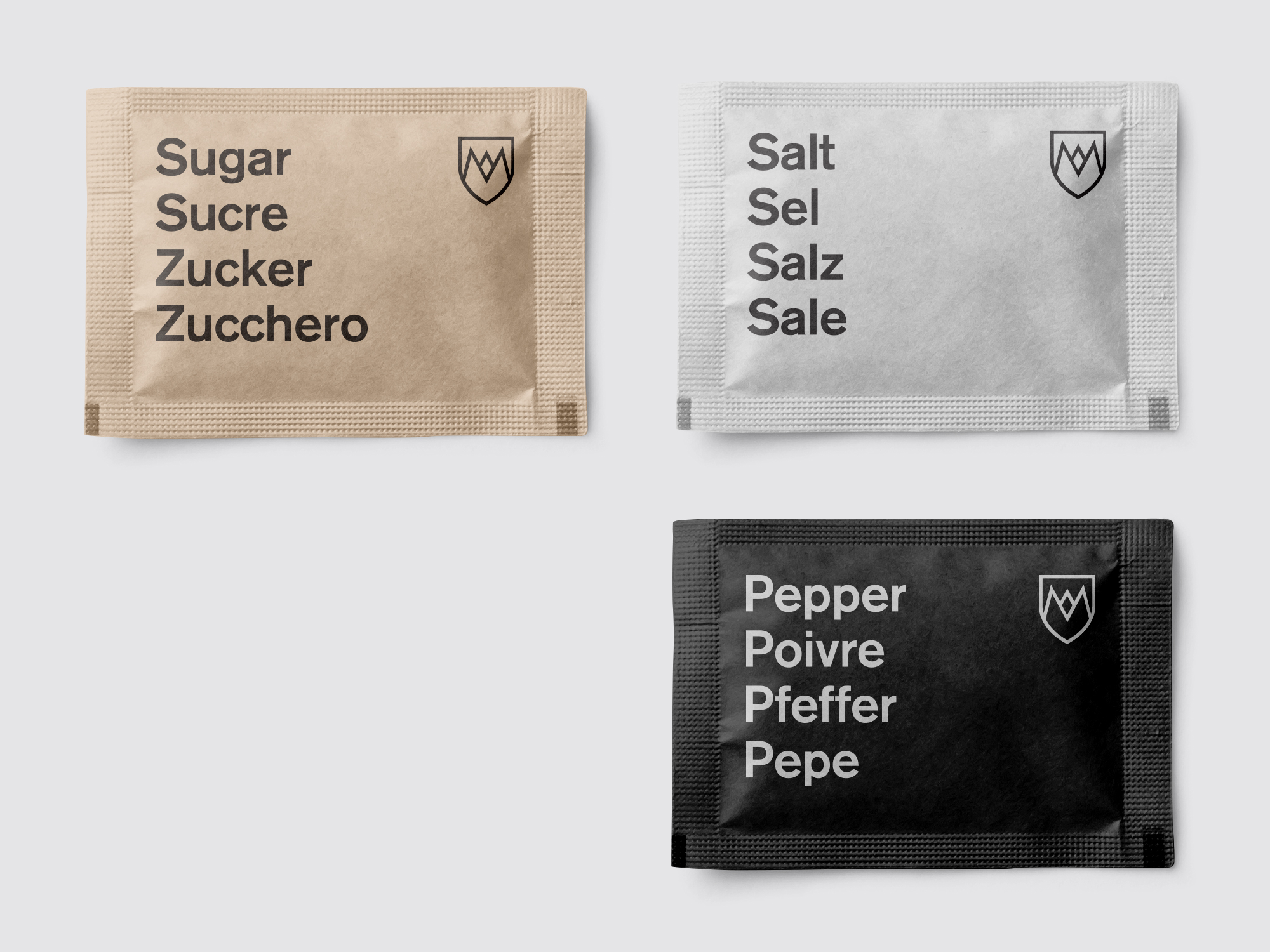
Hotel Montpelier
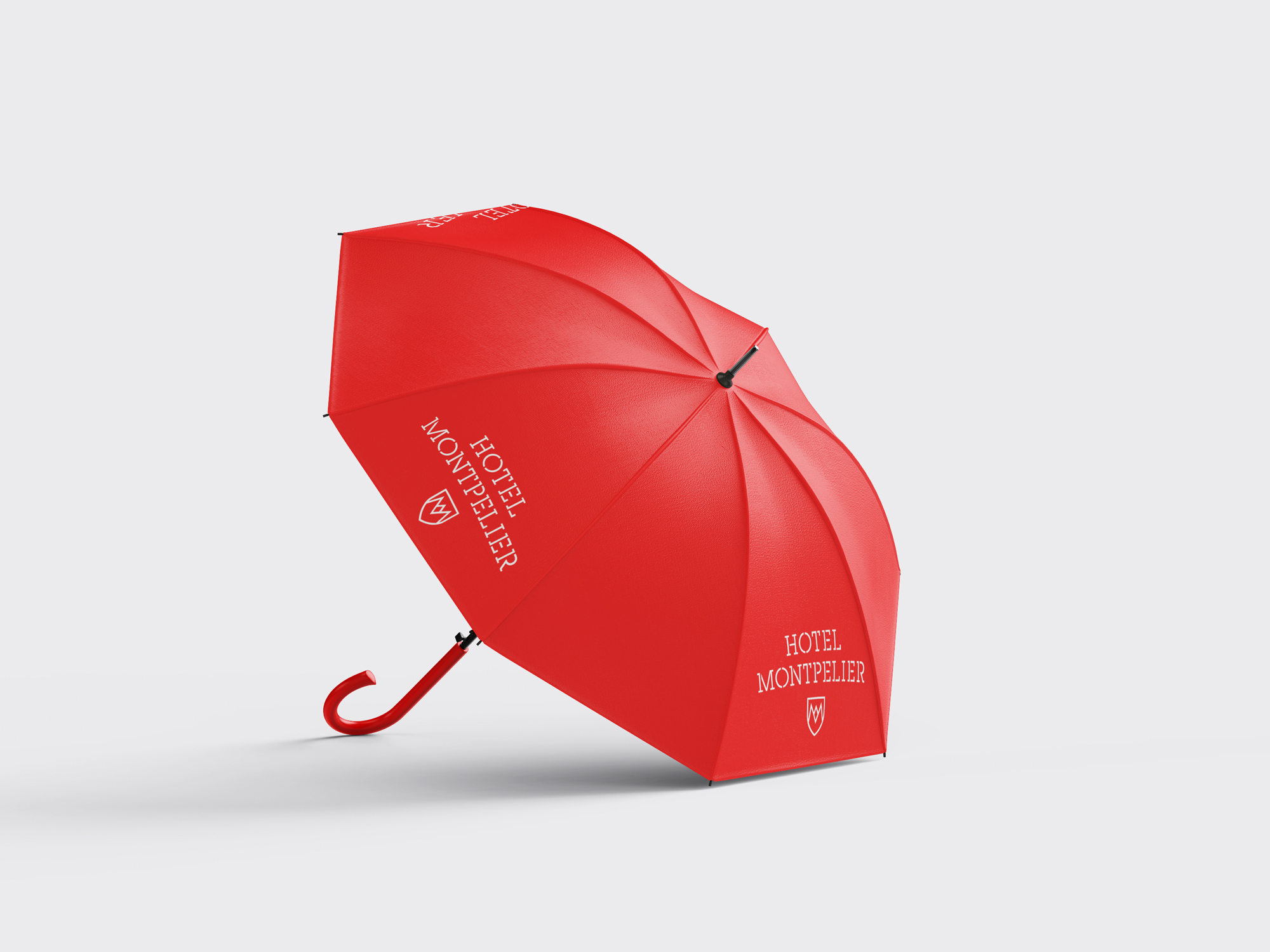
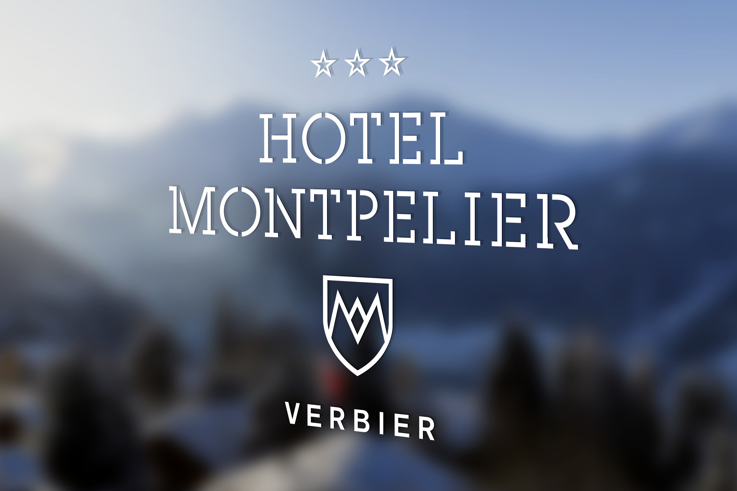
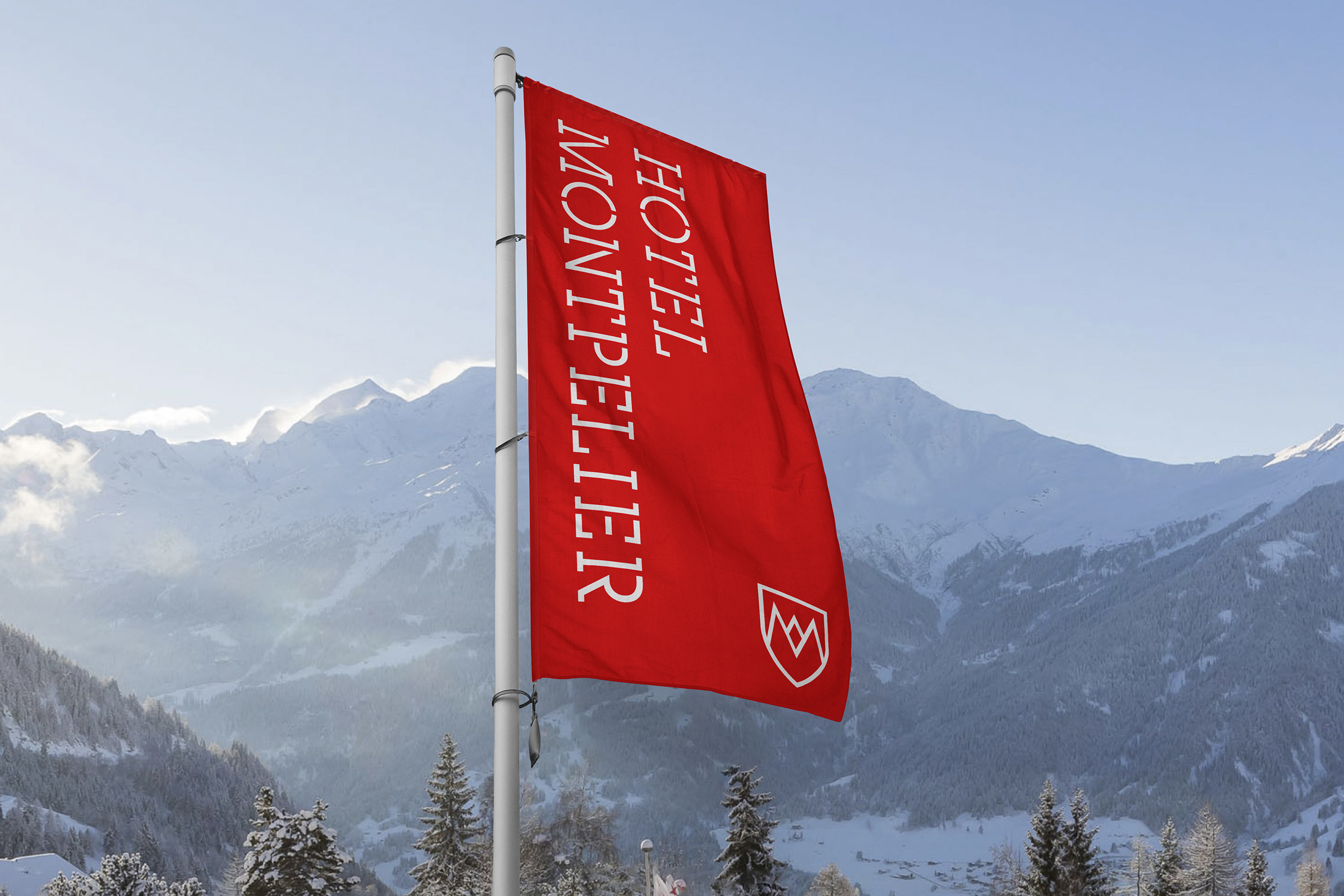
The Hotel Montpelier is a friendly and welcoming hotel offering a more relaxed and accessible approach than it's sister hotel, Cordée des Alpes. It appeals to families, couples, groups and business trips.
The logo shares the same DNA as Cordée, but the overall design is much less focussed on luxury and more about being comfortable, warm and friendly.
Work carried out
—
Logo design
Visual identity
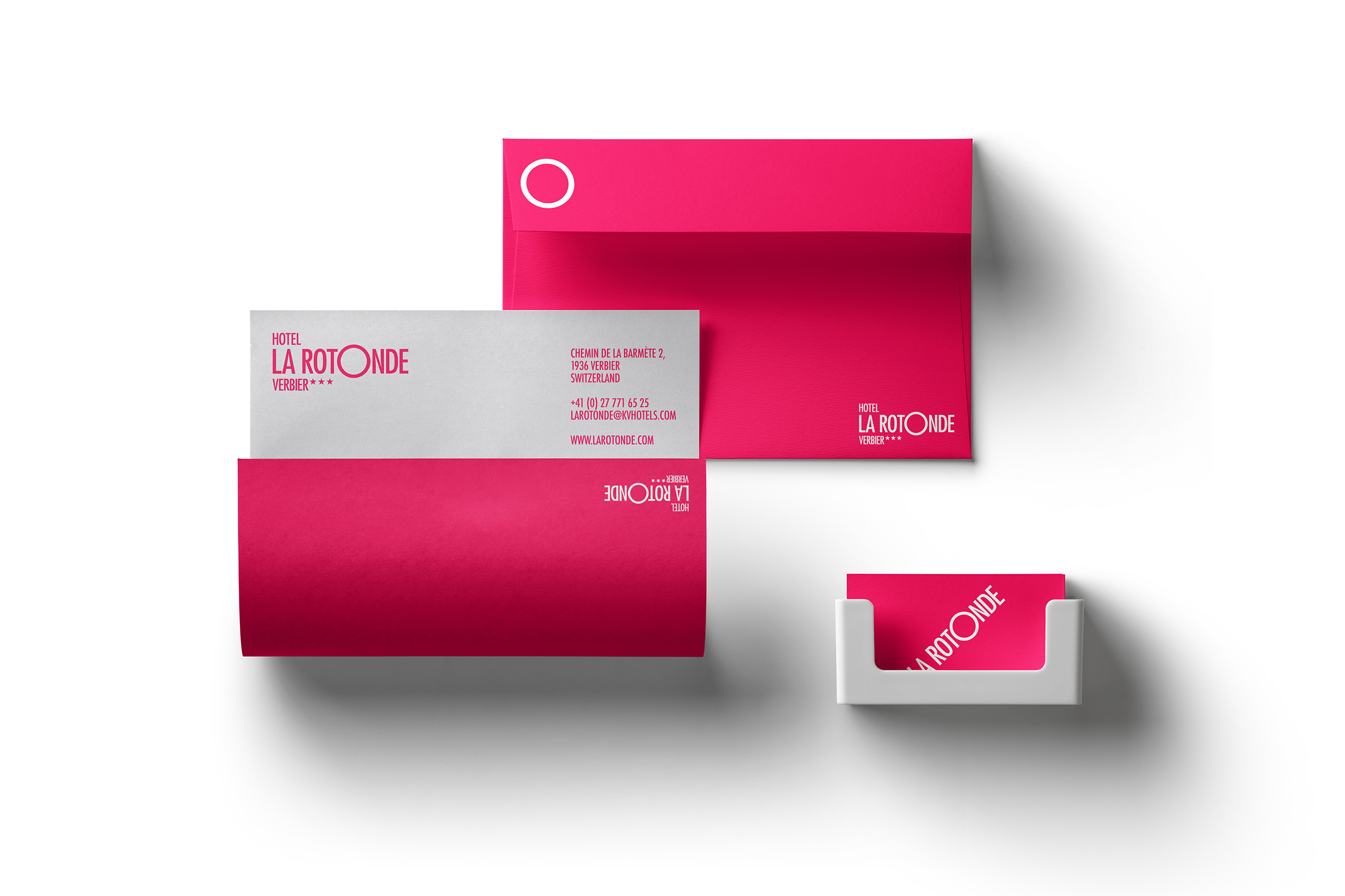
The La Rotonde Hotel
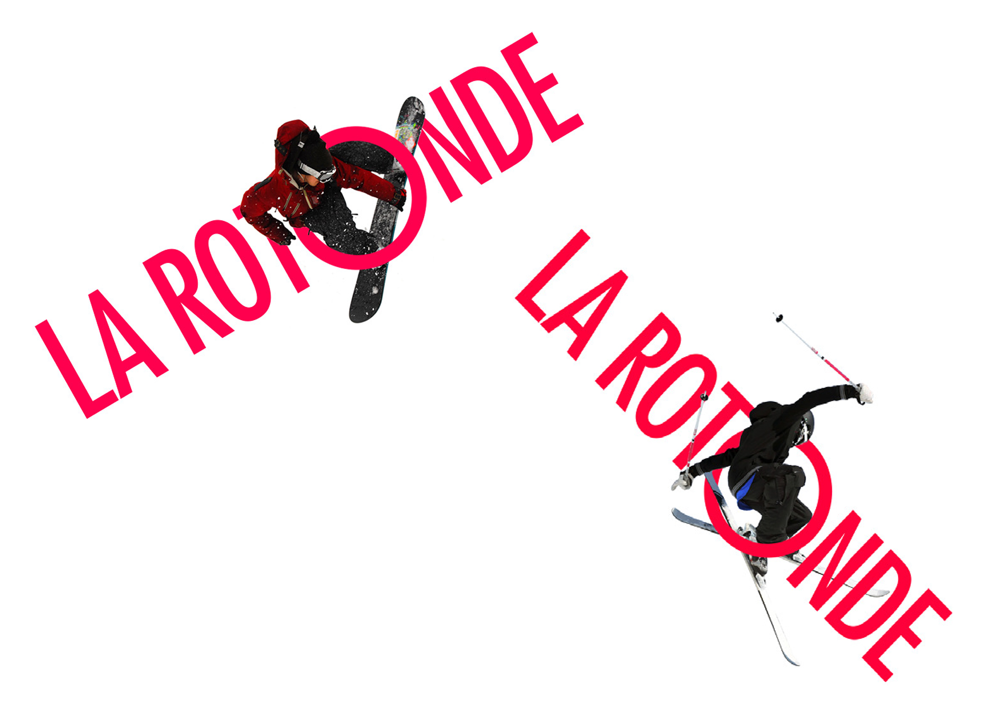
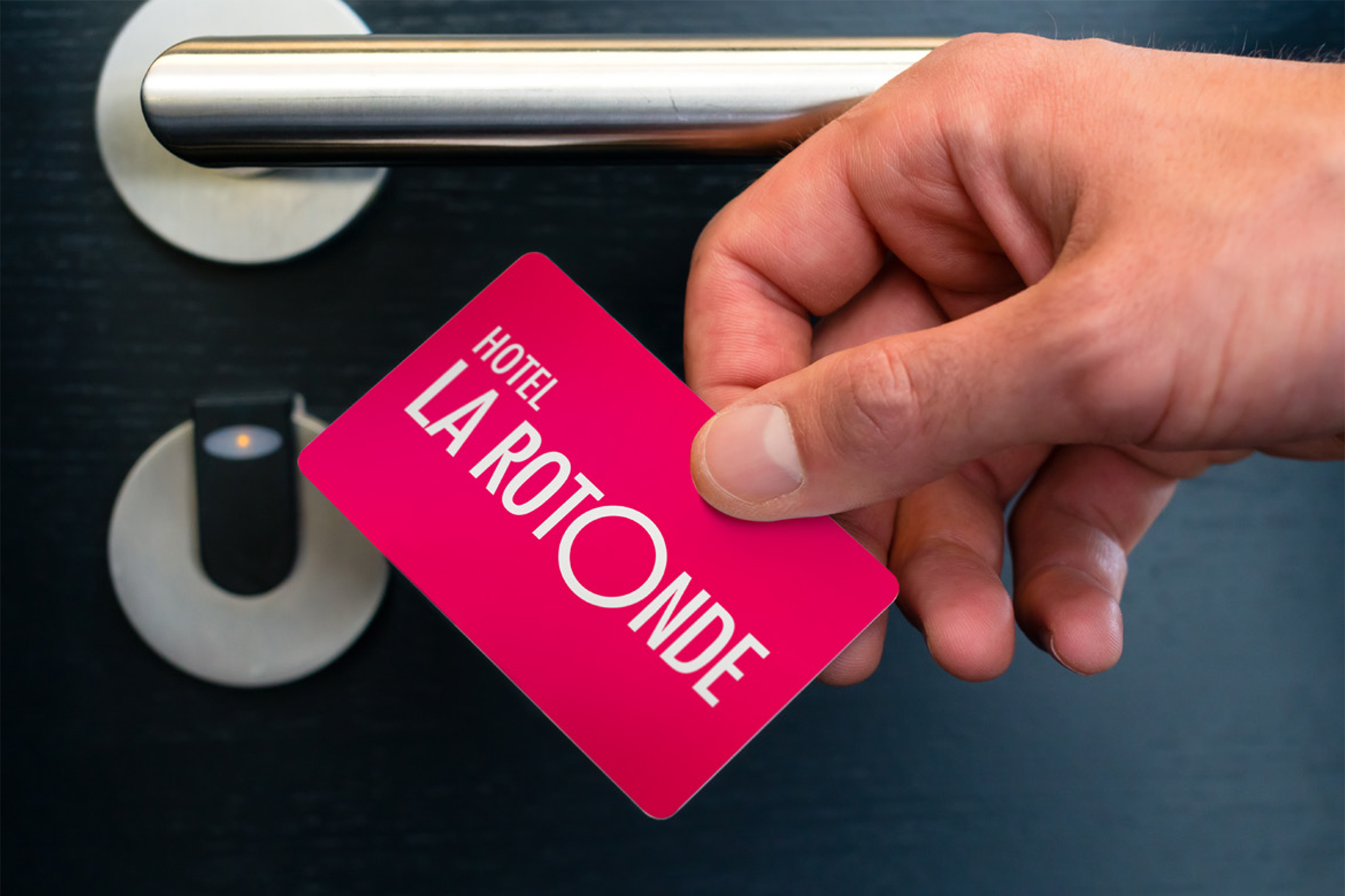
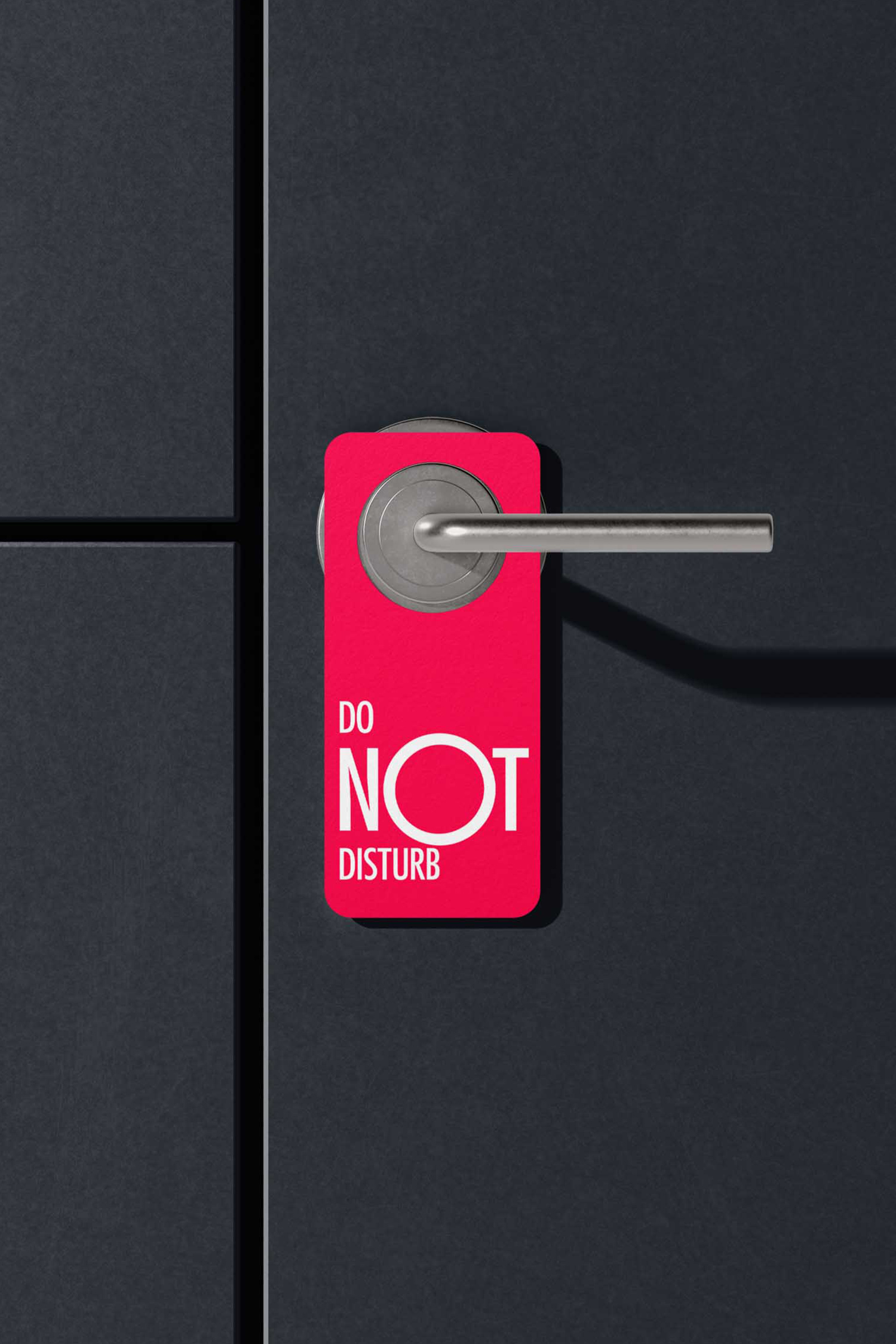
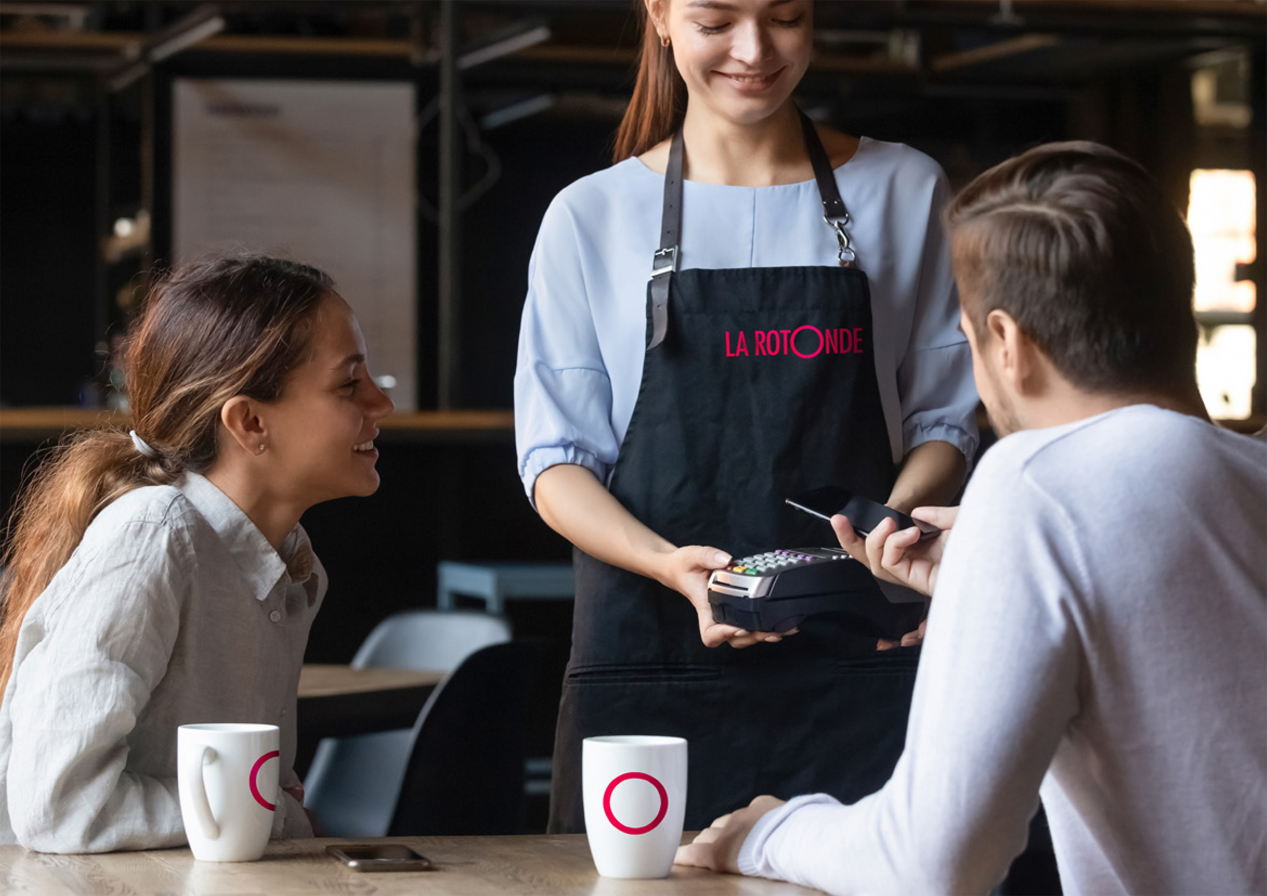
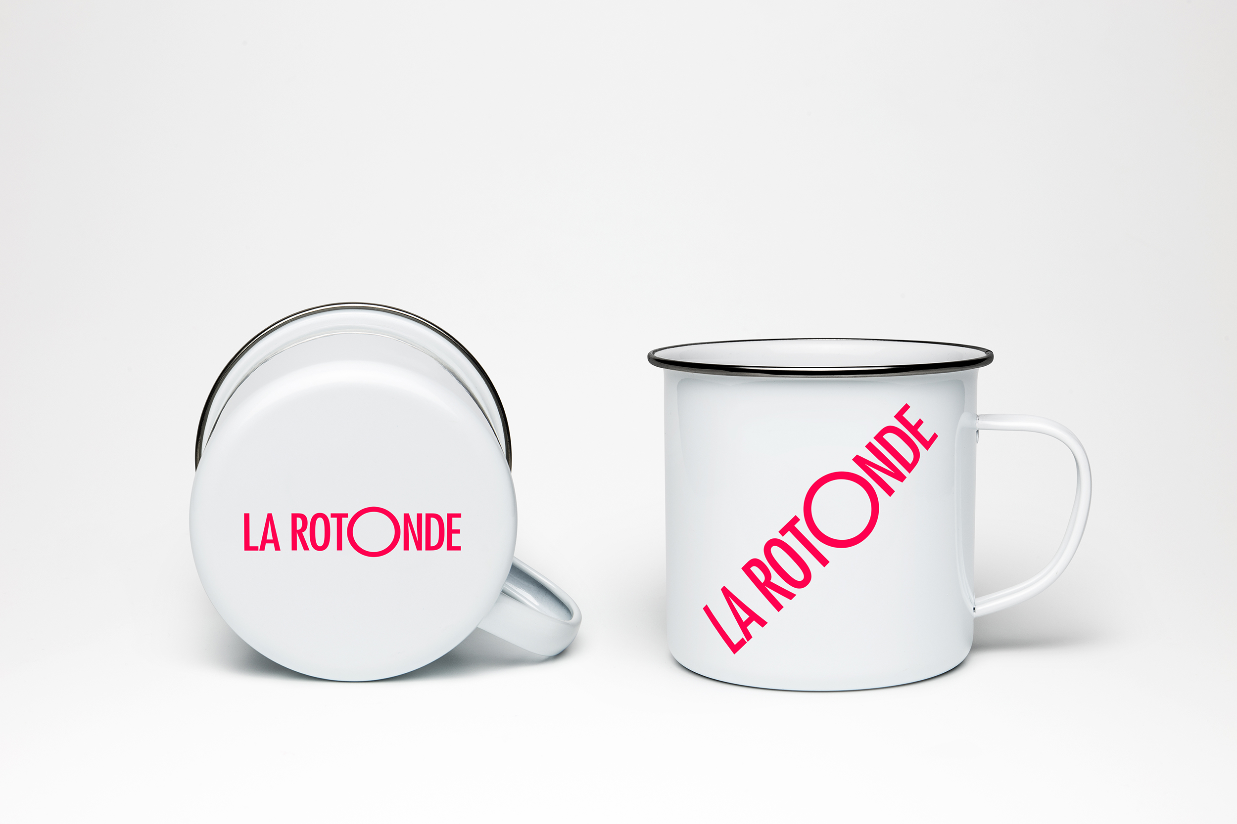
La Rotonde is aimed at a young, sport-focussed audience with decor that is very simple, stylish and utilitarian. The colours and imagery we have used across the identity are very vibrant and dynamic to compliment this approach.
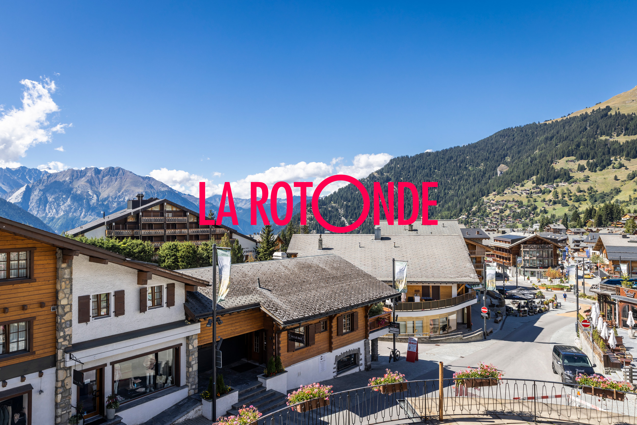
The hotel's name is derived from its unique shape. The front is circular, curving between two roads.
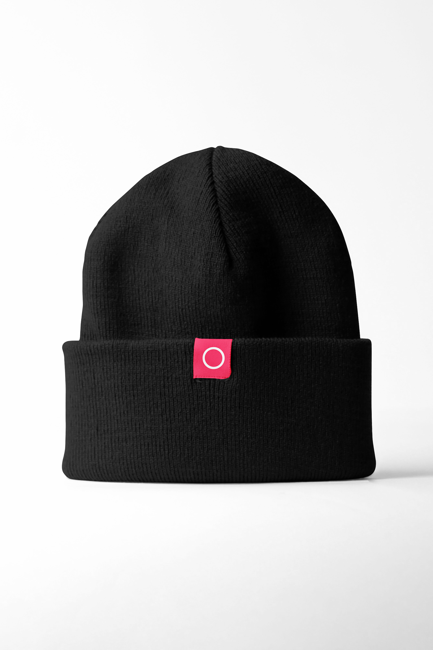
This inspired our idea for the logo. By highlighting one ‘O’ as a larger circle it can be also be used seperately as a graphic signature on other materials.
Work carried out
—
Logo design
Visual identity
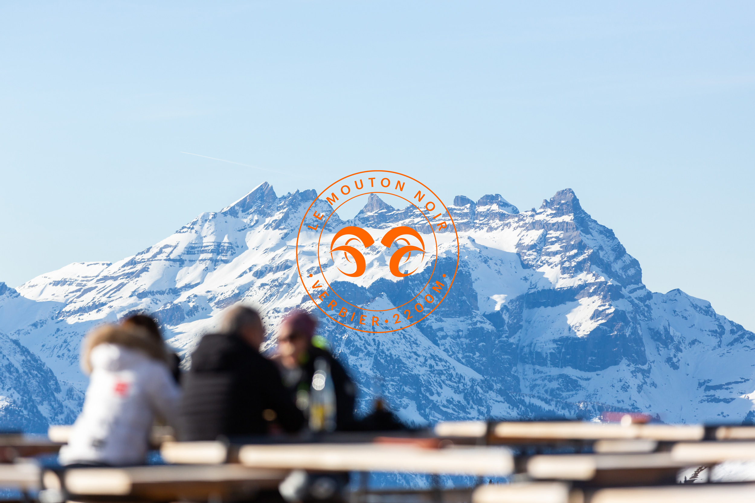
Le Mouton Noir
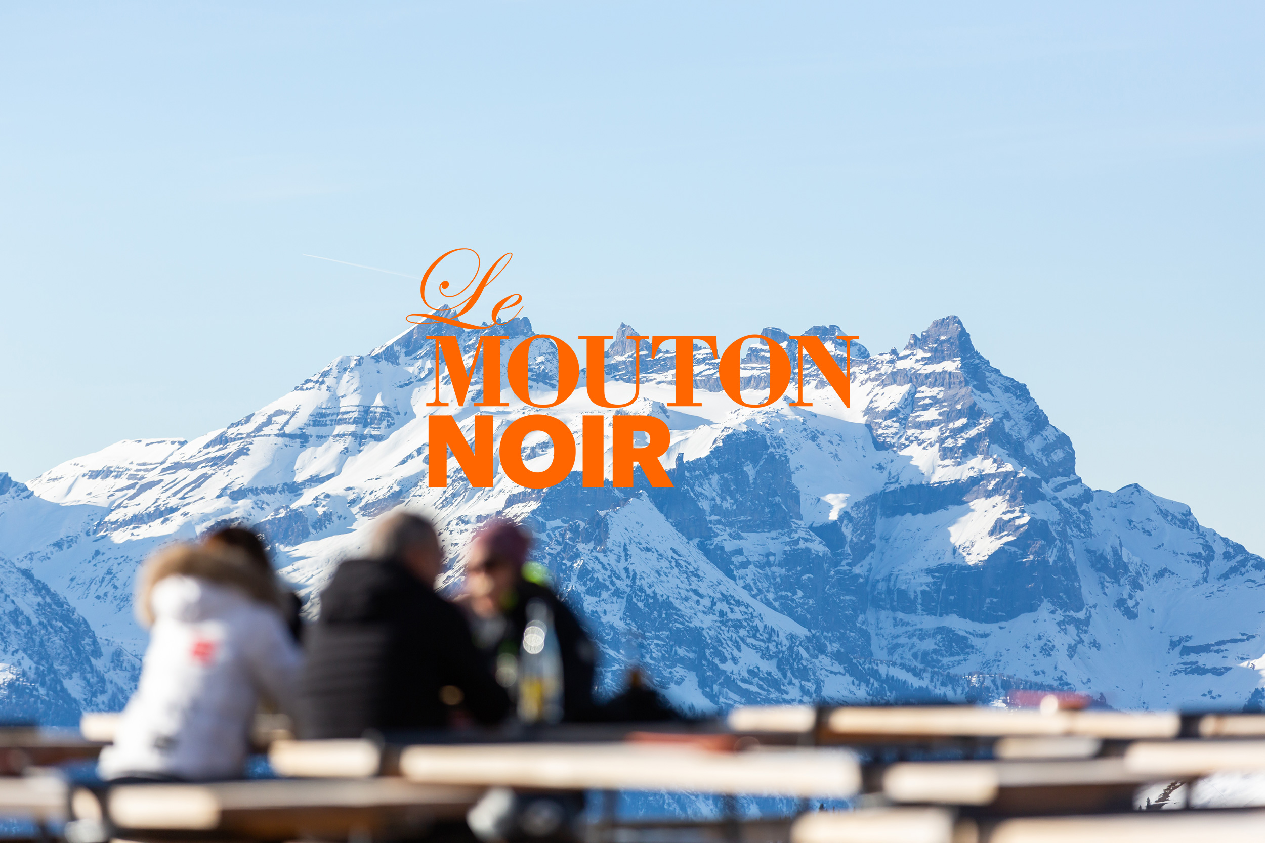
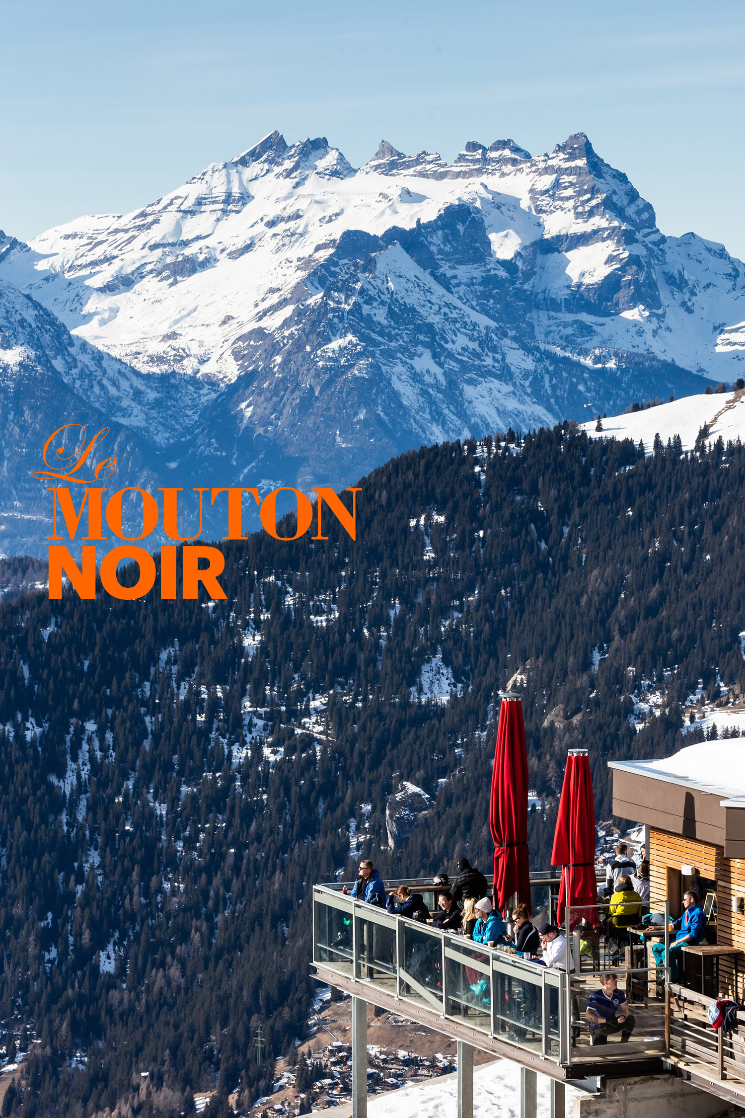
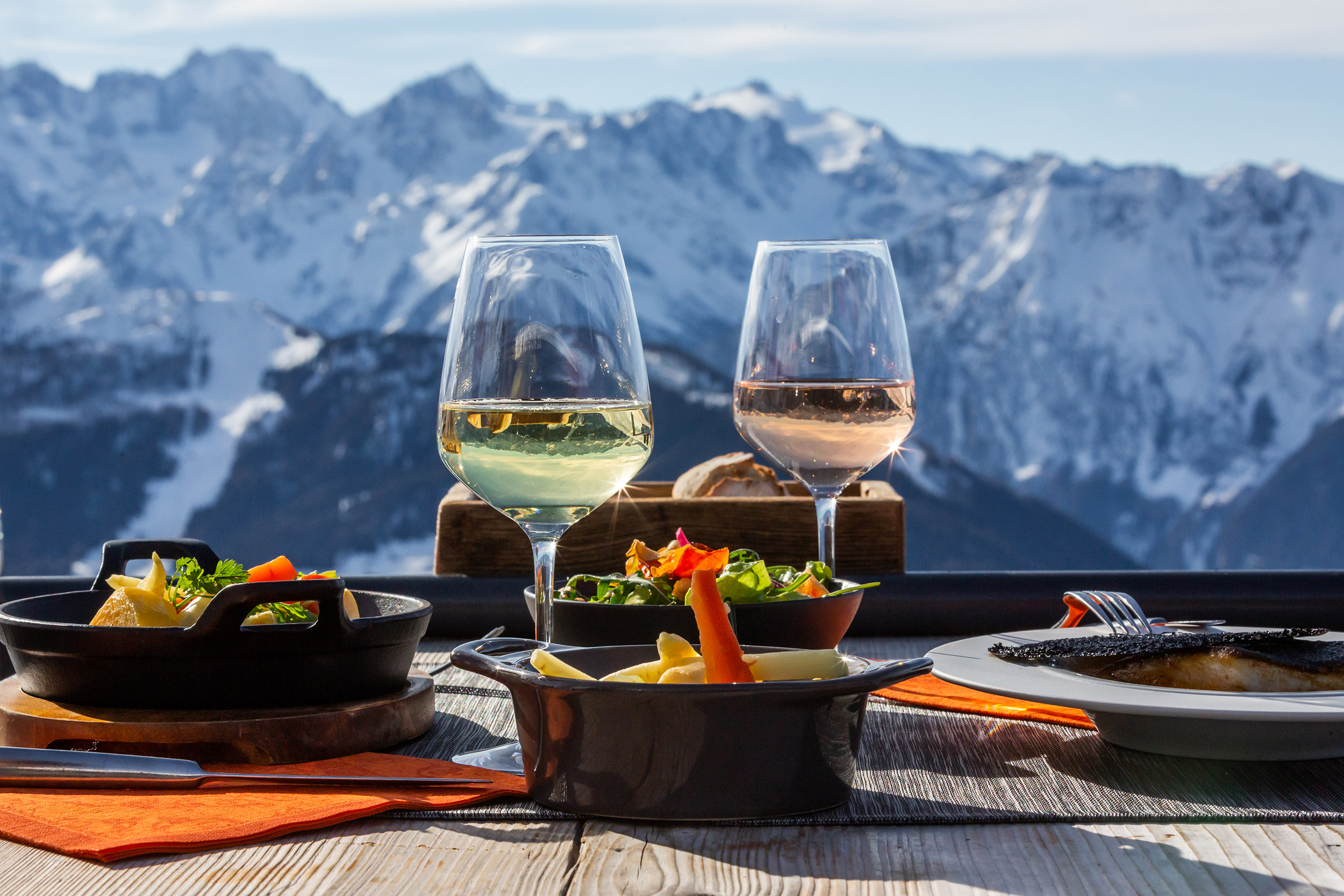
Situated at 2200 metres, with panoramic views across some of the most impressive peaks in Valais and the largest terrace bar in Verbier, Le Mouton Noir is a popular destination for skiers and snow boarders to eat, drink and enjoy a lively aprés ski atmosphere with DJ’s, and live music.
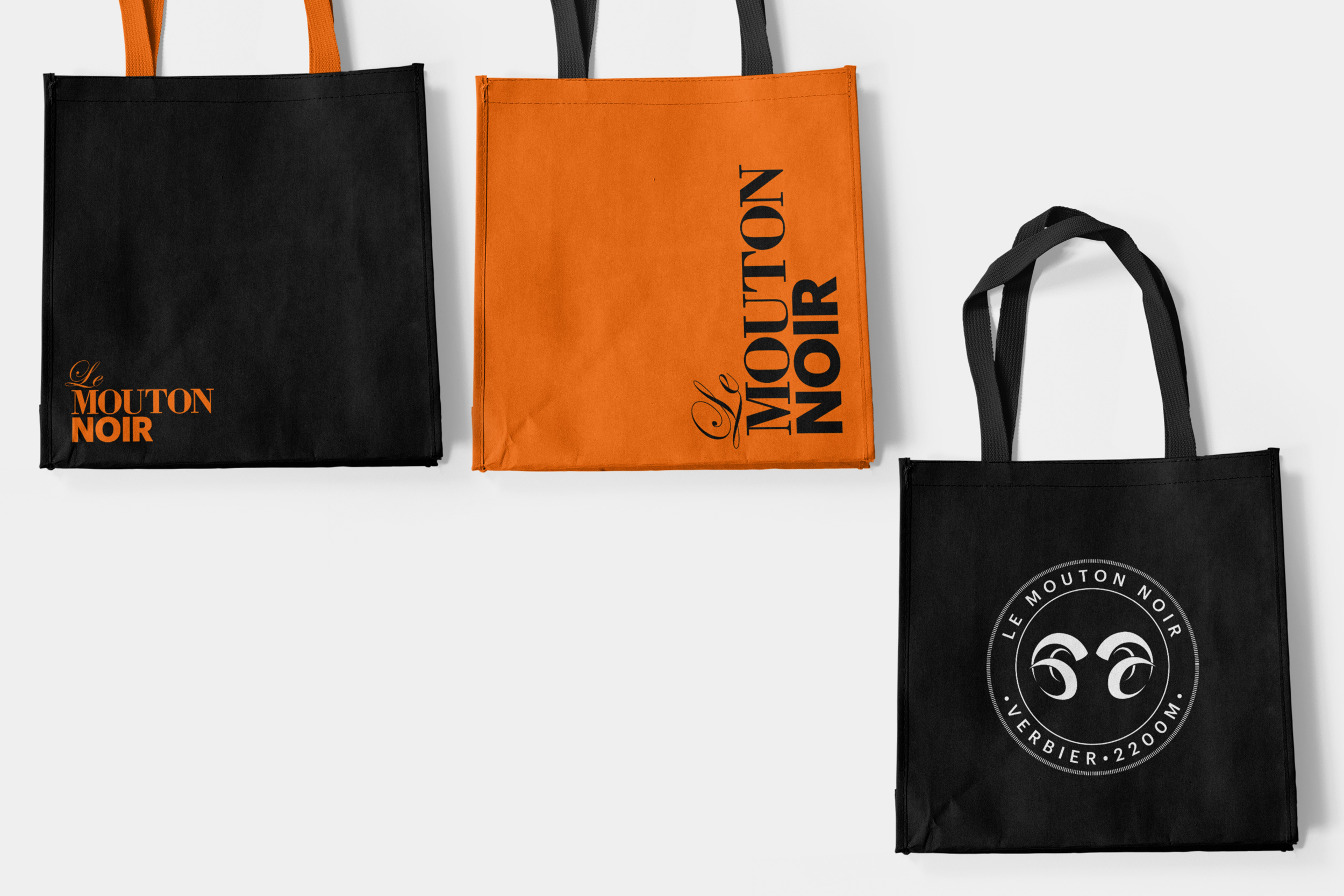
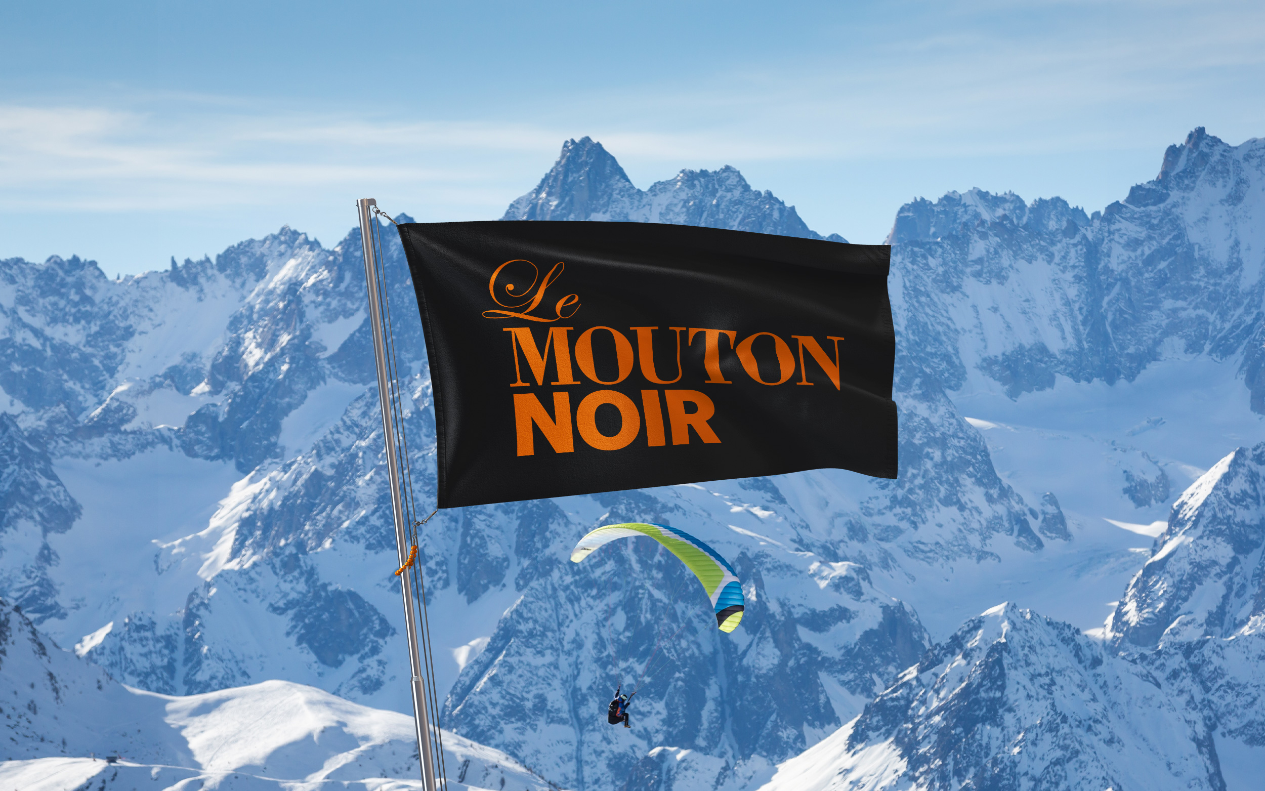
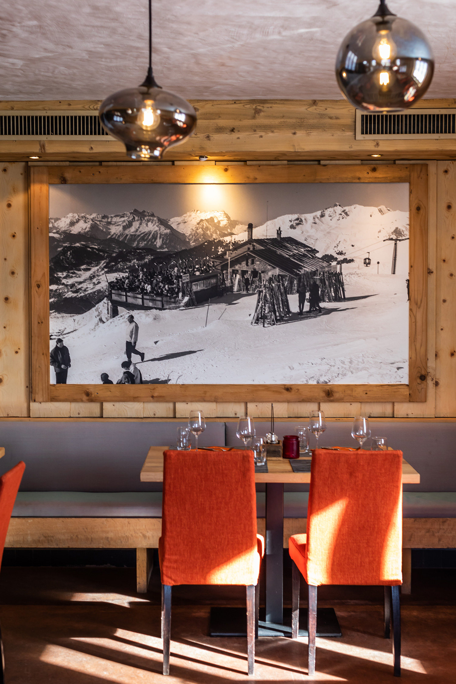
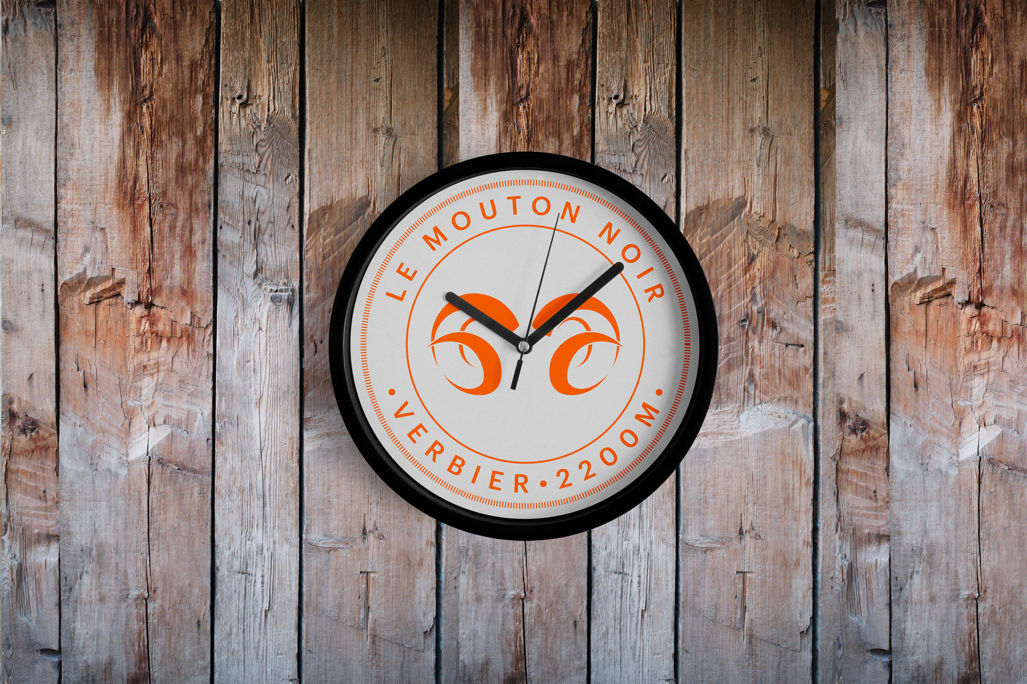
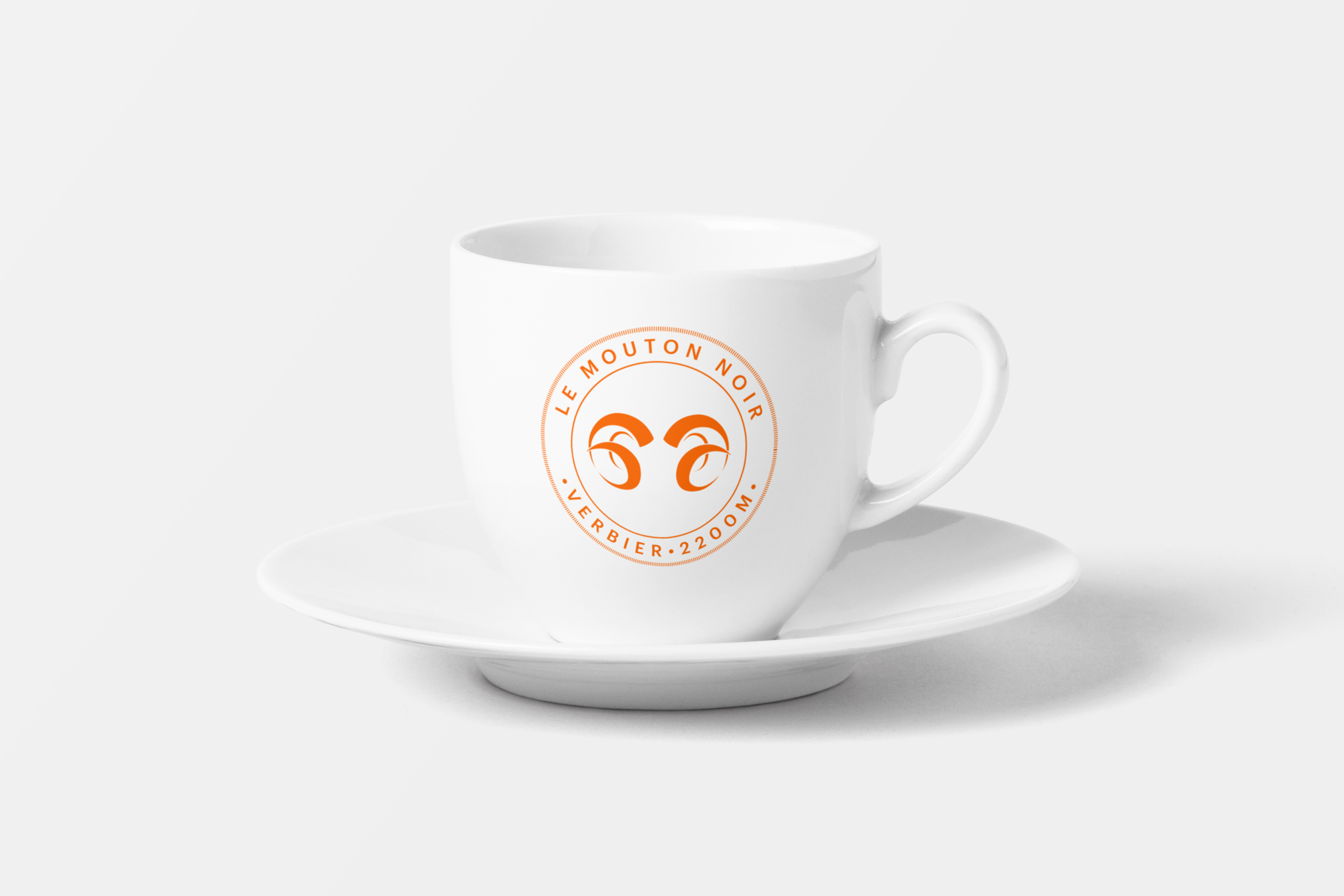
It is comprised of two main restaurants that appeal to different diners — the self-service area is a busy and entertaining place accomodating families and skiers young and old, while the main restaurant is fine dining at altitude. Our identity and design work acknowledged these different attributes. The logotype is a mix of traditional and elegant in tandem with bold and modern typography.
Work carried out
—
Logo design
Visual identity
Art direction
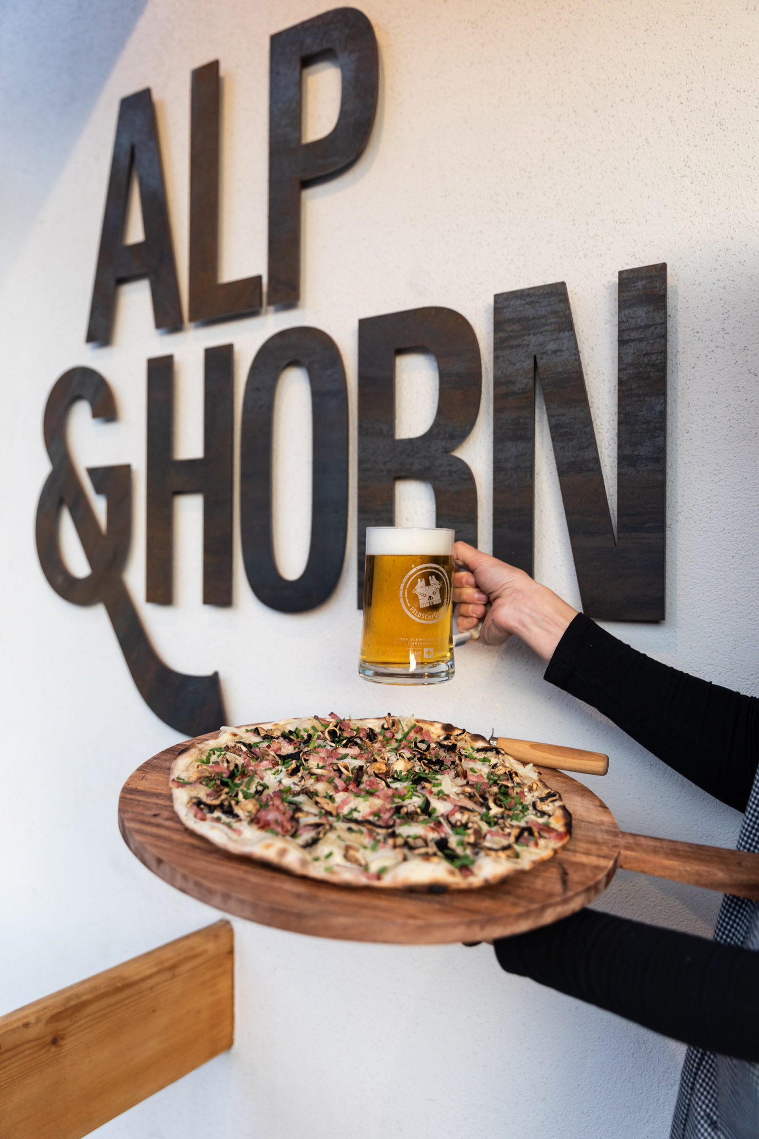
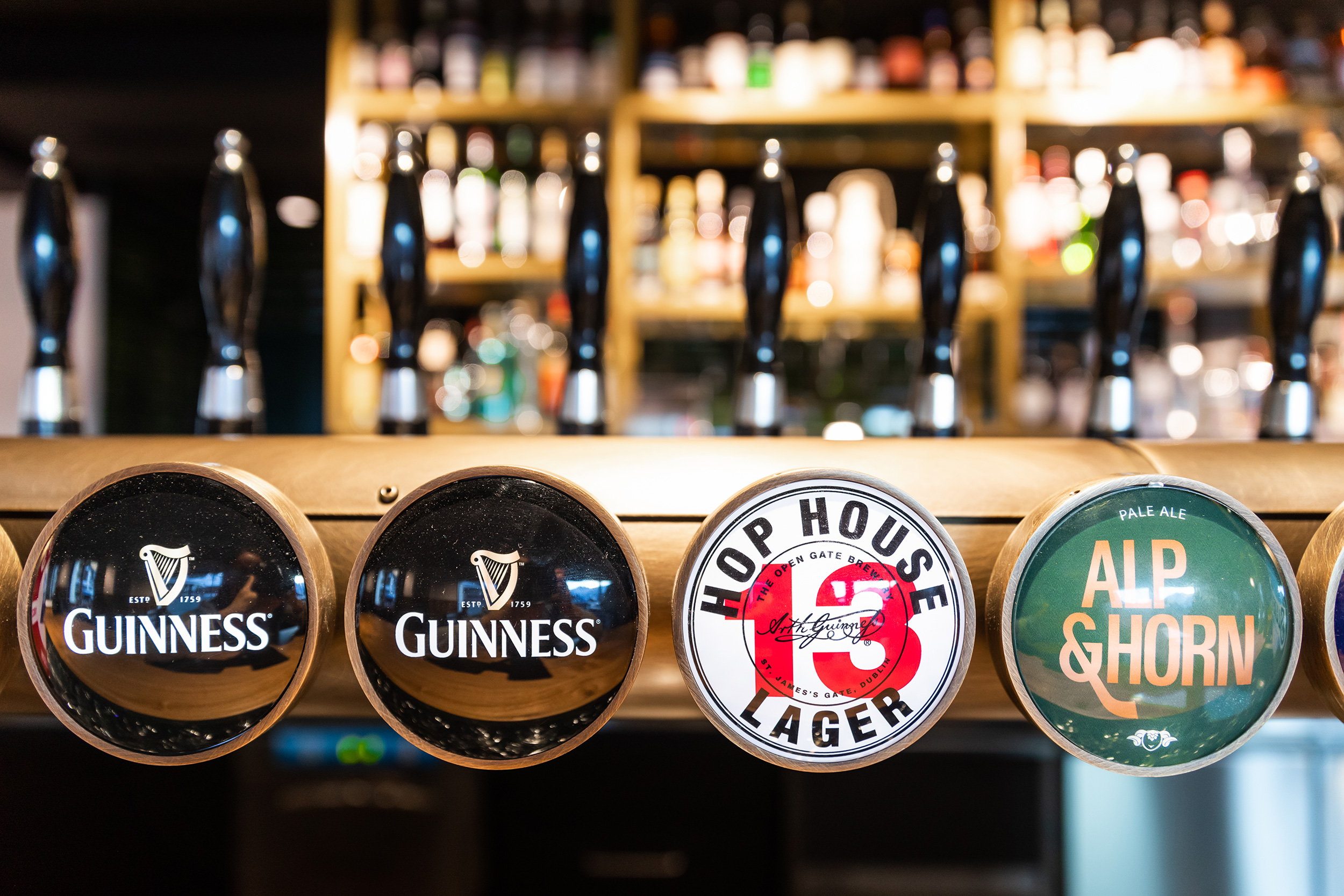
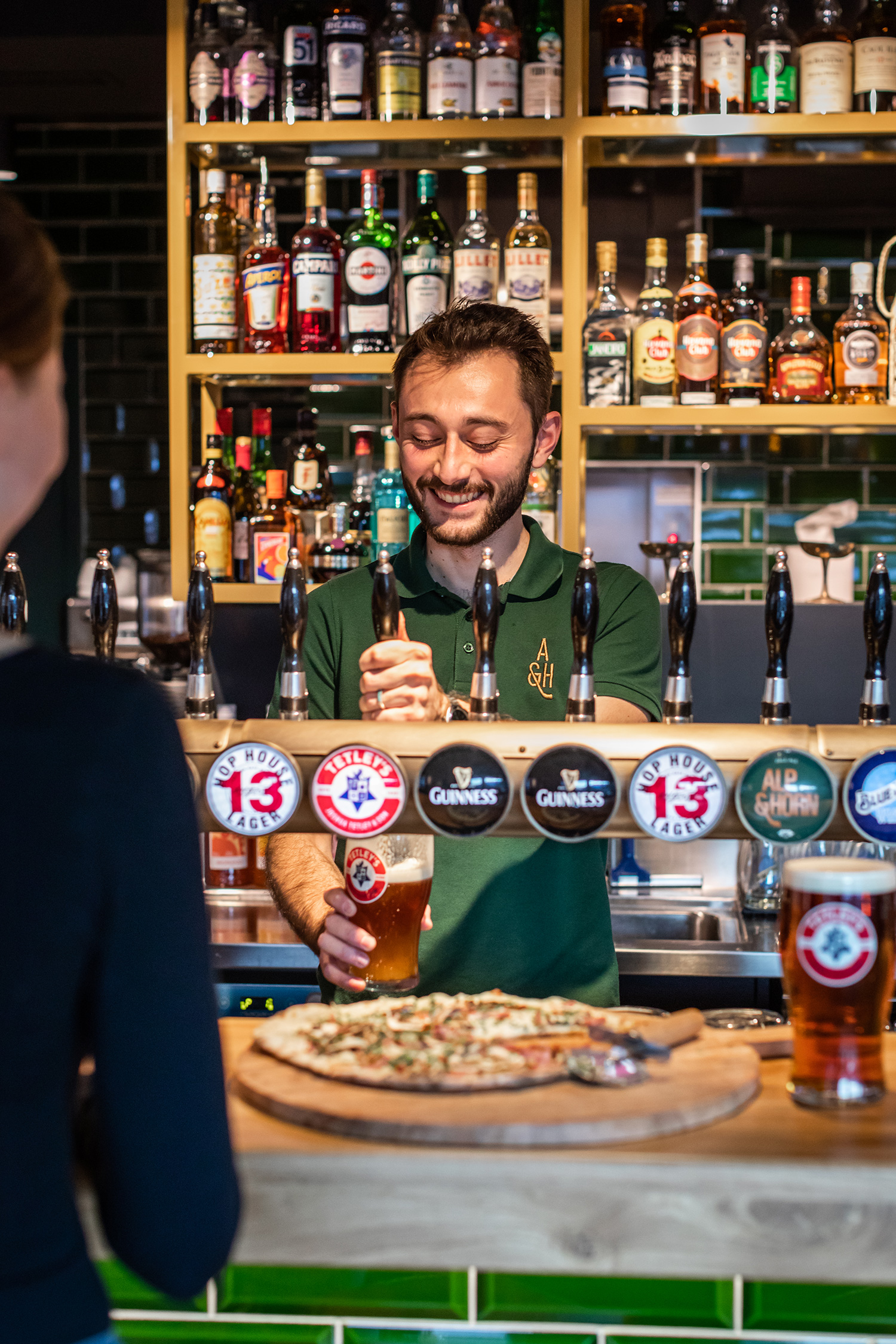
Alp & Horn
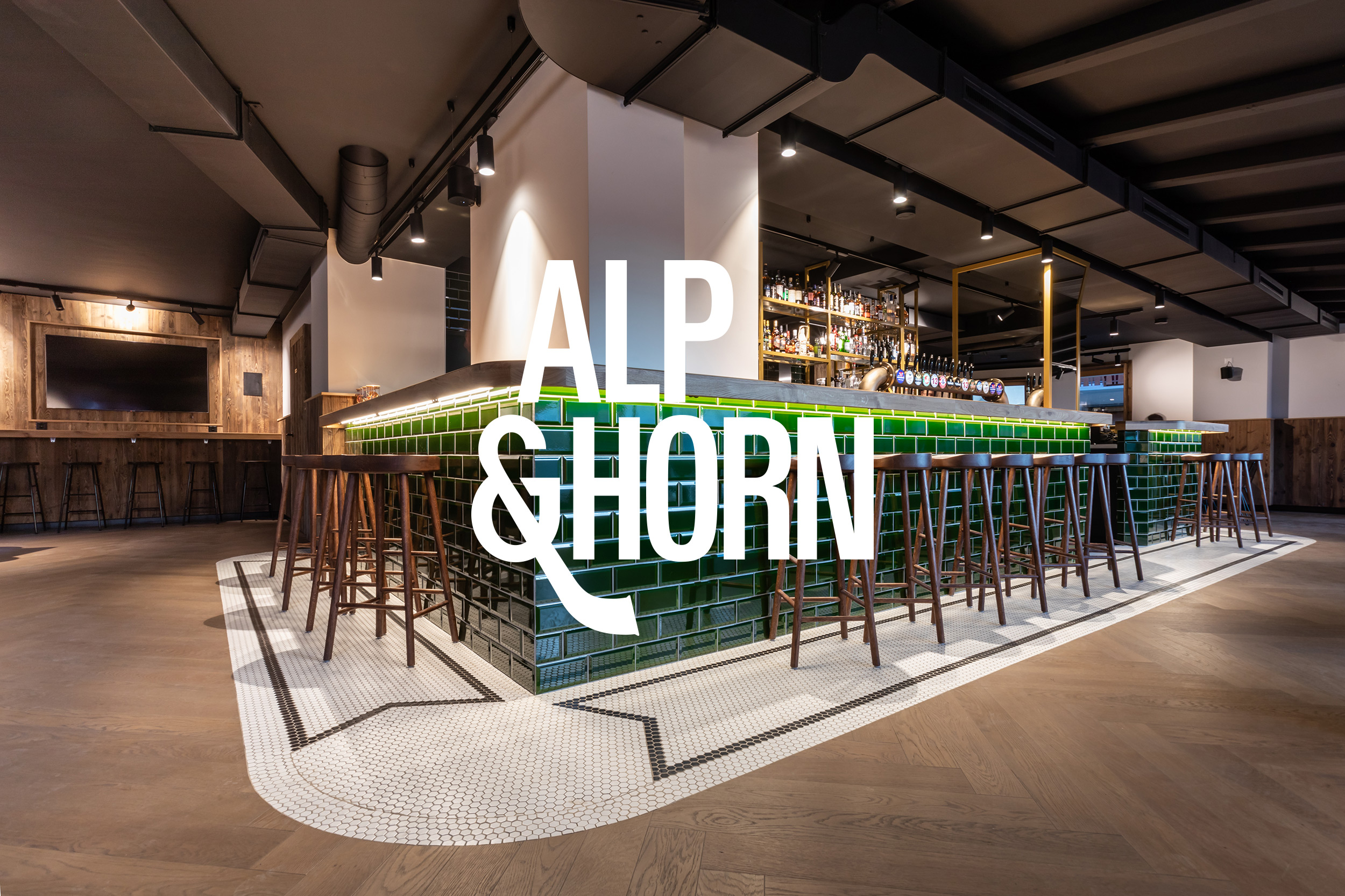
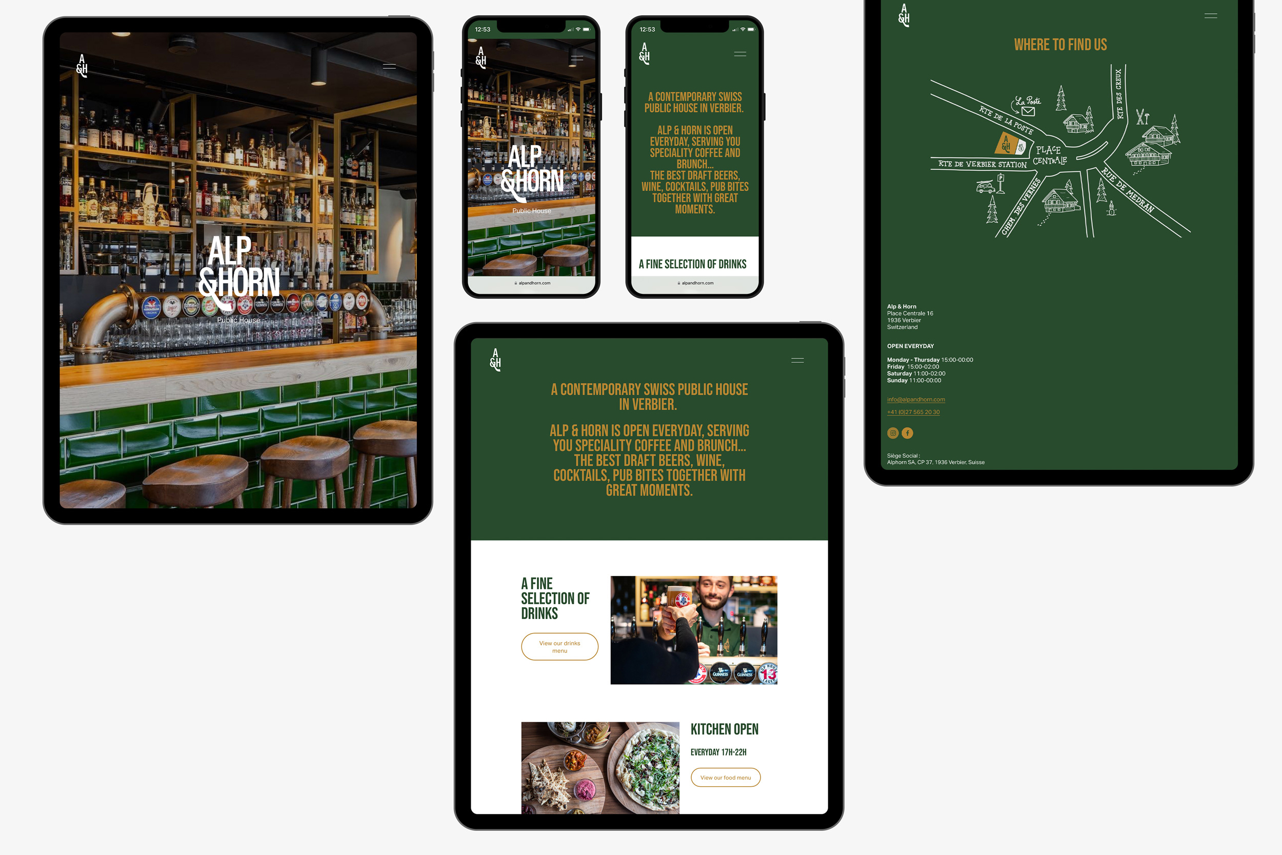
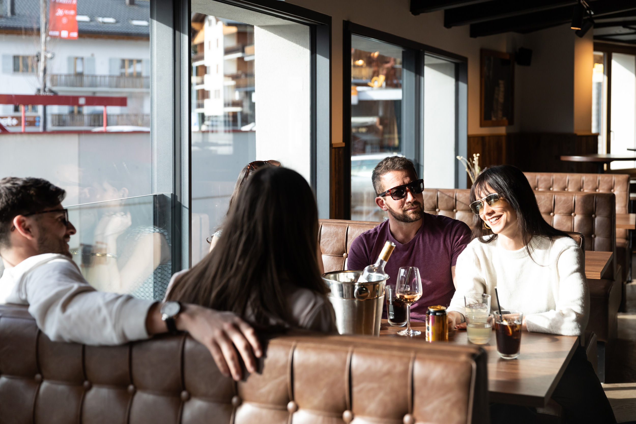
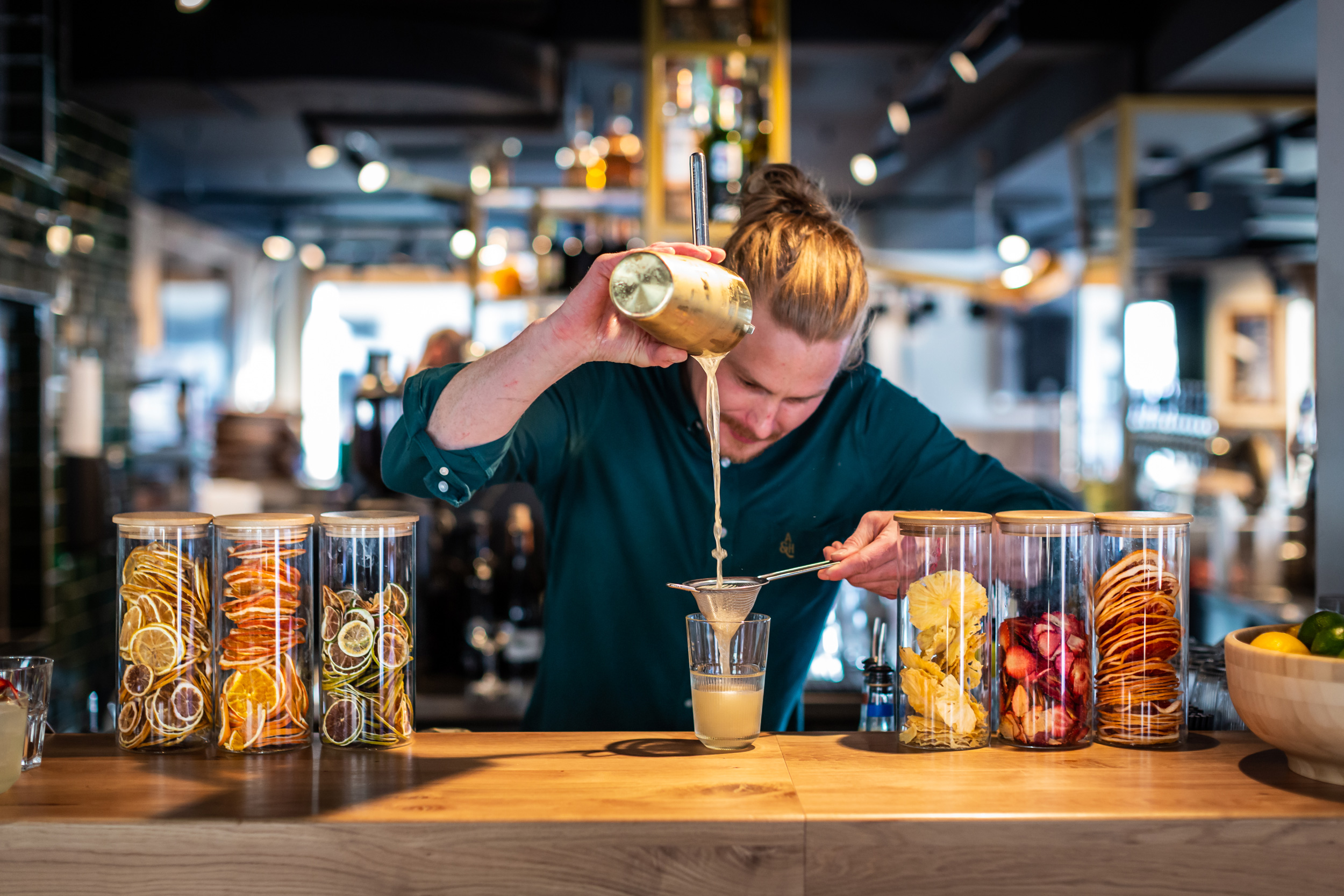
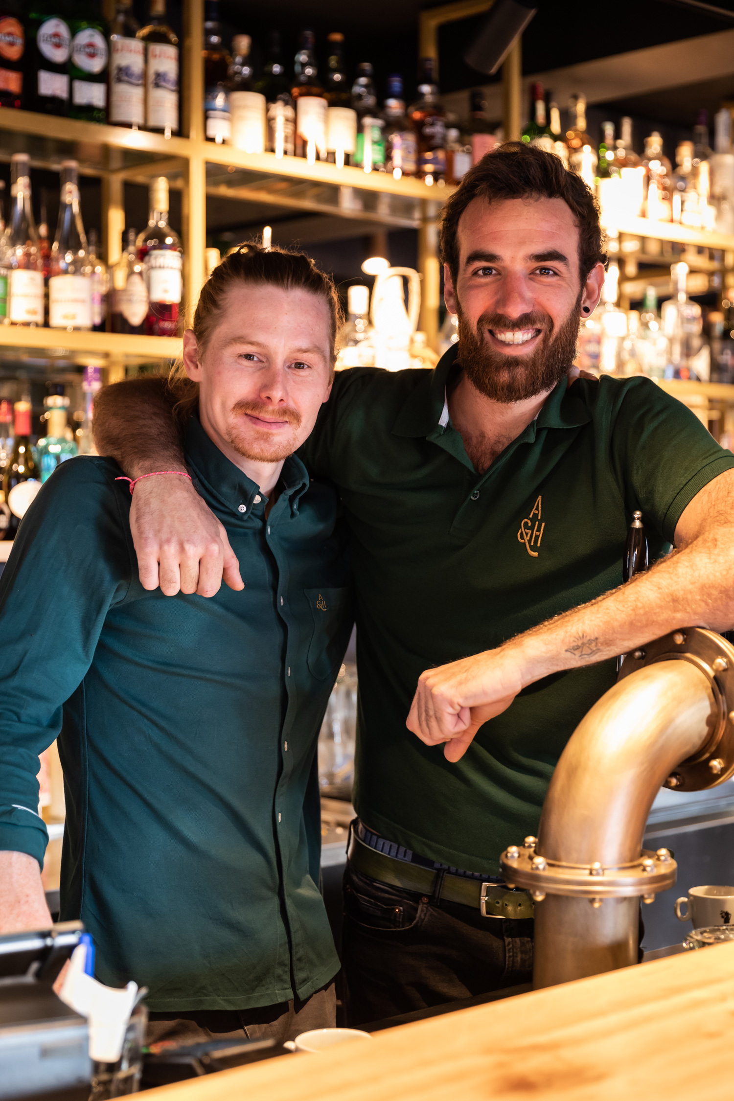
Alp & Horn is a contemporary public house in Verbier serving draft beers, speciality coffees, cocktails and traditional pub bites. It is the first venture for the new Alp & Co. brand who are developing this concept in various locations such as Geneva, Zurich and London. The venues will be influenced directly by the neighbourhood they sit in, focussing on locally produced drinks and food.
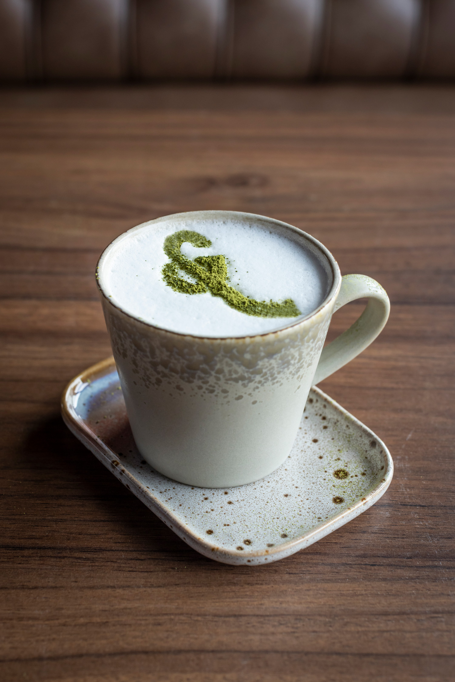
Each pub will follow the same naming convention, starting with ‘Alp&’ then adding a unique second word. Our logo also follows this style, using a distinctive ampersand shape that is modelled on the traditional Swiss instrument, the alphorn, from which the pub gets its name.
Work carried out
—
Logo design
Visual identity
Website design
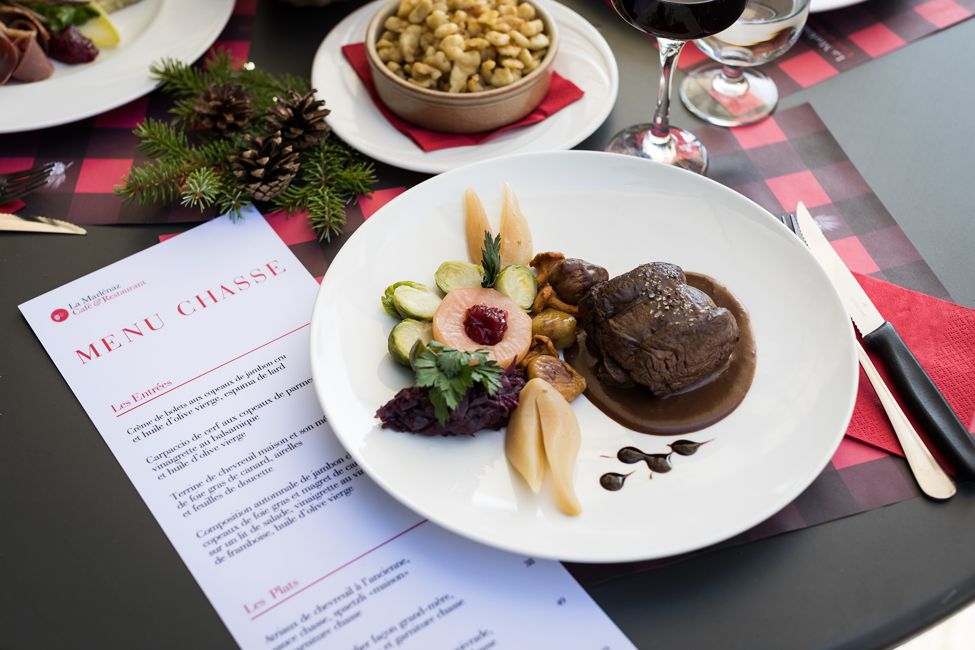
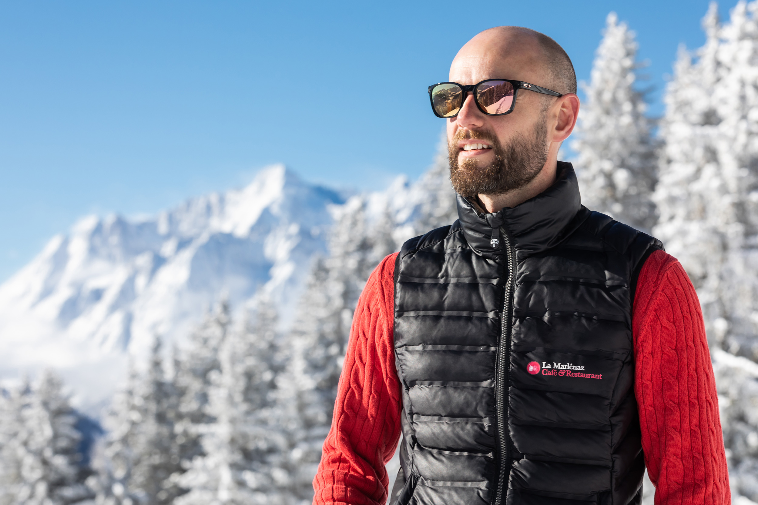
La Marlénaz
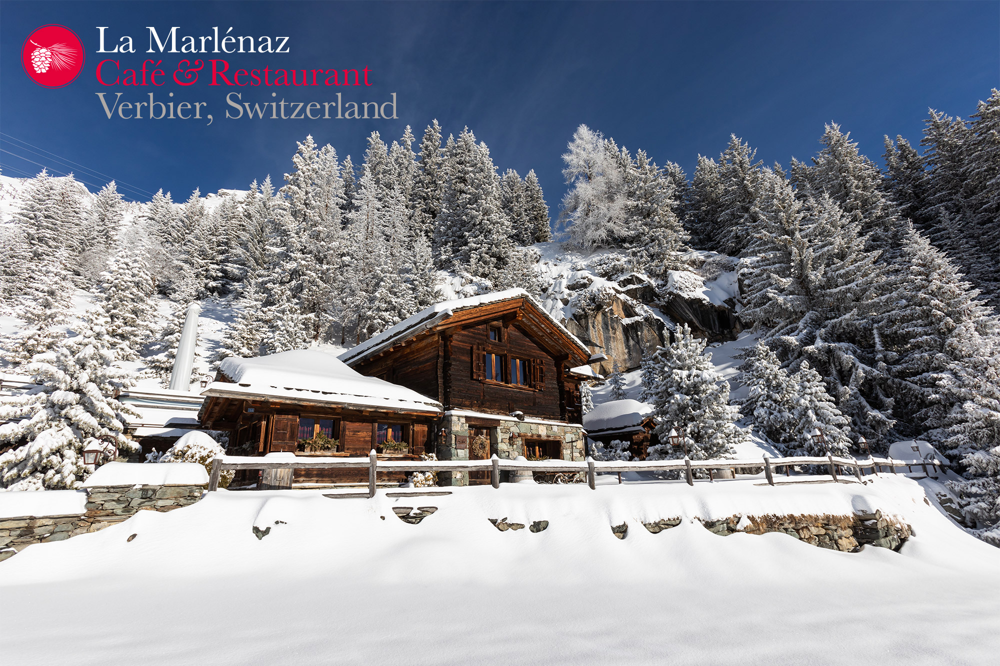
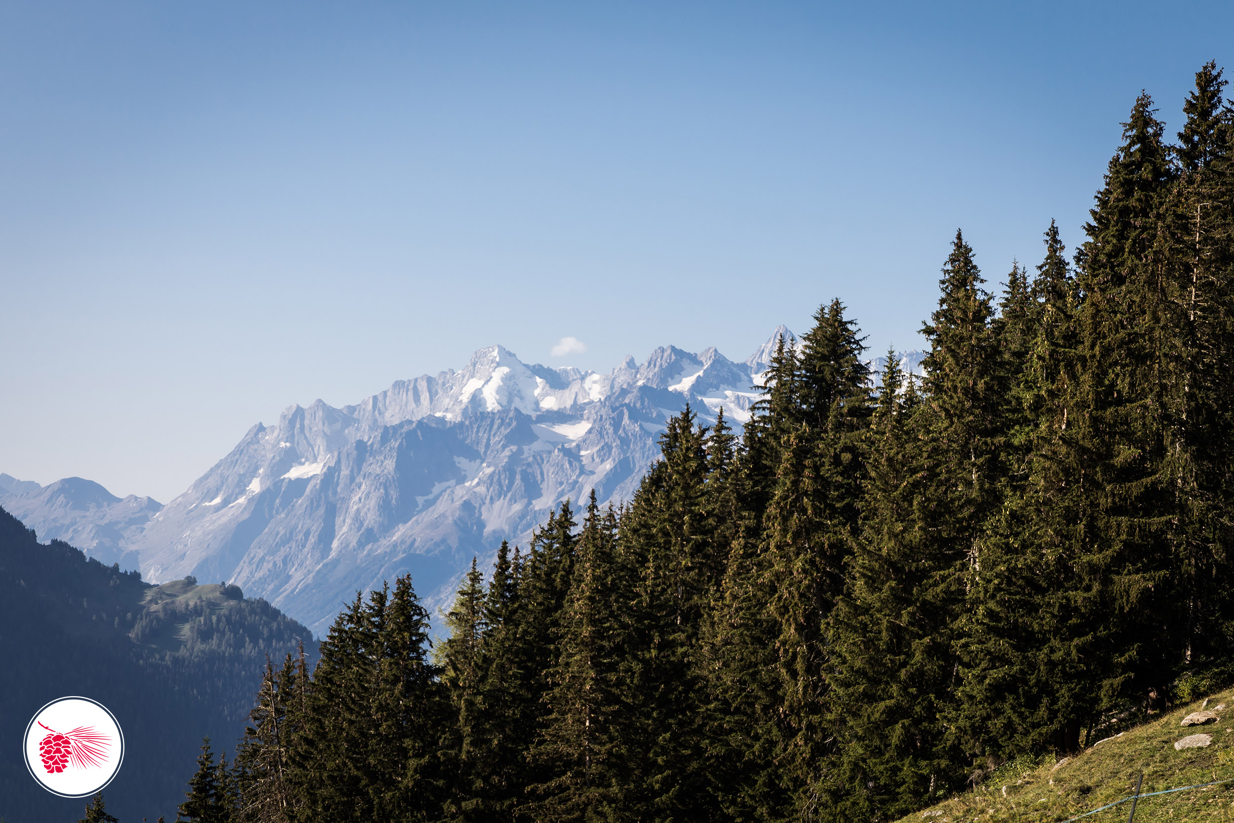
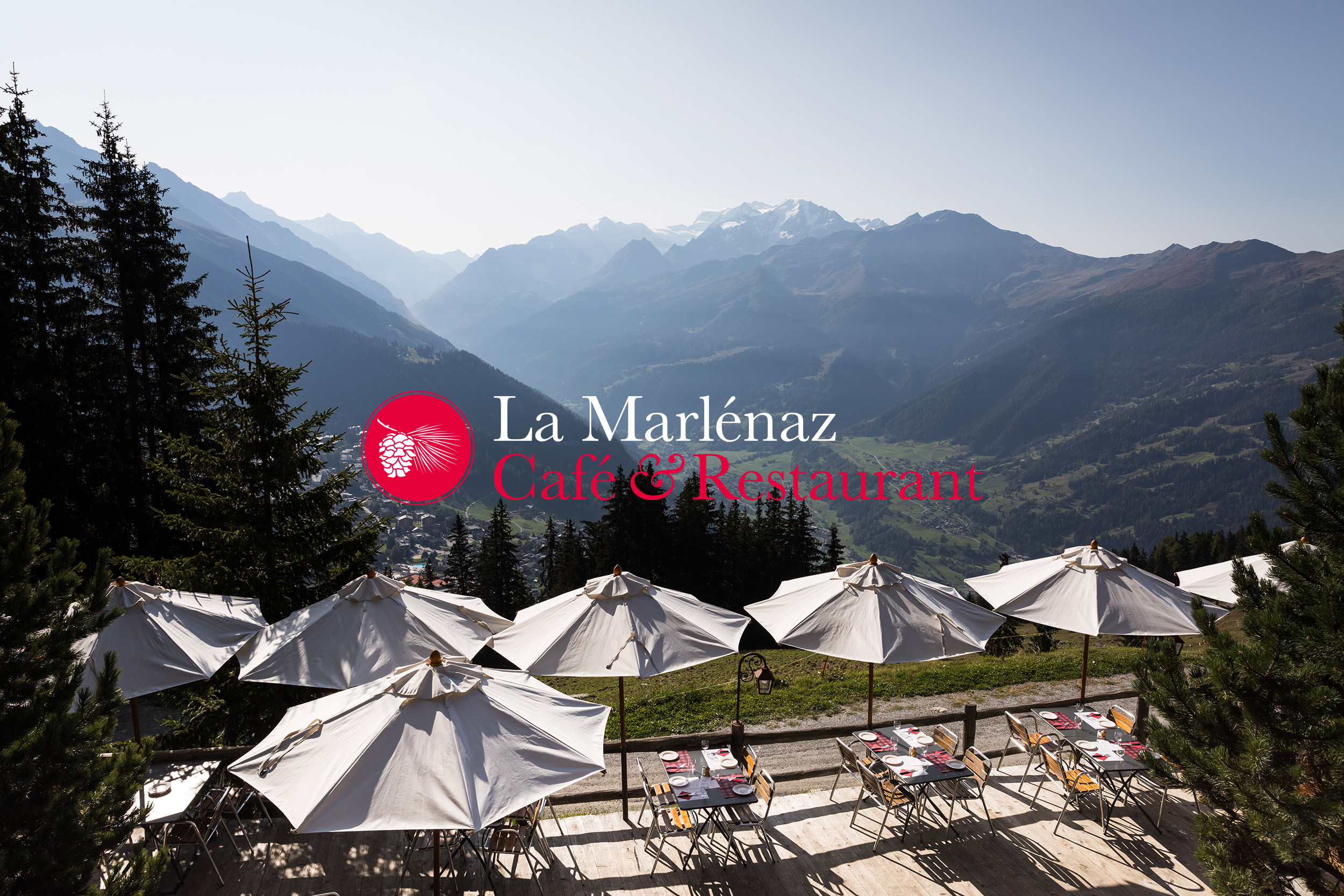
This mountain restaurant is located at an altitude of 1895 meters and enjoys a unique panorama of the massive Combins and the town below.
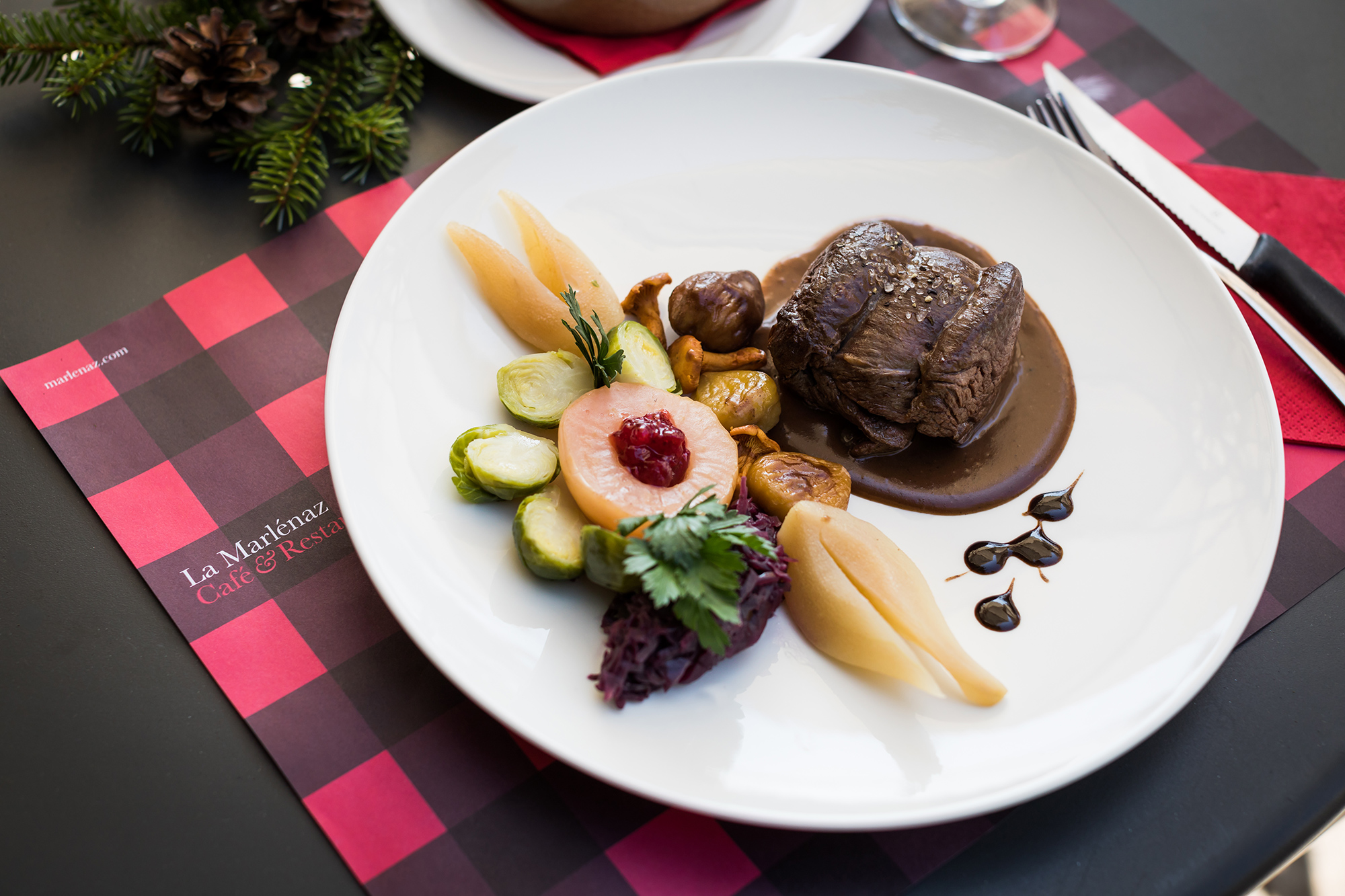
One of Verbier’s first restaurants, La Marlénaz is housed in the time-honored Swiss chalet style. It’s cuisine is traditional Swiss with a modern twist and uses the best locally-sourced produce. It is one of the must-see places in the resort.
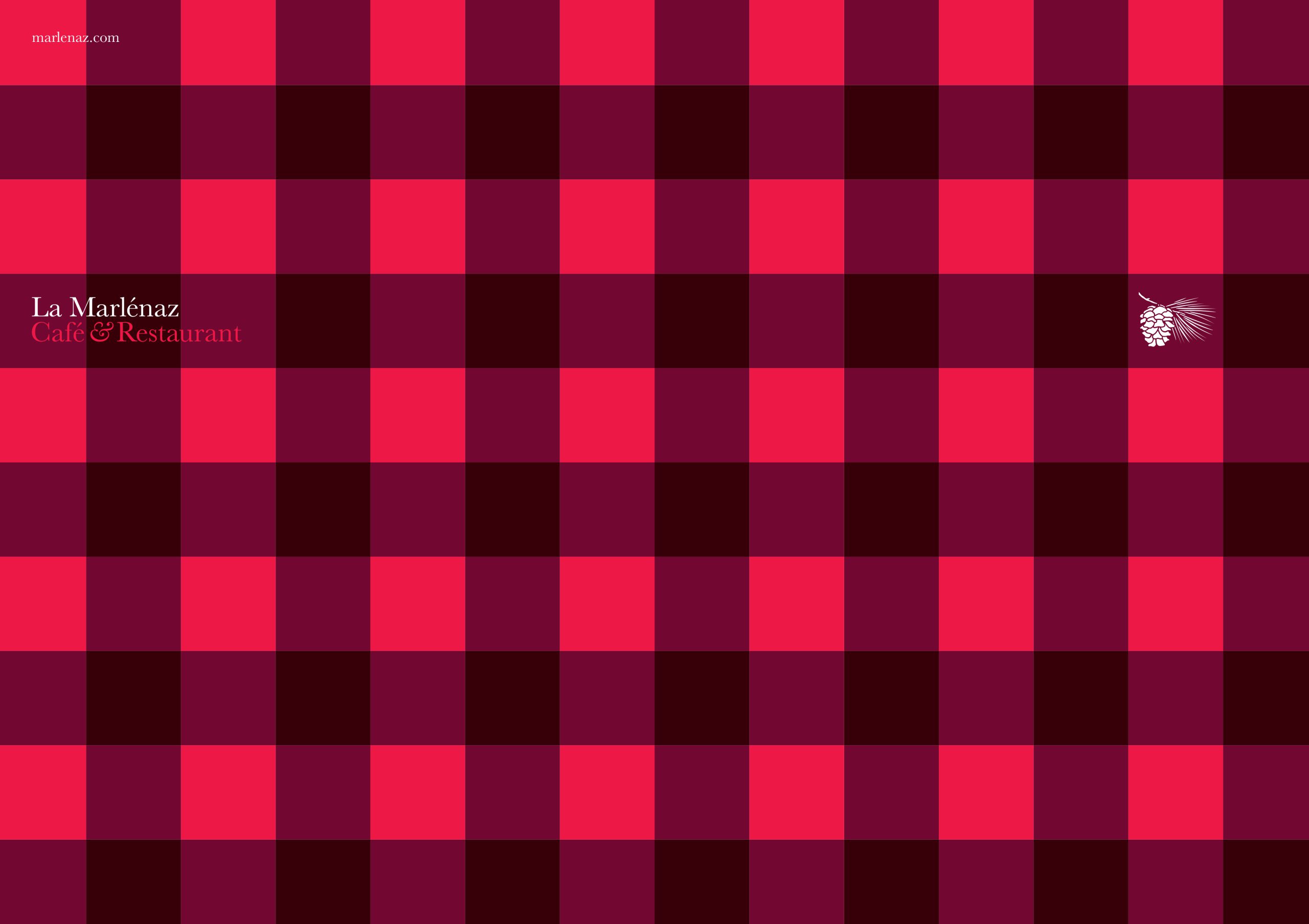
Our designs for the restaurant are inspired by the long established building, it's decor and surrounding elements. A distinctive red plaid pattern is coupled with very understated, classic typography and a redrawn symbol that was originally created in the 1940’s.
Work carried out
—
Logo design
Visual identity
Art direction
